Wednesday, November 30, 2011

How to Use Patterns on Stationery - Part Seven: Big and Bold

In this final post about different ways that I like to use patterns in my stationery designs, I wanted to make one final point: patterns don't have to be small, delicate, or subtle, even though I usually make them that way. That's just the aesthetic I tend to prefer - feminine and pretty. But big, bold, graphic patterns can be really awesome on stationery too, even if it's a wedding or other formal event.

The floral pattern shown below wouldn't feel nearly as much like springtime if it weren't so bold. The yellow and green colors are cheerful - so why not let the pattern shout a little with joy, too? ;)


Even fancier, more delicate patterns can take on a whole new look when they're blown up larger than life. I often use my favorite font characters to create patterns, and in this one I used a lowercase "f" and "y." How great would a bold fun pattern like this be if your initials were F and Y?


Similarly, the angular font I used to create this pattern is pretty apparent - capital "R"s and "P"s almost jump out at you when the pattern is shown big and bold like it is in this design. For a couple with first names that begin with "R" and "P", this could be the perfect font. Even if those letters aren't meaningful to you, though, the pattern still works on its own. With the bright orange color, the pattern looks even more evocative of starbursts than it already was!


Don't be afraid to blow a more delicate, intricate pattern up so that it's large and in charge! I even fill almost half of a design with a large pattern sometimes, if there isn't a lot of text that needs to be incorporated.


Finally, simple shapes make for great big, bold patterns. They look modern and exciting, just like these final two examples that create circle or rectangular-type shapes with their simple lines and curves.


I really enjoyed showing off all of these patterned pieces, so I hope you enjoyed seeing them, too! If you love pattern as much as I do, don't worry - I'll still be posting images of my favorite patterns every Fancy/Funky Friday!

-

Shameless plug time: Love my patterns? Love these designs? I incorporate them into a lot of the artwork I create, from stationery for Invites by Andrea to the watercolors I paint. Check out Invites by Andrea's website to see examples of these patterns or download a catalogue pdf (coming soon!). Or drop me a line at andrea@invitesbyandrea.com to let me know what you think!

Tuesday, November 29, 2011

How to Use Patterns on Stationery - Part Six: Guides for Brads

I love decorative brads. There are so many awesome ones to choose from. They have pretty much any color available, from metallic to pastel to bold and bright. There are sparkly ones, fabric ones, and brads that have their own patterns on them already. They even have themed brads that are in the shape of your favorite foods or animals. The brads in these examples are pretty plain - small round brads in various colors - but they look more personalized and unique because they're incorporated into the patterns I designed.

The best part? You don't have to measure with your ruler each individual invitation and mark where the brads should go to ensure that they'll all end up in the same place, because you can use the pattern as a guide for where to place your brads! Any pattern that has small circles, interesting intersections of lines, a touch of white space, or an obvious origin point for radial or linear symmetry is a great option for this, since any of those features make for a great place to insert a brad.

In the example below, a vaguely floral pattern provides the perfect opportunity for a brad in the center of the first flower on right. Guess where the brad is on the other side of the invitation? Bingo. The center of the first flower on the left. So easy!


This pattern is obviously symmetrical, with a vertical line axis. So where to put the brads? Equally spaced on that line of symmetry, of course, right in the center of where two units of the pattern come together and touch. Though I created the pattern first and added the brads later, it looks like I planned it all along!


To dress up stationery even more, you can also add ribbon on top of the pattern. Since this ribbon is half sheer, it's still easy to see the pattern well enough underneath to use the pattern as a guide for where to insert the brads, plus since the pattern, ribbon, and brads are all almost the same color, they work really well as a cohesive group.


In the example below, each item's brads were placed on a different spot of the pattern, based on the size and design of the item. The brads on the reply card are inserted further to the left so that the guests have enough room to write their name and reply when they lift up the peach-colored vellum paper overlay.


My absolute favorite way to incorporate brads into a pattern is at the center of a flower-like intersection, where several lines or ovals come together, just like these final two examples.


The final part of this extensive seven-part blog post will be tomorrow, so don't forget to check back! :)

-

Shameless plug time: Love my patterns? Love these designs? I incorporate them into a lot of the artwork I create, from stationery for Invites by Andrea to the watercolors I paint. Check out Invites by Andrea's website to see examples of these patterns or download a catalogue pdf (coming soon!). Or drop me a line at andrea@invitesbyandrea.com to let me know what you think!


Sunday, November 27, 2011

Sunday Sample Spotlight: "Olive My Love"

Shades of olive green are a great color choice for autumn and winter since they feel deeper and cooler than a bright kelly green or lime green, and the best part about this design is the different shades of green it employs. The scrapbook paper I chose for inspiration incorporated olive greens, darker greens, light blue-greens, and neutral tans and whites into a handmade-like stripe pattern. I love that the stripes aren't quite straight, and that they vary in thickness - it really gives the design a more casual, earthy, rustic feel.

"Olive My Love" - Invitation Duo (invite & information insert)

This design is similar to many others I've made with scrapbook paper - I cut out the appropriate shapes of paper and glued them to the left closing flap and right pocket of the Himalaya Pocketfold type of envelope, and then scanned the same paper into my computer so that I could incorporate just a thin stripe of the paper into the top and bottom of the design to tie the invitation and information insert back to the envelope it came in.


When you look at the scrapbook paper close-up you can see that it also has thin wavy horizontal stripes in addition to its more prominent vertical ones. I tried to play this great little detail up in the design I created for the invitation and information insert by creating small groups of thin horizontal stripes to act as barriers between different paragraphs of text.


I find that it's often best to keep the actual invitation design simple when you have a great scrapbook paper you want to incorporate on the envelope, especially if it has a bold presence like these wide olive stripes have. The key is to include hints of the bold pattern in the design so that the viewer returns to the splash of color they've already noticed as the most important element of the package.

Next week's Sunday Sample Spotlight: the perfect design for a vineyard wedding or event!

Click here to view all Sunday Sample Spotlight posts.

"Like" Invites by Andrea on Facebook!

-

Shameless Plug Time: Love this invitation (or others featured on this blog)? Want something similar (or something completely custom) designed for your event? Visit Invites by Andrea to view more samples, download a catalogue pdf (coming soon!), or fill out a design request form. Or shoot me an email to ask me your questions or learn more information.

Friday, November 25, 2011

Fancy/Funky Friday: Patterns Elizabeth & Nancy

Whether you're still full from yesterday's Thanksgiving meal, or exhausted from hitting the shops so early in the morning on this glorious Black Friday, allow me to soothe your weariness with a new Fancy/Funky Friday! ;)

First, the "fancy": Pattern Elizabeth


This is one of my favorite "fancy" patterns. I just love how delicate and lace-like it looks, especially from far away! From a distance it definitely takes on a striped quality, since one of the pattern "units" is a slightly larger circular form than the other, making it easy to differentiate between the two looks and categorize them together by appearance. This would be a great pattern for frilly curtains or throw pillows, and it's one of my top go-to choices for use in the backgrounds of some of the watercolors I paint.


Of course, it works great on stationery, too, especially when it's light and subtle in the background. It adds a hint of formality and decoration without being over-the-top.

And now, the "funky": Pattern Nancy


This is one of those patterns where the character I used to create it (a lowercase cursive "s") is still quite obvious - if you know what you're looking for. I just love how there's a part of the pattern that has almost straight lines. Those X's create the perfect contrast to the more fluid, curvy part of the rest of the "s" and help to give the pattern some structure. The thinness of the straight lines also adds to the contrast, since the thickness of the stroke in the rest of the "s" is more variable, becoming quite wide at times and tapering off at the ends.

Another great thing about this pattern is how it looks floral-like from far away, since the "s" shapes look almost like petals. I love patterns that take on a different meaning or mood depending on what scale their viewed out. It just proves that it really matters if the pattern is displayed big or small! :)

-

Click here to see all posts related to "Fancy/Funky Friday" 


Shameless plug time: Love my patterns? I incorporate them into a lot of the artwork I create, from stationery for Invites by Andrea to the watercolors I paint. Check out Invites by Andrea's website to see examples of these patterns in use or drop me a line at andrea@invitesbyandrea.com to let me know what you think!

Wednesday, November 23, 2011

Thanksgiving Dinner Stationery

I was just thinking - how cool would it be to print up really pretty menus for your family's Thanksgiving dinner? Even if you're just having a few relatives and friends over, it'd be an instant way to spice up a tradition and make the meal seem well-planned and festive. Plus, it'd be fun! And I'm sure all of your holiday guests would be very impressed with your hosting prowess. ;)

I've been so busy I haven't made any sample menus for Thanksgiving dinner, but here are some photos of the ceremony programs and menus I designed and assembled for my wedding back in July. How easy would it be to adapt the design and colors to something more fall-inspired? You wouldn't even have to print an individual menu for every table setting if you didn't have time - just one for the whole table, integrated into the table's centerpiece, would also add a nice personal touch to your decor. It's a simple and small project, but it's a little detail that would pack a powerful punch.


And you wouldn't have to stop at menus, either. If you have a large family, why not help them figure out where to sit at your dining table by printing up little name cards for each place setting? Or, if your family's Thanksgiving has a buffet or potluck element (pie displays, anyone?), print little description cards to place next to each item describing the dish and some of its key ingredients. Even if the guest list is small, that doesn't mean the event can't be a big one! :)

Happy Thanksgiving everyone!

-

Shameless Plug Time: Like my ideas? Like the programs and menus you see above? Visit my website or drop me a line for more information!

Tuesday, November 22, 2011

How to Use Patterns on Stationery - Part Five: Reply Boxes

Yesterday I showed you how I've used parts of a pattern in other places of an invitation design, in illustrations or simple decorative images. Another thing I like to do, if the pattern allows it, is to incorporate a part of the pattern as the check-off boxes on a reply card. As long as the pattern has enough white space in the middle to allow room for a check mark or X, isn't it better to use the pattern than a boring straight line, rectangle, or circle? It instantly makes your guests' responses an important part of your stationery design!

The obvious choice for the design below was the diamond-like part of the pattern.


In this pattern, there were already some rectangular-like shapes present, so it was easy to rotate them until they were straight and line them up with the text.


There are small circle-like elements to this design, but my favorite part is the pinched diamond-like part in the middle of the white space of the strip of pattern at the top, so that was what I chose to make into the reply boxes for the R.S.V.P. card. It's a more interesting choice, and there's still plenty of room for a guest to make a check mark or X - or even fill in the whole diamond if they want! I just made that element of the pattern bigger so that it would be easy to fill in, and voila! An awesome reply card. :)


Recognize this one? I featured it as the Sunday Sample Spotlight this week, but I just love this reply card so much that I had to show it off again. ;) The diamonds created by the pattern are perfect - both for an easy place for brads to secure multiple layers of paper together, and for decorative reply boxes for your guests to check off!


More next week!

-

Shameless plug time: Love my patterns? Love these designs? I incorporate them into a lot of the artwork I create, from stationery for Invites by Andrea to the watercolors I paint. Check out Invites by Andrea's website to see examples of these patterns or download a catalogue pdf (coming soon!). Or drop me a line at andrea@invitesbyandrea.com to let me know what you think!

Monday, November 21, 2011

How to Use Patterns on Stationery - Part Four: Decorative Images

Last week I showed some examples of patterned stationery - some with two colors, and others with pattern fading into a plain colored background or as the actual background itself. One of the most common ways that I incorporate pattern into custom stationery, though, is to include stripes of the pattern along the edges of the design - on just the right or left, on both sides, on just the top, or along the top and bottom. It's an easy way to include pattern without distracting too much from the text, and getting the stationery to hold onto its clean, crisp, modern aesthetic. Of course, sometimes there just isn't enough text to adequately fill up the rest of the design, and it starts to look a little plain.

That's where this next idea comes in - using a single unit, or a small part of the pattern as a decorative image or space-holder. It looks like a unique stamp, and it's an easy way to remind your guests that even the quiet white space of your invitations has a hint of personality.

If the pattern is large and attention-grabbing on the sides of the design, I'll make the centered decorative image in the extra white space smaller in scale, like I did in the two images below. It's purpose is just to give a hint back to the pattern design - not to completely replicate it.


If I don't scale the image down, I may rotate it instead, like I did in the next example. That way, the decoration addition feels more similar to the text that surrounds it, since both are more horizontal than vertical, while still tying back into the pattern on either side.


In this set, the invitation has the pattern on the left and right sides, whereas the reply card has the pattern rotated and on the top of the design. The decorative bit of pattern in the center of the invitation, then, is facing the same orientation as the pattern on the reply card, instantly connecting the two pieces into one cohesive set.


There's more than one way to incorporate an already-established pattern into other parts of an invitation, as well. Below, a reply card just repeats a bit of the two-colored pattern further down, just as we've seen in examples above.


But this design, below, which is based on the same pattern but for a completely different event, uses the pattern in an actual illustration, instead of as a simple repeat. Did you notice the curved strip of the already-established pattern into the image of the clock I designed for this anniversary invitation? What about the tiny single units of the pattern in between each of the roman numerals?


Finally, in this last example, I adapted part of the pattern on the side, adding a line to the top or bottom to act as a decorative box around the names of the engaged couple. It adds instant emphasis to the most important text, yet also reflects back to the pattern on the side, even though it's a different color.


Shameless plug time: Love my patterns? Love these designs? I incorporate them into a lot of the artwork I create, from stationery for Invites by Andrea to the watercolors I paint. Check out Invites by Andrea's website to see examples of these patterns or download a catalogue pdf (coming soon!). Or drop me a line at andrea@invitesbyandrea.com to let me know what you think!

Sunday, November 20, 2011

Sunday Sample Spotlight: "A Light Left On"

Today's Sunday Sample Spotlight is another one of my favorites. It seems simpler at a distance, but it also has a lot going on once you look at all the little details - though it doesn't have quite as much going on as last week's "Classic Vintage" does! :)

"A Light Left On" - Invitation Duo (invite & reply card)

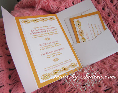
This invitation duo is enclosed in a Bright White Metallic Linen Himalaya Pocketfold Card. It's a lot of descriptors, I know, but what it really means is that the envelope enclosure has a linen texture to it - but also a sparkly, metallic quality, make it seem even fancier. The details of this design almost drip with decadence, and the metallic shimmer to the envelope is only part of that. The invitation and reply card (which are each printed on Bright White Linen paper to give it the same texture as the envelope) are each mounted on two different background papers, the first of which is a matching Metallic Linen paper that exactly matches the envelope. The second background paper is a cheerful golden yellow, which is also textured, but not shimmery or metallic.


To hold the invitation and reply card to their respective background layers (and, in the case of the invitation, the actual envelope), I used four small gold brads on each strip of pattern. The white space of the pattern was practically begging for some bling to match the metallic shimmer of the paper and envelope, and these gold brads were the perfect solution - beautiful and practical! I think they really dress up an already gorgeous pattern with their shine, and the golden color matches the yellows used throughout the design to make it even cheerier!


The photographs directly above and below this paragraph do the best job at capturing the shimmer of the envelope and middle paper layer. I love how the invitation and reply card are mostly matte, but with that one little hint of metallic in between the solid white and golden yellows that tie them back into the envelope pocketfold it came in. :)


I incorporated part of the pattern from the top of the design into the actual text of the reply card by using it as a check-box for guests to mark with their response. It's one of my favorite little things to do with pattern in a design, because it's unexpected and unique, yet very effective at tying the text of the design back into the pattern along the design's edges. If you like what I did with this design, make sure to check out my posts next week - I'll be continuing the discussion I started last week about different ways I incorporate pattern into designs, and I have an entire post planned with examples of using pattern as part of the response cards. :)

Next week's Sunday Sample Spotlight: "Olive My Love"...

Click here to view all Sunday Sample Spotlight posts.

"Like" Invites by Andrea on Facebook!

-

Shameless Plug Time: Love this invitation (or others featured on this blog)? Want something similar (or something completely custom) designed for your event? Visit Invites by Andrea to view more samples, download a catalogue pdf (coming soon!), or fill out a design request form. Or shoot me an email to ask me your questions or learn more information.

Friday, November 18, 2011

Fancy/Funky Friday: Patterns Imogen & Jeanette

I hope you've enjoyed my pattern-themed posts this week. To continue in that spirit, it's time for another Fancy/Funky Friday!

First, the "fancy": Pattern Imogen


This is a pretty simple pattern - it's easy to repeat and looks good small or large. It's not super curvy and lacy like many of my "fancy" patterns are, but it does remind me a lot of argyle, which is why I've placed it in the "fancy" category. Wouldn't this pattern be great on a professional-looking career sweater vest, or on an expensive designer handbag? It feels preppy and sleek, which I absolutely love.

If you follow this blog, you may remember that several of my patterns include hidden text - certain characters that I've reflected, rotated, and repeated to create the pattern. At first glance, you'd probably guess that this pattern features an "X", since it has so many "X"-like qualities, but it's actually a unique "W" - to make a single unit of the pattern I just took the normal orientation of the W, and paired it with a reflection of the "W" over the x-axis. So easy!

And now, the "funky": Pattern Jeanette


I think it's pretty obvious why this pattern is "funky" - it has a lot of different, unique elements going on within each unit of the pattern, and then I repeated it at a diagonal so that even the repetition is dynamic. One of the characters I used to create this design is definitely a lowercase "j" (which is where the little diamond comes from - it was the dot above the "j"), but the pattern has so much going that I can't even tell what the other characters I used were. I think that's what makes a good pattern - when it flows into each other so well that it's hard to tell one character from another because it has turned into a solid unit.

Don't forget to check back for next week's Fancy/Funky Friday post! And if you love my patterns, check out the entries I posted this past week about the different ways that I incorporate patten into my stationery designs. More of those types of posts are coming up next week, too!

-

Click here to see all posts related to "Fancy/Funky Friday" 


Shameless plug time: Love my patterns? I incorporate them into a lot of the artwork I create, from stationery for Invites by Andrea to the watercolors I paint. Check out Invites by Andrea's website to see examples of these patterns in use or drop me a line at andrea@invitesbyandrea.com to let me know what you think!

Wednesday, November 16, 2011

How to Use Patterns on Stationery - Part Three: Being the Background

We've already seen examples of how to use two colors within the same pattern, or how to fade a pattern into the background. But what about using the pattern as the background? This can be a little trickier, since you have to make sure that the pattern isn't too dark, too thick, or too busy to distract from the text and illustrations that'll be placed on top of it. It adds depth to the stationery and can end up giving it a great implied texture, so it's often worth the trouble.


If there isn't too much else going on in the stationery design, the pattern in the background can be a little more interesting. In the example below, I used several strips of the pattern (magically made transparent in Illustrator) to layer on top of each other and give an interesting textured and shimmering effect. I also used two patterns, one that alluded to the color of the text, and one that matched the textured cardstock I used as a second background border to the invitation.


The pattern works as a great background to the invitation below because it's so detailed and has so little white space that from far away it almost just looks like a light pink background. Plus, I made sure to print the pattern in a very light pink, so that the dark black text would still be easy to read and differentiate from the background. The lace-like quality of the pattern goes terrifically with the formal-looking font!


Similarly, the pattern works with this save-the-date by being very light-colored in the background, and by keeping the rest of the design very simple and text-based. There are no other pictures or images to clutter up the save-the-date and make either the pattern or the text harder to see. That way, a nice balance is struck between both parts.


Another option is to not use the pattern as the whole background, but just as parts of it, like I did in the invitation below. The pattern is so dense that from far away it just looks like a strip of yellow lace, making it the perfect choice for background imagery. Here, I used a bit of the pattern in a long stripe to subtly highlight the time and place of the baby shower. It only adds to the already gorgeous font, instead of being too busy and distracting from it.


In this final example, I've also included a pastel green vellum overlay, which helps to keep the pattern less obvious. When the vellum is lifted, however, the pattern (which was printed in a light pink to match the envelopes shown in this photograph), no longer neutralized by the complementary green, becomes a more prominent part of the design. It's like a pattern surprise! ;)


I'll post some more next week! :)

-

Shameless plug time: Love my patterns? Love these designs? I incorporate them into a lot of the artwork I create, from stationery for Invites by Andrea to the watercolors I paint. Check out Invites by Andrea's website to see examples of these patterns or download a catalogue pdf (coming soon!). Or drop me a line at andrea@invitesbyandrea.com to let me know what you think!

Tuesday, November 15, 2011

How to Use Patterns on Stationery - Part Two: Fading into the Background

Yesterday I showed off some of the samples I've created that use two colors within the same pattern. Today, I'd like to exhibit some of my stationery examples that use gradients and fading to blend the pattern into the background of the design.

In the piece below, I used two colors in a gradient before finally fading the pattern to the same white as the background color. The far edge of the pattern stands out more, since it's darker, and relates to the color used for the envelope and font, but the closer your eye gets to the center of the design, the less attention the pattern calls for, until it has just become part of the background.


Or, why stop at only two colors? In this invitation for a Sunday brunch, I incorporated several different colors of the sunrise, from the dark blackish-brown of the night, to a sunny orange, and finally a pale yellow to match the color of the envelope before fading into the white of the background.


You don't have to use multiple colors or have the patterns in boring vertical or horizontal stripes to achieve this effect, either. In the example below, a triangle of pattern on either side of the invitation and reply card gradually fades to white. Since the pattern is printed in the same color as the background paper layer, it nicely ties the pink border into the printed part of the stationery. The light color of the pattern never demands too much attention, but it adds a nice touch of interest to the white background to keep the invitation from seeming too plain.


Of course, you also don't have to fade the pattern to white. In the example below, the entire invitation was printed with a light beige background, so the pattern fades to that color instead, once again achieving the effect of fading into and becoming part of the background.


Finally, you don't have to fade into the background in only one spot, or in any sort of linear fashion. In the example below, I placed a pattern in the background of this save-the-date, and then faded it in to and out of the white background in certain spots to give it a kind of shimmering effect. I also made sure to fade it enough into the background where the text was printing, so that it wouldn't prevent the text from being easy to read.


If you're concerned with an awesome pattern taking too much emphasis away from other elements on your stationery design - the text, a really interesting font, or pictures and other illustrations - fading a pattern into the background is a great way to instantly make the pattern more subtle but still an integral part of the stationery design. It spices up an otherwise boring and plain invitation into something more unique, without going overboard, and it adds another layer of depth and implied texture to an invitation with other things going on. It's a win-win! :)

Shameless plug time: Love my patterns? Love these designs? I incorporate them into a lot of the artwork I create, from stationery for Invites by Andrea to the watercolors I paint. Check out Invites by Andrea's website to see examples of these patterns or download a catalogue pdf (coming soon!). Or drop me a line at andrea@invitesbyandrea.com to let me know what you think!