Monday, January 30, 2012

Cabin Fever Party Ideas

Sometimes the best part about winter can be the coldest, darkest, stormiest days, when the whole family is shut indoors because it's just too terrible to go outside. And losing power in a snowstorm can cause a lot of worries, but there can also be something nice about being cut off from the world for just a little while, especially with our reliance on electricity for entertainment these days.

And that is why I suggest hosting a Cabin Fever Party. You can pretend that the weather is so horrible outside that the power has gone out without actually having the stress of losing power. Plan entertainment that doesn't involve the television or computer, like playing board games or charades by candlelight. Light a fire and roast marshmallows in your fireplace. And since your power isn't really out, you can still have your heat on and cook delicious warm food in your oven and microwave. It's the best of both worlds. :)

It would be so much fun to create the decor for an event like this. Just think of ski lodges or Vermont Bed and Breakfasts, with their rustic wooden furniture and furs. Pile warm, cozy crocheted blankets on every armchair and couch so all of the guests can stay snuggled and warm while you socialize or play board games. You could even tell all of the guests to come in their pajamas or lounge wear! If there are a lot of children at the event, there are all sorts of games you can make up to fit the theme. Remember the scene in A Christmas Story when Ralphie's little brother is wrapped up in so many layers of winter clothes he can barely move? Dress up in multiple layers until you can all barely move and hold relay races. If there's actually several inches of snow outside, it'll make it even harder to move without falling - and when you do ultimately fall, you'll be covered in enough padding that you won't hurt yourself too much. :)

There are also several craft ideas you could do - like making paper snowflakes or making miniature edible snowmen out of Rice Krispie treats or marshmallows. Or have everyone bring an old sweatshirt or sweater and decorate them with puffy paint to make hideous Christmas sweaters for next year! ;) If your guests are good at knitting or sewing, sit around and have a knitting or quilting circle like the old pioneer days, sewing quilts and knitting winter hats and scarfs for each other.

There's plenty of things you can do to beat the winter blues and still have fun!

Sunday, January 29, 2012

Sunday Sample Spotlight: "Castle of Ladies"

In the summer of 2005, I left North America for the first time in my life to go to France for a few weeks with a small group of classmates and my high school French teacher. We each stayed with a different family in southern France (just outside of Montpellier) for three weeks, and then I met up again with the other eleven students and two chaperones for a few days in Paris before returning to the States. It was an experience I'll never forget, and only fueled my love of everything European. I've since returned to France to see the family I stayed with (and Paris) again.

And so I couldn't resist creating an illustration of one of my favorite sites of my first overseas trip - the castle of Chenonceau, which is a relatively small 16th century castle that was built as a bridge over the River Cher in the Loire Valley - and adapting it for a stationery set.

"Castle of Ladies" Invitation Duo (invite & reply card)

The most unique feature of the castle is it's bridge-like main hallway, which stretches across the river with large windows on either side, providing perfect views of the water. One of the colors I used for this stationery set, then, was practically chosen for me. I just had to use a deep, royal blue to help pronounce Chenonceau's beautiful river. The second color - metallic gold - also came out naturally, in an effort to maintain the regal European feel of the stationery.


I created the illustration of the castle in Adobe Illustrator by tracing a photograph I'd taken on my trip using Illustrator's pen tool. Since the illustration looked very stencil-like (and therefore more casual than a 16th century castle design should), I chose a very elegant script for the font, and spelled out the typical RSVP abbreviation to incorporate a little commonly understood French in the design.


The invitation and reply card were printed on my standard 67# smooth white cardstock, but they were mounted on a dark navy textured cardstock and paired with metallic gold envelopes to give it the rich texture and metallic shine it needed. The end result is a very elegant French design that would work great for any event that requires an excursion to Europe... or any stateside event that's merely European inspired. :)


Next week's Sunday Sample Spotlight: An artistic take on cupcakes!

Click here to view all Sunday Sample Spotlight posts.

"Like" Invites by Andrea on Facebook!

-

Shameless Plug Time: Love this invitation (or others featured on this blog)? Want something similar (or something completely custom) designed for your event? Visit Invites by Andrea to view more samples, download a catalogue pdf, or fill out a design request form. Or shoot me an email to ask me your questions or learn more information.

Friday, January 27, 2012

Fancy/Funky Friday: Patterns Cosette & Jennifer


Here's today's Fancy/Funky Friday post!

First, the "fancy": Pattern Cosette


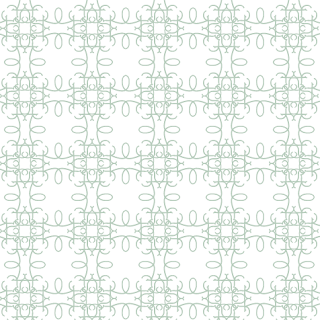
Made almost entirely of circles and loops, one of the best things about Pattern Cosette is how versatile it can be. From a distance, it definitely looks like rows of two kinds of lace - one that's more elegant and detailed, and one that's larger - or even like a crocheted blanket. But if you use only one row, or if you zoom in and focus on just the larger circular forms, it feels much more bold and modern, like it does in the stationery design I created below.


If that pattern were a darker or brighter color it would be even bolder, but even as just a pastel green, the large circles (which take up almost half of the save-the-date) really command attention.


And now, the "funky": Pattern Jennifer


Pattern Jennifer is definitely bold. The pen strokes are very thick and dense (except for just a couple of key spots, where the lines grow significantly and abruptly skinnier). To make the pattern even funkier, I repeated the units along diagonals rather than straight lines. With all of its curves and twists, the pattern would be very dynamic - if it wasn't so dense. From a distance, all of the craziness almost looks like just a solid block of color, and it's that quality, plus the few choice large white spaces, that calm the otherwise too-intense pattern.

-

Click here to see all posts related to "Fancy/Funky Friday" 


Shameless plug time: Love my patterns? I incorporate them into a lot of the artwork I create, from stationery for Invites by Andrea to the watercolors I paint. Check out Invites by Andrea's website to see examples of these patterns in use or drop me a line at andrea@invitesbyandrea.com to let me know what you think!


Wednesday, January 25, 2012

Winter Event Color Combinations - Part 2

Yesterday I posted three of my favorite color combinations for winter events - lavender & chocolate brown, wine & white, and pale yellow & slate gray. If that wasn't enough inspiration for you, today I have three more color scheme options for you to consider. :)

Color Combination #1 - Peach & White


Peach and other light pinks can start to feel like spring, but you can keep them cool and wintry by pairing them with a pure white or crystal. Imagine ripe peaches with a dusting of frost or freshly fallen snow on top of their fuzz, and you can start to see the inspiration for the color scheme shown above. Frost might be a nightmare for farmers - but it can look absolutely breathtaking and magical when used as inspiration for decor! Pair any peach or light orange blooms with similarly sized white ones to instantly make the light peach color look even lighter, and use clear materials like glass or crystal wherever you can fit it in to your decor - the transparency will feel like sheets of ice or snowflakes on a window pane. :)


Color Combination #2 - Evergreen & Silver


The color of evergreen trees is an obvious choice for winter - because it's often the only color you can find in the otherwise bleak winter-ridden landscape! It looks very sophisticated paired with silver, pewter, or white. Try to use actual branches in your decor to really get the winter feeling across, and don't forget the pine-scented candles! To mix up your event's look so it's not only evergreen branches and other green plants, you can take the thin, spindly bare branches of deciduous trees and spray paint them silver or pewter for a pop of instant shine against the richness of the dark green.


Color Combination #3 - Neutrals (Champagne, Cream, Black, White, etc.)


Finally, you just can't go wrong with an all-neutral wedding in the wintertime. Champagnes, silvers, golds, whites, creams, grays, and blacks all feel very wintry. You can pick one color - like an all-white wedding, which feels very pristine and magical - or a few of your favorite neutrals. The best colors should mimic the bleak outside landscape - the snow, the thin wisps of clouds in the gray sky, the bare tree branches, and the dim light - and bring that winter scene feeling indoors... where the temperatures are (hopefully!) a little warmer. ;)

-

"Like" Invites by Andrea on Facebook!


Shameless Plug Time: Love these color combinations? Looking for custom stationery made to match these colors (or whatever other color combinations you're using for your event)? Visit Invites by Andrea to view more samples, download a catalogue pdf, or fill out a design request form. Or shoot me an email to ask me your questions or learn more information.

Tuesday, January 24, 2012

Winter Event Color Combinations - Part 1

I've already posted some color combination ideas for New Year's Eve (and all of those color schemes would also work great for any other winter event), but here are some more color pairings that look fantastic this time of year. :)

Color Combination #1 - Lavender & Chocolate Brown


I love shades of purple. Growing up, I painted the walls of bedroom lavender. :) So, it should be no surprise that I really love this color combination. The lavender gives the rich brown a frosty look that's so perfect for winter. Plus, sprigs of wild lavender just look wintry, with their dark green and white stems and tiny buds - they'd make for great decorations or favors! Make sure you choose a brown that has a bit of warmth too it, to balance out the cool color of the lavender. That way, the color scheme will cover all aspects of winter, from the chilly weather to the warmth of staying indoors with family and friends. :)


Color Combination #2 - Wine & White


Thanks to Christmas commercialism, the bright red of poinsettia plants is one of the more common colors that come to mind this time of year - but just because it's associated with Santa's suit doesn't mean it has to feel like Christmas. Still, if that's a concern, it's easy to adapt the color to a classic, sophisticated dark burgundy, or a deep purplish-red wine. This color looks great paired with a pure white. Think of late season berries covered by a blanket of freshly fallen snow, and it's easy to see how perfect this color scheme is for the winter months.


Color Combination #3 - Pale Yellow & Slate Gray


Yellow is often thought of as a springtime color - and it certainly is sunny, and goes great with other bright colors for spring and summer events. But as long as the yellow is kept a little pale and desaturated, and paired with a cool-toned neutral like slate gray, it can also feel distinctly wintry. To tone down the brightness of the yellow, you can also add another neutral like a light cream to the mix. The end result is a very modern, sophisticated color scheme that works great for a late winter event, when everyone starts to feel the drag of the cold, dark winter months. The hint of yellow color acts like a ray of hope that the sun will shine again soon, without being too over-the-top and spring-like.

-

"Like" Invites by Andrea on Facebook!


Shameless Plug Time: Love these color combinations? Looking for custom stationery made to match these colors (or whatever other color combinations you're using for your event)? Visit Invites by Andrea to view more samples, download a catalogue pdf, or fill out a design request form. Or shoot me an email to ask me your questions or learn more information.

Sunday, January 22, 2012

Sunday Sample Spotlight: "Casino Royale"

A few years ago, a friend told me about the site Offbeat Bride. She wasn't even engaged, but she loved looking at the blog to browse through their ideas anyway. It's an absolutely amazing site, with some great theme ideas. It think it's so awesome that some couples are choosing to have carnival, Star Wars, Renaissance, or steampunk weddings. And as a stationery designer, I would absolutely love to design the paper products for an offbeat wedding like that. How fun would that be? :)

So, in the spirit of offbeat weddings, I created a sample for a casino-themed wedding - "Casino Royale." The best part is that this design could easily be adapted to any kind of casino-themed event other than an awesome wedding.

"Casino Royale" Invitation Duo (invite & reply card) and Save-the-Date

The first step was to create some fun illustrations to immediately get across the idea of a fun, casual casino-themed event, while still seeming like a wedding invitation. The solution? Focus on the suit of hearts for the playing cards, use lots of red and white, and modify an image of a pair of dice to turn the dots into matching little hearts. I love how the illustrations turned out. And wouldn't they work just as great for a casino-themed Valentine's Day party?


I've never been to Las Vegas, but when I think of the city, the color that comes to mind is bright yellow - perfect for a city that's up all night and never turns off the lights. So for a second color I decided to incorporate a bit of yellow, and I created a stripe of yellow circles to call to mind a row of large light bulbs.


For the paper, I chose a bit of texture for two reasons - firstly, the illustrations and bold sans serif fonts felt so casual that I wanted to bring a bit of sophistication back to the stationery set. Secondly, casinos are known for the way they overindulge the senses - there are always lights flashing, noises going off, buffet tables full of food... Casinos are all about getting their customers to experience as many of their five senses as they can. And since it would be a lot more expensive to create a musical stationery set, I decided to add an experience of the sense of touch to whatever lucky guests opened this invitation.

All of the stationery is printed on a bright white linen paper and mounted on a solid black linen paper. The envelopes are all bright white linen, from the folding Himalaya pocketfold A7 envelope, to the reply card's 4Bar-sized and the save-the-date's A2-sized envelopes.


As a final touch, I decided to word the reply card creatively, again to reflect the theme of the event. For my own wedding I wrote "___ will be there in person" and "___ will be there in spirit" as the two reply options (an idea I found online), and a lot of guests commented about how cute the RSVP wording was. It's an easy change to make, and it makes the stationery reflect the level of casualness and comfort you want your guests to look forward to. :)


Next week's Sunday Sample Spotlight: Inspired by the French castle Chenonceau

Click here to view all Sunday Sample Spotlight posts.

"Like" Invites by Andrea on Facebook!

-

Shameless Plug Time: Love this invitation (or others featured on this blog)? Want something similar (or something completely custom) designed for your event? Visit Invites by Andrea to view more samples, download a catalogue pdf, or fill out a design request form. Or shoot me an email to ask me your questions or learn more information.

Friday, January 20, 2012

Fancy/Funky Friday: Patterns Valencia & Vivian


Today's Fancy/Funky Friday post is brought to you by the letter "v"... ;)  I just love names that start with "v" - some of them can be pretty common names, but the "v" still makes them sound unique!

First, the "fancy": Pattern Valencia


This pattern could probably be categorized as "funky" as well, but I ultimately put it in the "fancy" collection because of the thin pen strokes and curvy qualities, which make it look a bit lace-like from a distance. I absolutely love this pattern - and not just because I'm partial to all things purple. ;) All of the separate pattern "units" just seem to flow so well into each other, that it's hard to tell what started together, and what didn't. Plus, there are a few different kinds of wavy lines and loops, but the lines and shapes don't get old, but rather feed off each other in a really classy way. Because the lines vary in thickness, it looks almost like calligraphy, and by drastically varying the scale of the loops, they don't stand out too much. The little loops especially just feel like a decorative touch, and don't take the attention away from the other lines.


And now, the "funky": Pattern Vivian


Does this pattern look familiar? It should. :) I've used it in a few stationery designs already. I just love how it unique it is. The pattern is based on an old English style letter capital "A" (reflected over the vertical axis and placed side-by-side to create the prominent heart-shape), which gives it that instant Germanic and old European feel.

But when the pattern is repeated several times, it takes on new qualities that feel distinctly modern. I placed the units of the pattern next to each other with a slight stagger so that the feet of the letter "A"s line up, which creates a great wavy zig-zag along each row of the pattern. It also makes those tilted white rectangular shapes, which create not-quite-straight vertical lines that seem to converge at the top and bottom of the pattern. These characteristics make what would otherwise be a very old, traditional pattern much more funky and modern.


The pattern looks good in almost any color, and can thus easily be adapted to different events. When it's a light yellow and paired with shiny cream and gold paper, Pattern Vivian is more subdued and elegant, and when it's a bold, bright color (like the hot pink shown above), it demands more attention and feels more modern.

-

Click here to see all posts related to "Fancy/Funky Friday" 


Shameless plug time: Love my patterns? I incorporate them into a lot of the artwork I create, from stationery for Invites by Andrea to the watercolors I paint. Check out Invites by Andrea's website to see examples of these patterns in use or drop me a line at andrea@invitesbyandrea.com to let me know what you think!


Wednesday, January 18, 2012

How to Use Scrapbook Paper on Stationery

I've divided my catalogue of designs into three categories: patterns, illustrations, and stationery with envelopes lined with or inspired by scrapbook papers. I've already posted several times about some of my patterned and illustrated designs, but I hadn't yet touched on the scrapbook paper category (except where some examples were featured in the weekly Sunday Sample Spotlight posts).

Unlike the other posts about pattern and illustration, however, I'm not going to draw this one out. Because "How to Use Scrapbook Papers on Stationery" is pretty straight forward - just do it.

Every piece of scrapbook paper is going to be a little bit different, and I couldn't possibly discuss every option. Part of the joy in using scrapbook paper is finding something great. Go to art stores. Browse online. Design your own. And when you've found The One, build the rest of your design around it. The easiest way to do this, I think, is just to scan the paper into the computer and use that exact design, or parts of it, on the actual invitation as well, and then adhere the actual paper with its rich colors to the envelopes.


But you don't have to go completely matchy-matchy either - if you have a design that has similar colors or a similar feel, it doesn't have to incorporate the exact design from the paper to go well together.


I love using scrapbook paper. Simple patterns, like stripes or polka dots - or even a solid color - are easy to incorporate, but I think some of the best designs come from more unique scrapbook paper. I just love ones that look photographic, like the purple rose image I used to line the petal-shaped envelope in the sample above.

The key is to just have fun with it. And when you go to attach the scrapbook paper to the envelopes, here's a little insider secret: Zots. They're little sticky dots that are so easy to use, and once they're placed, they're super sturdy, so the paper won't go anywhere. Before I discovered Zots, I was using glue sticks (often not tacky enough, and the paper would peel right off again), and book glue (which worked really well, but got the paper so wet that the whole envelopes would curl up at the ends until I flattened them under a thick hardcover copy of the Complete Works of William Shakespeare). Trust me - Zots are faster, easier, and less messy. And if you're lining several hundred envelopes for your event, easier and faster is definitely the way to go. :)

Another great, easy option is using decorative brads to attach scrapbook paper. One thing to remember with brads, though, is to never put them through an outside envelope. The post office doesn't like pokey brads sticking out of the envelopes they're trying to handle and sort, and you want to make sure your beautiful stationery gets delivered! So keep brads to just the invitations or inside envelope packages only. And make sure to add in extra costs for mailing into your budget - brads might be heavy enough that you'll have to pay more per item to ship them out. Then again, they're so adorable they're often worth the little bit of extra work and cost if you can swing it!


-


"Like" Invites by Andrea on Facebook!

-


Shameless Plug Time: Love these invitations (or others featured on this blog)? Want something similar (or something completely custom) designed for your event? Visit Invites by Andrea to view more samples, download a catalogue pdf, or fill out a design request form. Or shoot me an email to ask me your questions or learn more information.

Sunday, January 15, 2012

Sunday Sample Spotlight: "The Last Winterberry"

We're already halfway through January, but we still have a lot of winter to go. Today's Sunday Sample Spotlight features a great (and delicious sounding) color scheme for a winter event - wine and chocolate brown.

"The Last Winterberry" - Invitation Duo (invite & information card)

This invitation duo features an invitation and information card, each mounted on a dark wine/berry colored texture cardstock. For the envelope, I used a Bronze Brown Metallic Petal Card, which has four round flaps that fold in to create a rectangle that fits perfectly in an A7-sized envelope (not pictured). The dark purplish-red and deep brown with little metallic gold shine are great selections for a winter wedding (or other event). The colors are dark and rich, while still feeling warm.


As usual, I designed the pattern featured with text, and here the character I selected is still pretty obvious. The lowercase "s" shapes also hint at hearts, and I loved the little white squares the pattern created in the negative space when I lined them up with each other. The design is pretty simple, but the pattern is such a large scale that it's all the design that's needed. Just because your event is in the wintertime doesn't mean you have to pick a design that's as bleak and subdued as the cold gray weather! Rich colors and bold patterns work well together to make a strong statement about the sophistication of your event. :)


The photo above gives a better example of the metallic shine found on the envelopes. A little bit of sparkle and shine are almost requirements for winter event decor and stationery. Overdo the glitter and it can feel like a cliche holiday party, but just a touch of sparkle is a very sophisticated spin on this old tradition. Just keep the shine soft enough to only hint at the way streetlights sparkle on freshly fallen snow for the perfect amount. :)


Next week's Sunday Sample Spotlight: A stationery set for a casino-themed wedding!

Click here to view all Sunday Sample Spotlight posts.

"Like" Invites by Andrea on Facebook!

-

Shameless Plug Time: Love this invitation (or others featured on this blog)? Want something similar (or something completely custom) designed for your event? Visit Invites by Andrea to view more samples, download a catalogue pdf, or fill out a design request form. Or shoot me an email to ask me your questions or learn more information.

Friday, January 13, 2012

Fancy/Funky Friday: Patterns Taila & Stephanie

Happy Friday the 13th, everyone! :) To celebrate the upcoming weekend, I like to post two patterns - one each from my "fancy" and "funky" pattern collections. So, without further ado, here is today's Fancy/Funky Friday post!

First, the "fancy": Pattern Taila


Like many of my "fancy" patterns, Pattern Taila alternates between airier white spaces and more dense parts of the design, giving it a bit of a lacy quality. The thin pen strokes and curly aspects further cement it into the "fancy" category, but at the same time, it feels a bit more modern than many in my "fancy" collection. I can't quite put my finger on why - but to me it feels like a modern take on a traditional design.

Perhaps it's the pairing of perfectly straight and slightly ornamented lines with the simple loops. Or perhaps it's the roundness of the loops, which feel fatter and more like lassos than the typical elegant arabesque. It could even be that each white area, with its generally circular form and sand-dollar-like design, seems like a casual beach house pattern, balancing out the rest of the more elaborate pattern to make the whole thing feel more modern. Whatever the reason, I feel like this pattern would be more likely to be turned into a stencil and painted on a single accent wall rather than printed as a wallpaper and filling an entire European interior, and that quality is something I really like about this design.


And now, the "funky": Pattern Stephanie


Pattern Stephanie is definitely "funky". I love how much simpler it looks from a distance. The square shapes, for instance, look like straight lines until you zoom in and see that they have a bit of curl and embellishment to them. And the triangles are the perfect contemporary, funky adaptation of the traditional heart shape. Repeated top-to-top (or side-to-side, when the triangular hearts are rotated), they form a diamond-like shape that takes on an almost plant-like or leafy quality. And yet, the unorthodox squares, triangles, and diamonds are all repeated in a very structured, grid-like pattern, again establishing them all as more traditional than they actually are at closer look. :)


It's also a great pattern to use in a single row on stationery, to add just a touch of interest, like I did in the invitation above. By keeping the funky pattern a light bluish-gray color, I don't overshadow the other textures and metallic shine of the rest of the stationery with the pattern's bold uniqueness.

-

Click here to see all posts related to "Fancy/Funky Friday" 


Shameless plug time: Love my patterns? I incorporate them into a lot of the artwork I create, from stationery for Invites by Andrea to the watercolors I paint. Check out Invites by Andrea's website to see examples of these patterns in use or drop me a line at andrea@invitesbyandrea.com to let me know what you think!


Thursday, January 12, 2012

Soup Party Ideas

If you're anything like me, the end of the holiday season can be a bit depressing, once all those pretty Christmas lights are taken down but the weather isn't any warmer (and in some cases, is even worse than it was in December). The next major excuse to hold a party isn't until Valentine's Day in February, but sometimes you just need a little event to help you make it through the cold winter until then...

Which is why a food party is such a great idea! Do you really need an official holiday to invite friends and family over for some warm food? One of my classmates in my art classes at Eastern Michigan University a few years ago was telling the class about how her boyfriend's family has a tradition every winter of hosting a soup party, and as a graphic design project, she created some invitations for that event. The way she described it sounded like a completely genius idea. The concept is simple - everyone who comes to the party has to bring a dish of soup to pass, just like a pot luck, and then everyone goes around and samples all of the different kinds of warm, delicious, winter-blues-healing soup. Once all of the guests have had their fill, they become judges and rate their favorite soups, and whoever cooked the soup with the most votes wins a prize.

You could also narrow the scope of the party to just a single kind of soup - like chili - and have an indoor chili cook-off. What better way to stay warm in the winter than feasting on hot, spicy chili?? :) For another twist, if you have a large enough kitchen and a small enough party, you could all cook your soup dishes on site, to ensure that they stay nice and warm. Or maybe you have access to your local high school's home ec classroom, so everyone can have their own little station for soup cooking. If you have the venue for it, you could even pretend you're all on a Food Network cooking competition, and supply everyone with the same ingredients, and see which teams can come up with the most delicious soups using only those ingredients.

It doesn't have to be soup to make a warm splash in your cold winter... any hot dish would do! The idea is just to have fun with family and friends and stay warm at the coldest time of the year - just like you did during the holiday season. :)

Tuesday, January 10, 2012

Brides-to-Be Show Recap

The Brides-to-Be show last weekend was a great success! I hung the sign I painted from the tablecloth and covered the table with three large albums full of sample stationery sets. I also brought one of the watercolor placemats I painted for my own wedding, my card box (which I used to collect contest entry forms), and a few loose samples to complete the table display. :)


Shameless plug time: Couldn't make it to the Brides-to-Be show but still want to see some samples of my work? Head on over to the Invites by Andrea website to check out some photographs of sample stationery sets. Didn't get a chance to sign up for exclusive Invites by Andrea discounts at the show? Send me an email with your email address and info, and I'll add you to the mailing list to receive notifications about special sales, AND enter you in a chance to win free custom designs for your invitations, reply cards, information inserts, thank-you notes and save-the-dates! :)

Sunday, January 8, 2012

Sunday Sample Spotlight: "Dilly Dilly"

Winter is in full swing, and you know what that means for Michigan (and much of the rest of the U.S., too) - frigid temperatures, bare tree branches, that cold winter wind, and (if we're lucky) some of that beautiful sparkling snow. When I found this scrapbook paper, based on a photograph of winter trees, I knew I had to use it in a winter-themed stationery set.

"Dilly Dilly" - Invitation duo (invite & reply card)

The scrapbook paper (which I cut out and attached to the left flap and right pockets of the light blue linen Himalaya pocketfold envelope) is a gorgeous periwinkle color that's almost lavender. It paired terrifically with the light blue linen I chose for the envelopes and to print the invitations on. Coupled with a couple lavender brads and a pastel blue vellum overlay, the color scheme becomes a hauntingly beautiful lavender and blue - which is where I got the name from. Remember the nursery rhyme?

Lavender Blue, Dilly Dilly...


Whenever I use scrapbook paper to line an envelope, I like to incorporate the imagery or pattern used into other parts of the stationery design, as well, and this set is no exception. I scanned in the beautiful bare tree photograph from the scrapbook paper, and made it lighter and more transparent so it blended even better with the cool light blue paper the invitation would be printed on. With the blue vellum overlay, the trees receded even further into the background, adding even more depth to the winter scene the design creates.


I also included just a hint of brighter blue at the top of the invitation and reply card, to reconnect the paper to the blue of the vellum overlay. This way, I didn't need to cover the reply card with blue vellum to have it still feel connected to and cohesive to the invitation. Though I have covered reply cards with vellum before, I generally decide not to, for practical reasons. It's certainly beautiful, but how many of your guests will not realize they can raise the vellum, and try to write their reply on the overlay instead of the actual paper? Plus, when you're stamping all of the reply envelopes for your guests to return, you have to be careful to put enough postage on if you start adding multiple layers onto your reply cards.

I love how peaceful and serene winter can be. It's a season that easily lends itself to elegant functions. This stationery set (like most that I've designed) is shown with text and information for a winter wedding, but the design could easily be adapted to any other winter event instead. You don't have to be betrothed to have an excuse to throw a formal winter party! :)

Next week's Sunday Sample Spotlight: "The Last Winterberry"

Click here to view all Sunday Sample Spotlight posts.

"Like" Invites by Andrea on Facebook!

-

Shameless Plug Time: Love this invitation (or others featured on this blog)? Want something similar (or something completely custom) designed for your event? Visit Invites by Andrea to view more samples, download a catalogue pdf, or fill out a design request form. Or shoot me an email to ask me your questions or learn more information.

Friday, January 6, 2012

Fancy/Funky Friday: Patterns Samantha & Leanna

It's Friday, and on Ideas by Andrea, that means it's time for another Fancy/Funky Friday post! I love creating patterns (often from characters from some of my favorite fonts), and I have a folder on my desktop filled with over 150 patterns. Every Friday, I share two of those designs - one that's more suited for elegant, "fancy" events, items, or stationery, and one that's a little "funkier."

First, the "fancy": Pattern Samantha


The white space is so prominent in this pattern that it almost becomes the pattern, especially from a distance. Yet, if only a strip of the pattern is used, instead of a large area, the linear details become prominent again, drawing the eye and adding visual interest.

I used it in a single stripe on the sample stationery set below because I didn't want the negative space to be so distracting. I added a thin line to the top of the pattern so that the individual units would like like little lanterns hanging off of a string, decorating an outdoor venue, which I really love.


One of the great things about Pattern Samantha is how well it works as both a lighter pattern on a darker background and a darker pattern on a lighter background. The thin lines that make up the pattern help it to stay elegant, yet the "x" and diamond shapes also give it some structure. It's the best of both worlds!

And now, the "funky": Pattern Leanna


This is just such a fun, bubbly pattern. Wouldn't it look great on a flirty skirt? I love how much personality Pattern Leanna has, yet there's also something sophisticated about it that makes it feel more mature than girly and juvenile. Like many of my best patterns, it seesaws between dense (and perhaps intense) parts of the pattern with more airy areas (where the negative space is greater and things feel less crowded). It ends up giving the impression that it's both a very simple pattern (since it's created mostly from the repetition of loops) and a little complicated, which makes for a very interesting and successful pattern! :)

-

Click here to see all posts related to "Fancy/Funky Friday" 


Shameless plug time: Love my patterns? I incorporate them into a lot of the artwork I create, from stationery for Invites by Andrea to the watercolors I paint. Check out Invites by Andrea's website to see examples of these patterns in use or drop me a line at andrea@invitesbyandrea.com to let me know what you think!

Thursday, January 5, 2012

Flower Bat Mitzvah Stationery Set

I had the opportunity recently to design the invitations, reply cards, and thank you notes for an almost-thirteen-year-old's Bat Mitzvah celebration. Her only requests were that her name be written in both English and Hebrew, and that I use the colors pink and green (with emphasis on the pink). I showed her a few different designs from my catalogue with her information and color choices to see what she thought.

She chose my rose stem design (called "Chocolate Valentine" in the catalogue, where I displayed it with a pink and brown color scheme) - which I've also used as the basis for a watercolor painting before. Obviously, it's an image I'm pretty fond of, and I'm glad she liked it so much, too! The different shades of pink look great with the green and black, and feel very feminine, stylish, and spring-like (perfect for a March Bat Mitzvah)!


She wanted the design paired with a metallic dark pink border and matching envelopes, and the end result is absolutely adorable (if I do say so myself). :) I'd never printed addresses directly on envelopes before, so I wasn't sure how they'd turn out on my printer, especially with the metallic envelopes. But my printer worked great, and the black showed up nicely, even with the dark pink color and the shimmer of the metallic. I printed return addresses and the addresses of each guest on the outside of the invitation envelope (size A7), as well as the address on every reply card envelope (size 4-Bar), and the return addresses on the envelopes for the thank you notes (size A2).


-


Shameless plug time: Love this design? Want one of your own? Download my convenient pdf catalogue to see all of my design options, or check out my Invites by Andrea website to view some samples and get more information.