Sunday, September 30, 2012

Sunday Sample Spotlight: "The One That I Want"

Today's Sunday Sample Spotlight uses a fun fifties theme throughout the stationery design. Check out the great aqua, pink, pale yellow, and black color scheme!

"The One That I Want" - Invitation Duo (invite & reply card)

The main envelope is a solid aqua-colored petal-fold design, with a matching reply envelope. The stationery is printed with a pale yellow background and mounted on textured pink cardstock for an extra pop of color.


I traced all of the illustrations using the pen tool in Adobe Illustrator and used a kitschy 1950s font for the text. The right of the invitation shows a diner scene, with a bar stool, counter, malt drink, and jukebox, while the left of the invitation focuses more on the traditional 1950s drive-in movie theatre, with an classic car and light-up sign.


For the reply card, I used the same elements from the invitation, keeping the black and pink arrow from the sign, but leaving it open for guests to write their names on the line. Then, I repeated the pink circles at a larger scale for the yes/no check boxes, and incorporated 1950s lingo in the response selections.


The final additions were the pink and black record decorations creating a border at the top of the invitation and reply card. I needed a way to balance out the eye-catching pink circles on the drive-in sign and was looking for another circular form to use. An homage to vintage records was the obvious solution! I added a larger record to the diner scene on the right of the invitation to tie it all together.


A 1950s theme is great for kid's parties, birthday parties, school dances, rehearsal dinners, casual weddings, and Valentine's day. My church hosted a mother-daughter "sock-hop" event once, and even though I was young at the time, I still remember how fun it was to dress up in a felt "poodle skirt" and dance around!


Next week's Sunday Sample Spotlight: "Paper Lanterns"


Click here to view all Sunday Sample Spotlight posts.

"Like" Invites by Andrea on Facebook!
Follow Invites by Andrea on Twitter!


-

Shameless Plug Time: Love this invitation (or others featured on this blog)? Want something similar (or something completely custom) designed for your event? Visit Invites by Andrea to view more samples, download a catalogue pdf, or fill out a design request form. Or shoot me an email to ask me your questions or learn more information.

Friday, September 28, 2012

Fancy/Funky Friday: Patterns Danielle & Marcella

Happy Friday! Here are today's "fancy" and "funky" patterns:

First, the "fancy": Pattern Danielle


This pattern is very dense - there isn't a lot of visible white space, and the thin lines are very close together. Its density gives it the appearance of lace, and the thin strokes and multiple loopy forms add to this illusion.


In the above example, I used Pattern Danielle to adorn a stationery set by placing a whole field of it in the background, then using gradients to blend most of center of the pattern into the ivory color of the paper so it wouldn't stand out. The end result is a hint of multi-colored pattern on either end of both the invitation and reply card, and further hints of the pattern in a single "unit" breaking up paragraphs of text. I also used the same loopy font I took this pattern from for the text of the stationery, to tie the text and pattern together.


And now, the "funky": Pattern Marcella


Though I played up the "funkiness" of Pattern Marcella by showing it here in a bright lime green, the thick brushstrokes, simplicity of design, and relationship of positive and negative space all gave it a modern feeling before I chose the color. When it was time to repeat the pattern units to create a large block of pattern, I staggered the units that were oriented the same way so that it wouldn't be just alternating columns of vertical units and horizontal units. This unexpected staggering only further adds to the fun, whimsical feeling of this design, making it a very funky pattern indeed. :)


-

Click here to see all posts related to "Fancy/Funky Friday" 


Shameless plug time: Love my patterns? I incorporate them into a lot of the artwork I create, from stationery for Invites by Andrea to the watercolors I paint. Check out Invites by Andrea's website to see examples of these patterns in use or drop me a line at andrea@invitesbyandrea.com to let me know what you think!

Wednesday, September 26, 2012

Fall Color Combo: Leather & Light Sage

I got the inspiration for this color combination from a unique place - Leonardo da Vinci's famous Mona Lisa. Da Vinci was a master of chiaroscuro - the act of adding smoky, shadowy undertones to his paintings to give them added depth and mystery. The Mona Lisa is a great example of this smoky technique and uses an interesting sienna brown and green color scheme that would be perfect for a vintage or rustic-inspired fall wedding.

Leather & Light Sage:


Just like da Vinci, start with a strong base of rich shades of brown. Play with texture whenever you can. I love the texture of soft leather for a wedding. It's easy (and classic!) to pair it with lace, and comes in a variety of great, rich neutrals. Have the groomsmen wear khaki tan or gray pants and suave leather blazers, and adorn the bridesmaids with feminine leather belts like the flowery one cinching the waist of the model in the second picture on the top row of the inspiration board.

You can also incorporate the warm, autumnal texture of worn leather in other places, like bridal jewelry, shoes, guest books, and even table runners. Once you have a solid foundation of warm brown, add various shades of medium to light sage green (just like da Vinci would have done while painting the background behind his beloved Mona Lisa). If you're looking for a third color, definitely go for a feminine ivory or cream selection (look to the bride's dress for inspiration) - and don't forget to layer different textures for a distinctly fall feeling! Sprinkle a few ivory blooms into a sea of green bouquets, and add hints of lace to soften the rustic leather decor into a more romantic, vintage scene.

Use this color combo for your spring events, too! The warmth of the brown goes perfectly with the coolness of the green, making this color scheme a great choice for either season that crosses the boundary between hot and cold.


-


Follow Invites by Andrea on Twitter!
"Like" Invites by Andrea on Facebook!

Shameless Plug Time: Love these color combinations? Looking for custom stationery made to match these colors (or whatever other color combinations you're using for your event)? Visit Invites by Andrea to view more samples, download a catalogue pdf, or fill out a design request form. Or shoot me an email to ask me your questions or learn more information.

Tuesday, September 25, 2012

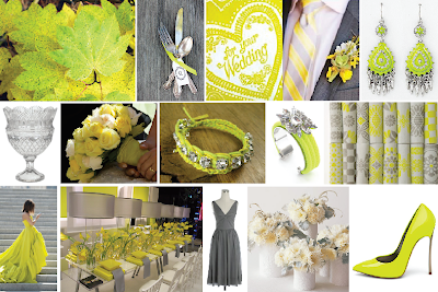
Fall Color Combo: Acid Yellow & Gray

Trendy acid yellow is a very unique color (especially for weddings!) but if done right, it can look very elegant and sophisticated.

Acid Yellow & Gray:


Pair acid yellow (a neon yellow color with spring green undertones) with an equally trendy neutral (like gray or ivory) for a funky, modern color scheme that will have your guests beyond impressed with your color pairing skill.

Acid yellow is an unexpected autumn color because it's much cooler than the typical fall yellows (which tend toward warm golds and mustard shades) - but like many great colors, it can be found just as readily in nature as more traditional options. Leaves that change colors too late in the season might not get the opportunity to completely switch from green to yellow before they fall off their branches, giving them a unique acid yellow wash. Another interpretation of acid yellow in nature? The cool green undertone both hints at the coming winter (bitter cold and at times sour in demeanor) and the hopeful spring waiting to bloom again the next year (the fresh yellow-green of the first-budding plants).

Of course, a little neon goes a long way. Tone down glaring acid yellow with plenty of neutral decor. Gray is a great choice because it also has cool undertones (which instantly relate back to the yellow), while still being a solid neutral guests are familiar - and comfortable - with.


-


Follow Invites by Andrea on Twitter!
"Like" Invites by Andrea on Facebook!

Shameless Plug Time: Love these color combinations? Looking for custom stationery made to match these colors (or whatever other color combinations you're using for your event)? Visit Invites by Andrea to view more samples, download a catalogue pdf, or fill out a design request form. Or shoot me an email to ask me your questions or learn more information.

Sunday, September 23, 2012

Sunday Sample Spotlight: "Pop Rocks"

Happy Sunday! Today's sample stationery set is all about metallic shine!

"Pop Rocks" - Invitation Duo (invite & reply card)

Hot pink and black are an exciting color combination for any event - but add a little metallic sparkle, and the bold color scheme pops even more! I used metallic pink and metallic black papers to create this stationery set. The main envelope is a metallic pink pocketfold, but the reply card fits inside an onyx black envelope for a bit of contrast. I also lined both the invitation and reply card in the same metallic onyx cardstock to help the crisp white stationery stand out even more from the hot pink base envelope, and help tie everything together.

For the actual stationery design, I kept things relatively simple so that the sparkly envelopes would still get the most attention. I used a casual blocky pattern to flank the left and right sides of the invitation and the right side of the reply card, and repeated parts of that pattern to break up the paragraphs of text. Finally, the text is an easy-to-read sans serif font in the same pink and black colors as the envelopes.


In the two photos above, you can really see how well the metallic papers shine when tilted or moved toward a light source. They're so beautiful!


Next week's Sunday Sample Spotlight: "The One That I Want"


Click here to view all Sunday Sample Spotlight posts.

"Like" Invites by Andrea on Facebook!
Follow Invites by Andrea on Twitter!


-

Shameless Plug Time: Love this invitation (or others featured on this blog)? Want something similar (or something completely custom) designed for your event? Visit Invites by Andrea to view more samples, download a catalogue pdf, or fill out a design request form. Or shoot me an email to ask me your questions or learn more information.

Friday, September 21, 2012

Fancy/Funky Friday: Patterns Cynthia & Clover

Though they look very different, I used cursive/calligraphic fonts to create both of today's fonts. The "fancy" pattern uses a lowercase cursive "z" and the "funky" pattern uses a capital "N" with lots of flourish. :)

First, the "fancy": Pattern Cynthia


Pattern Cynthia is a classic "fancy" pattern. The lines are thin and curvy, and when the pattern "units" are repeated, diagonals and diamonds are formed, mimicking my favorite argyle patterns. I also made sure to include lots of negative white space and kept the repetition and shapes rather simple to play up the delicacy and elegance of the pattern.


And now, the "funky": Pattern Clover


From a distance, the red lines are so close to each other that they almost become a solid field of color; then, the white circular forms jump forward, becoming the positive space in a background field of red. When you look more closely at Pattern Clover, however, it's easier to see the individual lines that radiate out from each white circle.

I made this pattern from a fancy capital "N" character - can you see it? The beginning and end of the "N" are such large flourishes that they create half of each red arc. Even though the lines are thin (and I started with a calligraphic font), the multiple arcs in a row seem much more "funky" than "fancy", since they take on a modern, zig-zag appearance.


-

Click here to see all posts related to "Fancy/Funky Friday" 


Shameless plug time: Love my patterns? I incorporate them into a lot of the artwork I create, from stationery for Invites by Andrea to the watercolors I paint. Check out Invites by Andrea's website to see examples of these patterns in use or drop me a line at andrea@invitesbyandrea.com to let me know what you think!

Wednesday, September 19, 2012

Fall Color Combo: Nuts & Berries

Today's color scheme comes from nature, and is the perfect pairing for any rustic or orchard-themed event.

Nuts & Berries:


A color combo that draws inspiration from nuts and berries first includes many shades of brown, from light tans to medium chestnuts and dark chocolate browns. Once you have a solid neutral base, add subtle hints of light green (think pistachios, grass, and moss) and eye-catching pops of bright cherry red for a unique color scheme that feels both freshly modern and completely natural.

Use real (or good-looking fake) nuts and berries whenever you can in your decor, and incorporate other natural textures like wood and moss. Have guests sign a wooden plank or thin slice of a tree trunk instead of a typical guest book, or set up a "wishing tree" out of rustic twigs and branches that guests can hang little notes on for you and your new spouse.

I love the idea of red-dressed bridesmaids covering up with a rich brown blazer, shrug, or vest (as seen in the group picture in the second row). It instantly feels more autumnal to have bare shoulders lightly covered, and it continues the casualness of the rustic decor into the outfits in a unique way.


-


Follow Invites by Andrea on Twitter!
"Like" Invites by Andrea on Facebook!

Shameless Plug Time: Love these color combinations? Looking for custom stationery made to match these colors (or whatever other color combinations you're using for your event)? Visit Invites by Andrea to view more samples, download a catalogue pdf, or fill out a design request form. Or shoot me an email to ask me your questions or learn more information.

Tuesday, September 18, 2012

Fall Color Combo: Dark Denim & Purple

Denim may not be the fabric that first comes to mind when you think of weddings, but it can work just as well at an elegant event as at a casual affair. Pair it with purple for a deep, rich color combination perfect for cooler fall and winter months.

Dark Denim & Purple:


Denim instantly makes me think of autumn. There's nothing more comfortable and familiar than a warm pair of blue jeans on a crisp fall day. Add a fun, casual vibe to your event by wearing denim - how awesome are the denim tuxedos the groomsmen are wearing in the top row of this inspiration board? If wearing denim on your wedding day just isn't what you had in mind, there are still other ways of adding hints of denim to your decor - sew flowers out of scraps of denim to insert into real or fake bouquets and centerpieces, or give a nod to your favorite fabric in a denim-designed wedding cake, like the adorable three-tiered cake in the second row.

Even the most casual denim looks regal when paired with purple; by juxtaposing the dark denim blue against a gorgeous deep violet, you reinsert elegance and sophistication to your special day. Keep your event even more prestigious by drawing inspiration from the color of dark wash blue jeans, but leaving the actual fabric at home.

-


Follow Invites by Andrea on Twitter!
"Like" Invites by Andrea on Facebook!

Shameless Plug Time: Love these color combinations? Looking for custom stationery made to match these colors (or whatever other color combinations you're using for your event)? Visit Invites by Andrea to view more samples, download a catalogue pdf, or fill out a design request form. Or shoot me an email to ask me your questions or learn more information.

Sunday, September 16, 2012

Sunday Sample Spotlight: "Recycled Pink"

Hot pink and chocolate brown is a modern color scheme so common that it's almost become boring. Thankfully, there are other ways to use pink and brown to create a fresh look. Here, I created a more pastel color scheme, using a light recycled brown envelope and pale cotton candy pink accents.


"Recycled Pink" - Invitation Duo (invite & info insert)

The enclosure is a textured "Cascade" pocketfold envelope made from recycled paper. I printed the stationery on my standard white cardstock - it used a lot of ink, but if I had started with a dark brown paper, I wouldn't have been able to print light pink over the top of it with my printer. The contrast between the rich brown and pale pink is totally worth the extra cost of ink - the dark background is more original, and the light blush color really grabs your attention.


I attached the invitation and information insert to a layer of cotton candy pink cardstock for two reasons: 1) Because the envelopes and stationery were brown, I wanted a way to create a border between where the envelope ends and the invitation begins, and 2) The added weight of an extra layer of cardstock both helps an invitation stand up better and gives a feeling of more importance to your elegant stationery.


The thin stroke of the pattern and cursive font add sophistication to the design. The sans serif italic font was used for larger paragraphs since it's easier to read.


In the photograph above, you can really get a sense of the texture of the recycled brown envelope. Recycled paper is more eco-friendly, of course, but it also has the added bonus of often being much softer and more romantic than typical paper or cardstock. The soft texture of the envelope worked well with the soft color scheme and elegant accent pattern on the design.


Next week's Sunday Sample Spotlight: A fun black and hot pink color scheme!


Click here to view all Sunday Sample Spotlight posts.

"Like" Invites by Andrea on Facebook!
Follow Invites by Andrea on Twitter!


-

Shameless Plug Time: Love this invitation (or others featured on this blog)? Want something similar (or something completely custom) designed for your event? Visit Invites by Andrea to view more samples, download a catalogue pdf, or fill out a design request form. Or shoot me an email to ask me your questions or learn more information.

Friday, September 14, 2012

Fancy/Funky Friday: Patterns Valerie & Denise

Happy Friday! Here are today's patterns! :)

First, the "fancy": Pattern Valerie


Pattern Valerie has thin strokes and an overall lace-like quality (especially from a distance). I love how the design creates columns that vary between skinnier white columns with interspersed patterns and thicker columns made up of tall, slanted loops. The variation makes it interesting up close - and all of the best patterns work great both from a distance and up close. :)


And now, the "funky": Pattern Denise


Made of four lowercase "a" characters in a fun font that uses both super-thick and thin strokes to make each letter, Pattern Denise is certainly unique! I rotated each "a" 90 degrees and joined them at the center to form windmill-like designs, which I then repeated on a diagonal, almost-but-not-quite lining up the serif at the top of each "a"with the next one. From a distance, you almost can't tell that the pattern "units" aren't quite touching, since our eyes/brains like to complete lines that are broken up.

Because the "units" are so far apart from each other, a lot of white negative space is let in - so much so that the white "plus-sign" designs jump out at you and demand attention. The white negative space thus becomes the positive space, and the brown windmill shapes are regulated to the background.


But when I only use a few columns of the pattern (and draw attention to each "stripe" by alternating colors, like I do in the example above), the windmill shapes once again become the prominent part of the pattern, and jump back into the foreground.

Isn't playing with positive/negative space fun? ;)


-

Click here to see all posts related to "Fancy/Funky Friday" 


Shameless plug time: Love my patterns? I incorporate them into a lot of the artwork I create, from stationery for Invites by Andrea to the watercolors I paint. Check out Invites by Andrea's website to see examples of these patterns in use or drop me a line at andrea@invitesbyandrea.com to let me know what you think!

Wednesday, September 12, 2012

Fall Color Combo: Peach & Plum


Today's inspiration board features the sophisticated and unique peach and violet color combination.

Peach & Violet:


This color combo works so well because each color has a common ancestor (hints of red/pink), yet they evoke such different emotions. The peach is subtle, light, pastel, and romantic; at first consideration, it might seem better suited for a spring or summer event, but the implied fragility of the color makes it a great choice for the cooler fall and winter months, as well. Meanwhile, the rich depth of the violet is bold and regal, and acts as the perfect dark complement to the light peach.

The great thing about a peach and violet color combo is how easy it is to find flowers to match your colors. Peach roses are perfect for weddings and easy to come by; other options are lilies, hydrangeas, daisies, and carnations. There are even more choices for violet blooms: irises, larkspur, carnations, orchids, hydrangeas, violets, and lisianthus all come in beautiful purple shades.


And wouldn't this elegant color scheme be just as perfect for other romantic occasions? Use peach and violet to impress your guests at a Valentine's Day party or special anniversary dinner, too!

-


Follow Invites by Andrea on Twitter!
"Like" Invites by Andrea on Facebook!

Shameless Plug Time: Love these color combinations? Looking for custom stationery made to match these colors (or whatever other color combinations you're using for your event)? Visit Invites by Andrea to view more samples, download a catalogue pdf, or fill out a design request form. Or shoot me an email to ask me your questions or learn more information.

Tuesday, September 11, 2012

Fall Color Combo: Honey & Mustard

The masses have spoken! I've been paying careful attention to my Blogger statistics, and my posts about color combinations featuring inspiration boards are by far the most viewed and searched for - and I am all about giving the people what they want!

From now on, expect more inspiration boards. I'm also going to make it easier to find past blog entries - starting now, I'll only be posting one color scheme/inspiration board per post, so the titles will be more specific than "Fall Color Schemes #4. ;)

Today starts a series of eight autumn-inspired color combinations that I'll be posting over the next few weeks.

Honey & Mustard:


My husband loves honey mustard sauces and salad dressing. Like the sauce, this color combination is equal parts sweet and spicy. Use different shades of yellow to vary the mood - hints of brighter yellow to highlight certain parts of your decor (flowers, napkins, paper lanterns, wedding favors - whatever your favorite items are) and deeper golden yellows as the all-important paste to hold it together. Then, add notes of sugary honey as contrast to the yellow for a beautiful and sophisticated color combo.

This analogous color scheme shines most brightly when it's complemented by a variety of textures and shades. Dress your wedding party in different shades within this color family (like the ivory, honey brown, and mustard yellow bridesmaid dresses shown in the first picture in the second row), and mix and match your bouquets and flower centerpieces with different blooms, too. A varied collection of textures instantly feels like fall (think crunchy freshly-fallen leaves, fleece sweaters, and warm crocheted blankets), so play up texture wherever you can! :)

I love this color scheme because it's easy to work with and lends itself easily to certain decor and wedding favor ideas. Hang vintage gold or bronze keys, or don each reception table with a gold-framed photograph of the happy couple. Serve hot pretzels with mustard dips, and give each guest a small jar of honey to take home at the end of the night.


-


Follow Invites by Andrea on Twitter!
"Like" Invites by Andrea on Facebook!

Shameless Plug Time: Love these color combinations? Looking for custom stationery made to match these colors (or whatever other color combinations you're using for your event)? Visit Invites by Andrea to view more samples, download a catalogue pdf, or fill out a design request form. Or shoot me an email to ask me your questions or learn more information.

Sunday, September 9, 2012

Sunday Sample Spotlight: "Ladybug Girl"

This week's Sunday Sample Spotlight pays homage to the adorable ladybug with a fun black red and white color scheme.

"Ladybug Girl' - Invitation Duo (invite & reply card)

This stationery set features a red linen "Himalaya" pocketfold envelope, which I lined with patterned scrapbook paper in matching colors. The invitation and reply card was printed on white linen paper to match the texture of the envelope, and the reply card was given a white linen envelope to contrast against the red of the pocketfold envelope.


This invitation design would be great for a child's birthday party or any springtime event. Though red, black, and white is a classic color combination, the fun cartoonish illustrations give it a more modern, childlike look - a feeling that the uneven stripes on the scrapbook paper only further plays up. :)


I put the small ladybugs in a line to refer back to the stripes on the scrapbook paper, but made sure to rotate and reflect the image so that the line wouldn't be too straight and predictable and keep that whimsical, childlike look.


Next week's Sunday Sample Spotlight: "Recycled Pink"


Click here to view all Sunday Sample Spotlight posts.

"Like" Invites by Andrea on Facebook!
Follow Invites by Andrea on Twitter!


-

Shameless Plug Time: Love this invitation (or others featured on this blog)? Want something similar (or something completely custom) designed for your event? Visit Invites by Andrea to view more samples, download a catalogue pdf, or fill out a design request form. Or shoot me an email to ask me your questions or learn more information.

Friday, September 7, 2012

Fancy/Funky Friday: Patterns Regina & Chesney

Hard to believe we're already a week into September, isn't it??

First, the "fancy": Pattern Regina:


This fancy pattern has a lot of white space, which gives the thin-stroked elegant curls plenty of room to breathe. The negative space keeps the pattern from feeling cluttered, and adds to the sophistication of the design.

Though the general premise of the pattern is fairly simple (endless columns and rows of adorned circular forms), the skinny bit of pattern between each main form add visual interest. From far away, those parts take on the role of a grid lines, squishing the circles into more flattened oval shapes - yet, up close, it's clear that there is more to them than that. Within each of those "lines" is a pair of touching hearts with serpentine tails - arguably the most interesting part of the entire design.


And now, the "funky": Pattern Chesney


Though Pattern Chesney has many curves and a stroke that varies (as calligraphy pens do) between thick and thin weightiness, it ultimately gives off a "funky" vibe. Vaguely bell-like shapes stand out most, because they allow the most white space in. They remind me of tulips, or, when looked at in a pair, a set of two lips puckering up for a kiss or making a "fishy" face. Meanwhile, the curves of the remaining sections of pattern take on the shape of butterfly wings and antennae.

Anytime a pattern easily lends itself to finding hidden images (or performing a Rorschach test), it almost has to fit into the "funky" branch of my pattern designs. Instead of being calming and pleasant to look at, it gets me excited to search through its layers and find more hidden possibilities, and that feeling of excitement and discovery is exactly what makes this pattern so fun. :)


-

Click here to see all posts related to "Fancy/Funky Friday" 


Shameless plug time: Love my patterns? I incorporate them into a lot of the artwork I create, from stationery for Invites by Andrea to the watercolors I paint. Check out Invites by Andrea's website to see examples of these patterns in use or drop me a line at andrea@invitesbyandrea.com to let me know what you think!

Thursday, September 6, 2012

Interior Design: Blue, Gray & Black Woodsy Bedroom

First, if you haven't watched any episodes of ABC's "Once Upon a Time" television series, you're really missing out. I watch quite a bit of (probably too much) television, and Once Upon a Time was easily my favorite show last year. In fact, I would even say that the first season was the absolutely best season of TV I have ever seen.

Besides the intriguing rewrites of familiar fairy tales, there was superb acting, beautiful costumes, and absolutely breathtaking scenery (CGI, of course). But one of my favorite backgrounds of the show was the interior design of the mayor's office. Mayor Regina Mills (trying desperately to hide her true identity as the evil queen and stepmother of Snow White) has an absolutely gorgeous black-and-white office that features, among other things, a really interesting tree-lined wallpaper.

I wanted to incorporate that wallpaper (or something similar) in the master bedroom of my new house, on a single accent wall behind the bed. First, I looked at wallpaper, and was amazed that I was able to find the exact same wallpaper used for the Once Upon a Time set on Anthropologie. Of course I wanted the exact wallpaper, but it would end up being much more expensive than I'd ever planned to spend decorating my bedroom (even for just one wall), and on top of the expense, the instructions for installing the wallpaper seemed way too complicated to do myself (and the reviews of the product agreed with my assessment, encouraging the hiring of a professional to install it).

I decided it would be easier to paint a mural of similar looking trees on the accent wall, and I'm so glad I did. I paid about $10 for the black paint, $10 for a handy paint bucket to pour it in, used an old brush from my art studio, and maybe $5 worth of painter's tape - significantly less than if I'd purchased the wallpaper, which would have been more than $400 for supplies, not including the cost of hiring a professional. Yes, it took a lot of time (I spent several hours on it over the course of five days), but it turned out even better than I expected, and I would spend all that time to do it all over again in a heartbeat.

Okay, enough talk. Here are the pictures I know you're dying to see. :)


First, we painted the other three walls a slightly blue-tinted medium gray, and the accent wall, ceiling, and trim around the whole room a very light gray that looks almost white. Then I measured where I wanted the main tree trunks on the wall and marked them off with painter's tape.


I drew freehand where I wanted all of the branches to go but didn't bother taping off the smaller branches because I knew it would 1) take forever if I did, and 2) waste a lot of tape. I knew I'd be careful painting the smaller branches anyway, and I wanted it to look a little gestural. Plus, I had plenty of extra light gray paint to go over any mistakes at the end (even after we used the same color to paint the staircase to our basement).

And then I painted! I got a (free!) sample of the actual Once Upon a Time wallpaper from Anthropologie and looked to it for guidance on how to add the details to the trees so that they'd look surprisingly realistic from a distance but obviously painted and really interesting up close.

Here's the final result!


I painted the shading on the tree trunks and branches on the right because the window (which faces east) was to their left, and I wanted it to seem like the sunlight streaming in the window was hitting the left sides of the trees. :)


Finally, when all the paint was dry, we moved our furniture back into place. Then we picked out a dark blue curtain to match our bedspread (and help block some of that early morning sunshine!) and replaced the old ceiling light/fan (though I took this picture before that last change was made). Voila! A super unique room with an awesome wintery tree mural I'm really proud of that pays homage to a television show my husband and I absolutely adore. What could be better?? :)


-


Shameless Plug Time: Love this mural, color combination and my decor ideas? I also paint watercolors (and occasionally acrylics)! Interested in purchasing one? Email me for more information!


Looking for custom stationery made to match these colors (or whatever other color combinations you're using for your event)? Visit Invites by Andrea to view stationery samples, download a catalogue pdf, or fill out a design request form. Or shoot me an email to ask me your questions or learn more information.
Wednesday, September 5, 2012

Interior Design: Green & Pink Guest Bedroom

As you may remember from previous blog entries, my husband I recently purchased a house. It's such a big house compared to the apartment we had before (and we still have so little furniture!) that it's definitely going to take awhile to get around to decorating all of the rooms. Two rooms that were high on our list of priorities were our master bedroom - which was painted a glaring salmon-peach color that didn't go with our black bedroom furniture or dark blue bedspread at all - and the guest bedroom. I'll show you pictures of how I decorated our master bedroom in a post tomorrow, but first --

Guest Bedroom:

Before:


Most of our house had been poorly painted by the previous owners - and I'm not just talking about a matter of taste. Even rooms that were painted only one (and not super offensive) color had obvious mistakes at closer inspection. The previous owners clearly didn't know about painter's tape - or were just too lazy to be bothered with it. Globs of green paint were all over the edges of the otherwise white ceiling, half of the white-painted trim had similar green splotches along edges, and there was even evidence of the previous bright blue paint color that was hiding under the newer green. When we went to change light switch and outlet covers, or remove their old curtain rods to put up new ones, there was suddenly bright blue paint visible everywhere that they never repainted.

And then there's the matter of the color green they chose. It wasn't horrible, but it wasn't quite right, either. The shade of green was somewhere between a pale mint/pistachio color and light lime green, which felt a little too pastel for the sophisticated feeling we wanted our grown-up guest room to have.

My husband loves green and pink color schemes, and I agreed that it would be great for our guest room, but the current green paint still had to go. We repainted the entire room (green-splotched white ceiling included) in a slightly darker and infinitely more sophisticated light olive green and found a great pink and green quilt to match. We installed window blinds and put up a white curtain, got a wrought iron bed at wayfair.com, and flanked the new bed with two nightstands from Ikea.

After:


The walls are still pretty bare (and we're still waiting for a wooden dresser and mirror that my in-laws are sending us), but we started to put some finishing touches in already. We hung up some wedding photos on the wall that I'd had matted in almost the same shade of green in amazing foresight last year, I found some nice inexpensive faux olive green flowers at Michael's to decorate one nightstand, and I put my grandma's old wooden hope chest at the foot of the bed.

The idea I had for this room was kind of a sweet homely garden cottage feel. The wooden dresser and chest will be different shades of wood, and I plan to drape at least one crocheted blanket over part of the wooden chest to add more texture to the room. We hung a leafy green wall hook from Pier 1 on the wall opposite the pictures, and I plan to make more art for the room over time that continues the green/pink color scheme and a warm, comfortable garden feeling. It's definitely on it's way!


-


I hope you enjoy my interior design advice. I'm a complete amateur when it comes to home decorating, but I've always loved finding new ideas to use color, and I can't wait to make over our new house with some of my own decorating ideas. :)


Shameless Plug Time: Love this color combination and my decor ideas? Looking for custom stationery made to match these colors (or whatever other color combinations you're using for your event)? Visit Invites by Andrea to view stationery samples, download a catalogue pdf, or fill out a design request form. Or shoot me an email to ask me your questions or learn more information.