As May draws to a close, I present you with two final May patterns - Kenzie & Faye!
First, the "fancy": Pattern Kenzie


Why it's "fancy": Thin, calligraphic lines, loops and curves, and a general lace-like appearance (especially from a distance) all characterize this fancy pattern (and many others)!
Why it's great: I love the little bow-tie like details!
And now, the "funky": Pattern Faye


Why it's "funky": With so many swirling loops, your eyes are constantly on the move, taking in the dynamic details of this fun pattern.
Why it's great: The evenly-spaced loops give it a funky mod 1960s feel.
-
Click here to see all posts related to "Fancy/Funky Friday"
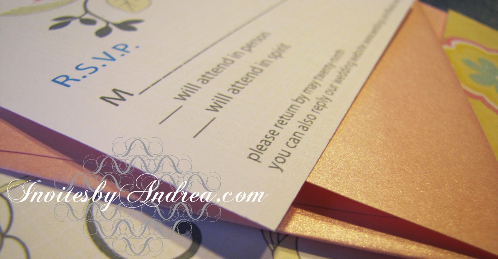
Shameless plug time: Love my patterns? I incorporate them into a lot of the artwork I create, from stationery for Invites by Andrea to the watercolors I paint. Check out Invites by Andrea's website to see examples of these patterns in use or drop me a line at andrea@invitesbyandrea.com to let me know what you think!
First, the "fancy": Pattern Kenzie


Why it's great: I love the little bow-tie like details!
And now, the "funky": Pattern Faye


Why it's great: The evenly-spaced loops give it a funky mod 1960s feel.
-
Click here to see all posts related to "Fancy/Funky Friday"
Shameless plug time: Love my patterns? I incorporate them into a lot of the artwork I create, from stationery for Invites by Andrea to the watercolors I paint. Check out Invites by Andrea's website to see examples of these patterns in use or drop me a line at andrea@invitesbyandrea.com to let me know what you think!