Sunday, October 30, 2011

Sunday Sample Spotlight: "Candy on the Cob"

I can't believe it's already the end of October! Exactly two years ago today, my now-husband proposed to me, so October thirtieth will always hold a special place in my heart. :) For most people, though, it's less about diamond rings and more about...

Halloween! That's right, Halloween is finally tomorrow. This could be one of the first years that I don't actually have any Halloween plans. After I finally reached an age when trick-or-treating was taboo (a genuinely sad day), I still usually had some sort of Halloween party to attend with friends (such as the one my now-husband and I held in his apartment the day after we got engaged). But this year I guess I'll just have to be satisfied with displaying this awesome Halloween-themed invitation as this week's Sunday Sample Spotlight! It's most Halloween-y thing I've done (and apparently will do!) all year. :)

"Candy on the Cob" was inspired by a piece of scrapbook paper I had that featured a large photo of piles of candy corn. I cut out a few pieces of the scrapbook paper to attach to the envelope, and then scanned the paper on my computer to incorporate it subtlety in the background of the actual stationery as well.

"Candy on the Cob" - Invitation Duo with inside and outside envelopes

The main envelope is a black linen cascade pocketfold (just like last week's "Pick Your Own"), meaning there is space in the middle for the A7-sized invitation (~5"x7"), and a pocket on the right for the reply card and envelope. I decorated the right pocket and the flap on the left with the candy corn scrapbook paper and then picked orange envelopes for the outside A7 envelope and reply card for two reasons. 1.) Black envelopes are hard to write addresses on, and the reply card and outside invitation envelopes would definitely need addresses, whereas the inside envelope (the black cascade, when folded up) would just need a couple of names written on it, which could more easily be done with a white or silver colored pencil, paint pen, gel pen, etc., and 2.) I love how the orange pops against the black and really brings the whole set together by bringing the orange from the candy corn imagery into the envelopes.


The silhouetted tree and the white zombie hand emerging from the ground are more examples of the traced illustrations I like to create with Illustrator's pen tool. I just find an image online (or use a picture I've taken), pull it into Illustrator to use it as a template, and trace it and modify it to make it my own. The smoky haze in the background and the little bats weren't traced from anything, but just drawn freehand with the pen tool, which is why they are even more simplified and stylized.


I really love how this stationery set came out. The text implies that it's for a Halloween-themed wedding, but it wouldn't have to be. While the invitation would also work fine on its own, I think it's the scrapbook paper lined envelope that really makes this set extraordinary. But the design could still easily be adapted to any Halloween-themed event, such as regular costume parties.

Happy Halloween, everyone!

Next week's Sunday Sample Spotlight: Autumn Leaves

Click here to view all Sunday Sample Spotlight posts.

"Like" Invites by Andrea on Facebook!

Shameless Plug Time: Love this invitation (or others featured on this blog)? Want something similar (or something completely custom) designed for your event? Visit Invites by Andrea to view more samples, download a catalogue pdf (coming soon!), or fill out a design request form. Or shoot me an email to ask me your questions or learn more information.

Friday, October 28, 2011

Fancy/Funky Friday: Patterns Virginia & Emma

It's time for another Fancy/Funky Friday!

First, the "fancy": Pattern Virginia


I absolutely love this pattern. As always with the "fancy" ones, I would love this upholstered on decorative furniture in my dream home someday. It looks like lace, and I really like how it created two different units when I started connecting the units to each other. The different parts of the pattern give the illusion of stripes, which creates a nice variance between the larger, more intricate unit and the smaller unit. This is a great pattern for invitations, too, because it looks formal and regal, and it looks good in several different ways.

"Frill of a Lifetime" - Sample Invitation

I'm always careful about overdoing patterns on invitation - I wouldn't want it to get too busy and overwhelm any viewers! So usually my go-to way of including pattern in invitations is just to include a small sample strip of it at the tops, bottoms, or sides, leaving most of the stationery with a plain white background. But with Pattern Virginia, it looks so lace-like in large quantities that I just had to try the whole thing in the background of one of my invitation samples. As long as the colors of the pattern are similar enough to the background, I think it just looks subtlety beautiful, rather than too busy, and it looks so much more elegant than just a hint of the pattern would.


And now the "funky": Pattern Emma


I really like this pattern, too, even though it's a lot simpler than Pattern Virginia. It's much more graphic and modern. Can you guess what character this pattern is entirely made of? In case you've forgotten, I almost exclusively use characters from different font families to create all of my patterns. The goal is to make a pattern that is beautiful outside of the beauty of the individual characters, and often that means creating a pattern in such a way that whatever characters I used are no longer decipherable. (For instance, in Pattern Virginia, above, I can still pick out a cursive "E" character, but I'm not sure about the others - I think there's a "T" in there, but there's still some other element that I can't quite put my finger on).

Anyway, with Pattern Emma the character is still obviously visible (give up? It's a comma!), but the pattern works and doesn't scream "look at me, I'm a collection of commas!" because of the drastic scale difference. We see commas all the time on a daily basis, but they're always really tiny and barely noticeable, and almost never seen on their own. So by blowing the commas up to giant size, it's hard to recognize them as commas anymore, since that's not how our brains think of them. Instead of seeing commas, when I look at this pattern I just see graphic floral elements, big and bold and modern, like a pattern that would have upholstered chairs during the seventies (just picture the pattern in a golden yellow or orange. Can't you see them as dining room chairs on "That 70's Show?"). Of course, now that I've told you they're just commas, perhaps that's all you can see when you look at it now. Hopefully I haven't ruined the pattern for you! ;)

-

Click here to see all posts related to "Fancy/Funky Friday" 


Shameless plug time: Love my patterns? I incorporate them into a lot of the artwork I create, from stationery for Invites by Andrea to the watercolors I paint. Check out Invites by Andrea's website to see examples of these patterns in use or drop me a line at andrea@invitesbyandrea.com to let me know what you think!

Wednesday, October 26, 2011

"Oian Sunset" Watercolor

I finished my latest watercolor this morning. It went so much faster than my previous one, and I'm much happier with how it turned out, too. I guess the secret is to not put too much time into it/try so hard. ;)

The background heavily features Pattern Celia, the "fancy" pattern I included in last week's "Fancy/Funky Friday" post. True story: I designed and had been working on this watercolor for a couple of weeks already before I picked which patterns to feature last week, and when I picked Pattern Celia, it was just one of the first ones I saw in my folder of over 100 patterns. I didn't intentionally pick it to match my watercolor, and it wasn't until I was writing the post about it that I realized the watercolor I was working on included the pattern as well!

Anyway, here's the watercolor. I've named it "Oian Sunset" because it's based on a photograph I took of a flowering plant in the town of Oia on the island of Santorini this summer. I loved how the flowers almost looked like silhouettes due to the setting sun in the background. This photograph doesn't really do the background justice - it's a bit yellower in real life, and the background & pattern have a bit of iridescent watercolor paint mixed in so they sparkle.

"Oian Sunset" Watercolor - Oct. 2011 - 22" x 15"

"Oian Sunset" Watercolor Close-up - Oct. 2011

Shameless plug time: Like my watercolors? Interested in purchasing one? Email me for more information!

Sunday, October 23, 2011

Sunday Sample Spotlight: "Pick Your Own"

It's time for the first official Sunday Sample Spotlight post! Every Sunday I plan to feature some photographs to showcase one of my sample pieces, starting today. So, without further ado, here is the orchard-themed "Pick Your Own," an invitation duo nestled in a red linen "cascade" envelope. The stationery (a wedding invitation and information card) was printed on 80# white linen text paper so that its texture would match the linen texture of the envelope.

"Pick Your Own" - Invitation Duo
The image of barrels of apples in the lower right of the invitation is an example of one of my specialties - taking an image and turning it into a vector image by tracing everything with Adobe Illustrator's pen tool. I just love using flat color in images instead of photographs. It feels more unique, especially on stationery.


Then I created layers of translucent bands of color behind the image to make it feel more whimsical. Trust me - without those stripes of color, the invitation felt really plain, but with them it really came alive. So I incorporated the colors in the background of some of the text as well, both to highlight the most important parts and to bring the text and image together more cohesively.


I wouldn't normally use this kind of kid-like font (it looks too much like the dreaded Comic Sans for my taste), but after trying lots of other options, I really did like how the font looked with the illustrative apples. It was clearly the best option - it even had "apple" in the name (though only because it came standard on my iMac, and not because it has anything to do with the red fruit featured in this invitation design). :)


This photo gives a good view of the texture of both the envelope and the paper the stationery was printed on. Linen paper feels so much more sophisticated than flat cardstock, and since the font and illustration were so informal looking, I felt that the linen texture would be the perfect way to bring back some elegance to the design.

Thanks for reading! Next week's Sunday Sample Spotlight: Halloween-themed! Make sure to check back.


Click here to view all Sunday Sample Spotlight posts.

"Like" Invites by Andrea on Facebook!

Shameless Plug Time: Love this invitation (or others featured on this blog)? Want something similar (or something completely custom) designed for your event? Visit Invites by Andrea to view more samples, download a catalogue pdf (coming soon!), or fill out a design request form. Or shoot me an email to ask me your questions or learn more information.

Friday, October 21, 2011

Fancy/Funky Friday: Patterns Celia & Ariel

It's finally Friday, and you know what that means! I'm really excited to share a couple of the patterns I've created. Since this is my first Fancy/Funky Friday post, let me identify how I'm using the terms "fancy" and "funky" a little bit first before we get to the good stuff.

The "fancy" patterns are all relatively elegant, often with thin strokes, while the "funky" patterns have something about them that makes them feel too heavy to be considered "fancy" (such as thicker strokes) or are eclectic in some other way. It's the difference between thin and thick, organic and geometric, and patterns you'd see upholstering King Louis XVI's furniture and patterns you'd see on more modern stuff. There is definitely some overlap and there were several patterns I've created that I could easily argue as being in either category, but generally one adjective tends to win out (in my mind at least).

So, on to today's patterns!

First, the "fancy": Pattern Celia


I love how elegant the pattern looks, whether scaled up or down. This was created completely out of the "D" character of a cursive font. I picture this being used to decorate the Napoleon III Apartments in the Louvre - it just feels historically ornate. Can't you just imagine a little jewel encrusted in each of those small white spaces in between the pattern units? I want a settee upholstered with this pattern - something that is true of pretty much every "fancy" pattern I've created. What can I say? I love arabesques and the feel of rococo. It's definitely my favorite kind of style.

Fun fact: The watercolor I am working on right now heavily features Pattern Celia. Since I was so displeased with my last watercolor, I started on a smaller, simpler one that's more similar to other things I've [more successfully] attempted in the past. I'm hoping to finish it this weekend, so look for a post more about it soon! :)

And now the "funky": Pattern Ariel


The strokes are a little thicker, there are more angles than there are gentle curves, the pattern is denser with less white space, there are some lines that flow into each other better than other ones, and the pattern looks best when it has a slight tilt. I think it has its own elegance to it, as well, especially when the units are scaled down and viewed from a bit of a distance, but overall I'd definitely categorize it as "funky." I find it really dynamic - there's a lot of movement that zig-zags your eye back and forth, but there are some interesting bits that let your eye rest for just a moment, too, such as the four-pronged starfish-type shape. I kind of like how the lines don't quite touch each other as they all come together there (which is why I left it that way instead of trying to fidget them into place). It's just another unexpected part in this really unique pattern. :)

-

Click here to see all posts related to "Fancy/Funky Friday"

Shameless plug time: Love my patterns? I incorporate them into a lot of the artwork I create, from stationery for Invites by Andrea to the watercolors I paint. Check out Invites by Andrea's website to see examples of these patterns in use or drop me a line at andrea@invitesbyandrea.com to let me know what you think!


Monday, October 17, 2011

New Weekly Themed Posts

I've been hard at work creating lots of samples for the upcoming Brides-to-Be show (and because, let's face it, my website needs some upgrading), and I've finally decided on the best way to share them on this blog.

Every Sunday (starting next week) I plan to feature one of my new samples on here with several photographs, as well as descriptions of the idea and/or creation process. That way, you'll be able to select the "Sunday Sample Spotlight" tag to look at only the posts that feature in-depth looks at some of my favorite invitation samples. Of course, you'll always be able to browse all of the samples on invitesbyandrea.com (that is, once I update the website sometime in the next couple of weeks), but not in the same in-depth way that these new blog posts will show - otherwise it would take my website ages to load all of the thousands of images!

Furthermore, I have a lot of patterns that I've designed in Illustrator that I also want to feature two of these patterns every Friday - one that's more "fancy" and one that's more "funky". To view all of the posts that show off my patterns, you'll be able to select the "Fancy/Funky Friday" tag. I just love creating fun designs with various fonts, and I have more than a hundred of these patterns created already, with more made each month.

Even though it's not Friday, how about a sneak peak, just to give you some idea of my process? ;)

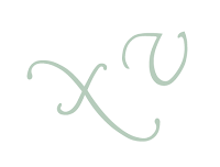
First, I find a cool looking font and select one or more characters from the font. Here's an "x" and a "v".
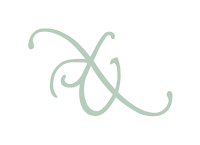
Then I decide how to connect the characters so that they form an interesting design.
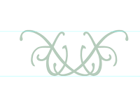
Then I start reflecting or rotating the "mini-unit" I've made to form larger "units".
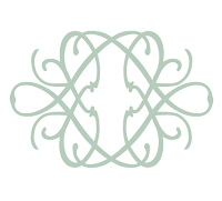
I get to a point where I'm really happy with the larger "unit" and group all of the characters together to make replicating the unit easier.
I decide how I want to connect the units to each other to create a larger pattern.
And I duplicate the unit until I have a large block of the pattern. :) Finally, I give it a name. Meet "Pattern Verity."
I can tell what you're thinking - sure, they're fun to create, but how are they actually useful? First of all, as you may have guessed, I've used several of these patterns in various invitation and stationery designs, many of which you'll see in my "Sunday Sample Spotlight" posts.

But I also like to incorporate my patterns into my watercolor paintings. Since I've created them all, I can use them in my own artwork without worrying about breaking any copyright laws. It's also easy to make several different patterns with the same font family, meaning I can include several different patterns in a watercolor that all have a similar feel, but are a little different. Plus, the variety in the patterns I've already made far exceeds any stock pattern images I could find online for such purposes, and since they're all vector drawings in Illustrator, I can blow the pattern up to as large (or small) as I need to trace on my watercolor paper without things getting too muddled by pixelation problems. Really, these patterns have been super helpful to me in painting some pretty successful watercolors (in my honest and usually harsh opinion).

"Melange Modele" (Watercolor, May 2011, 22" x 30")
"Melange Modele" - Close-up
So, get excited for a guaranteed two posts per week - one "Sunday Sample Spotlight," and one "Fancy Friday" pattern post. I'll also still update this blog with any recent current projects and any design or event planning ideas I want to share. In summary, get ready for a lot more posts! :)

Sunday, October 9, 2011

"Santorini" Watercolor

I don't usually post things outside of the realm of projects I do for Invites by Andrea, but today I thought I'd post about a recent watercolor painting I finished. Since I graduated from Eastern with a double major in Graphic Design and Watercolor, I haven't done nearly as many watercolors as I used to - apparently there was something about having a deadline and being graded on my paintings that motivated me to actually do them - but I've still made sure I painted at least a few.

One of my goals for 2011 was to paint eight watercolors (which, considering I cranked out one every two weeks my senior year at EMU when I was getting ready for my senior thesis, shouldn't have been too difficult to accomplish). So far I've painted only four, and with everything else I have going on getting ready for the Brides-to-Be show in January 2012, I just don't know if I'll be able to get four more paintings done. Especially considering I'm not even that happy with the one I just completed.

"Santorini" by Andrea Arbit - 22" x 30" Watercolor and Colored Pencil, 9-10/2011

 It was a massive undertaking. I absolutely love taking photographs of landscapes and scenery on vacation (or just every day), and I always want to turn those photographs into watercolors. But it's so hard! I never get the water to look like water or the trees to look like trees... This particularly painting I've been working on now and then for the last couple of months was based on a collage of five different photographs I took while on my honeymoon on the Greek island of Santorini. I figured if I tried to do five photographs at once I wouldn't overwork any one photograph (like I usually do), and it would be one of the best "landscapes" I've ever done. (And maybe it is - though I guess that says something about my earlier landscapes...)

Of course, instead I just ended up overworking *every* photograph and it came out looking like a muddled mess. It actually doesn't look half-bad from a distance, but up-close I think it really falls apart.

Close-up of the upper right corner of the painting (Santorini Cliffs)
Close-up of the upper left corner of the painting (Black Sand Beach)

I tried to bring some lights back into it with colored pencil and help define (fix) some of the edges that needed help, and that made it a little better. I'm just so out of practice since I don't paint as often as I did two years ago anymore.

Close-up of the colored pencil additions to the upper right corner of the painting (the town of Oia in the distance)
Close-up of the bottom right corner of the painting (a church and sunset in Oia)

I guess the individual "quadrants" of the painting aren't too bad with the added colored pencil. It's mainly the flowers that I'm most disappointed in - especially considering I have more experience painting flowers than anything else I painted in this piece! They just look like a solid blob of pink and it's just not working for me. It's really too bad, because I think if this painting had turned out terrific it would have inspired me to paint more and meet my eight-paintings-in-2011 goal. And now, I just don't feel like it's worth it to push myself to put in that extra time if I'm not going to be satisfied with the end product anyway.

It's okay - I really do have enough on my plate right now without trying to finish an arbitrary painting goal I put on myself. I still want to try to get two or three more paintings done this year (probably smaller ones), but my focus is definitely going to be on Invites by Andrea instead.

I still have a lot to do to get ready for the Brides-to-Be show! Expect an update soon with some pictures of some of the samples I've been working on, once I finish some more and photograph my whole new collection. :)


Shameless plug time: I know, I just spent this whole post acting self-deprecating about my watercolors, but if you love this painting, let me know! Email me at andrea@invitesbyandrea.com if you're interested in learning more about my watercolors, would like to see some more examples, or would like to purchase one. I can also do commissions! Love a photograph you've taken on vacation? I can copy it for you in watercolor, colored pencil, or a mixed of both!

Please do not steal my images. I am not watermarking them because I want to trust the people who visit my blog, and I can only continue to not watermark them if you don't commandeer the pictures I post for your own uses. I spent a lot of time and energy on this painting (and all the other paintings and projects I display on this blog), and I want credit for my work. Thanks!