Friday, March 30, 2012

Fancy/Funky Friday: Patterns Lola & Mimi

It's hard to believe March is almost over already! Here's today's Fancy/Funky Friday post.

First, the "fancy": Pattern Lola


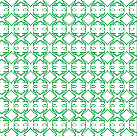
This pattern obviously has a very horizontal structure. It's so strong that you really look at the pattern as a collection of stacked "striped" units, rather than the individual parts of the stripe repeated within the horizontal bands. The diagonal lines, which shift direction in each row, give the pattern a very dynamic movement, but the thin lines and elegant loops keep it from getting too "funky."

Can you spot the cursive capital letter I used to create this pattern? L has been my favorite letter for as long as I can remember. I love the way it sounds, the way it looks, and the way it lends itself so well to singing... Plus, I'm sure it didn't hurt that it was the first letter of my middle name. ;) When I learned cursive in grade school, I was very pleased to discover that a cursive L is one of the most beautiful characters.


And now, the "funky": Pattern Mimi


Pattern Mimi is the exact opposite of Pattern Lola - instead of being a series of horizontal rows, it's a collection of vertical columns. The contrast between the dense lines and wide open white spaces is even more prominent in this pattern - so much so that from a distance, it almost looks as if the white circular pairs are sitting on top of a background of solid orange.

The main shape that pops out from the pattern - the side-by-side white circles that form sideways figure-eights - reminds me of Konstantin Brancusi's minimalist sculpture "The Kiss." Doesn't each one kind of look like the outlines of two profiles (with prominent ears) mushed together in an embrace? :)

-

Click here to see all posts related to "Fancy/Funky Friday" 


Shameless plug time: Love my patterns? I incorporate them into a lot of the artwork I create, from stationery for Invites by Andrea to the watercolors I paint. Check out Invites by Andrea's website to see examples of these patterns in use or drop me a line at andrea@invitesbyandrea.com to let me know what you think!

Wednesday, March 28, 2012

Flower Bat Mitzvah Placecard Poster and Table Markers

A couple months ago I posted a pink and green flower-themed Bat Mitzvah invitation set I designed for a client. A few weeks after I made that post, the client came back to me to ask for some table markers and a placecard poster in a similar theme for the dinner party after the ceremony.

I used the same template for the table markers as I did when I made some for my own wedding. The three-sided self-standing table marker template fits onto standard legal paper (8.5" x 14") - a size that's bigger than the usual 8.5" x 11" but still fits into my printer. :) I used the same rose design from the invitations on each side of the table marker, but changed the number to a different (serif) font since the sans-serif font I used for everything else didn't have the most recognizable number characters from a distance.

Before I sent them off to the Chicago area (where the event was to take place), I first took some photos of them in my apartment. I had a bit of fun setting them up on a chair by the window, letting the spring sunshine work as lighting. Since they're self-standing, they even easily stack on top of each other to make a tall tower!


And here is a photograph of the table markers at the actual event. I love how it works with the color of the tablecloth and centerpiece flowers! :)


I also painted and assembled a sign for the dining room to show guests where to sit. I painted a large version of the same rose design along the right side of the sign (a large tri-fold foam board I found in the science fair aisle of my local Michael's store), and painted the new Bat Mitzvah's name across the top in both English and Hebrew (just like I did on the invitations).

To make sure that I painted it as accurately as possible, I printed out a template from my computer and traced it onto the board before painting. I used acrylic paint, mixing my own pink and green to try to emulate the exact colors I used on the invitations. For the rest of the sign, I printed a list of names for each table on my computer and attached each to a piece of the same metallic "pink azalea" colored cardstock I used on the invitations.

Here are a few photographs I took in my apartment of the completed sign:


And here is the self-standing sign on a pink-clothed table at the entrance to the dining room at the Bat Mitzvah celebration:


The clients loved the table markers and sign, and a lot of the guests were talking about them too! I'm glad it was a successful event!


-

Shameless plug time: Love these design? Want some of your own? Download my convenient pdf catalogue to see all of my design options, or check out my Invites by Andrea website to view some samples and get more information. I can also do custom designs! Need a sign painted in acrylic or watercolor for your event? I do paintings, too! :)

Tuesday, March 27, 2012

Grass Collection Scrapbook Paper

In honor of spring, today I want to show you a new collection of scrapbook paper designs I've created. All of the papers are solid colors (either two or three colors), and feature one of the patterns I've designed. They're shown here as 12" x 12" scrapbook paper squares, but could be adapted down to a different size, as well. Though I only used springtime yellows and greens (plus a few neutrals) for this collection, the colors could also be changed to whatever other color combinations you may want!


If you see a design you like, or want to see some more examples of the scrapbook paper I've been creating, shoot me an email and I can send you some more pictures. I'm also planning to post more designs on this blog as I make them, so be sure to keep checking back!


Shameless plug time: Want to purchase some scrapbook paper, or have stationery designed from the patterns and color combinations featured here? I also incorporate pattern in some of my watercolor paintings. Check out Invites by Andrea to browse sample stationery
or drop me a line at andrea@invitesbyandrea.com to let me know what you think!

Sunday, March 25, 2012

Sunday Sample Spotlight: "Rainbow Bright"

Nothing is more symbolic of springtime than rainbows - the natural phenomena that show off beautiful colors in the sky during periods of rain and sunshine. Today's Sunday Sample Spotlight uses rainbows, as well as other common images like clouds, grass, and flowers, to really evoke the feeling of spring.


"Rainbow Bright" - Invitation Duo (invite & information insert)

The envelope is a solid dark purple Himalaya pocketfold envelope, which I lined with a pale yellow scrapbook paper on the left flap and right pocket. The scrapbook paper has a subtle design of large yellow flowers, which further adds to the theme of the invitation.


I drew all of the images, from the fun spirals and imperfect flowers and grass to the simplified three-color rainbow and light blue clouds, with the pen tool in Adobe Illustrator. Usually I find an image (such as a photograph I've taken) to use as a starting point, and trace that photograph with the pen tool to change it into a flat-color vector image - but for these drawings, I wanted them to seem more whimsical and free, so I didn't start with anything and just made the drawings from scratch.

You can really tell in the images of the flowers (scroll down for a close-up photograph of them), which are clearly drawn freely. They are meant to be symbolic of flowers and springtime in general rather than indicative of any actual type of flower. Even the rainbow is simplified. Instead of using all of the colors, I picked only three, including the two colors used in the envelope to help bring the envelope and invitation design together into a cohesive package.


To finish off the design, I picked a fun, curly font that matched the spirals and designs I drew with the pen tool. Though this particular example is for a fun, casual springtime wedding, this design could easily be adapted to any event. I think it would work particularly well for a child's birthday party, since the images and font are all so whimsical and childlike themselves. :)


Next week's Sunday Sample Spotlight: "Out in the Yellow Meadows"

Click here to view all Sunday Sample Spotlight posts.

"Like" Invites by Andrea on Facebook!

-

Shameless Plug Time: Love this invitation (or others featured on this blog)? Want something similar (or something completely custom) designed for your event? Visit Invites by Andrea to view more samples, download a catalogue pdf, or fill out a design request form. Or shoot me an email to ask me your questions or learn more information.

Friday, March 23, 2012

Fancy/Funky Friday: Patterns Genesis & Sydney

Happy Friday! Here are today's Fancy and Funky patterns! :)

First, the "fancy": Pattern Genesis


I love this pattern. It reminds me of decorative sand dollars, and because of this I find that it feels distinctly summery. I love how the pattern looks in beachy colors like tans, blues, and sunshine yellow. In the example below, I used the pattern to dress up an invitation, reply card, and save-the-date set with recycled tan envelopes.


The pattern also reminds me of stained glass windows. Having a wedding in a beautifully decorated cathedral or church? You could play up the stained glass decor by coloring in this pattern with vibrant reds, blues, and greens, and give your guests a tantalizing taste of what they'll see at your event. :)


And now, the "funky": Pattern Sydney


Patterns that don't follow a traditional horizontal/vertical grid are so much more exciting - and they're easy to do. I just made this pattern like I did so many others - by repeating a unit in horizontal and vertical lines - but when I had a large area of the pattern, I tilted everything so that it was at an angle. It's instantly more dynamic and energized, but since the grid is still there (just tilted), it still has an underlying structure.

I love how these lines connect with each other so seamlessly. Doesn't it look like the whole pattern was drawn without ever picking up your pencil? The pattern practically begs you to trace your finger along it, following all of its fun zig-zags and U-turns. :)

-

Click here to see all posts related to "Fancy/Funky Friday" 


Shameless plug time: Love my patterns? I incorporate them into a lot of the artwork I create, from stationery for Invites by Andrea to the watercolors I paint. Check out Invites by Andrea's website to see examples of these patterns in use or drop me a line at andrea@invitesbyandrea.com to let me know what you think!

Wednesday, March 21, 2012

Ice Collection Scrapbook Paper

Last month, I posted a collection of pink, red, and purple scrapbook paper designs I created for Valentine's Day. Today, I want to show you another set of patterned scrapbook paper designs in a different set of colors - pastels from the cool half of the color wheel. These color combinations would work great for a winter or spring wedding, or another spring event, like Easter. Because even the purples and yellows I used have a hint of cool temperament when paired with the icy blues and pale greens, I like to call this collection of scrapbook paper designs the "Ice Collection." :)

As before, all of these papers are solid colors (either two or three colors), and feature one of the patterns I've designed. They're shown here as 12" x 12" scrapbook paper squares, but could be adapted down to a different size, as well. Though I only used icy pastels for this collection, the colors could also be changed to whatever other color combinations you may want!


Some of these patterns have already been featured elsewhere on this blog (on stationery samples or Fancy/Funky Friday posts), so they might look familiar to you.


If you see a design you like, or want to see some more examples of the scrapbook paper I've been creating, shoot me an email and I can send you some more pictures. I'm also planning to post more designs on this blog as I make them, so be sure to keep checking back!


Shameless plug time: Want to purchase some scrapbook paper, or have stationery designed from the patterns and color combinations featured here? I also incorporate pattern in some of my watercolor paintings. Check out Invites by Andrea to browse sample stationery
or drop me a line at andrea@invitesbyandrea.com to let me know what you think! 

Tuesday, March 20, 2012

Photo Save-the-Dates

Anytime a client wants to use a photograph in their stationery designs, the design would have to count as a "custom" design rather than a "catalogue" one, which is why I don't have any examples of photographs in my catalogue. But I do have some samples of photographic stationery, and I wanted to take the opportunity now to show a few of them off.

All three of these designs are "fake" save-the-dates I made after my wedding, just for photographic stationery examples. The photographs were all taken by Amber Hunt Photography at our engagement photo shoot.


-

Shameless Plug Time: Love these save-the-dates (or other stationery featured on this blog)? Want something similar (or something completely custom) designed for your event? Visit Invites by Andrea to view more samples, download a catalogue pdf, or fill out a design request form. Or shoot me an email to ask me your questions or learn more information.

Sunday, March 18, 2012

Sunday Sample Spotlight: "The Orange and the Green"

Happy St. Patrick's Day Weekend! And here's something else to celebrate: you're currently reading my 100th blog post!! :)

I gave this design the name "The Orange and the Green" because of the colors it uses and because the petal folding envelope resembles a green four-leaf clover. Despite all that, this design is not for St. Patrick's party - though it could certainly be adapted for one, or for any other springtime party, with its bright, sunny colors.


"The Orange and the Green" - Invitation with Petal Envelope

Though it doesn't particularly look like it in the photograph above, the petal envelope is a metallic green (you can see the metallic shine better in the next photo, below). Instead of lining each of the four petal flaps with scrapbook paper, this time I only lined the top and bottom flaps. Since the colors were so bright and bold, I didn't want to overdo it.


Above, you can see what the petal envelope looks like when closed. The envelopes lie perfectly flat until the you open up the flaps like a blooming flower to reveal the shape seen in the first photograph.


The invitation, which is for a kid's birthday party, is printed on standard 67# bright white cardstock and mounted to a textured orange cardstock paper with yellow brads, which I punched through the printed blue stripe.


Because the scrapbook paper featured little dots in some of its striped pattern, it was a no-brainer to also include round brads to mount the invitations to the orange cardstock. The brads match the exciting, bold colors found elsewhere in both the scrapbook paper and the printed invitation, and the circular shapes are just larger scale versions of the dots seen on the paper's pattern.

Next week's Sunday Sample Spotlight: The epitome of springtime!

Click here to view all Sunday Sample Spotlight posts.

"Like" Invites by Andrea on Facebook!

-

Shameless Plug Time: Love this invitation (or others featured on this blog)? Want something similar (or something completely custom) designed for your event? Visit Invites by Andrea to view more samples, download a catalogue pdf, or fill out a design request form. Or shoot me an email to ask me your questions or learn more information.

Friday, March 16, 2012

Fancy/Funky Friday: Patterns Vera & Melissa

If you're like me, you're never more grateful for a Friday than the ones that precede a holiday weekend. And what better way to celebrate the start of St. Patrick's Day weekend than with today's Fancy/Funky Friday post? ;)

First, the "fancy": Pattern Vera


If you've been following this blog, you know that I love patterns that remind me of argyle. Anything that uses diamond-like shapes just feels instantly sophisticated to me. :) This pattern is no exception, even though the "diamonds" are more like ovals, since the lines are so curved. I think they resemble those fancy Christmas ornaments that were popular decades ago... And so this pattern feels kind of antique or vintage to me, which I love. It's simple and classic, and perfect to use in the background of so many different stationery designs or watercolor paintings.


The pattern is a light enough color in the background that it just adds some visual interest without being too distracting. The ample amount of white negative space also helps the pattern to stay simple and classic. Any pattern that has that much negative space can never be too busy. :)


And now, the "funky": Pattern Melissa


If Pattern Vera was simple and airy, Pattern Melissa is it's opposite. This pattern is quite busy and dense, made to seem even more so since the pen strokes are so thick. If you look carefully at the pattern, you can see that each individual square "unit" is either rotated 90 degrees from the one directly next to it, or reflected across the invisible axis between them. This makes the pattern flow so well that it's hard to tell where the "units" actually are, since they function so well as a whole. That's one of the marks of a good pattern. :)


It is a very busy pattern, but if you use just a column of it instead of an entire block, it's a little simpler. In the stationery design above, I used a single column in a copper color to add a fun pattern to both vertical borders to frame the invitation information without being too distracting.

-

Click here to see all posts related to "Fancy/Funky Friday" 


Shameless plug time: Love my patterns? I incorporate them into a lot of the artwork I create, from stationery for Invites by Andrea to the watercolors I paint. Check out Invites by Andrea's website to see examples of these patterns in use or drop me a line at andrea@invitesbyandrea.com to let me know what you think!


Wednesday, March 14, 2012

Happy Pi Day!

In middle school, my math teacher introduced our class to the concept of Pi Day - a celebration of the number pi on March fourteenth (since 3.14 is the closest decimal approximation of pi). She taught us a song to help us memorize several digits of the number, and our whole class sang it on the morning announcements that day. To this day, I still remember the chorus and first verse of that song. And considering that last year my husband (a high school math teacher) brought home some leftover pie from his own school's Pi Day festivities, I'd say the tradition of Pi Day is still alive and well.

But celebrations of pi (or pie) should not be limited to K-12 schools - or just your nerdy friends. After all, who would deny an invitation to a delicious pie party?

There are several things you could plan for your Pi Day event. The obvious ideas are, of course, various pie-themed contests: baking contests, decorating contests, pie-throwing contests (whether that's pie-in-the-face or long distance pie throwing is up to you), pie eating contests (miniature, individual-sized pies made in muffin tins would be great for this), or even pie architecture contests. If the cake shops featured on channels like TLC can carve sculptures out of cake, why couldn't you do something similar with pie? See who can stake the most pies on top of each other in a leaning-tower-of-pie contest, or get creative and carve pie-castles out of gooey filling and structural crust.

If you want to avoid all that fun-but-messy competition, there are other options, too. Have everyone bring in a pie for a pie potluck, or have a silent auction in a support of your favorite charity, where all of your guests can bid on the pies that they think look the most delicious.

Of course, you can also feature other round foods and activities at your Pi Party - pi is applicable to all circles, after all. Have a pizza pie cook-off, or bake fresh, homemade donuts. Play Twister. Sit in a circle and relive your childhood with games like musical chairs or duck-duck-goose - or your adolescence, with games like spin-the-bottle or truth or dare. Make a Settlers of Catan board out of miniature pies or other round foods. Sit around a bonfire. And, naturally, decorate your party with lots of circles and polka dots. :)

Tuesday, March 13, 2012

Snow Scrapbook Paper

A few weeks ago I showed you some Valentine's Day scrapbook paper I'd created - all solid color papers featuring one of the patterns I'd designed - but some of my favorite scrapbook pages I've ever used were simple photographs, such as the sample "Dilly Dilly," which I featured as a Sunday Sample Spotlight back in January.


With this in mind, I dug through my own collection of photographs and found some great images to make my own photographic scrapbook paper. And today, as we finally start to welcome the coming spring, I present to you a few winter photographs I've adapted to scrapbook paper designs, each measuring 12" x 12".


These photos were all taken in Michigan. Some were from this most recent winter, while others are from as long ago as 2007 and 2008. A few of those older photographs I even turned into watercolor paintings during the first watercolor class I took at EMU back in 2008.

"Winter Backyard" - 2008 (22" x 30")

"Winter Bench" - 2008 (22" x 30")

"Winter Berries" - 2008 (15" x 22")

If you see a scrapbook design you like, or want to see some more examples of the scrapbook paper I've been creating, shoot me an email and I can send you some more pictures. I'm also planning to post more designs on this blog as I make them, so be sure to keep checking back!


Shameless plug time: Want to purchase some scrapbook paper or a watercolor painting? Drop me a line at andrea@invitesbyandrea.com to let me know! And don't forget to check out my other watercolor paintings, or browse my Invites by Andrea website to see sample stationery.

Sunday, March 11, 2012

Sunday Sample Spotlight: "Blue Lagoon"

Today's Sunday Sample Spotlight is a large matching stationery set that includes a wedding invitation, reply card, save-the-date, thank you note, and rehearsal dinner invitation. Though it's presented for a wedding, the design, as always, could be modified to any event.

"Blue Lagoon" Invitation Duo (invite & reply card), Save-the-Date, Thank You Note, and Rehearsal Dinner Invite

I designed this pattern in Adobe Illustrator (as always). Can you spot the lowercase italic "y"s that make up the pattern? I rotated them 90 degrees four times to make a single star-like shape, and then repeated that by lining the ends of the "y" characters up to create little loops. They kind of remind me of those spinning ninja stars, which gives them this great funky feeling while still being elegant.


I couldn't decide if I liked the pattern better as a dark color on a light background or as a light color on a dark background... So I incorporated both in the same design! Since I faded the dark background at the edges, the light colored pattern starts to blend into the white of the background, playing with positive and negative space relationships in a fun way. It also keeps the pattern from getting old as it's carried on to all of the different items in the stationery set. Sometimes there are two columns of white pattern, sometimes only one, and sometimes there is a column of dark pattern on the right of the design, and sometimes there isn't - little discrepancies like that keep the design fresh, even as it is repeated on to several different pieces.


Finally, I just had to use part of the little star design as the reply check boxes for the reply card. They're fun and instant connect the text of the design with the patterns along the design's edges. Plus, I used the same italic font for the text that I did when I made the original pattern, which also connects the two and brings the whole design together.


Each piece of stationery (except for the thank you note, which is folded in half and blank on the inside) is mounted to a piece of dark teal textured cardstock. Each envelope is a metallic "aqua lagoon" color. The save-the-dates and thank you notes fit into A2-sized envelopes, the reply card fits into a 4Bar-sized envelope, and the rehearsal dinner invitation fits into a business #10 sized envelope. The invitation and reply card package fit into the matching metallic "aqua lagoon" petal-folding card.


Next week's Sunday Sample Spotlight: "The Orange and the Green"

Click here to view all Sunday Sample Spotlight posts.

"Like" Invites by Andrea on Facebook!

-

Shameless Plug Time: Love this invitation (or others featured on this blog)? Want something similar (or something completely custom) designed for your event? Visit Invites by Andrea to view more samples, download a catalogue pdf, or fill out a design request form. Or shoot me an email to ask me your questions or learn more information.

Friday, March 9, 2012

Fancy/Funky Friday: Patterns Tiffany & Ricki

We lose an hour "springing forward" this weekend for Daylight Savings Time, but hopefully that doesn't mean you don't have the time to check out today's Fancy/Funky Friday post! It's short and sweet this week, I promise. ;)

First, the "fancy": Pattern Tiffany


When I started making different patterns just for the purpose of making patterns (and not for a particular project I was already working on), this was one of the first ones I designed. It's zig-zag parts look just like strips of scalloped lace, which I absolutely love. It's the same basic pattern unit, repeated side-by-side for one version, and top-to-bottom in the other strips. The result is some really cool lace-like options that look great together or used separately, like I did in the stationery design below.


The little bunches of circular shapes also resemble flowers, which gives it an even more feminine quality, making it perfect for elegant stationery. Those flower-like forms also make it easy to measure out where decorative brads or ribbons could go. I love placing brads at the origins of symmetry like that! :)


And now, the "funky": Pattern Ricki


This pattern has a great balance between thin lines placed so densely together that they look like thicker lines and lines with lots of negative white space between them. It creates diamond shapes, loops, pointed-ovals, and x-like shapes, yet also emphases horizontal lines with the use of white space. At closer look, Pattern Ricki has a lot of interesting details going on that make it really cool to look at.

-

Click here to see all posts related to "Fancy/Funky Friday" 


Shameless plug time: Love my patterns? I incorporate them into a lot of the artwork I create, from stationery for Invites by Andrea to the watercolors I paint. Check out Invites by Andrea's website to see examples of these patterns in use or drop me a line at andrea@invitesbyandrea.com to let me know what you think!