Showing posts with label romantic. Show all posts

Sunday, September 8, 2013

Sunday Sample Spotlight: "Dressed to Impress"

Purple has long been one of my favorite colors. This simple purple and white color scheme combines a rich metallic purple with elegant lavender!

"Dressed to Impress" Invitation Duo (invite & reply card)

Both the main folding envelope and the reply card envelope are metallic purple. I used the same deep color for the smaller text and chose a subtler lavender tint for the larger text and elegant pattern.


Naturally, the font is calligraphic, thin, and sophisticated to match the fancy pattern flanking the top and bottom of the invitation!


Next week's Sunday Sample Spotlight: "Steel Magnolias"


Click here to view all Sunday Sample Spotlight posts.

"Like" Invites by Andrea on Facebook!
Follow Invites by Andrea on Twitter!


-

Shameless Plug Time: Love this invitation (or others featured on this blog)? Want something similar (or something completely custom) designed for your event? Visit Invites by Andrea to view more samples, download a catalogue pdf, or fill out a design request form. Or shoot me an email to ask me your questions or learn more information.

Monday, August 26, 2013

Color of the Week - Ballet Pink

This week's color is Ballet Pink - a pastel pink perfect for adding a sweet, calming touch to any bright color!

For a typical Parisian or Ballet-inspired color scheme, pair ballet pink with white and black or a dark navy blue.


Fun facts about Ballet Pink:

1. The color's name comes from the typical pink shade of ballet tutus, leotards, and slippers worn by female ballet dancers. Traditionally, male dancers wear white or black ballet shoes, though many modern ballerinas of both genders wear nude-colored slippers to give the illusion of dancing barefoot.

2. The art of ballet originated in the Italian Renaissance courts of the 15th century, eventually becoming very popular in France and Russia.


3. Many flowers come in ballet pink shades, including carnations, roses, tulips, orchids, daisies, hydrangeas, and dahlias, as well as the blossoms of many flowering fruit trees.

 -

Follow Invites by Andrea on Twitter!

"Like" Invites by Andrea on Facebook!


Shameless Plug Time: Love this color? Looking for custom stationery made to match this color (or whatever other color combinations you're using for your event)? Visit Invites by Andrea to view more samples, download a catalogue pdf, or fill out a design request form. Or shoot me an email to ask me your questions or learn more information.

Tuesday, August 20, 2013

Flowerless Bouquets 5 - Brooches

Today's wedding bouquets and centerpieces aren't limited to fragrant blooms. For the next five weeks, I'll be showing you my favorite flower alternatives, from new DIY creations to bouquets rich in history (and heirloom antiques!), from transient arrangements that look beautiful at your event to permanent keepsakes that'll look beautiful for generations to come.

Option 5: Brooch Bouquets


Brooch bouquets are <i>all</i> the rage right now! They're absolutely gorgeous, and they have a great vintage feel to them. Scour antique shops, jewelry stores (go for costume jewelry to save money and find large, colorful brooches), flea markets - even your grandmother's attic!

If the brooches mean something to your or your family, you'll have the added bonus of heirloom history on your wedding day - but even if all the brooches you find are brand new purchases, they'll mean something to you now, and will have all the more value for future generations.

Don't be afraid to mix different brooches! The best brooch bouquets have a variety of sizes and styles that all flow together by similarity in color or shape.

-

Shameless plug time: Need invitations as beautiful as your decor? Check out InvitesbyAndea.com and let me design stationery for your event!

Sunday, August 11, 2013

Sunday Sample Spotlight: "Down Memory Lane"

For a formal event, sometimes simple and elegant is the best way to go!


"Down Memory Lane" Save-the-Date

This save-the-date features one of my "fancy" pattern designs in a soft green in the background. The text is calligraphic and traditional, but instead of boring black the letters and the linen textured cardstock bordering the save-the-date are both in a rich chocolate brown. For a pop of color, the outside envelope is a cool grass green to match the light green pattern.


Next week's Sunday Sample Spotlight: A unique, retro twist on flower-inspired stationery!


Click here to view all Sunday Sample Spotlight posts.

"Like" Invites by Andrea on Facebook!
Follow Invites by Andrea on Twitter!


-

Shameless Plug Time: Love this invitation (or others featured on this blog)? Want something similar (or something completely custom) designed for your event? Visit Invites by Andrea to view more samples, download a catalogue pdf, or fill out a design request form. Or shoot me an email to ask me your questions or learn more information.

Friday, August 9, 2013

Fancy/Funky Friday: Patterns Olivia & Milana

Here are today's fancy and funky patterns -

First, the "fancy": Pattern Olivia


Why it's "fancy": The lines are thin and curvy, and the style seems a little worn, like a vintage fabric that has faded over time.

Why it's great: Like many of my fancy patterns, pattern Olivia also looks like lace from a distance!


And now, the "funky": Pattern Milana


Why it's "funky": Dense shapes, evenly spaced lines, bold color, and a modern, graphic style all make this pattern "funky."

Why it's great: I love the mini arcs that bring to mind the image of cartoonish rainbows!

-

Click here to see all posts related to "Fancy/Funky Friday" 


Shameless plug time: Love my patterns? I incorporate them into a lot of the artwork I create, from stationery for Invites by Andrea to the watercolors I paint. Check out Invites by Andrea's website to see examples of these patterns in use or drop me a line at andrea@invitesbyandrea.com to let me know what you think!

Friday, August 2, 2013

Fancy/Funky Friday: Patterns Kiara & Cherise

The difference between today's "fancy" and "funky" patterns is in the lines - Kiara emphasizes curves, while Cherise focuses on straight lines and angles.

First, the "fancy": Pattern Kiara


Why it's "fancy": These thin, calligraphic lines create elegant arabesques!

Why it's great: I love the hint of straight lines at ninety degree angles in the details between the arcs.


And now, the "funky": Pattern Cherise


Why it's "funky": The sunburst-like shapes and large pockets of negative white space are more modern and graphic than my elegant patterns.

Why it's great: My favorite details are the curves that look like criss-crossed hearts or pretzels!

-

Click here to see all posts related to "Fancy/Funky Friday" 


Shameless plug time: Love my patterns? I incorporate them into a lot of the artwork I create, from stationery for Invites by Andrea to the watercolors I paint. Check out Invites by Andrea's website to see examples of these patterns in use or drop me a line at andrea@invitesbyandrea.com to let me know what you think!

Sunday, July 28, 2013

Sunday Sample Spotlight: "Under Formal Circumstances"

This stationery set is soft and romantic, with its pale pink, gray, and ivory color scheme!


"Under Formal Circumstances" Invitation Duo (invite & reply card)

The pattern is elegant, with its calligraphic lines and curves, but it's printed at such a large scale that it takes on a bold, modern feel. The invitation and reply card are each printed on ivory paper and mounted on smooth pink cardstock.


This color scheme would be particularly beautiful in winter! 


Next week's Sunday Sample Spotlight: "Basket Case"


Click here to view all Sunday Sample Spotlight posts.

"Like" Invites by Andrea on Facebook!
Follow Invites by Andrea on Twitter!


-

Shameless Plug Time: Love this invitation (or others featured on this blog)? Want something similar (or something completely custom) designed for your event? Visit Invites by Andrea to view more samples, download a catalogue pdf, or fill out a design request form. Or shoot me an email to ask me your questions or learn more information.

Wednesday, July 17, 2013

Summer Color Combo - Cherry Blossom & Avocado

This color scheme is beautiful for spring and summer!


Decorate with cherry blossom branches (or drawings of them) to keep up the theme, and embrace vintage props, fabrics, and decor! Vintage botanic-style drawings in green and pink would make for beautiful wedding favors, stationery - even fabric!

-

Follow Invites by Andrea on Twitter!
"Like" Invites by Andrea on Facebook!

Friday, June 28, 2013

Fancy/Funky Friday: Patterns Leela & Avery

Complex and elegant or simple and bold - what's your favorite type of pattern?

First, the "fancy": Pattern Leela


Why it's "fancy": From a distance, it looks like lace, with its thin lines and curls.

Why it's great: Up close, it's interesting to note that some loops touch each other while others leave a small buffer of white negative space in between.


And now, the "funky": Pattern Avery


Why it's "funky": Simple, bold, and modern, this pattern takes simple ellipsoid shapes, radiates them out to create a "racetrack" feel, and then alternates vertical and horizontal orientation to create unexpected repetition.

Why it's great: I love the fun shapes created from the negative space between each square of four "racetracks" - it's like a tilted white square that's being pinched in a little on all four sides!

-

Click here to see all posts related to "Fancy/Funky Friday" 


Shameless plug time: Love my patterns? I incorporate them into a lot of the artwork I create, from stationery for Invites by Andrea to the watercolors I paint. Check out Invites by Andrea's website to see examples of these patterns in use or drop me a line at andrea@invitesbyandrea.com to let me know what you think!

Sunday, June 2, 2013

Sunday Sample Spotlight: "Manors & Etiquette"

This romantic invitation has a beautiful yellow and purple color scheme.


An elegant yellow pattern lines the top of this baby shower invitation; an identical stripe cuts the remaining white background into two, acting as both a design element and a way to feature the most important text of the invitation - the day, time, and location of the event. I love how the second pattern stripe acts like a fancy yellow highlighter!


Though this example is for a baby shower, this design could work for almost any traditional or elegant event, including weddings and spring holidays.


Next week's Sunday Sample Spotlight: A bold red & turquoise color scheme!


Click here to view all Sunday Sample Spotlight posts.

"Like" Invites by Andrea on Facebook!
Follow Invites by Andrea on Twitter!


-

Shameless Plug Time: Love this invitation (or others featured on this blog)? Want something similar (or something completely custom) designed for your event? Visit Invites by Andrea to view more samples, download a catalogue pdf, or fill out a design request form. Or shoot me an email to ask me your questions or learn more information.

Monday, May 13, 2013

Color of the Week - Lavender

This week's color is Lavender - a great pastel purple for spring!

Because it's so pale, lavender works best with darker shades. I particularly like it with unique colors with gray undertones (like moss green or dusty rose pink)!


Fun facts about Lavender:

1. The first recorded use of the word lavender as a color term in English was in 1705; it was named for the flowering plant of the same name native to much of southern Europe, northern Africa, and southwestern Asia.

2. The color lavender has symbolized many things throughout history, including love at first sight, decadence (especially the sensual enjoyment of music and art), elegance, femininity, homosexuality, imagination, and general cancer awareness.

3. There is a character in J.K. Rowling's Harry Potter book series named Lavender Brown.


-

Follow Invites by Andrea on Twitter!
"Like" Invites by Andrea on Facebook!

Shameless Plug Time: Love this color? Looking for custom stationery made to match this color (or whatever other color combinations you're using for your event)? Visit Invites by Andrea to view more samples, download a catalogue pdf, or fill out a design request form. Or shoot me an email to ask me your questions or learn more information.

Friday, April 26, 2013

Fancy/Funky Friday: Patterns Giselle & Harper

TGIF! Celebrate the weekend with these two pattern designs:

First, the "fancy": Pattern Giselle


Why it's "fancy": Loopy, calligraphic, and ostentatious, these lines are the epitome of "fancy."

Why it's great: I love the heart-like shapes formed where the "stripes" of the pattern meet.


And now, the "funky": Pattern Harper


Why it's "funky": Bold, evenly spaced lines in concentric "circles" give this pattern a mod 1960s feeling.

Why it's great: Every other pattern "unit" is flipped - but you can tell only by the way the inner rainbow-like arcs interact with the middle horizontal stripes.

-

Click here to see all posts related to "Fancy/Funky Friday" 


Shameless plug time: Love my patterns? I incorporate them into a lot of the artwork I create, from stationery for Invites by Andrea to the watercolors I paint. Check out Invites by Andrea's website to see examples of these patterns in use or drop me a line at andrea@invitesbyandrea.com to let me know what you think!

Sunday, April 14, 2013

Sunday Sample Spotlight: "The Music in Me"

This beautiful music-themed stationery design is all about the background image.

"The Music in Me" Invitation Duo (invite & info insert)

The envelope pictured is a metallic bronze-brown pocket envelope - perfect for giving off a rich, antique vibe and storing informational inserts right inside the envelope.


Semi-transparent layers of sheet music are stacked in the background of the design to give it both depth and a playful aged quality. I further played up this "classical" feel by choosing a font that feels like an old-school handwritten love letter.


This design also features a few different textures, which adds to its decadence. The invitation and info sheet were both printed on linen paper, and the folding envelope has a beautiful metallic sheen that shimmers in different lighting. In fact, depending on the warmth of the light, the linen paper can also take on a very different orange-brown tone, as you can see in the picture below.


Next week's Sunday Sample Spotlight: "Rainy Day"


Click here to view all Sunday Sample Spotlight posts.

"Like" Invites by Andrea on Facebook!
Follow Invites by Andrea on Twitter!


-

Shameless Plug Time: Love this invitation (or others featured on this blog)? Want something similar (or something completely custom) designed for your event? Visit Invites by Andrea to view more samples, download a catalogue pdf, or fill out a design request form. Or shoot me an email to ask me your questions or learn more information.

Sunday, March 24, 2013

Sunday Sample Spotlight: "King's Cross"

Today's stationery set is all about subtle beauty.

"King's Cross" Invitation Duo (invite & reply card) with matching Save-the-Date

When a guest receives this invitation, they first see a closed white petal envelope...


...And when they open it, they see the invitation and reply card, safely nestled inside.


The reply card stands alone - an elegant and timeless design printed on white cardstock. The text is calligraphic and all in traditional black, and a thinly-lined lace-like gold pattern fades in and out of the otherwise white background to add a hint of dimension.

But for the invitation and save-the-date, another layer was also added.


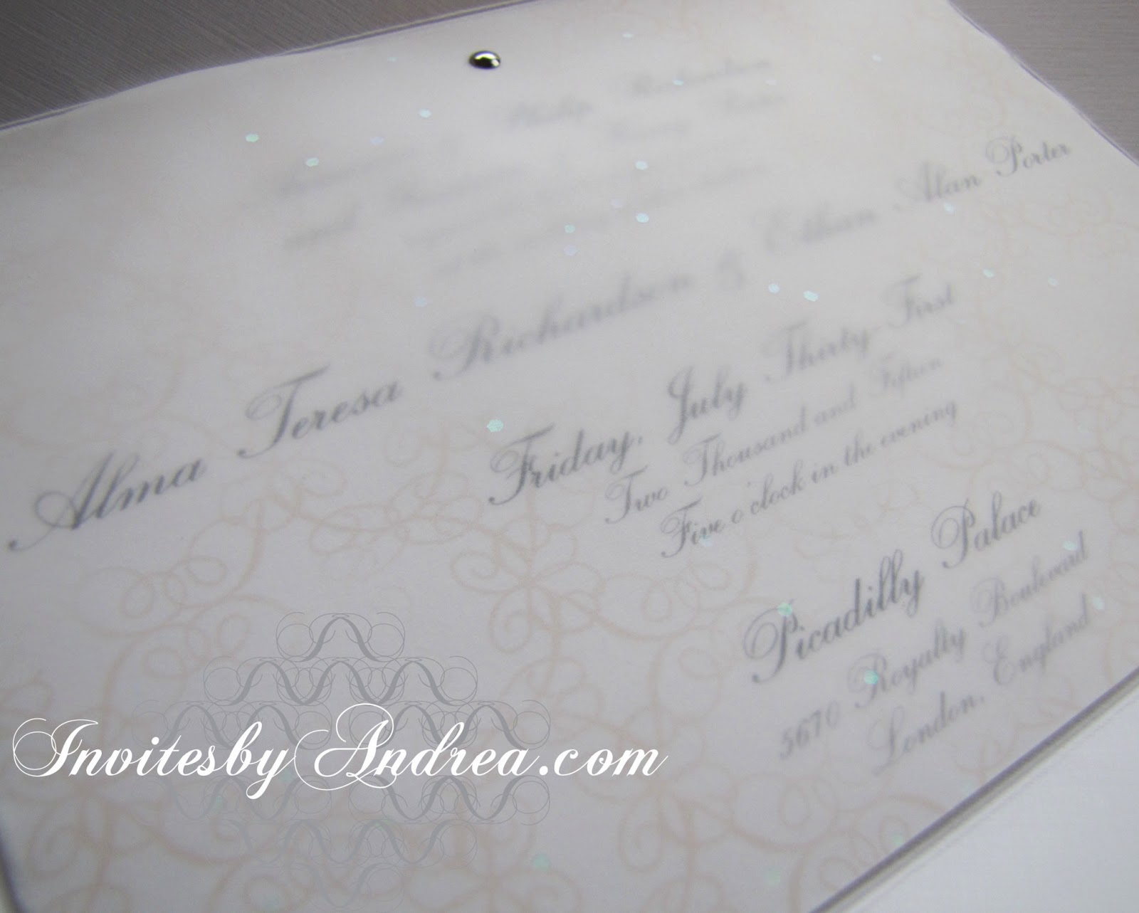
A thin sheet of sparkly white vellum was overlaid on top of the invitation and save-the-date, held in place just at the top with three small silver brads. The text is mostly readable through the vellum, and it's easy enough to lift that top layer to see the words even better - and all the details in the pattern.


The vellum's sparkles were a little difficult to capture with the camera, since they were so transient in the light, but you can get some idea of the iridescent specks sprinkled throughout the vellum with the above image, as well as the image below, showing the vellum laid on top of the save-the-date.


All white, with a hint of black and gold, is a classically elegant color scheme that will never go out of style. It's perfect for formal events like weddings because it harkens back to a fairy tale time gone by.


Next week's Sunday Sample Spotlight: The perfect birth announcement stationery for a baby girl


Click here to view all Sunday Sample Spotlight posts.

"Like" Invites by Andrea on Facebook!
Follow Invites by Andrea on Twitter!


-

Shameless Plug Time: Love this invitation (or others featured on this blog)? Want something similar (or something completely custom) designed for your event? Visit Invites by Andrea to view more samples, download a catalogue pdf, or fill out a design request form. Or shoot me an email to ask me your questions or learn more information.

Sunday, March 17, 2013

Sunday Sample Spotlight: "Timeless Treasure"

Previously, I've shown a pink and gray stationery set that featured Lacey - the first pattern I ever designed in Illustrator. Today's stationery sample uses the same pattern - but in some new, interesting ways!


"Timeless Treasure" Invitation Design

Printed on cream linen paper and mounted on a textured gray cardstock, this stationery set boasts a lavender and gray color scheme that's subtly beautiful and perfect for almost any occasion, from weddings to anniversary celebrations.

This particular invitation is for an anniversary dinner, and the theme is - fittingly - the passage of time.


I used a strip of Pattern Lacey along the top and bottom of the design, and then repeated a smaller scale version of the pattern right next to it in a lighter shade to add the illusion of depth. The pattern is also found in the actual illustration of the clock, where I wrapped the pattern around into a circle and put patterned spacers between each of the Roman numerals on the clock face.


Next week's Sunday Sample Spotlight: An all-white color scheme that is sophisticated and ethereal...


Click here to view all Sunday Sample Spotlight posts.

"Like" Invites by Andrea on Facebook!
Follow Invites by Andrea on Twitter!


-

Shameless Plug Time: Love this invitation (or others featured on this blog)? Want something similar (or something completely custom) designed for your event? Visit Invites by Andrea to view more samples, download a catalogue pdf, or fill out a design request form. Or shoot me an email to ask me your questions or learn more information.

Tuesday, March 12, 2013

Spring Color Combo: Lavender & Salmon Pink

Pastels are always beautiful for spring events, and today's color scheme of lavender and pale salmon is another great example!


Give out fabric satchels of lavender as guest favors at a fancy event like a wedding or dinner party. I just love the small salmon pink pocket tied with twine in the middle of the second row. 

Versatile and calming, this color scheme is also great for everyday fashion, and easily lends itself to makeup (lavender purple eyes and pale pink lips are always classic). These colors would also be gorgeous for a baby shower, baby announcements, or to decorate a child's bedroom or nursery. And don't forget spring holidays. The soft colors and pink accents work great for Valentine's Day and Easter!


-

Follow Invites by Andrea on Twitter!
"Like" Invites by Andrea on Facebook!

Shameless Plug Time: Love this color combination? Looking for custom stationery made to match these colors (or whatever other color combinations you're using for your event)? Visit Invites by Andrea to view more samples, download a catalogue pdf, or fill out a design request form. Or shoot me an email to ask me your questions or learn more information.

Sunday, March 3, 2013

Sunday Sample Spotlight: "Beyond the Veil"

Today's Sunday Sample Spotlight design has a lot going on - so we'll take it slow and address each detail separately. :)

"Beyond the Veil" Invitation Duo (invite & reply card)

First, the invitation (which was printed on white cardstock and mounted to a dark purple cardstock background) was attached to the metallic gold pocketfold envelope, which I had accented with solid purple scrapbook paper on the left flap and right side pocket.


I used an elegant script like font and added a lace-like pattern to the top edge of both the invitation and reply card to give it sophistication.


Then, I used those strips of pattern as a guide for the placement of the small gold brads that would hold the several layers together. For the reply card, I simply added a layer of semi-sheer purple vellum and cinched the vellum, white cardstock, and purple cardstock together with three brads. 

For the invitation, I also add two stripes of cotton ribbon, which added dimension while still allowing some of the pattern underneath to shine through.


Finally, I frayed the ends of each line of ribbon, to give it a bit of a deconstructed look. The gold brads on either end hold the ribbon in place and keep it from continuing to fray past the brad. I liked the added dimensionality and texture of the frayed ends, which I thought made the cream/white stripes along the ribbon more pronounced (since you could see that different individual threads were different colors), as well as added an unexpected casual feeling to an otherwise over-the-top elegant invitation.


Next week's Sunday Sample Spotlight: A crisp green and white design perfect for spring!


Click here to view all Sunday Sample Spotlight posts.

"Like" Invites by Andrea on Facebook!
Follow Invites by Andrea on Twitter!


-

Shameless Plug Time: Love this invitation (or others featured on this blog)? Want something similar (or something completely custom) designed for your event? Visit Invites by Andrea to view more samples, download a catalogue pdf, or fill out a design request form. Or shoot me an email to ask me your questions or learn more information.