Showing posts with label hearts. Show all posts

Friday, August 16, 2013

Fancy/Funky Friday: Patterns Juliet & Arenzia

Both of these patterns are green and feature little white space, with lots of curves. But they evoke <i>very</i> different feelings...

First, the "fancy": Pattern Juliet


Why it's "fancy": This pattern looks like a scrap of vintage lace, with its cutesy curls and flattened heart-like shapes.

Why it's great: It even reminds me of argyle, with its stripes of diamonds!


And now, the "funky": Pattern Arenzia


Why it's "funky": The curls in this pattern feel more whimsical and kid-like than elegant and refined.

Why it's great: The density of line leaves little room for negative white space.

-

Click here to see all posts related to "Fancy/Funky Friday" 


Shameless plug time: Love my patterns? I incorporate them into a lot of the artwork I create, from stationery for Invites by Andrea to the watercolors I paint. Check out Invites by Andrea's website to see examples of these patterns in use or drop me a line at andrea@invitesbyandrea.com to let me know what you think!

Friday, August 2, 2013

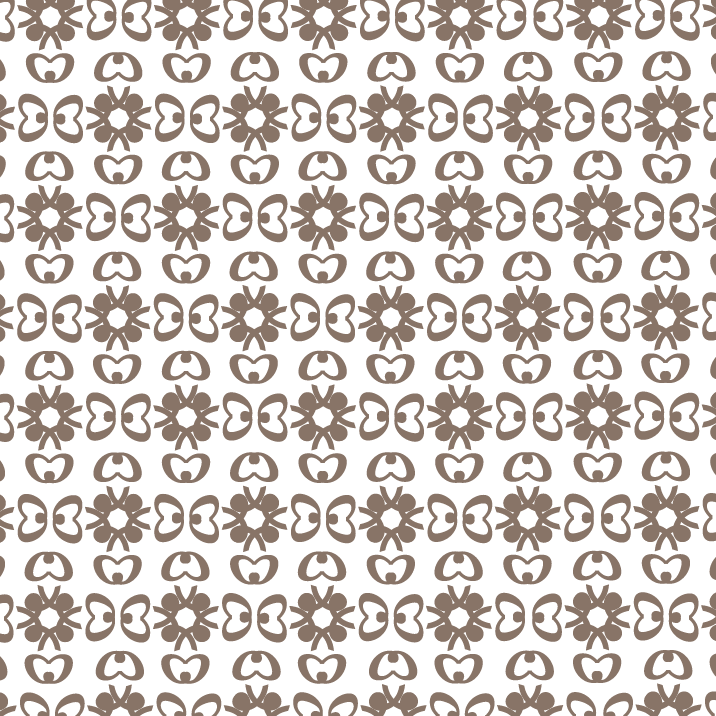
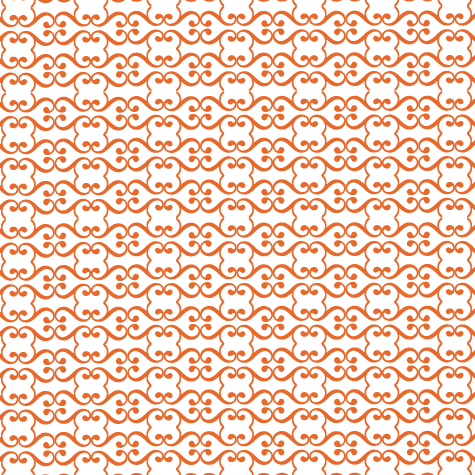
Fancy/Funky Friday: Patterns Kiara & Cherise

The difference between today's "fancy" and "funky" patterns is in the lines - Kiara emphasizes curves, while Cherise focuses on straight lines and angles.

First, the "fancy": Pattern Kiara


Why it's "fancy": These thin, calligraphic lines create elegant arabesques!

Why it's great: I love the hint of straight lines at ninety degree angles in the details between the arcs.


And now, the "funky": Pattern Cherise


Why it's "funky": The sunburst-like shapes and large pockets of negative white space are more modern and graphic than my elegant patterns.

Why it's great: My favorite details are the curves that look like criss-crossed hearts or pretzels!

-

Click here to see all posts related to "Fancy/Funky Friday" 


Shameless plug time: Love my patterns? I incorporate them into a lot of the artwork I create, from stationery for Invites by Andrea to the watercolors I paint. Check out Invites by Andrea's website to see examples of these patterns in use or drop me a line at andrea@invitesbyandrea.com to let me know what you think!

Sunday, June 23, 2013

Sunday Sample Spotlight: "Plum Major"

I just love this stationery set. It's colorful and whimsical, with fun flowers that look child-drawn and carefree. It's a great design for any spring or summer outdoor event, especially a more casual, family affair, or a hippie- or pagan-inspired event (including May Day and Renaissance Festivals)!

"Plum Major" Invitation Duo (invite & reply card)

For this stationery set, I started with a scrapbook paper I really liked. The paper had a scratched-texture purple and blue background, with colorful stems of flowers vertically aligned into stripes.


I used the same colors found on those flowers for each line of text on the invitation and reply card, and found a purple petal envelope and green outside and reply card envelopes to match the purple and green colors found in the scrapbook paper.


I also scanned in the scrapbook paper and included a strip of it on each side of the invitation and the left side of the reply card, to further tie everything together.


I love the petal folding envelopes because they mimic the same flower shapes from the scrapbook paper - and if you fold in two adjacent sides, the envelope looks like a heart!


Next week's Sunday Sample Spotlight: "The Only Exception"


Click here to view all Sunday Sample Spotlight posts.

"Like" Invites by Andrea on Facebook!
Follow Invites by Andrea on Twitter!


-

Shameless Plug Time: Love this invitation (or others featured on this blog)? Want something similar (or something completely custom) designed for your event? Visit Invites by Andrea to view more samples, download a catalogue pdf, or fill out a design request form. Or shoot me an email to ask me your questions or learn more information.

Friday, April 26, 2013

Fancy/Funky Friday: Patterns Giselle & Harper

TGIF! Celebrate the weekend with these two pattern designs:

First, the "fancy": Pattern Giselle


Why it's "fancy": Loopy, calligraphic, and ostentatious, these lines are the epitome of "fancy."

Why it's great: I love the heart-like shapes formed where the "stripes" of the pattern meet.


And now, the "funky": Pattern Harper


Why it's "funky": Bold, evenly spaced lines in concentric "circles" give this pattern a mod 1960s feeling.

Why it's great: Every other pattern "unit" is flipped - but you can tell only by the way the inner rainbow-like arcs interact with the middle horizontal stripes.

-

Click here to see all posts related to "Fancy/Funky Friday" 


Shameless plug time: Love my patterns? I incorporate them into a lot of the artwork I create, from stationery for Invites by Andrea to the watercolors I paint. Check out Invites by Andrea's website to see examples of these patterns in use or drop me a line at andrea@invitesbyandrea.com to let me know what you think!

Friday, March 1, 2013

Fancy/Funky Friday: Patterns Jayda & Sarabi

Happy Friday! Here are today's patterns:

First, the "fancy": Pattern Jayda


Why it's "fancy": Thin, calligraphic lines show off with sweeping loops and a classically elegant arrangement

Why it's great: I love finding shapes within the lines, and I'm reminded of all sorts of things in this pattern, from hearts and puckered lips to lotus flowers and crouching frogs.


And now, the "funky": Pattern Sarabi


Why it's "funky": From a distance, standard "X" shapes take on a new edge by rotating orientation; up close, the detailed lines within each "X" become more apparent

Why it's great: Inspired by fun 1970s "striped" lettering, the densely packed "tracks" of thin lines remind me of paper clips or other office supplies.

-

Click here to see all posts related to "Fancy/Funky Friday" 


Shameless plug time: Love my patterns? I incorporate them into a lot of the artwork I create, from stationery for Invites by Andrea to the watercolors I paint. Check out Invites by Andrea's website to see examples of these patterns in use or drop me a line at andrea@invitesbyandrea.com to let me know what you think!

Wednesday, February 13, 2013

Valentine's Day Color Combo #2 - Cherry Red & Aqua

I've featured a red and aqua inspiration board on this blog before - and I've even featured a red and aqua stationery set for a "Sunday Sample Spotlight" post - but the color scheme is so versatile and exciting that it bears repeating.

Today's inspiration board is different from the one I posted last March because it specifically focuses on Valentine's Day decor:


I love the idea of scrapbook-paper "fortune cookies" (the first three pictures on the left of the first row), as well as the fabric patchwork-like banner that spells out l-o-v-e in different red and aqua fabrics. Valentine's Day is the perfect time to emphasize cute, so don't be afraid to don a fun aqua dress dotted with bright red cherries - or keep things romantic and simple by decorating a two-person "sweetheart" table with a centerpiece of classic red roses tucked into aqua-blue glass jars and bottles.

Just like yesterday's Valentine's Day color scheme of ballet pink and black, red and aqua also makes a great color combo for birthdays, children's bedrooms, or nurseries!


-

Follow Invites by Andrea on Twitter!
"Like" Invites by Andrea on Facebook!

Shameless Plug Time: Love this color combination? Looking for custom stationery made to match these colors (or whatever other color combinations you're using for your event)? Visit Invites by Andrea to view more samples, download a catalogue pdf, or fill out a design request form. Or shoot me an email to ask me your questions or learn more information.

Sunday, December 30, 2012

Sunday Sample Spotlight: "Black Gold"

Can you believe it's almost 2013?? A big THANK YOU to all who've been regularly visiting my blog - making 2012 an amazing year!

I loved the metallic "antique gold" color of this petal-fold envelope so much that I left it as is - without adding any embellishments like ribbons or scrapbook paper.


"Black Gold" Invitation Duo (invite & reply card)


The gold reply envelope matches the petal fold envelope, and both the invitation and reply card are mounted on metallic onyx black cardstock for extra sparkle.


 The amount of shine on the metallic envelopes and papers depends on the angle to the nearest light source. In the photo below, you can really see how sparkly the materials can look - making this stationery set perfect for winter weddings and holiday parties (especially New Year's Eve)!


The invitation and reply card are printed with simple black and gold lettering and one of my favorite patterns on a classic white cardstock background.


If the pattern looks familiar to you, it may be because you've seen it on one of my first Fancy/Funky Friday posts, which I posted more than a year ago! I used this pattern on the invitations I created for my own rehearsal dinner, way back in July 2011.


Next week's Sunday Sample Spotlight: "Through the Glass" - another one of my absolute favorites!


Click here to view all Sunday Sample Spotlight posts.

"Like" Invites by Andrea on Facebook!
Follow Invites by Andrea on Twitter!


-

Shameless Plug Time: Love this invitation (or others featured on this blog)? Want something similar (or something completely custom) designed for your event? Visit Invites by Andrea to view more samples, download a catalogue pdf, or fill out a design request form. Or shoot me an email to ask me your questions or learn more information.

Friday, November 23, 2012

Fancy/Funky Friday: Patterns Catherine & Flora

Aren't long holiday weekends the best? Celebrate Thanksgiving with today's pattern post!

First, the "fancy": Pattern Catherine


Why it's "fancy": Calligraphic lines (lines that vary in thickness), loops, and a diamond-like repetition.

Why it's great: The lowercase d's are a little obvious - made all the more so because they often don't quite connect with each other. I love the thin bits of negative space that rest between the serif of one d and the "counter" (circular part) of the next.


And now, the "funky": Pattern Flora


Why it's "funky": The individual pattern "units" are thick, bold, and graphic - and leave lots of negative white space in between!

Why it's great: The flower-like shapes are made of extremely large commas, and the shapes that look like wings are made of lowercase c's.

-

Click here to see all posts related to "Fancy/Funky Friday" 


Shameless plug time: Love my patterns? I incorporate them into a lot of the artwork I create, from stationery for Invites by Andrea to the watercolors I paint. Check out Invites by Andrea's website to see examples of these patterns in use or drop me a line at andrea@invitesbyandrea.com to let me know what you think!

Friday, November 9, 2012

Fancy/Funky Friday: Patterns Brittany & Brooke

Happy Friday! How do you like these new "less-text-heavy" pattern posts??


First, the "fancy": Pattern Brittany


Why it's "fancy": Calligraphic lines (lines that vary in width from thin to thick) and a lace-like quality (especially from a distance).

Why it's great: The lowercase "s" shapes connect to create heart-like icons that are repeated throughout the pattern.


And now, the "funky": Pattern Brooke


Why it's "funky": The obvious capital-B's are bold and graphic, while the wavy lines are fun.

Why it's great: I love the little "four-leaf-clover moment" that happens when the capital-B's meet!


-

Click here to see all posts related to "Fancy/Funky Friday" 


Shameless plug time: Love my patterns? I incorporate them into a lot of the artwork I create, from stationery for Invites by Andrea to the watercolors I paint. Check out Invites by Andrea's website to see examples of these patterns in use or drop me a line at andrea@invitesbyandrea.com to let me know what you think!

Sunday, October 7, 2012

Sunday Sample Spotlight: "Paper Lanterns"

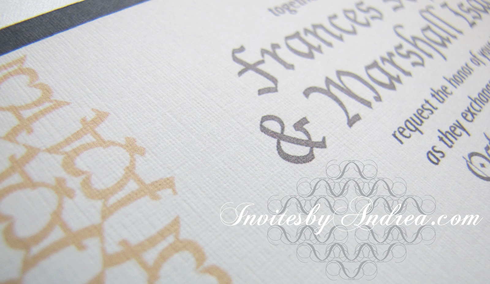
Today's Sunday Sample Spotlight has a very sophisticated neutral color scheme of ivory, dark gray, and pale gold.


"Paper Lanterns" - Invitation Duo (invite & reply card)

The "Himalaya" pocketfold envelope is a shimmering metallic ivory with an elegant linen texture that really makes a statement about the formality of the event. Because the envelope was so romantic, I decided to use a dark gray instead of traditional black, to further soften the mood. Finally, I printed the stationery on white cardstock and added pattern accents in a pretty pale gold color to complete the look.


If this pattern looks familiar to you, don't worry - it should. :) I featured Pattern Vivian in a previous Fancy/Funky Friday blog post, and I've used the same pattern (in a radically different color scheme) in another stationery sample ("At First Blush").

I love this pattern because it's both simple and complex. To create it, I took the capital "A" of an Olde English font and reflected the character to create an elaborate heart shape. It can be very bold and funky when it's shown in a bright color (like hot pink), but in this design it starts to blend into the background, thanks to its pale color. It looks more elegant and refined in this color scheme, and adds the perfect amount of visual interest to a clean, sophisticated invitation.


In the photograph above, you can finally start to get a sense of the shimmery quality of the metallic linen envelope. In certain light, it really comes alive. I just love how pretty it looks!


Next week's Sunday Sample Spotlight: A bold blue and rich chocolate brown color combo!


Click here to view all Sunday Sample Spotlight posts.

"Like" Invites by Andrea on Facebook!
Follow Invites by Andrea on Twitter!


-

Shameless Plug Time: Love this invitation (or others featured on this blog)? Want something similar (or something completely custom) designed for your event? Visit Invites by Andrea to view more samples, download a catalogue pdf, or fill out a design request form. Or shoot me an email to ask me your questions or learn more information.

Friday, July 13, 2012

Fancy/Funky Friday: Patterns Andrea & Gigi

Because my one-year wedding anniversary is in three days, this week's theme is reflecting on the projects I finished for my own wedding. Today's "fancy" pattern is (though not the first pattern I ever designed) certainly the one that planted the seed in my mind to create more patterns and use my designs to decorate the borders of wedding stationery.


First, the "fancy": Pattern Andrea


Pattern Andrea (named after myself not for narcissistic purposes but simply because it was the one I designed for my own wedding) was created from the curled line of the Baskerville italic ampersand character. Ampersands are some of my favorite characters to make patterns from, and I love how fitting they are to wedding themes. What could be more symbolic than an ampersand for an event celebrating the union of two people?

This pattern worked great for my wedding stationery because I used Baskerville italic in several places throughout the invitation; the text and pattern instantly connected to create a coheisive design. I also loved the slightly abstract heart-shaped forms that the pattern hinted at. I had our cake baker decorate each tier of our four-layer cake with a single strip of this pattern, and hand painted several watercolor placemats to incorporate the pattern into our reception table centerpieces. And of course, I used the pattern on all of our wedding stationery, from the thank you cards (I ordered so many that I'm still using them for non-wedding gifts!) and invitations to the table markers, escort cards, programs, and menus the guests picked up on the day of the event.


And now, the "funky": Pattern Gigi


Pattern Gigi (so named because of the prominent lowercase "g"s I used to create it) is a much bolder pattern. Because the lines are so thick, it works best as a large, graphic pattern. When it's small, the thick lines tend to bleed together, making it almost a solid color field instead of a fun, modern pattern.

Gigi has a fair bit of white negative space and the horizontal stripes of pattern create obvious divisions where the underlying structure is clear. These characteristics help calm it a little; Pattern Gigi is only projecting with the strong, clear voice of a public speaker - not screaming like a toddler. :)


-

Click here to see all posts related to "Fancy/Funky Friday" 


Shameless plug time: Love my patterns? I incorporate them into a lot of the artwork I create, from stationery for Invites by Andrea to the watercolors I paint. Check out Invites by Andrea's website to see examples of these patterns in use or drop me a line at andrea@invitesbyandrea.com to let me know what you think!

Sunday, June 24, 2012

Sunday Sample Spotlight: "Ink & Toner"

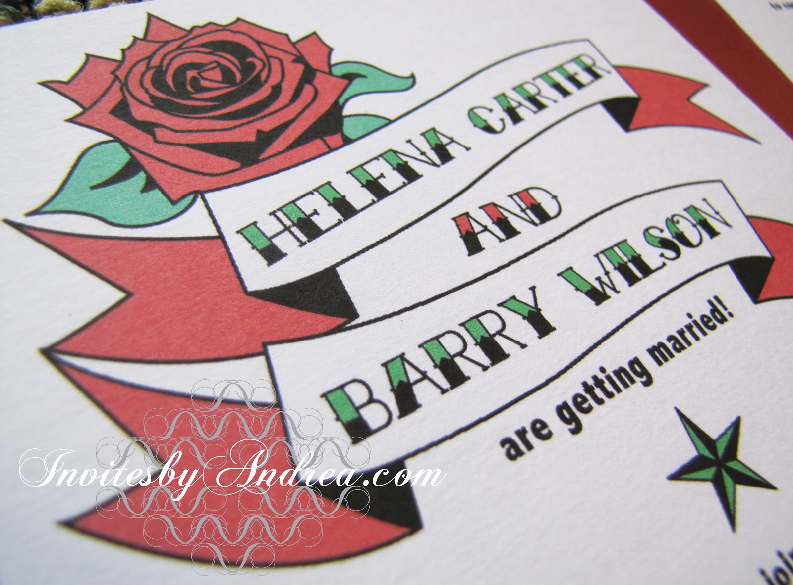
This invitation duo features an invitation and matching information insert tucked into a bright metallic red "Himalaya" pocketfold envelope - all in a fun tattoo theme!


I chose some of the most popular tattoo illustrations for this design to instantly get across the tattoo theme, and I kept things simple by limiting the colors to bright red, green, and black, printed on a solid white paper. The rose, star, winged heart, and banners were all created with the pen tool in Adobe Illustrator, and the bold graphic text was printed in a classic tattoo font.


Because of the popularity of wedding websites, many budget-conscious couples are including information on their invitation about how to reply online - and foregoing the need for reply cards, and self-addressed stamped reply envelopes altogether. For a casual tattoo-themed wedding with a potluck reception, including a card with the necessary information and a link to your wedding website is more than enough to let your guests know what to expect at your event. :)


Next week's Sunday Sample Spotlight: "Under the Sea"


Click here to view all Sunday Sample Spotlight posts.

"Like" Invites by Andrea on Facebook!
-

Shameless Plug Time: Love this invitation (or others featured on this blog)? Want something similar (or something completely custom) designed for your event? Visit Invites by Andrea to view more samples, download a catalogue pdf, or fill out a design request form. Or shoot me an email to ask me your questions or learn more information.