Showing posts with label bridal show. Show all posts

Tuesday, January 10, 2012

Brides-to-Be Show Recap

The Brides-to-Be show last weekend was a great success! I hung the sign I painted from the tablecloth and covered the table with three large albums full of sample stationery sets. I also brought one of the watercolor placemats I painted for my own wedding, my card box (which I used to collect contest entry forms), and a few loose samples to complete the table display. :)


Shameless plug time: Couldn't make it to the Brides-to-Be show but still want to see some samples of my work? Head on over to the Invites by Andrea website to check out some photographs of sample stationery sets. Didn't get a chance to sign up for exclusive Invites by Andrea discounts at the show? Send me an email with your email address and info, and I'll add you to the mailing list to receive notifications about special sales, AND enter you in a chance to win free custom designs for your invitations, reply cards, information inserts, thank-you notes and save-the-dates! :)

Tuesday, January 3, 2012

Invites by Andrea Watercolor Sign

Remember waaaay back in September when I announced I'd be a participating vendor in the upcoming Brides-to-Be show in January? Well, now it's January! :)

Just to remind you, here are the details: It's the biggest Michigan Brides-to-Be show every year, and it's at the Hyatt Regency in Dearborn, MI. I'll be there on both days - Saturday, January 7th and Sunday, January 8th, from 12 noon - 5 pm both days. Tickets are $7 in advance or $8 at the door. If you're planning a wedding, you should definitely be there - besides my own awesome booth, there will be hundreds of other vendors present, and hundreds of prizes you have a chance to win.

And if you want a sneak peak of what my table is going to feature, you're in luck! Besides two large albums literally bursting with sample invitations, reply cards, announcements, and other stationery items, I'll also be showcasing this sign that I painted for the event.


It was super fun to design and paint, and I think it's bright colors are going to be a great attention-grabber at the show. :) It also shows off what I can do with watercolor - how awesome would a banner like this be at a wedding, or any other event? Just picture the words saying "Happy Birthday" or "Congratulations, Bride & Groom" instead, and voila - instant event decor!

So how did I go about making this masterpiece? ;)

First, I designed the sign in Adobe Illustrator, importing many of my favorites out of the patterns I'd already created. I used clipping masks to cut the patterns down to the same tilted-rectangle shape, and the arranged them into the design you see above, placing my signature "Invites by Andrea" font nice and big on top. I had to make sure that the font was big enough for me to paint - the font can get pretty thin in certain flourishes, and my watercolor brushes only go so small!

Next, I printed the design out on several pieces of paper, taped them together, and transferred the design onto the watercolor paper. Usually I just tape the print out and a piece of watercolor paper to the window and use the sunlight as a vertical light table to trace the image, but this time I decided that the patterns and fonts were too small that tracing all of that vertically would be too difficult. Not to mention the fact that Michigan's sky had already become its traditional winter gray by the time I started on this sign, and the sunlight available was pretty abysmal.

So instead I colored the entire back of the print outs with graphite (pencil lead), and then placed the print out on top of the watercolor paper and traced over all of the patterns with a pen so that the graphite would transfer onto the watercolor paper.

The graphite-covered back (on the left) and pen-traced front (on the right) of the computer print outs of my design

Once the design was transferred onto the watercolor paper, I soaked it in a bathtub of cold water for fifteen minutes. Since the design for the sign was so long, I ended up having to use two long pieces of watercolor paper and attach them to each other later, once the sign was finished. Working on only one half of the sign at a time was the hardest part about creating this sign.


When the paper was fully saturated, I stapled it to my gatorboard. This "stretches" the watercolor paper, which means that the staples keep it taut and flat regardless of how many layers of water you add to it over the course of painting. If you don't stretch the watercolor paper, it gets all wrinkled when you paint it, and then you have to gently iron it out later to get it flat again.


While the paper is completely saturated and stretching on the gatorboard, I always like to put down the first wash right away. I try to keep the colors light and bright (yellows, reds, etc. rather than grays or muddy browns) and I swirl the colors around with my brush so that the painting will have a little bit of depth to it in the background. The photograph above was taken when the painting was still very wet, so the colors look darker than they ended up. Watercolor always dries lighter than it looks when it's wet (which is the opposite of acrylic paint, which dries darker than it looks when it's wet), so I always try to keep that into consideration when I paint.

On the left: working on each half of the sign simultaneously; On the right: two photos of what some rectangles looked like with masking fluid still on the patterns, protecting the lighter backgrounds

Once the first layer was dry (I gave it overnight to make sure it was really dry), it was time to start painting the individual rectangles. Sometimes I made the pattern darker than the background of the rectangle, and other times I made the pattern lighter. To preserve a lighter color for the pattern, I used masking fluid, which is pretty much the best thing ever invented for watercolor painting (besides watercolor paints, of course). ;)


In the photographs above, you can see what a difference it makes. I masked off the pattern with masking fluid (it appears yellow, on the photograph on the left), painted a couple of orangey-coppery layers on top of the masking, and then rubbed the fluid off so the light colored background was visible again (as seen on the right).


I kept doing layers of color in all of the patchwork-like rectangles in the background until I was satisfied with how the background looked. I tried to make some of the rectangles "imperfect" to prove that it was hand-painted rather than printed off a computer. It's easiest to tell in the red background squares and the blueish-red background behind the last letters of "Invites". On those rectangles, I left some watermarks to give it a more painterly feel. A watermark is created when there's not enough water for the whole painted area, and parts of the rectangle dried at a different rate than other parts.

Once I was satisfied with the background, I finally painted the letters on top. Veeeeerrrrry carefully, because if I messed up it would be very hard to fix. I saved the letters for last because I knew I wanted the letters to be dark, and if I'd painted them dark first and then painted rectangles that touched the letters, the new water I put down would fade some of that darkness away.


Finally, it was time to remove the two separate signs and merge them into the single sign they were intended to be. :) The great thing about gatorboard is that it's super easy to pull the staples out of it when you're all done with your painting. I pulled all the staples out, and then lined up the "seam" where the two parts of the sign met.

I wasn't entirely sure how to attach the signs together. The watercolor paper I used had a very rough texture (rougher than even the cold press paper I usually use), so it was hard to just glue the pieces together. I tried to sew them with clear fishing wire, but the paper was so thick that the needle made very unattractive holes. Ultimately, I used a few "Zots" - fabulous little sticky dots that are another wonderful crafting invention - to secure the paintings to each other. I was concerned that this wouldn't hold forever, though, and so I painted the seam on the back of the long banner with some white acrylic paint to help seal it a bit better. Finally, I put a couple of decorative brads in just the right spots to add a final security measure to keep the two halves of the painting together.


And since the brads looked so good and I had a few more extras from all of the samples I made for the upcoming Brides-to-Be show, I placed more scattered throughout the sign. I put each brad along a fake seam connecting the patchwork-like rectangles in the background. From a distance, they're not visible at all, but up close they add the perfect amount of three-dimensionality. They make the sign seem even more hand-made, which sets it apart from all of the other flat-printed signs that will be at the show.

So that's the sign I designed and painted! These photographs don't do it justice - so you should definitely come check out the Brides-to-Be show this weekend so you can see it in person! ;)

Shameless plug time: Love this sign? Want a sign painted for your event? Want to commission a watercolor painting? Shoot me an email with your thoughts and let me know! :)

Sunday, January 1, 2012

Sunday Sample Spotlight: "All the Right Moves"

Happy New Year! I hope your 2011 was fantastic, and that 2012 proves to be wonderful for you as well.

"All the Right Moves" - Invitation duo (invite & reply card)

I totally loved this scrapbook paper when I found it and knew I had to somehow incorporate it into a stationery design. The end result? "All the Right Moves," a tribute to multi-colored events that refuse to be pigeon-holed by the idea that the perfect party decorations only utilize a pair or trio of colors. There's nothing wrong with using a palette with a wide and fun variety - if you know how to do it right.

This color scheme works because there's still some structure to it. The polka dots are all tints or shades of colors, and there's nothing too saturated. The purples, greens, and pinks are either dark or light and none of the colors demands more attention than the others. Furthermore, there are a lot of neutrals sprinkled throughout the polka-dots, such as khaki tans and calm light browns.


Indeed, even though multi-colored large polka-dots often command all your attention, it is actually the dark gray background of the scrapbook paper or the metallic aqua lagoon colored Himalaya pocketfold envelope that are the most obvious colors in this design. The polka-dots really pop against the dark gray background, but are more subtle when placed on the white background used for the stationery designs, creating a nice balance.


The scrapbook paper has a fun worn look to it that adds to the vintage feel of the design, and I tried to keep that "scuffed" appearance in the polka dots on the white stationery, as well, to help tie the two parts of the design together. I chose the fun, vibrant aqua envelope because it was a similar color (though more saturated) to one of the polka-dots. By printing the text in aqua blues and dark grays, the font also reconnects to the colors of the envelope.

Isn't dark gray and cool aqua a great color combination for winter? I just love it!


Next weekend I'll be at the Brides-to-Be show at the Hyatt Regency in Dearborn, MI! I'll schedule a blog post ahead of time so you won't have to miss out on your Sunday Sample Spotlight, but if you come to the show you'll get a chance to see more than a hundred other samples in person! I have two large albums full of designs, plus a smaller third album. If you're in the market for some custom or catalogue stationery, you should definitely come by and check out my booth!

Here's the details:

Hyatt Regency
600 Town Center Drive
Dearborn, MI 48126

Saturday and Sunday, January 7 - 8
12 noon - 5 pm both days

Tickets are $7 in advance or $8 at the door. There will be hundreds of booths and hundreds of prizes brides have a chance to win, and I'll be giving away discounted wedding stationery! Hope to see you there!


Next week's Sunday Sample Spotlight: Winter themed!

Click here to view all Sunday Sample Spotlight posts.

"Like" Invites by Andrea on Facebook!

-

Shameless Plug Time: Love this invitation (or others featured on this blog)? Want something similar (or something completely custom) designed for your event? Visit Invites by Andrea to view more samples, download a catalogue pdf (coming soon!), or fill out a design request form. Or shoot me an email to ask me your questions or learn more information.

Sunday, November 13, 2011

Sunday Sample Spotlight: "Classic Vintage"

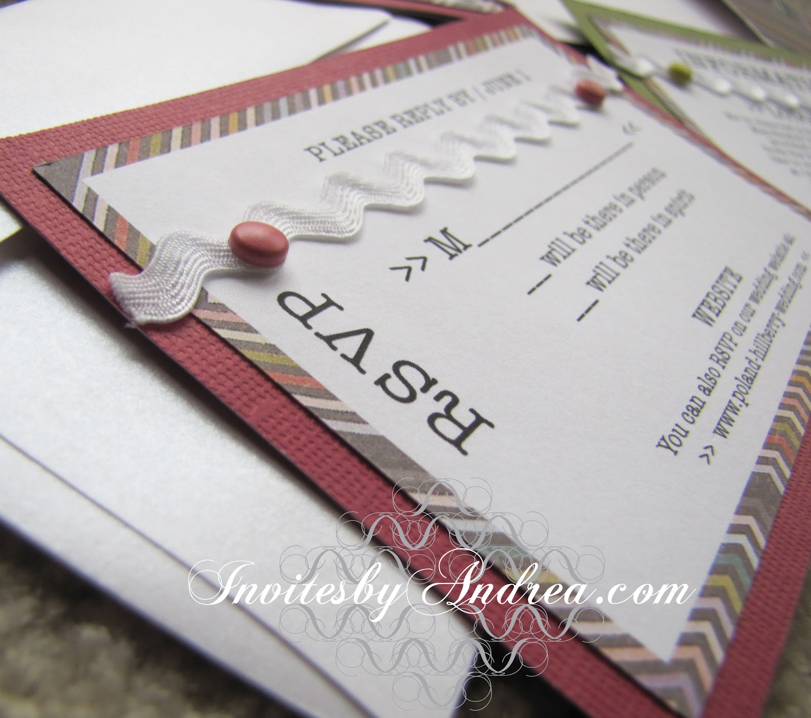
This is one of my favorites of the approximately 170 sample sets I designed and assembled in preparation for the upcoming Brides-to-Be show I'll be participating in (in just two short months!). I call it "Classic Vintage" because the colors and worn-out aesthetic of the zig-zag-patterned scrapbook paper I used are really unique and have a vintage quality about them. This invitation set would be perfect for a chic vintage-inspired wedding. They have a very "hand-made" feel because of all of the different layers and textures. I started with a Pearl White Metallic Cascade Pocketfold Envelope, and lined the left flap and right pocket with a piece of scrapbook paper I had. Then I scanned in the rest of the scrapbook paper so that I could use the same zig-zag pattern on the actual invitations.

"Classic Vintage" - Invitation Trio (invite, reply card & information insert), plus save-the-date

I found a couple of different colored textured cardstock pages that matched two of the colors in the scrapbook paper and used those for the backgrounds of each stationery item. The dark olive and cheery raspberry colors are unique and fun, but also sophisticated. The brightness of the other colors in the scrapbook paper would help this design work for spring or summer as well, but I think the olive and raspberry feel particularly autumnal, like late summer berries. I used the most similarly colored decorative brads I could find, and I love that they're not quite right. The different shades give it a more casual and vintage feel again. The green brads are so yellow that they pick up the thin yellow stripes in the scrapbook paper, as well.


And then, because the smooth textured of the flat 67# cardstock I printed the invitations on, the implied textured of the scrapbook paper, and the texture of the olive and raspberry cardstock weren't quite enough, I added a ric rac ribbon in pure white to match the background of the stationery. The best part? I found it in the $1 bargain bin at Michael's. :)


Every piece, from the information insert to the reply card have the decorative brads and ribbons. Though this would probably cause the price of mailing to increase, I think it's worth it. The ribbon adds texture to what would otherwise be a rather plain design and ties the stationery to the texture found in the background and on the Cascade envelope.


Since there is so much going on with the different textures, papers, and add-ons, I kept the actual printed stationery pretty simple, and used only black ink and one font for the text (though I did play with uppercase vs. lowercase letters to differentiate the more important information). I used a type-writer inspired font for each stationery item to again play up the vintage feel, but I incorporated >> brackets << as decorative elements to help the stationery feel more modern. They instantly remind you of the digital age, while still looking crisp and clean. Plus, they once again tie back to the other papers and textures used in the stationery, since the brackets look like the tiny v's of parts of the zig-zag pattern!


It took a lot of time and resources just to create this one sample, so making enough for all of the guests to a wedding (or other event) would undoubtedly be time-consuming and expensive. But it's such a unique look that for some people it may be worth the extra time and cost. The save-the-dates and invitations you send out to your guests is the first impression of your event your guests will get. It sets the mood and gets them excited for the upcoming nuptials, and this stationery set definitely delivers. If I received this package in the mail, I'd be expecting a beautiful (but unique) event, with a very tactile feel - maybe some highly textured tablecloths and cloth napkins, with some gorgeous raspberry and olive floral centerpieces.

Next week's Sunday Sample Spotlight: a simple patterned design with a cheerful color scheme!

Click here to view all Sunday Sample Spotlight posts.

"Like" Invites by Andrea on Facebook!

-

Shameless Plug Time: Love this invitation (or others featured on this blog)? Want something similar (or something completely custom) designed for your event? Visit Invites by Andrea to view more samples, download a catalogue pdf (coming soon!), or fill out a design request form. Or shoot me an email to ask me your questions or learn more information.

Monday, October 17, 2011

New Weekly Themed Posts

I've been hard at work creating lots of samples for the upcoming Brides-to-Be show (and because, let's face it, my website needs some upgrading), and I've finally decided on the best way to share them on this blog.

Every Sunday (starting next week) I plan to feature one of my new samples on here with several photographs, as well as descriptions of the idea and/or creation process. That way, you'll be able to select the "Sunday Sample Spotlight" tag to look at only the posts that feature in-depth looks at some of my favorite invitation samples. Of course, you'll always be able to browse all of the samples on invitesbyandrea.com (that is, once I update the website sometime in the next couple of weeks), but not in the same in-depth way that these new blog posts will show - otherwise it would take my website ages to load all of the thousands of images!

Furthermore, I have a lot of patterns that I've designed in Illustrator that I also want to feature two of these patterns every Friday - one that's more "fancy" and one that's more "funky". To view all of the posts that show off my patterns, you'll be able to select the "Fancy/Funky Friday" tag. I just love creating fun designs with various fonts, and I have more than a hundred of these patterns created already, with more made each month.

Even though it's not Friday, how about a sneak peak, just to give you some idea of my process? ;)

First, I find a cool looking font and select one or more characters from the font. Here's an "x" and a "v".
Then I decide how to connect the characters so that they form an interesting design.
Then I start reflecting or rotating the "mini-unit" I've made to form larger "units".
I get to a point where I'm really happy with the larger "unit" and group all of the characters together to make replicating the unit easier.
I decide how I want to connect the units to each other to create a larger pattern.
And I duplicate the unit until I have a large block of the pattern. :) Finally, I give it a name. Meet "Pattern Verity."
I can tell what you're thinking - sure, they're fun to create, but how are they actually useful? First of all, as you may have guessed, I've used several of these patterns in various invitation and stationery designs, many of which you'll see in my "Sunday Sample Spotlight" posts.

But I also like to incorporate my patterns into my watercolor paintings. Since I've created them all, I can use them in my own artwork without worrying about breaking any copyright laws. It's also easy to make several different patterns with the same font family, meaning I can include several different patterns in a watercolor that all have a similar feel, but are a little different. Plus, the variety in the patterns I've already made far exceeds any stock pattern images I could find online for such purposes, and since they're all vector drawings in Illustrator, I can blow the pattern up to as large (or small) as I need to trace on my watercolor paper without things getting too muddled by pixelation problems. Really, these patterns have been super helpful to me in painting some pretty successful watercolors (in my honest and usually harsh opinion).

"Melange Modele" (Watercolor, May 2011, 22" x 30")
"Melange Modele" - Close-up
So, get excited for a guaranteed two posts per week - one "Sunday Sample Spotlight," and one "Fancy Friday" pattern post. I'll also still update this blog with any recent current projects and any design or event planning ideas I want to share. In summary, get ready for a lot more posts! :)

Sunday, October 9, 2011

"Santorini" Watercolor

I don't usually post things outside of the realm of projects I do for Invites by Andrea, but today I thought I'd post about a recent watercolor painting I finished. Since I graduated from Eastern with a double major in Graphic Design and Watercolor, I haven't done nearly as many watercolors as I used to - apparently there was something about having a deadline and being graded on my paintings that motivated me to actually do them - but I've still made sure I painted at least a few.

One of my goals for 2011 was to paint eight watercolors (which, considering I cranked out one every two weeks my senior year at EMU when I was getting ready for my senior thesis, shouldn't have been too difficult to accomplish). So far I've painted only four, and with everything else I have going on getting ready for the Brides-to-Be show in January 2012, I just don't know if I'll be able to get four more paintings done. Especially considering I'm not even that happy with the one I just completed.

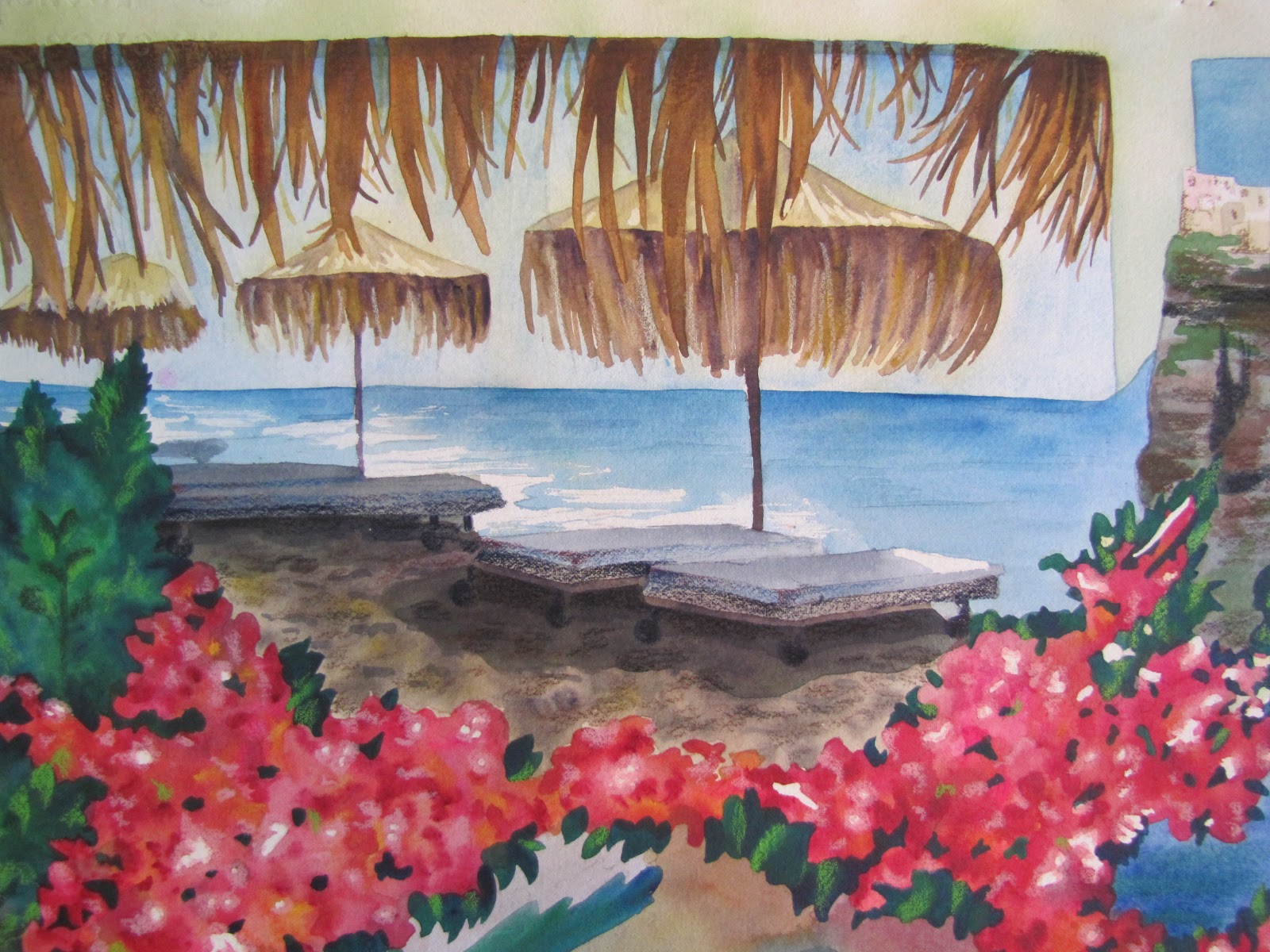
"Santorini" by Andrea Arbit - 22" x 30" Watercolor and Colored Pencil, 9-10/2011

 It was a massive undertaking. I absolutely love taking photographs of landscapes and scenery on vacation (or just every day), and I always want to turn those photographs into watercolors. But it's so hard! I never get the water to look like water or the trees to look like trees... This particularly painting I've been working on now and then for the last couple of months was based on a collage of five different photographs I took while on my honeymoon on the Greek island of Santorini. I figured if I tried to do five photographs at once I wouldn't overwork any one photograph (like I usually do), and it would be one of the best "landscapes" I've ever done. (And maybe it is - though I guess that says something about my earlier landscapes...)

Of course, instead I just ended up overworking *every* photograph and it came out looking like a muddled mess. It actually doesn't look half-bad from a distance, but up-close I think it really falls apart.

Close-up of the upper right corner of the painting (Santorini Cliffs)
Close-up of the upper left corner of the painting (Black Sand Beach)

I tried to bring some lights back into it with colored pencil and help define (fix) some of the edges that needed help, and that made it a little better. I'm just so out of practice since I don't paint as often as I did two years ago anymore.

Close-up of the colored pencil additions to the upper right corner of the painting (the town of Oia in the distance)
Close-up of the bottom right corner of the painting (a church and sunset in Oia)

I guess the individual "quadrants" of the painting aren't too bad with the added colored pencil. It's mainly the flowers that I'm most disappointed in - especially considering I have more experience painting flowers than anything else I painted in this piece! They just look like a solid blob of pink and it's just not working for me. It's really too bad, because I think if this painting had turned out terrific it would have inspired me to paint more and meet my eight-paintings-in-2011 goal. And now, I just don't feel like it's worth it to push myself to put in that extra time if I'm not going to be satisfied with the end product anyway.

It's okay - I really do have enough on my plate right now without trying to finish an arbitrary painting goal I put on myself. I still want to try to get two or three more paintings done this year (probably smaller ones), but my focus is definitely going to be on Invites by Andrea instead.

I still have a lot to do to get ready for the Brides-to-Be show! Expect an update soon with some pictures of some of the samples I've been working on, once I finish some more and photograph my whole new collection. :)


Shameless plug time: I know, I just spent this whole post acting self-deprecating about my watercolors, but if you love this painting, let me know! Email me at andrea@invitesbyandrea.com if you're interested in learning more about my watercolors, would like to see some more examples, or would like to purchase one. I can also do commissions! Love a photograph you've taken on vacation? I can copy it for you in watercolor, colored pencil, or a mixed of both!

Please do not steal my images. I am not watermarking them because I want to trust the people who visit my blog, and I can only continue to not watermark them if you don't commandeer the pictures I post for your own uses. I spent a lot of time and energy on this painting (and all the other paintings and projects I display on this blog), and I want credit for my work. Thanks!

Thursday, September 22, 2011

Brides-to-Be Show

It's official - Invites by Andrea will be represented at the biggest Michigan Brides-to-Be show this winter at the Hyatt Regency in Dearborn, MI! The show will be Saturday and Sunday, January 7 - 8, 2012, from 12 noon - 5 pm both days. Tickets are $7 in advance or $8 at the door. There will be hundreds of booths and hundreds of prizes brides have a chance to win. I'll be giving away discounted wedding stationery, and giving exclusive discounts to every bride who signs up at my table to receive emails from Invites by Andrea. I went to the very same show when I was engaged and starting to plan my wedding, and it was a lot of fun. I'm excited to see it from the other perspective - the perspective of a vendor!

I have a lot to do to prepare for the show, so I'll be very busy in the next few months designing more samples and getting brochures printed for the event. You can also expect a redesign of the samples section of my website in the next few months as I prepare new designs for the show, so even if you can't make it out to the show, make sure you check out my updated website by the end of 2011. :)

Shameless plug time: Don't know about Invites by Andrea? I create custom invitations and other stationery for any event, including weddings, bar/bat mitzvahs, birthdays, showers, theme parties, office events, holiday parties and more! Check out my website or email me at andrea@invitesbyandrea.com for more information!