Showing posts with label winter. Show all posts

Sunday, September 15, 2013

Sunday Sample Spotlight: "Steel Magnolias"

This simple stationery design features a neutral silver and white color scheme (perfect for winter!), a thick, modern serif font and a cute (but subtle) graphic flower-inspired pattern.

"Steel Magnolias" Invitation Duo (invite & info insert)

The invitation was printed on white paper and mounted to the folding silver metallic envelope with small silver brads in each corner.


You can really see how the dark silver envelope catches the light depending on the angle! Metallic envelopes are a great way to add elegance to your stationery.


Click here to view all Sunday Sample Spotlight posts.

"Like" Invites by Andrea on Facebook!
Follow Invites by Andrea on Twitter!


-

Shameless Plug Time: Love this invitation (or others featured on this blog)? Want something similar (or something completely custom) designed for your event? Visit Invites by Andrea to view more samples, download a catalogue pdf, or fill out a design request form. Or shoot me an email to ask me your questions or learn more information.

Wednesday, September 4, 2013

Flowerless Bouquets 10 - Nature

Today's wedding bouquets and centerpieces aren't limited to fragrant blooms. This week, I have two final flower alternatives to show you!

Option 10: Nature Bouquets


Nature has other options to offer besides flowers and the other flower alternatives we've already looked at (feathers, seashells, and fresh produce)!

In spring, use grasses and leafy ferns. In fall, celebrate harvest season with autumn leaves and stalks of wheat and other grains. And in winter, add pinecones and cotton to your bouquet for earthy colors and variety in texture!

In the top left picture, autumn leaves have been shaped into flowers. On the bottom right (second row up from the bottom), pinecones have been spray-painted teal to match a color scheme and dusted with glitter to mimic freshly fallen snow. Pair natural elements with fresh flowers (I love the sunflowers with cotton and grain second in from the left on the bottom row!) or let them stand alone, simple and unadorned (except for a ribbon to tie the bouquet together).

I hope you enjoyed this exploration into flower alternatives as much as I enjoyed scouring the internet for ideas and photos! It's amazing how many creative ideas are out there. I encourage you to explore yourself, or come up with something completely new! Your unique decor ideas may become inspiration for someone else planning their own event... :)

-

Shameless plug time: Need invitations as beautiful as your decor? Check out InvitesbyAndea.com and let me design stationery for your event!

Monday, September 2, 2013

Color of the Week - Charcoal

This week's color is Charcoal - a dark gray neutral with blue undertones!

Charcoal works with almost any color, but I particularly like it with colors that are just "off" of highly saturated hues, like the grayish-blue Denim, and the brownish-yellow Dijon Mustard.


Fun facts about Charcoal:

1. The first recorded use of charcoal as a color name in English was in 1606.

2. It gets its name from the dark gray color of the carbon and ash remaining after wood is burned.

3. Artists have used charcoal for centuries. Check out your local art supply store to see a wide range of compressed charcoal sticks (charcoal powder mixed with gum binder) and charcoal pencils.

 -

Follow Invites by Andrea on Twitter!

"Like" Invites by Andrea on Facebook!


Shameless Plug Time: Love this color? Looking for custom stationery made to match this color (or whatever other color combinations you're using for your event)? Visit Invites by Andrea to view more samples, download a catalogue pdf, or fill out a design request form. Or shoot me an email to ask me your questions or learn more information.

Sunday, August 18, 2013

Sunday Sample Spotlight: "Garden Pixel"

This invitation combines retro 80's video-game style graphics with feminine touches and bright, cheery colors!

"Garden Pixel" Invitation

The idea for this invitation came from an idea I had for a fun winter party. Beat the cold winter blues with an indoor garden party! Celebrate the season's dismal bloom options with creativity! Make flower bouquets out of paper or fabric, or arrange pictures of flowers into 2D bouquets.


This invitation features 8-bit flower images printed on white paper and mounted on textured orange cardstock. Then, I paired the bright orange with a neon pink envelope to really scream for attention!


Next week's Sunday Sample Spotlight: "Silly Love Songs"


Click here to view all Sunday Sample Spotlight posts.

"Like" Invites by Andrea on Facebook!
Follow Invites by Andrea on Twitter!


-

Shameless Plug Time: Love this invitation (or others featured on this blog)? Want something similar (or something completely custom) designed for your event? Visit Invites by Andrea to view more samples, download a catalogue pdf, or fill out a design request form. Or shoot me an email to ask me your questions or learn more information.

Tuesday, August 13, 2013

Flowerless Bouquets 3 - Feathers

Today's wedding bouquets and centerpieces aren't limited to fragrant blooms. For the next five weeks, I'll be showing you my favorite flower alternatives, from new DIY creations to bouquets rich in history (and heirloom antiques!), from transient arrangements that look beautiful at your event to permanent keepsakes that'll look beautiful for generations to come.

Option 3: Feather Bouquets


Feather is a great way to add texture to other styles of bouquets - including fabric and paper flowers, as well as real blooms - but you can also create an entirely feather bouquet to really indulge the senses. Feather bouquets are great for winter, when real blooms are harder (and more expensive) to come by, and look amazing with single-color or neutral color schemes (like an all-white winter wedding, or a vintage ivory/light rose pink wedding).

Use real feathers (or feathers that mimic those that occur in nature) for a realistic look (think bright peacock feathers, earthy brown ostrich feathers, or the white softness of goose down), or have fun with bright, unnatural feathers like hot pink and neon green!

-

Shameless plug time: Need invitations as beautiful as your decor? Check out InvitesbyAndea.com and let me design stationery for your event!

Sunday, July 28, 2013

Sunday Sample Spotlight: "Under Formal Circumstances"

This stationery set is soft and romantic, with its pale pink, gray, and ivory color scheme!


"Under Formal Circumstances" Invitation Duo (invite & reply card)

The pattern is elegant, with its calligraphic lines and curves, but it's printed at such a large scale that it takes on a bold, modern feel. The invitation and reply card are each printed on ivory paper and mounted on smooth pink cardstock.


This color scheme would be particularly beautiful in winter! 


Next week's Sunday Sample Spotlight: "Basket Case"


Click here to view all Sunday Sample Spotlight posts.

"Like" Invites by Andrea on Facebook!
Follow Invites by Andrea on Twitter!


-

Shameless Plug Time: Love this invitation (or others featured on this blog)? Want something similar (or something completely custom) designed for your event? Visit Invites by Andrea to view more samples, download a catalogue pdf, or fill out a design request form. Or shoot me an email to ask me your questions or learn more information.

Monday, July 22, 2013

Color of the Week - Teal

This week's color is Teal - a dark greenish-blue hue!

Teal is a beautiful, rich color that's perfect for anchoring light, bright, spring-and-summer candy-colored hues like watermelon pink, apple green, and turquoise. Alternatively, pair it with a neutral like snow white, icy silver, or jet black to create a sophisticated cool color scheme for winter events.


Fun facts about Teal:

1. The first recorded use of teal as a color name was in 1917. The name came from a type of duck native to Eurasia - the "Common Teal" - which has the distinguishing feature of dark blueish-green feathers around its eyes.

2. The post-2004 redesigned version of the U.S. $100 bill features teal as its primary background color.

3. The basketball team the Detroit Pistons used teal as one of their primary colors from 1996 to 2001.

 -

Follow Invites by Andrea on Twitter!

"Like" Invites by Andrea on Facebook!


Shameless Plug Time: Love this color? Looking for custom stationery made to match this color (or whatever other color combinations you're using for your event)? Visit Invites by Andrea to view more samples, download a catalogue pdf, or fill out a design request form. Or shoot me an email to ask me your questions or learn more information.

Sunday, July 21, 2013

Sunday Sample Spotlight: "Where the Story Ends"

Metallic copper is a great neutral for almost any event - pair it with snow white and cream to let the copper really shine as the star!

"Where the Story Ends" Invitation Duo (invite & reply card)

This stationery set uses a horizontal pocketfold envelope in metallic copper. The invitation is attached to the main part of the envelope with a series of small metallic copper brads and cream striped ribbon for added texture; the reply card and reply envelope are easily tucked into the side pocket for mailing.


The invitation and reply card are both printed on smooth white cardstock. The smooth texture of the paper really helps the metallic shine of the envelope and the subtle texture of the ribbon stand out and take center stage!


Next week's Sunday Sample Spotlight: "Under Formal Circumstances"


Click here to view all Sunday Sample Spotlight posts.

"Like" Invites by Andrea on Facebook!
Follow Invites by Andrea on Twitter!


-

Shameless Plug Time: Love this invitation (or others featured on this blog)? Want something similar (or something completely custom) designed for your event? Visit Invites by Andrea to view more samples, download a catalogue pdf, or fill out a design request form. Or shoot me an email to ask me your questions or learn more information.

Wednesday, July 10, 2013

Summer Color Combo - Emerald & Navy

Rich and dark, emerald and navy is a great color scheme for fall and winter, as well. For summer events, keep things bright by using more emerald than navy and focusing on fun pops of color!


I love the peacock feather design painted on the sides of the green shoes on the left photograph in the middle row! And the tropical scarf in the middle of the bottom row is a great example of how to keep this dark color scheme sunny and cheerful with just a few hints of lime green and orange.

-

Follow Invites by Andrea on Twitter!
"Like" Invites by Andrea on Facebook!

Monday, July 8, 2013

Color of the Week - Sky Blue

This week's color is Sky Blue - a pastel shade of blue that's calming, cool, and refreshing!

Pair it with another pastel or a light neutral (like silver or ivory) for a chilly color scheme beautiful for winter and spring, or add a pop of bright color for summertime!


Fun facts about Sky Blue:

1. The name "sky blue" has been used since at least 1728 to refer to the pale blue of the sky.

2. Many current professional sports teams use the color, including the Uruguay national football (soccer) team, whose team nickname is La Celeste (The Sky Blue One).

3. In contemporary culture, pale blue colors like sky blue are often associated with baby boys (though prior to the 1940s, baby boys were actually associated with pale pink, while baby girls were associated with pale blue).
 
 -

Follow Invites by Andrea on Twitter!

"Like" Invites by Andrea on Facebook!


Shameless Plug Time: Love this color? Looking for custom stationery made to match this color (or whatever other color combinations you're using for your event)? Visit Invites by Andrea to view more samples, download a catalogue pdf, or fill out a design request form. Or shoot me an email to ask me your questions or learn more information.

Monday, June 10, 2013

Color of the Week - Coral

This week's color is Coral - a pink-orange shade that's beautiful almost any time of year!

Pair it with pastels, silver, or ivory for winter and springtime, bright jewel tones for summer
, and rich neutrals like brown or gold for autumn!


Fun facts about Coral:

1.
Though coral reefs naturally occur in many colors (including blues, purples, greens, and yellows), the color coral only refers to the Corallium rubrum and similar species which share a pink or red exoskeleton.

2. Owing to its intense and permanent coloration and glossiness, red coral (also known as "precious coral") has been used since antiquity for jewelry making. Coral jewelry has been found in ancient Egyptian tombs, and was especially popular during the Victorian age.

3.
The ancient Romans believed red coral could protect children from harm, as well as cure wounds made by snakes and scorpions.

-


Follow Invites by Andrea on Twitter!

"Like" Invites by Andrea on Facebook!


Shameless Plug Time: Love this color? Looking for custom stationery made to match this color (or whatever other color combinations you're using for your event)? Visit Invites by Andrea to view more samples, download a catalogue pdf, or fill out a design request form. Or shoot me an email to ask me your questions or learn more information.

Monday, April 8, 2013

Color of the week - Powder Blue

This week's color is Powder Blue - a light blue-gray perfect for winter, spring, and summer!

Paired with a bright hue (like blood orange - see this color board from last month!), powder blue can almost act as a neutral - or juxtapose it against neutrals (like seashell or slate gray) to let it shine as the star!


Fun facts about Powder Blue: 

1. The name powder blue was first used in the 1700s and can also refer to smalt, a dark cobalt-blue crushed-glass product used in dyeing.

2. Powder Blue is also the name of a 2009 drama film starring Jessica Biel, Forest Whitaker, and Patrick Swayze (in his last film role).

3. In Western culture, powder blue (and other light tints of blue) are often associated with baby boys (particularly in clothing, linens, and nursery decoration), while pale pinks are paired with baby girls - but before the 1940s, this convention was exactly the opposite.

-

Follow Invites by Andrea on Twitter!
"Like" Invites by Andrea on Facebook!

Shameless Plug Time: Love this color? Looking for custom stationery made to match this color (or whatever other color combinations you're using for your event)? Visit Invites by Andrea to view more samples, download a catalogue pdf, or fill out a design request form. Or shoot me an email to ask me your questions or learn more information.

Monday, April 1, 2013

Color of the Week: Mauve

I'm starting a new weekly post - every Monday I'll choose a "color of the week" and give you a sample of colors that pair well with it!

This week's color is Mauve - a light pastel purple with gray undertones!

Because of it's light tint, mauve works well with darker colors and more saturated hues. It's a great color for spring!

Fun facts about Mauve: 
 
1. It's named after the French word for the mallow flower (latin: malva), a species of plant widespread throughout the Mediterranean and the Middle East, and one of the earliest cited in recorded literature. 

2. After eighteen-year-old chemist William Henry Perkins discovered the first aniline dye ("mauveine") in 1856, the fashion industry latched onto the color. By 1890, mauve was so pervasive in fashion that the 1890s were called The Mauve Decade by author Thomas Beer.

3.  Mauve is a commonly used color in stage lighting to represent sunsets.

-

Follow Invites by Andrea on Twitter!
"Like" Invites by Andrea on Facebook!

Shameless Plug Time: Love this color? Looking for custom stationery made to match this color (or whatever other color combinations you're using for your event)? Visit Invites by Andrea to view more samples, download a catalogue pdf, or fill out a design request form. Or shoot me an email to ask me your questions or learn more information.

Sunday, March 24, 2013

Sunday Sample Spotlight: "King's Cross"

Today's stationery set is all about subtle beauty.

"King's Cross" Invitation Duo (invite & reply card) with matching Save-the-Date

When a guest receives this invitation, they first see a closed white petal envelope...


...And when they open it, they see the invitation and reply card, safely nestled inside.


The reply card stands alone - an elegant and timeless design printed on white cardstock. The text is calligraphic and all in traditional black, and a thinly-lined lace-like gold pattern fades in and out of the otherwise white background to add a hint of dimension.

But for the invitation and save-the-date, another layer was also added.


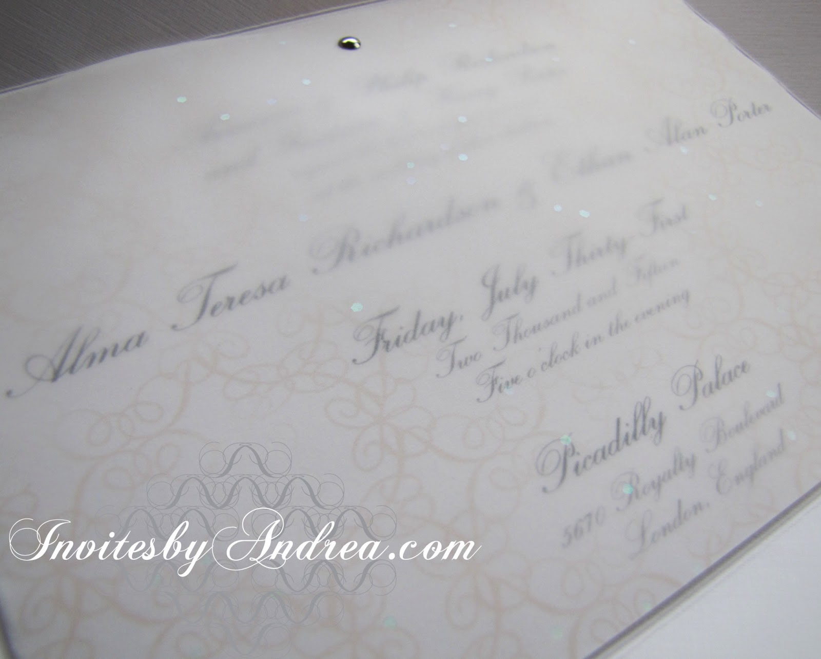
A thin sheet of sparkly white vellum was overlaid on top of the invitation and save-the-date, held in place just at the top with three small silver brads. The text is mostly readable through the vellum, and it's easy enough to lift that top layer to see the words even better - and all the details in the pattern.


The vellum's sparkles were a little difficult to capture with the camera, since they were so transient in the light, but you can get some idea of the iridescent specks sprinkled throughout the vellum with the above image, as well as the image below, showing the vellum laid on top of the save-the-date.


All white, with a hint of black and gold, is a classically elegant color scheme that will never go out of style. It's perfect for formal events like weddings because it harkens back to a fairy tale time gone by.


Next week's Sunday Sample Spotlight: The perfect birth announcement stationery for a baby girl


Click here to view all Sunday Sample Spotlight posts.

"Like" Invites by Andrea on Facebook!
Follow Invites by Andrea on Twitter!


-

Shameless Plug Time: Love this invitation (or others featured on this blog)? Want something similar (or something completely custom) designed for your event? Visit Invites by Andrea to view more samples, download a catalogue pdf, or fill out a design request form. Or shoot me an email to ask me your questions or learn more information.

Sunday, March 17, 2013

Sunday Sample Spotlight: "Timeless Treasure"

Previously, I've shown a pink and gray stationery set that featured Lacey - the first pattern I ever designed in Illustrator. Today's stationery sample uses the same pattern - but in some new, interesting ways!


"Timeless Treasure" Invitation Design

Printed on cream linen paper and mounted on a textured gray cardstock, this stationery set boasts a lavender and gray color scheme that's subtly beautiful and perfect for almost any occasion, from weddings to anniversary celebrations.

This particular invitation is for an anniversary dinner, and the theme is - fittingly - the passage of time.


I used a strip of Pattern Lacey along the top and bottom of the design, and then repeated a smaller scale version of the pattern right next to it in a lighter shade to add the illusion of depth. The pattern is also found in the actual illustration of the clock, where I wrapped the pattern around into a circle and put patterned spacers between each of the Roman numerals on the clock face.


Next week's Sunday Sample Spotlight: An all-white color scheme that is sophisticated and ethereal...


Click here to view all Sunday Sample Spotlight posts.

"Like" Invites by Andrea on Facebook!
Follow Invites by Andrea on Twitter!


-

Shameless Plug Time: Love this invitation (or others featured on this blog)? Want something similar (or something completely custom) designed for your event? Visit Invites by Andrea to view more samples, download a catalogue pdf, or fill out a design request form. Or shoot me an email to ask me your questions or learn more information.

Wednesday, March 13, 2013

Spring Color Combo: Blood Orange & Misty Blue

If you're at all like me, you find blood oranges a little creepy - but even I can't deny how beautiful and rich the color is. Pair it with a pale misty blue for a unique color scheme with a perfect balance between hot and cold colors that works great in the winter and spring.


This shade of blue is pale with hints of silver-gray, while the orange is so red it's - well, practically red. Still, they both retain their core orange and blue so obviously that it's not hard to understand why they seem to work so effortlessly together (orange and blue are color wheel complements).

Impress your guests with a dazzling paper crane display (see the middle picture of this inspiration board's bottom row), add unexpected bursts of dark orange blooms in the middle of a pale blue-and-white bouquet, and serve orange-flavored cupcakes and blood-orange garnished cocktails.

This color scheme is also a great choice for beachfront weddings - just look at how adorable the cake is on the far-right of the top row! Use blood orange to color fish accents in a misty blue ocean.

-

Follow Invites by Andrea on Twitter!
"Like" Invites by Andrea on Facebook!

Shameless Plug Time: Love this color combination? Looking for custom stationery made to match these colors (or whatever other color combinations you're using for your event)? Visit Invites by Andrea to view more samples, download a catalogue pdf, or fill out a design request form. Or shoot me an email to ask me your questions or learn more information.

Tuesday, March 5, 2013

Spring Color Combo: Citron Green & Slate Gray

Slate gray is a great neutral - rich, cool, sophisticated, and a bit mysterious, it contains a dark greenish-blue undertone. Pair it with a bright spring color like citron green for the perfect spring color scheme!


There are some truly beautiful green-gray fabrics out there - be daring and wear a full, textured green-gray wedding dress (like the far-right photo in the middle row of the above inspiration board); then brighten your look with a light green bouquet and bright silver jewelry.

Use lots of different types of green flowers in your bouquets and centerpiece decor, to add texture and play up the abundant feeling of new springtime growth. Add even more texture (and keep warm on a cool spring day!) with some strategic chunky knits (like a citron green scarf or slate gray hat).

-

Follow Invites by Andrea on Twitter!
"Like" Invites by Andrea on Facebook!

Shameless Plug Time: Love this color combination? Looking for custom stationery made to match these colors (or whatever other color combinations you're using for your event)? Visit Invites by Andrea to view more samples, download a catalogue pdf, or fill out a design request form. Or shoot me an email to ask me your questions or learn more information.

Wednesday, February 27, 2013

Spring Color Combo: Poppy Red & Linen

Pantone has included both "poppy red" and "linen" in its list of spring colors for 2013 - and its certainly true that it's easy to find both of these colors on the fashion runways! Incorporate this classic color scheme into almost any spring event (weddings, Valentine's Day - even Easter, if you're open to changing out traditional white lily decor for some brilliant red poppies)!


Poppies are easy flowers to fake with crepe paper or fabric, making it a breeze to decorate (under budget!) for any occasion. Play up texture within the neutral beige color to add dimension - string a paper or fabric banner of triangle flags, and use a linen tablecloth with visible threads.

This color scheme would also be beautiful in the fall, or even for winter holidays like Thanksgiving or Christmas!

-

Follow Invites by Andrea on Twitter!
"Like" Invites by Andrea on Facebook!

Shameless Plug Time: Love this color combination? Looking for custom stationery made to match these colors (or whatever other color combinations you're using for your event)? Visit Invites by Andrea to view more samples, download a catalogue pdf, or fill out a design request form. Or shoot me an email to ask me your questions or learn more information.

Friday, February 22, 2013

Fancy/Funky Friday: Patterns Gloria & Alaska

Other than the warm colors they share, today's fancy and funky patterns couldn't be more different!

First, the "fancy": Pattern Gloria


Why it's "fancy": Loopy curves interact with each other to create a lace or crochet-like quality, especially when viewed at a distance.

Why it's great: This design reminds me of a pattern for a warm winter sweater or blanket - so cozy!


And now, the "funky": Pattern Alaska


 Why it's "funky": Straight lines and even spacing between lines give it a very ordered appearance; the emphasis on line length and simple repetition remind me of the patterns, paintings, carvings, and totem poles of native cultures.

Why it's great: From a distance, the negative white stripes between the rows of patterns and the white triangles left behind by the X shapes become the most prominent areas of the design - everything else almost fades into a solid block of red color.

-

Click here to see all posts related to "Fancy/Funky Friday" 


Shameless plug time: Love my patterns? I incorporate them into a lot of the artwork I create, from stationery for Invites by Andrea to the watercolors I paint. Check out Invites by Andrea's website to see examples of these patterns in use or drop me a line at andrea@invitesbyandrea.com to let me know what you think!

Sunday, February 3, 2013

Sunday Sample Spotlight: "Heart of Steel"

Pink and gray is a classic color combo that works almost any time of the year - but especially in the winter and spring, or for Valentine's Day!

"Heart of Steel" Invitation Duo (invite & reply card)

For this stationery design, I kept the design crisp and clean with a pure white background, a simple, smooth pink petal envelope (no metallic shine, scrapbook paper embellishment, or texture here!), and a touch of gray in a textured cardstock border.


If the pattern looks familiar, it may because I talked about it in great length in a Fancy/Funky Friday post from more than a year ago. This is the first pattern I ever created - I initially used it to accent my personal business card and resume back in 2009, but I've used it on many different projects since then. :)


I love how simple the pattern is - it acts as a great blank palette you can add almost anything to. It can be "dressed up" with elegant, cursive fonts, and embellishments like vellum and other layers of fancy paper, or it can be "dressed down" with sans-serif Helvetica. It's even easy to change the colors around - as you can see in this stationery set, I alternated pink and gray within the pattern, but it works just as well if all parts of the pattern are the same color.


Next week's Sunday Sample Spotlight: Fun with paint splatter!


Click here to view all Sunday Sample Spotlight posts.

"Like" Invites by Andrea on Facebook!
Follow Invites by Andrea on Twitter!


-

Shameless Plug Time: Love this invitation (or others featured on this blog)? Want something similar (or something completely custom) designed for your event? Visit Invites by Andrea to view more samples, download a catalogue pdf, or fill out a design request form. Or shoot me an email to ask me your questions or learn more information.