Remember waaaay back in September when I announced I'd be a participating vendor in the upcoming Brides-to-Be show in January? Well, now it's January! :)
Just to remind you, here are the details: It's the biggest Michigan Brides-to-Be show every year, and it's at the Hyatt Regency in Dearborn, MI. I'll be there on both days - Saturday, January 7th and Sunday, January 8th, from 12 noon - 5 pm both days. Tickets are $7 in advance or $8 at the door. If you're planning a wedding, you should definitely be there - besides my own awesome booth, there will be hundreds of other vendors present, and hundreds of prizes you have a chance to win.
And if you want a sneak peak of what my table is going to feature, you're in luck! Besides two large albums literally bursting with sample invitations, reply cards, announcements, and other stationery items, I'll also be showcasing this sign that I painted for the event.

It was super fun to design and paint, and I think it's bright colors are going to be a great attention-grabber at the show. :) It also shows off what I can do with watercolor - how awesome would a banner like this be at a wedding, or any other event? Just picture the words saying "Happy Birthday" or "Congratulations, Bride & Groom" instead, and voila - instant event decor!
So how did I go about making this masterpiece? ;)
First, I designed the sign in Adobe Illustrator, importing many of my favorites out of the patterns I'd already created. I used clipping masks to cut the patterns down to the same tilted-rectangle shape, and the arranged them into the design you see above, placing my signature "Invites by Andrea" font nice and big on top. I had to make sure that the font was big enough for me to paint - the font can get pretty thin in certain flourishes, and my watercolor brushes only go so small!
Next, I printed the design out on several pieces of paper, taped them together, and transferred the design onto the watercolor paper. Usually I just tape the print out and a piece of watercolor paper to the window and use the sunlight as a vertical light table to trace the image, but this time I decided that the patterns and fonts were too small that tracing all of that vertically would be too difficult. Not to mention the fact that Michigan's sky had already become its traditional winter gray by the time I started on this sign, and the sunlight available was pretty abysmal.
So instead I colored the entire back of the print outs with graphite (pencil lead), and then placed the print out on top of the watercolor paper and traced over all of the patterns with a pen so that the graphite would transfer onto the watercolor paper.
Once the design was transferred onto the watercolor paper, I soaked it in a bathtub of cold water for fifteen minutes. Since the design for the sign was so long, I ended up having to use two long pieces of watercolor paper and attach them to each other later, once the sign was finished. Working on only one half of the sign at a time was the hardest part about creating this sign.

When the paper was fully saturated, I stapled it to my gatorboard. This "stretches" the watercolor paper, which means that the staples keep it taut and flat regardless of how many layers of water you add to it over the course of painting. If you don't stretch the watercolor paper, it gets all wrinkled when you paint it, and then you have to gently iron it out later to get it flat again.

While the paper is completely saturated and stretching on the gatorboard, I always like to put down the first wash right away. I try to keep the colors light and bright (yellows, reds, etc. rather than grays or muddy browns) and I swirl the colors around with my brush so that the painting will have a little bit of depth to it in the background. The photograph above was taken when the painting was still very wet, so the colors look darker than they ended up. Watercolor always dries lighter than it looks when it's wet (which is the opposite of acrylic paint, which dries darker than it looks when it's wet), so I always try to keep that into consideration when I paint.
Once the first layer was dry (I gave it overnight to make sure it was really dry), it was time to start painting the individual rectangles. Sometimes I made the pattern darker than the background of the rectangle, and other times I made the pattern lighter. To preserve a lighter color for the pattern, I used masking fluid, which is pretty much the best thing ever invented for watercolor painting (besides watercolor paints, of course). ;)

In the photographs above, you can see what a difference it makes. I masked off the pattern with masking fluid (it appears yellow, on the photograph on the left), painted a couple of orangey-coppery layers on top of the masking, and then rubbed the fluid off so the light colored background was visible again (as seen on the right).

I kept doing layers of color in all of the patchwork-like rectangles in the background until I was satisfied with how the background looked. I tried to make some of the rectangles "imperfect" to prove that it was hand-painted rather than printed off a computer. It's easiest to tell in the red background squares and the blueish-red background behind the last letters of "Invites". On those rectangles, I left some watermarks to give it a more painterly feel. A watermark is created when there's not enough water for the whole painted area, and parts of the rectangle dried at a different rate than other parts.
Once I was satisfied with the background, I finally painted the letters on top. Veeeeerrrrry carefully, because if I messed up it would be very hard to fix. I saved the letters for last because I knew I wanted the letters to be dark, and if I'd painted them dark first and then painted rectangles that touched the letters, the new water I put down would fade some of that darkness away.

Finally, it was time to remove the two separate signs and merge them into the single sign they were intended to be. :) The great thing about gatorboard is that it's super easy to pull the staples out of it when you're all done with your painting. I pulled all the staples out, and then lined up the "seam" where the two parts of the sign met.
I wasn't entirely sure how to attach the signs together. The watercolor paper I used had a very rough texture (rougher than even the cold press paper I usually use), so it was hard to just glue the pieces together. I tried to sew them with clear fishing wire, but the paper was so thick that the needle made very unattractive holes. Ultimately, I used a few "Zots" - fabulous little sticky dots that are another wonderful crafting invention - to secure the paintings to each other. I was concerned that this wouldn't hold forever, though, and so I painted the seam on the back of the long banner with some white acrylic paint to help seal it a bit better. Finally, I put a couple of decorative brads in just the right spots to add a final security measure to keep the two halves of the painting together.
And since the brads looked so good and I had a few more extras from all of the samples I made for the upcoming Brides-to-Be show, I placed more scattered throughout the sign. I put each brad along a fake seam connecting the patchwork-like rectangles in the background. From a distance, they're not visible at all, but up close they add the perfect amount of three-dimensionality. They make the sign seem even more hand-made, which sets it apart from all of the other flat-printed signs that will be at the show.
So that's the sign I designed and painted! These photographs don't do it justice - so you should definitely come check out the Brides-to-Be show this weekend so you can see it in person! ;)
Shameless plug time: Love this sign? Want a sign painted for your event? Want to commission a watercolor painting? Shoot me an email with your thoughts and let me know! :)
Just to remind you, here are the details: It's the biggest Michigan Brides-to-Be show every year, and it's at the Hyatt Regency in Dearborn, MI. I'll be there on both days - Saturday, January 7th and Sunday, January 8th, from 12 noon - 5 pm both days. Tickets are $7 in advance or $8 at the door. If you're planning a wedding, you should definitely be there - besides my own awesome booth, there will be hundreds of other vendors present, and hundreds of prizes you have a chance to win.
And if you want a sneak peak of what my table is going to feature, you're in luck! Besides two large albums literally bursting with sample invitations, reply cards, announcements, and other stationery items, I'll also be showcasing this sign that I painted for the event.

It was super fun to design and paint, and I think it's bright colors are going to be a great attention-grabber at the show. :) It also shows off what I can do with watercolor - how awesome would a banner like this be at a wedding, or any other event? Just picture the words saying "Happy Birthday" or "Congratulations, Bride & Groom" instead, and voila - instant event decor!
So how did I go about making this masterpiece? ;)
First, I designed the sign in Adobe Illustrator, importing many of my favorites out of the patterns I'd already created. I used clipping masks to cut the patterns down to the same tilted-rectangle shape, and the arranged them into the design you see above, placing my signature "Invites by Andrea" font nice and big on top. I had to make sure that the font was big enough for me to paint - the font can get pretty thin in certain flourishes, and my watercolor brushes only go so small!
Next, I printed the design out on several pieces of paper, taped them together, and transferred the design onto the watercolor paper. Usually I just tape the print out and a piece of watercolor paper to the window and use the sunlight as a vertical light table to trace the image, but this time I decided that the patterns and fonts were too small that tracing all of that vertically would be too difficult. Not to mention the fact that Michigan's sky had already become its traditional winter gray by the time I started on this sign, and the sunlight available was pretty abysmal.
So instead I colored the entire back of the print outs with graphite (pencil lead), and then placed the print out on top of the watercolor paper and traced over all of the patterns with a pen so that the graphite would transfer onto the watercolor paper.
 |
| The graphite-covered back (on the left) and pen-traced front (on the right) of the computer print outs of my design |
Once the design was transferred onto the watercolor paper, I soaked it in a bathtub of cold water for fifteen minutes. Since the design for the sign was so long, I ended up having to use two long pieces of watercolor paper and attach them to each other later, once the sign was finished. Working on only one half of the sign at a time was the hardest part about creating this sign.

When the paper was fully saturated, I stapled it to my gatorboard. This "stretches" the watercolor paper, which means that the staples keep it taut and flat regardless of how many layers of water you add to it over the course of painting. If you don't stretch the watercolor paper, it gets all wrinkled when you paint it, and then you have to gently iron it out later to get it flat again.

While the paper is completely saturated and stretching on the gatorboard, I always like to put down the first wash right away. I try to keep the colors light and bright (yellows, reds, etc. rather than grays or muddy browns) and I swirl the colors around with my brush so that the painting will have a little bit of depth to it in the background. The photograph above was taken when the painting was still very wet, so the colors look darker than they ended up. Watercolor always dries lighter than it looks when it's wet (which is the opposite of acrylic paint, which dries darker than it looks when it's wet), so I always try to keep that into consideration when I paint.
 |
| On the left: working on each half of the sign simultaneously; On the right: two photos of what some rectangles looked like with masking fluid still on the patterns, protecting the lighter backgrounds |
Once the first layer was dry (I gave it overnight to make sure it was really dry), it was time to start painting the individual rectangles. Sometimes I made the pattern darker than the background of the rectangle, and other times I made the pattern lighter. To preserve a lighter color for the pattern, I used masking fluid, which is pretty much the best thing ever invented for watercolor painting (besides watercolor paints, of course). ;)

In the photographs above, you can see what a difference it makes. I masked off the pattern with masking fluid (it appears yellow, on the photograph on the left), painted a couple of orangey-coppery layers on top of the masking, and then rubbed the fluid off so the light colored background was visible again (as seen on the right).

I kept doing layers of color in all of the patchwork-like rectangles in the background until I was satisfied with how the background looked. I tried to make some of the rectangles "imperfect" to prove that it was hand-painted rather than printed off a computer. It's easiest to tell in the red background squares and the blueish-red background behind the last letters of "Invites". On those rectangles, I left some watermarks to give it a more painterly feel. A watermark is created when there's not enough water for the whole painted area, and parts of the rectangle dried at a different rate than other parts.
Once I was satisfied with the background, I finally painted the letters on top. Veeeeerrrrry carefully, because if I messed up it would be very hard to fix. I saved the letters for last because I knew I wanted the letters to be dark, and if I'd painted them dark first and then painted rectangles that touched the letters, the new water I put down would fade some of that darkness away.

Finally, it was time to remove the two separate signs and merge them into the single sign they were intended to be. :) The great thing about gatorboard is that it's super easy to pull the staples out of it when you're all done with your painting. I pulled all the staples out, and then lined up the "seam" where the two parts of the sign met.
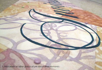
I wasn't entirely sure how to attach the signs together. The watercolor paper I used had a very rough texture (rougher than even the cold press paper I usually use), so it was hard to just glue the pieces together. I tried to sew them with clear fishing wire, but the paper was so thick that the needle made very unattractive holes. Ultimately, I used a few "Zots" - fabulous little sticky dots that are another wonderful crafting invention - to secure the paintings to each other. I was concerned that this wouldn't hold forever, though, and so I painted the seam on the back of the long banner with some white acrylic paint to help seal it a bit better. Finally, I put a couple of decorative brads in just the right spots to add a final security measure to keep the two halves of the painting together.

And since the brads looked so good and I had a few more extras from all of the samples I made for the upcoming Brides-to-Be show, I placed more scattered throughout the sign. I put each brad along a fake seam connecting the patchwork-like rectangles in the background. From a distance, they're not visible at all, but up close they add the perfect amount of three-dimensionality. They make the sign seem even more hand-made, which sets it apart from all of the other flat-printed signs that will be at the show.
So that's the sign I designed and painted! These photographs don't do it justice - so you should definitely come check out the Brides-to-Be show this weekend so you can see it in person! ;)
Shameless plug time: Love this sign? Want a sign painted for your event? Want to commission a watercolor painting? Shoot me an email with your thoughts and let me know! :)
No comments:
Post a Comment