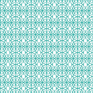
Today's pattern choices are Pattern Julia & Eleanor. Scroll down to take a look!
First, the "fancy": Pattern Julia
This
is a great pattern. From a distance it almost looks lace-like, which
immediately brings to mind fancy occasions and formal wear - but up
close the six-pointed stars that are formed in the white space jump
forward and demand attention. These stars are so graphic (and they're
repeated in such an obvious horizontal/vertical grid) that they turn an
otherwise elegant pattern into something much more modern.
The strokes are thin and form infinite loops at a high density, but if anything, the crowded-ness of the loops only adds to the modern feeling of the pattern, since it creates a huge contrast to the simpler six-pointed stars. Obvious contrast is a great way to pull emphasis to the parts of the pattern that you want the viewer to be attracted to, and here the contrast between the dense loops and white stars only makes the stars more visible.
And now, the "funky": Pattern Eleanor
The simplicity of the pattern is what makes this a great "funky" design. The emphasis is on straight lines (though almost all of the pattern is actually curved) - since the "units" almost make perfect squares, our brain is tricked into thinking they are squares from a distance. Only up close can you tell just how many lines are actually curved.
Our brains get the idea of straight lines from the little white squares in between each pattern unit. These small negative spaces are made from the edges of the thicker black strokes. Furthermore, the "units" are stacked in an obvious grid, which adds to the deception of straight lines.
A couple weeks ago, I highlighted this stationery sample (shown above) in a Sunday Sample Spotlight post. Titled "Pop Rocks" for the shimmery quality of the paper and bright hot pink and black color scheme, this stationery set uses Pattern Eleanor as a graphic burst of pink color on either side of the paragraphs of text.
-
Click here to see all posts related to "Fancy/Funky Friday"
Shameless plug time: Love my patterns? I incorporate them into a lot of the artwork I create, from stationery for Invites by Andrea to the watercolors I paint. Check out Invites by Andrea's website to see examples of these patterns in use or drop me a line at andrea@invitesbyandrea.com to let me know what you think!
First, the "fancy": Pattern Julia
The strokes are thin and form infinite loops at a high density, but if anything, the crowded-ness of the loops only adds to the modern feeling of the pattern, since it creates a huge contrast to the simpler six-pointed stars. Obvious contrast is a great way to pull emphasis to the parts of the pattern that you want the viewer to be attracted to, and here the contrast between the dense loops and white stars only makes the stars more visible.
And now, the "funky": Pattern Eleanor
The simplicity of the pattern is what makes this a great "funky" design. The emphasis is on straight lines (though almost all of the pattern is actually curved) - since the "units" almost make perfect squares, our brain is tricked into thinking they are squares from a distance. Only up close can you tell just how many lines are actually curved.
Our brains get the idea of straight lines from the little white squares in between each pattern unit. These small negative spaces are made from the edges of the thicker black strokes. Furthermore, the "units" are stacked in an obvious grid, which adds to the deception of straight lines.
A couple weeks ago, I highlighted this stationery sample (shown above) in a Sunday Sample Spotlight post. Titled "Pop Rocks" for the shimmery quality of the paper and bright hot pink and black color scheme, this stationery set uses Pattern Eleanor as a graphic burst of pink color on either side of the paragraphs of text.
-
Click here to see all posts related to "Fancy/Funky Friday"
Shameless plug time: Love my patterns? I incorporate them into a lot of the artwork I create, from stationery for Invites by Andrea to the watercolors I paint. Check out Invites by Andrea's website to see examples of these patterns in use or drop me a line at andrea@invitesbyandrea.com to let me know what you think!


No comments:
Post a Comment