It's hard to believe March is almost over already! Here's today's Fancy/Funky Friday post.
First, the "fancy": Pattern Lola


This pattern obviously has a very horizontal structure. It's so strong that you really look at the pattern as a collection of stacked "striped" units, rather than the individual parts of the stripe repeated within the horizontal bands. The diagonal lines, which shift direction in each row, give the pattern a very dynamic movement, but the thin lines and elegant loops keep it from getting too "funky."
Can you spot the cursive capital letter I used to create this pattern? L has been my favorite letter for as long as I can remember. I love the way it sounds, the way it looks, and the way it lends itself so well to singing... Plus, I'm sure it didn't hurt that it was the first letter of my middle name. ;) When I learned cursive in grade school, I was very pleased to discover that a cursive L is one of the most beautiful characters.
And now, the "funky": Pattern Mimi


Pattern Mimi is the exact opposite of Pattern Lola - instead of being a series of horizontal rows, it's a collection of vertical columns. The contrast between the dense lines and wide open white spaces is even more prominent in this pattern - so much so that from a distance, it almost looks as if the white circular pairs are sitting on top of a background of solid orange.
The main shape that pops out from the pattern - the side-by-side white circles that form sideways figure-eights - reminds me of Konstantin Brancusi's minimalist sculpture "The Kiss." Doesn't each one kind of look like the outlines of two profiles (with prominent ears) mushed together in an embrace? :)
-
Click here to see all posts related to "Fancy/Funky Friday"
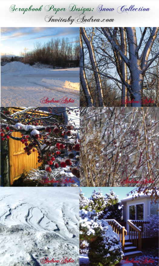
Shameless plug time: Love my patterns? I incorporate them into a lot of the artwork I create, from stationery for Invites by Andrea to the watercolors I paint. Check out Invites by Andrea's website to see examples of these patterns in use or drop me a line at andrea@invitesbyandrea.com to let me know what you think!
First, the "fancy": Pattern Lola


This pattern obviously has a very horizontal structure. It's so strong that you really look at the pattern as a collection of stacked "striped" units, rather than the individual parts of the stripe repeated within the horizontal bands. The diagonal lines, which shift direction in each row, give the pattern a very dynamic movement, but the thin lines and elegant loops keep it from getting too "funky."
Can you spot the cursive capital letter I used to create this pattern? L has been my favorite letter for as long as I can remember. I love the way it sounds, the way it looks, and the way it lends itself so well to singing... Plus, I'm sure it didn't hurt that it was the first letter of my middle name. ;) When I learned cursive in grade school, I was very pleased to discover that a cursive L is one of the most beautiful characters.
And now, the "funky": Pattern Mimi
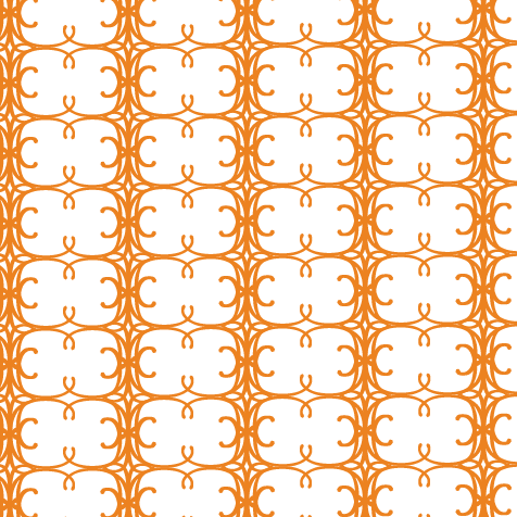

Pattern Mimi is the exact opposite of Pattern Lola - instead of being a series of horizontal rows, it's a collection of vertical columns. The contrast between the dense lines and wide open white spaces is even more prominent in this pattern - so much so that from a distance, it almost looks as if the white circular pairs are sitting on top of a background of solid orange.
The main shape that pops out from the pattern - the side-by-side white circles that form sideways figure-eights - reminds me of Konstantin Brancusi's minimalist sculpture "The Kiss." Doesn't each one kind of look like the outlines of two profiles (with prominent ears) mushed together in an embrace? :)
-
Click here to see all posts related to "Fancy/Funky Friday"
Shameless plug time: Love my patterns? I incorporate them into a lot of the artwork I create, from stationery for Invites by Andrea to the watercolors I paint. Check out Invites by Andrea's website to see examples of these patterns in use or drop me a line at andrea@invitesbyandrea.com to let me know what you think!