Savor the last day of November with today's patterns. (There are even a couple surprise photos sprinkled in!)
First, the "fancy": Pattern Veronica


Why it's "fancy": Thin, curvy lines, loops, and a lace-like quality.
Why it's great: By aligning the thickest part of the curvy lines right next to each other, they appear even thicker from a distance, really drawing attention to the almost-diamond shapes.
BONUS PICTURE: Scroll down to see how I incorporated this elegant pattern into a gold-colored stationery set. So pretty!

And now, the "funky": Pattern Jenna

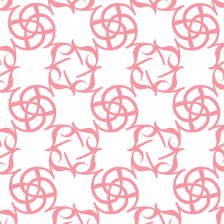
Why it's "funky": There are two competing pattern "units" - a swirl-like form, and a collection of four cursive lowercase s's rotated to create a curvy square.
Why it's great: Because there's a lot of breathing room between the different rows, one pattern doesn't hog too much attention, and they end up working well together.
BONUS PICTURE: Scroll down to see how I incorporated this funky pattern into a pink & gray invitation.

-
Click here to see all posts related to "Fancy/Funky Friday"
Shameless plug time: Love my patterns? I incorporate them into a lot of the artwork I create, from stationery for Invites by Andrea to the watercolors I paint. Check out Invites by Andrea's website to see examples of these patterns in use or drop me a line at andrea@invitesbyandrea.com to let me know what you think!
First, the "fancy": Pattern Veronica
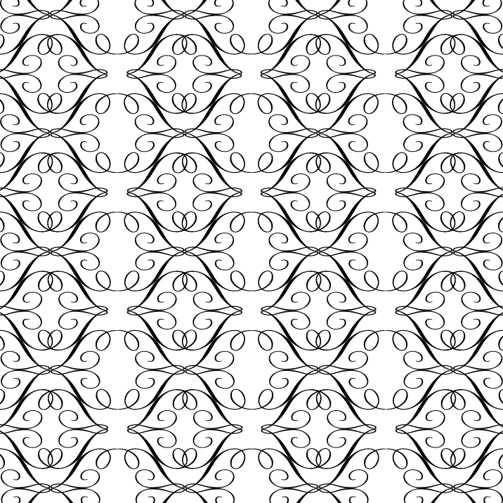

Why it's great: By aligning the thickest part of the curvy lines right next to each other, they appear even thicker from a distance, really drawing attention to the almost-diamond shapes.
BONUS PICTURE: Scroll down to see how I incorporated this elegant pattern into a gold-colored stationery set. So pretty!

And now, the "funky": Pattern Jenna


Why it's great: Because there's a lot of breathing room between the different rows, one pattern doesn't hog too much attention, and they end up working well together.
BONUS PICTURE: Scroll down to see how I incorporated this funky pattern into a pink & gray invitation.

-
Click here to see all posts related to "Fancy/Funky Friday"
Shameless plug time: Love my patterns? I incorporate them into a lot of the artwork I create, from stationery for Invites by Andrea to the watercolors I paint. Check out Invites by Andrea's website to see examples of these patterns in use or drop me a line at andrea@invitesbyandrea.com to let me know what you think!