Sunday, March 31, 2013

Sunday Sample Spotlight: "What Lips My Lips Have Kissed"

This baby girl birth announcement is the perfect mixture of classic elegance and modern fun. 

"What Lips My Lips Have Kissed" Birth Announcement


The fun: The hot pink metallic petal-fold envelope is lined with semi-circles of scrapbook paper featuring large-scale pink polka dots.


The elegance: The printed announcement features a calligraphic font and hints of curly patterns in each corner.


But my favorite detail is the baby's head. Traced from an old photograph of myself as a baby, I turned a picture into a graphic illustration that's fun and modern, while still being realistic and photographic. Given photographs of your child (or engagement photos for wedding announcements), I can similarly turn one of your personal images into a fun illustration for use in whatever type of stationery you desire!


Next week's Sunday Sample Spotlight: "Ever the Same"


Click here to view all Sunday Sample Spotlight posts.

"Like" Invites by Andrea on Facebook!
Follow Invites by Andrea on Twitter!


-

Shameless Plug Time: Love this invitation (or others featured on this blog)? Want something similar (or something completely custom) designed for your event? Visit Invites by Andrea to view more samples, download a catalogue pdf, or fill out a design request form. Or shoot me an email to ask me your questions or learn more information.

Friday, March 29, 2013

Fancy/Funky Friday: Patterns Nora & Remarka

Can you believe it's almost April?? Celebrate the last Friday in March with today's fancy and funky patterns!

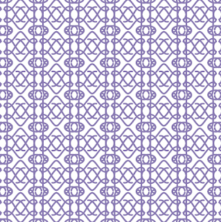
First, the "fancy": Pattern Nora


Why it's "fancy": Thin, curvy lines that form lace-like stripes of pattern

Why it's great: The plasma-like moment where two of the oval pattern units meet reminds me of lava lamp blobs.


And now, the "funky": Pattern Remarka


Why it's "funky": Whimsical spirals, obvious capital R's, crazy movement, and unaligned pattern "units" - what part of this pattern isn't funky?? :)

Why it's great: I just love the little tally marks that decorate some of the lines (especially where the capital Y, R, and J letter forms meet).

-

Click here to see all posts related to "Fancy/Funky Friday" 


Shameless plug time: Love my patterns? I incorporate them into a lot of the artwork I create, from stationery for Invites by Andrea to the watercolors I paint. Check out Invites by Andrea's website to see examples of these patterns in use or drop me a line at andrea@invitesbyandrea.com to let me know what you think!

Wednesday, March 27, 2013

Supersize Pastel Inspiration Board

As March draws to an end, I leave you with this - an oversized inspiration board featuring this season's beautiful pastel color palette!

Within this inspiration board are ideas for everything:

- Easter decor (ornate eggs, pastel balloons!)
- Spring fashion (pastel lips, jewelry, clothes, hair!)
- Interior design (a pretty mint green sunroom, and floral wallpaper!)
- Party refreshments (gelato-colored candies and cupcakes!)

- And, of course, spring wedding decor (painted mason jars, bouquets, centerpieces, dresses!)

If you're planning a baby shower, child's birthday party, Easter gathering, or spring wedding, this board is for you. :)

Enjoy!


-

Follow Invites by Andrea on Twitter!
"Like" Invites by Andrea on Facebook!

Shameless Plug Time: Love this color combination? Looking for custom stationery made to match these colors (or whatever other color combinations you're using for your event)? Visit Invites by Andrea to view more samples, download a catalogue pdf, or fill out a design request form. Or shoot me an email to ask me your questions or learn more information.

Monday, March 25, 2013

Upcoming Weekly Theme Post

Good news - starting next Monday, I'll be posting a NEW weekly theme post - "Color of the Week"!

The "Color of the Week" entries (posted every Monday) will present a color, three similar colors, and six other sample colors that look great paired with the color of the week. I'll also be including CMYK codes for all ten colors so you can recreate and use those exact colors on your own computer! (If you'd prefer RGB or Hexadecimal codes, this website is a great tool to use to get an approximation.)

And don't worry if you're a fan of my other weekly posts - "Sunday Sample Spotlight" & "Fancy/Funky Friday" - I'll still be churning those posts out every Sunday & Friday, too!

Sunday, March 24, 2013

Sunday Sample Spotlight: "King's Cross"

Today's stationery set is all about subtle beauty.

"King's Cross" Invitation Duo (invite & reply card) with matching Save-the-Date

When a guest receives this invitation, they first see a closed white petal envelope...


...And when they open it, they see the invitation and reply card, safely nestled inside.


The reply card stands alone - an elegant and timeless design printed on white cardstock. The text is calligraphic and all in traditional black, and a thinly-lined lace-like gold pattern fades in and out of the otherwise white background to add a hint of dimension.

But for the invitation and save-the-date, another layer was also added.


A thin sheet of sparkly white vellum was overlaid on top of the invitation and save-the-date, held in place just at the top with three small silver brads. The text is mostly readable through the vellum, and it's easy enough to lift that top layer to see the words even better - and all the details in the pattern.


The vellum's sparkles were a little difficult to capture with the camera, since they were so transient in the light, but you can get some idea of the iridescent specks sprinkled throughout the vellum with the above image, as well as the image below, showing the vellum laid on top of the save-the-date.


All white, with a hint of black and gold, is a classically elegant color scheme that will never go out of style. It's perfect for formal events like weddings because it harkens back to a fairy tale time gone by.


Next week's Sunday Sample Spotlight: The perfect birth announcement stationery for a baby girl


Click here to view all Sunday Sample Spotlight posts.

"Like" Invites by Andrea on Facebook!
Follow Invites by Andrea on Twitter!


-

Shameless Plug Time: Love this invitation (or others featured on this blog)? Want something similar (or something completely custom) designed for your event? Visit Invites by Andrea to view more samples, download a catalogue pdf, or fill out a design request form. Or shoot me an email to ask me your questions or learn more information.

Friday, March 22, 2013

Fancy/Funky Friday: Indigo & Rita

For the beginning of spring, I present to you: brightly-colored patterns that remind of eggs and flowers. :)

First, the "fancy": Pattern Indigo


Why it's "fancy": This pattern's lines are the very definition of calligraphic, with elegant curves ending in solid dots of color and slight variations of thickness within each line.

Why it's great: When I look at the design, I see strips of lace interspersed with stripes of tilting "egg" forms.


And now, the "funky": Pattern Rita


Why it's "funky": Like last week, this "funky" pattern focuses on spirals that create flower-like forms, and arranges them in a predictable plaid-like grid.

Why it's great: From a distance, the negative white space at the middle of each flowery spiral cloud look like miniature parallelograms!

-

Click here to see all posts related to "Fancy/Funky Friday" 


Shameless plug time: Love my patterns? I incorporate them into a lot of the artwork I create, from stationery for Invites by Andrea to the watercolors I paint. Check out Invites by Andrea's website to see examples of these patterns in use or drop me a line at andrea@invitesbyandrea.com to let me know what you think!

Sunday, March 17, 2013

Sunday Sample Spotlight: "Timeless Treasure"

Previously, I've shown a pink and gray stationery set that featured Lacey - the first pattern I ever designed in Illustrator. Today's stationery sample uses the same pattern - but in some new, interesting ways!


"Timeless Treasure" Invitation Design

Printed on cream linen paper and mounted on a textured gray cardstock, this stationery set boasts a lavender and gray color scheme that's subtly beautiful and perfect for almost any occasion, from weddings to anniversary celebrations.

This particular invitation is for an anniversary dinner, and the theme is - fittingly - the passage of time.


I used a strip of Pattern Lacey along the top and bottom of the design, and then repeated a smaller scale version of the pattern right next to it in a lighter shade to add the illusion of depth. The pattern is also found in the actual illustration of the clock, where I wrapped the pattern around into a circle and put patterned spacers between each of the Roman numerals on the clock face.


Next week's Sunday Sample Spotlight: An all-white color scheme that is sophisticated and ethereal...


Click here to view all Sunday Sample Spotlight posts.

"Like" Invites by Andrea on Facebook!
Follow Invites by Andrea on Twitter!


-

Shameless Plug Time: Love this invitation (or others featured on this blog)? Want something similar (or something completely custom) designed for your event? Visit Invites by Andrea to view more samples, download a catalogue pdf, or fill out a design request form. Or shoot me an email to ask me your questions or learn more information.

Friday, March 15, 2013

Fancy/Funky Friday: Patterns Kristy & Buttercup

Sometimes the most interesting part of the pattern is not the lines or shapes that make it up - but the shapes that are created in the negative space because of the arrangement of the pattern.

First, the "fancy": Pattern Kristy


Why it's "fancy": The thin lines in this pattern vary between elegant loops and pairs of diagonal straight lines that form argyle-like diamonds.

Why it's great: If you focus only on the negative white space between each "row" of pattern, you'll see blocky capital Z or N shapes!


And now, the "funky": Pattern Buttercup


Why it's "funky": Each row of pattern orients the flower-like rectangles in the opposite direction - creating squares of different sizes in the negative white spaces.

Why it's great: From afar, the design resembles a plastic picnic tablecloth with its emphasis on plaid and flower-like forms.

-

Click here to see all posts related to "Fancy/Funky Friday" 


Shameless plug time: Love my patterns? I incorporate them into a lot of the artwork I create, from stationery for Invites by Andrea to the watercolors I paint. Check out Invites by Andrea's website to see examples of these patterns in use or drop me a line at andrea@invitesbyandrea.com to let me know what you think!

Wednesday, March 13, 2013

Spring Color Combo: Blood Orange & Misty Blue

If you're at all like me, you find blood oranges a little creepy - but even I can't deny how beautiful and rich the color is. Pair it with a pale misty blue for a unique color scheme with a perfect balance between hot and cold colors that works great in the winter and spring.


This shade of blue is pale with hints of silver-gray, while the orange is so red it's - well, practically red. Still, they both retain their core orange and blue so obviously that it's not hard to understand why they seem to work so effortlessly together (orange and blue are color wheel complements).

Impress your guests with a dazzling paper crane display (see the middle picture of this inspiration board's bottom row), add unexpected bursts of dark orange blooms in the middle of a pale blue-and-white bouquet, and serve orange-flavored cupcakes and blood-orange garnished cocktails.

This color scheme is also a great choice for beachfront weddings - just look at how adorable the cake is on the far-right of the top row! Use blood orange to color fish accents in a misty blue ocean.

-

Follow Invites by Andrea on Twitter!
"Like" Invites by Andrea on Facebook!

Shameless Plug Time: Love this color combination? Looking for custom stationery made to match these colors (or whatever other color combinations you're using for your event)? Visit Invites by Andrea to view more samples, download a catalogue pdf, or fill out a design request form. Or shoot me an email to ask me your questions or learn more information.

Tuesday, March 12, 2013

Spring Color Combo: Lavender & Salmon Pink

Pastels are always beautiful for spring events, and today's color scheme of lavender and pale salmon is another great example!


Give out fabric satchels of lavender as guest favors at a fancy event like a wedding or dinner party. I just love the small salmon pink pocket tied with twine in the middle of the second row. 

Versatile and calming, this color scheme is also great for everyday fashion, and easily lends itself to makeup (lavender purple eyes and pale pink lips are always classic). These colors would also be gorgeous for a baby shower, baby announcements, or to decorate a child's bedroom or nursery. And don't forget spring holidays. The soft colors and pink accents work great for Valentine's Day and Easter!


-

Follow Invites by Andrea on Twitter!
"Like" Invites by Andrea on Facebook!

Shameless Plug Time: Love this color combination? Looking for custom stationery made to match these colors (or whatever other color combinations you're using for your event)? Visit Invites by Andrea to view more samples, download a catalogue pdf, or fill out a design request form. Or shoot me an email to ask me your questions or learn more information.

Sunday, March 10, 2013

Sunday Sample Spotlight: "Morning Market"

This petal-fold envelope in pure white adds a chill to this springy green - making it a great color combo for an in-between seasons event, where winter is starting to thaw, but spring still feels a bit too far away.

"Morning Market" Invitation Duo (invite & reply card)

The large-scale graphic pattern, the bold text, and the stark contrast of the solid green cardstock border all add the necessary pops of color to this otherwise all-white design.


Both the green cardstock and the white linen envelopes have subtle (but different!) textures up close - these small details also add visual interest to this fairly simple design.


The pattern is funky and joyous, with bubble-like forms and "sunbursts" that also look a little like flowers (especially when paired with a petal-fold envelope like this invitation set is)!


Next week's Sunday Sample Spotlight: "Timeless Treasure"


Click here to view all Sunday Sample Spotlight posts.

"Like" Invites by Andrea on Facebook!
Follow Invites by Andrea on Twitter!


-

Shameless Plug Time: Love this invitation (or others featured on this blog)? Want something similar (or something completely custom) designed for your event? Visit Invites by Andrea to view more samples, download a catalogue pdf, or fill out a design request form. Or shoot me an email to ask me your questions or learn more information.

Friday, March 8, 2013

Fancy/Funky Friday: Patterns Carrie & Delta

Today's Fancy/Funky patterns are all about being unique in at least one crucial way...

First, the "fancy": Pattern Carrie


Why it's "fancy": This pattern is comprised of loops and wavy lines that look like lace from a distance

Why it's great: Relatively simple, well organized, and uniform in line thickness, pattern Carrie is interesting because of the decorated Easter egg shapes that pop forward in space and demand attention.


And now, the "funky": Pattern Delta


Why it's "funky": The arrangement of the pattern "units" is a simple one - squares with interior X's - but each "unit" is crazy detailed, with an emphasis on straight lines.

Why it's great: From a distance, it starts to take on the appearance of a quilt pattern; up close, it looks like the insides of a computer or other technological device, with memory chips and wires.

-

Click here to see all posts related to "Fancy/Funky Friday" 


Shameless plug time: Love my patterns? I incorporate them into a lot of the artwork I create, from stationery for Invites by Andrea to the watercolors I paint. Check out Invites by Andrea's website to see examples of these patterns in use or drop me a line at andrea@invitesbyandrea.com to let me know what you think!

Wednesday, March 6, 2013

Spring Color Combo: Dijon Mustard & Bermuda Blue

Dijon Mustard is a yellow so dark that it's almost brown; it makes for a great neutral for almost any color! I particularly like it with supersaturated shades like the Bermuda Blue I paired it with below:


Though the Dijon Mustard color is dark and autumnal, the Bermuda Blue is bright and fresh enough to balance it out and give the overall look a very spring/summer feeling. Don't you just love the beach-inspired cupcakes on the far-right of the inspiration board's third row?

-

Follow Invites by Andrea on Twitter!
"Like" Invites by Andrea on Facebook!

Shameless Plug Time: Love this color combination? Looking for custom stationery made to match these colors (or whatever other color combinations you're using for your event)? Visit Invites by Andrea to view more samples, download a catalogue pdf, or fill out a design request form. Or shoot me an email to ask me your questions or learn more information.

Tuesday, March 5, 2013

Spring Color Combo: Citron Green & Slate Gray

Slate gray is a great neutral - rich, cool, sophisticated, and a bit mysterious, it contains a dark greenish-blue undertone. Pair it with a bright spring color like citron green for the perfect spring color scheme!


There are some truly beautiful green-gray fabrics out there - be daring and wear a full, textured green-gray wedding dress (like the far-right photo in the middle row of the above inspiration board); then brighten your look with a light green bouquet and bright silver jewelry.

Use lots of different types of green flowers in your bouquets and centerpiece decor, to add texture and play up the abundant feeling of new springtime growth. Add even more texture (and keep warm on a cool spring day!) with some strategic chunky knits (like a citron green scarf or slate gray hat).

-

Follow Invites by Andrea on Twitter!
"Like" Invites by Andrea on Facebook!

Shameless Plug Time: Love this color combination? Looking for custom stationery made to match these colors (or whatever other color combinations you're using for your event)? Visit Invites by Andrea to view more samples, download a catalogue pdf, or fill out a design request form. Or shoot me an email to ask me your questions or learn more information.

Sunday, March 3, 2013

Sunday Sample Spotlight: "Beyond the Veil"

Today's Sunday Sample Spotlight design has a lot going on - so we'll take it slow and address each detail separately. :)

"Beyond the Veil" Invitation Duo (invite & reply card)

First, the invitation (which was printed on white cardstock and mounted to a dark purple cardstock background) was attached to the metallic gold pocketfold envelope, which I had accented with solid purple scrapbook paper on the left flap and right side pocket.


I used an elegant script like font and added a lace-like pattern to the top edge of both the invitation and reply card to give it sophistication.


Then, I used those strips of pattern as a guide for the placement of the small gold brads that would hold the several layers together. For the reply card, I simply added a layer of semi-sheer purple vellum and cinched the vellum, white cardstock, and purple cardstock together with three brads. 

For the invitation, I also add two stripes of cotton ribbon, which added dimension while still allowing some of the pattern underneath to shine through.


Finally, I frayed the ends of each line of ribbon, to give it a bit of a deconstructed look. The gold brads on either end hold the ribbon in place and keep it from continuing to fray past the brad. I liked the added dimensionality and texture of the frayed ends, which I thought made the cream/white stripes along the ribbon more pronounced (since you could see that different individual threads were different colors), as well as added an unexpected casual feeling to an otherwise over-the-top elegant invitation.


Next week's Sunday Sample Spotlight: A crisp green and white design perfect for spring!


Click here to view all Sunday Sample Spotlight posts.

"Like" Invites by Andrea on Facebook!
Follow Invites by Andrea on Twitter!


-

Shameless Plug Time: Love this invitation (or others featured on this blog)? Want something similar (or something completely custom) designed for your event? Visit Invites by Andrea to view more samples, download a catalogue pdf, or fill out a design request form. Or shoot me an email to ask me your questions or learn more information.

Friday, March 1, 2013

Fancy/Funky Friday: Patterns Jayda & Sarabi

Happy Friday! Here are today's patterns:

First, the "fancy": Pattern Jayda


Why it's "fancy": Thin, calligraphic lines show off with sweeping loops and a classically elegant arrangement

Why it's great: I love finding shapes within the lines, and I'm reminded of all sorts of things in this pattern, from hearts and puckered lips to lotus flowers and crouching frogs.


And now, the "funky": Pattern Sarabi


Why it's "funky": From a distance, standard "X" shapes take on a new edge by rotating orientation; up close, the detailed lines within each "X" become more apparent

Why it's great: Inspired by fun 1970s "striped" lettering, the densely packed "tracks" of thin lines remind me of paper clips or other office supplies.

-

Click here to see all posts related to "Fancy/Funky Friday" 


Shameless plug time: Love my patterns? I incorporate them into a lot of the artwork I create, from stationery for Invites by Andrea to the watercolors I paint. Check out Invites by Andrea's website to see examples of these patterns in use or drop me a line at andrea@invitesbyandrea.com to let me know what you think!