Monday, April 29, 2013

Color of the Week - Robin's Egg Blue

This week's color is Robin's Egg Blue - a rich medium blue color with green undertones.

Robin's Egg Blue works great with neutrals and pastels. For a more unique combination, you can also choose a bright, saturated color (like lime or fuschia)!


Fun facts about Robin's Egg Blue:
 
1. The first recorded use of robin egg blue as a color name in English was in 1873; it approximates the shade of eggs laid by the American Robin.

2. The name "robin egg blue" has been trademarked by New York City jewelry company Tiffany & Co.

3. When Crayola first introduced its crayon of this color, it was unlabeled. Purchasers were asked to submit ideas for the color's name.


-

Follow Invites by Andrea on Twitter!
"Like" Invites by Andrea on Facebook!

Shameless Plug Time: Love this color? Looking for custom stationery made to match this color (or whatever other color combinations you're using for your event)? Visit Invites by Andrea to view more samples, download a catalogue pdf, or fill out a design request form. Or shoot me an email to ask me your questions or learn more information.

Sunday, April 28, 2013

Sunday Sample Spotlight: "In the Land of Gray & Pink"

Gunmetal gray and hot pink make a great color combination for almost any time of year - the gray is cool and fresh, while the pink is bold and bright!


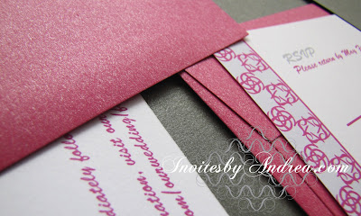
"In the Land of Gray & Pink" Invitation Duo (invite & reply card)

The above design features a long metallic gray folding envelope, with a pocket on the right to hold the RSVP card and metallic pink reply card envelope. To mail, the entire package is folded up and slipped inside a matching metallic pink A7 sized envelope.


 In the above picture, you can really see the metallic shine on both colors of envelope.


The pattern is fun and unexpected, featuring swirling starburst and spiral images, which are then repeated in a highly-structured plaid. By running the pattern along two adjacent sides of the design (the left and top edges), the whole invitation takes on an asymmetrical balance that is funky and playful.


Next week's Sunday Sample Spotlight: Birds!


Click here to view all Sunday Sample Spotlight posts.

"Like" Invites by Andrea on Facebook!
Follow Invites by Andrea on Twitter!


-

Shameless Plug Time: Love this invitation (or others featured on this blog)? Want something similar (or something completely custom) designed for your event? Visit Invites by Andrea to view more samples, download a catalogue pdf, or fill out a design request form. Or shoot me an email to ask me your questions or learn more information.

Friday, April 26, 2013

Fancy/Funky Friday: Patterns Giselle & Harper

TGIF! Celebrate the weekend with these two pattern designs:

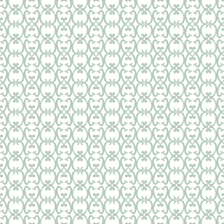
First, the "fancy": Pattern Giselle


Why it's "fancy": Loopy, calligraphic, and ostentatious, these lines are the epitome of "fancy."

Why it's great: I love the heart-like shapes formed where the "stripes" of the pattern meet.


And now, the "funky": Pattern Harper


Why it's "funky": Bold, evenly spaced lines in concentric "circles" give this pattern a mod 1960s feeling.

Why it's great: Every other pattern "unit" is flipped - but you can tell only by the way the inner rainbow-like arcs interact with the middle horizontal stripes.

-

Click here to see all posts related to "Fancy/Funky Friday" 


Shameless plug time: Love my patterns? I incorporate them into a lot of the artwork I create, from stationery for Invites by Andrea to the watercolors I paint. Check out Invites by Andrea's website to see examples of these patterns in use or drop me a line at andrea@invitesbyandrea.com to let me know what you think!

Wednesday, April 24, 2013

"Cool" Color Flowers


Flowers are great for decorating your home (both inside and out!) every day, as well as for decorating special events! Last week I showed you the difference between "cool" and "warm" colors on the subtractive color wheel. Now, I offer you inspiration with a list of flowers that fall under the "cool" color category.


There are many flowers that come naturally in blue and purple/blue shades. Green and yellow-green flowers are less abundant, though there are some lovely plants that would make for great centerpieces or bouquets even though they're not technically "flowering" plants. Teal flowers, unfortunately, tend not to exist in nature, but many flowers can be dyed to create this popular blue-green color. There are also some beautiful blue-green non-flowering leaves and plants.

Purple/Blue flowers: Iris, Violet, Geranium, Mountain Bluet, Bellfower, Babiana, Aster, Angelface, Lupine, Purple Robe Nierembergia, Petunia, Salvia, Pansy, Skullcap, Tulip, Blue Lithospermum, Lily-of-the-Nile, Lavender, Lilac, Hydrangea, Wisteria, Anemone, Hyacinth, Spring Starflower, Skyflower, Kenilworth Ivy, Longwood Blue, Catmint, Rosemary, Sage, Scabiosa, Alliums, Bindweed, Larkspur, Wolfsbane, Burdock, Carnation, Crocus, Eupatorium, Flax, Periwinkle, Forget-Me-Not, Gentian, Heather Flower, Ipomoea, Jacob's Ladder, Spiderwort, Lobellia, Love-in-the-Mist, Nightshade, Purple Rose, Saffron, Statice, Syringa, Veronica, Euphorbia Black Bird

Green/Yellow-Green flowers: Cymbidium Orchids, Chrysanthemum, Gladiolus, Carnation, Fennel, Sea holly, Forsythia, Hop, Houseleek, Ivy, Mint, Bells of Ireland, Lisianthus, Hypericum, Anthirium, Hydrangea, Amaranthus, Viburnum, Celosia

Blue-Green/Teal flowers: Jade Vine, Roman Wormwood, Mother-of-Thousands, Blue Fescue, Hydrangea, Teal Thistle Flower, Nigella, Daisy, Dyed Carnations, Orchid, Chrysanthemum

-

Follow Invites by Andrea on Twitter!
"Like" Invites by Andrea on Facebook!


Shameless Plug Time

I design custom stationery in whichever color(s) you love! Visit Invites by Andrea to view samples, download a catalogue pdf, or fill out a design request form. Or shoot me an email to ask me your questions or learn more information. 

I also paint watercolors! Send me an email and let me know if you're interested in purchasing or commissioning a piece! :)

Monday, April 22, 2013

Color of the Week - Emerald

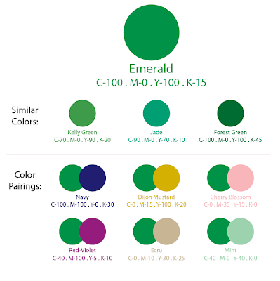
This week's color is Emerald - a beautiful medium green (and Pantone's named color of the year for 2013)!

Because Emerald is already so saturated, it works well with neutrals and tints (lighter colors) - but if you're daring, go for another saturated color to create a rich, jewel-toned pair.


Fun facts about Emerald:
 
1. The first recorded use of emerald as a color name in English was in 1598; unsurprisingly, the name comes from the typical appearance of the gemstone (and May birthstone) of the same name.

2. Ireland is sometimes referred to as the Emerald Isle due to its lush greenery.

3. L. Frank Baum's famous children's story, The Wonderful Wizard of Oz, features a grand "Emerald City" where everything from the food eaten to the people are emerald green. In the end, it is revealed that the city is actually normal colored - but the glasses everyone wears are emerald-tinted.


-

Follow Invites by Andrea on Twitter!
"Like" Invites by Andrea on Facebook!

Shameless Plug Time: Love this color? Looking for custom stationery made to match this color (or whatever other color combinations you're using for your event)? Visit Invites by Andrea to view more samples, download a catalogue pdf, or fill out a design request form. Or shoot me an email to ask me your questions or learn more information.

Sunday, April 21, 2013

Sunday Sample Spotlight: "Rainy Day"

This rain-inspired color scheme features the pale blue-gray of the sky on a rainy day, the rich brown of mud, and the fresh saturated blue associated with water and renewal. It's the perfect design for spring months like April!


"Rainy Day" Invitation Duo (invite & reply card)

All of the papers (including the envelopes) feature a subtle linen texture to add depth and sophistication to the design. The invitation and reply card were both printed on sky blue linen paper to exactly match the sky blue linen envelopes. The large, folded envelope is a rich brown linen - giving the design the strong neutral it needed to contrast with the pale beauty of the blue.


The pattern featured has a fun, cloud-like appearance - another reason I found it fitting for a "rainy day" theme. I love how whimsical the lines are!


Next week's Sunday Sample Spotlight: A fun gray & pink color scheme...


Click here to view all Sunday Sample Spotlight posts.

"Like" Invites by Andrea on Facebook!
Follow Invites by Andrea on Twitter!


-

Shameless Plug Time: Love this invitation (or others featured on this blog)? Want something similar (or something completely custom) designed for your event? Visit Invites by Andrea to view more samples, download a catalogue pdf, or fill out a design request form. Or shoot me an email to ask me your questions or learn more information.

Friday, April 19, 2013

Fancy/Funky Friday: Patterns Fortia & Nina

Each of this week's patterns has a main, basic geometric shape that stands out from a distance - either a circle or a tilted square (diamond) - but the pattern details reveal so much more!

First, the "fancy": Pattern Fortia


Why it's "fancy": The lines are thin, elegant, and curved, and overlap each other in delicate intersections.

Why it's great: This pattern reminds me of the designs my old spirograph toy would create!


And now, the "funky": Pattern Nina


Why it's "funky": Starburst shapes and embellished lines give an otherwise preppy argyle-like pattern a sharp, jagged look.

Why it's great: Is it just me, or do the diamond shapes begin to look like jeweled cabochons surrounded by such spikey "prongs"?

-

Click here to see all posts related to "Fancy/Funky Friday" 


Shameless plug time: Love my patterns? I incorporate them into a lot of the artwork I create, from stationery for Invites by Andrea to the watercolors I paint. Check out Invites by Andrea's website to see examples of these patterns in use or drop me a line at andrea@invitesbyandrea.com to let me know what you think!

Wednesday, April 17, 2013

Mini Art Class - Defining Color Terms

I talk a lot about primary, secondary, and tertiary colors, as well as warm colors and cool colors, so I wanted to take the opportunity today to give you a visual reference of what I mean when I use these terms.

There are two types of ways to think about color - additive and subtractive. Additive color is the system you probably learned in science class as a kid and deals with the visual light spectrum - when you add all of the colors of the rainbow together, you get white light; if you use a prism to refract these colors, you see individual hues. The primary colors of the additive spectrum are Red, Green, and Blue, which is why your computer monitor uses "RGB" color.

Additive Color

For the purposes of the artwork I create, however, I use the Subtractive color system - the one you probably learned in art class. The subtractive color system is used when mixing paints (or inks on your computer's printer) - when you mix a dab of every color in every paint tube, you get black instead of white.

Subtractive Color

Subtractive color predates modern scientific color theory and has been used in art and art education since the dawn of civilization. In the subtractive color system, the three primary colors are Red, Yellow, and Blue. The secondary colors (Violet (or purple), Orange, and Green), are formed by mixing equal amounts of Red & Blue, Red & Yellow, and Blue & Yellow, respectively.

[Side note: In the 20th centuries, the more versatile CMY (Cyan, Magenta, and Yellow) triad was adopted for the purposes of digital printing (Cyan is sometimes referred to as "process blue" and Magenta is sometimes referred to as "process red") - but artists who use a traditional method (like painting) continue to use the standard RYB color wheel.]


On the color wheel, colors that are exact complements of each other are placed directly opposite. Each primary color's complement is the secondary color created when combining the other two primary colors - so Red's complement is Green (Blue + Yellow), Yellow's complement is Violet (Blue + Red), and Blue's complement is Orange (Red + Yellow).

In between each secondary and primary color is a tertiary color, created by combining the two colors on either side - for example, Blue-Green is (not surprisingly) created by mixing Blue with Green, and Red-Orange is formed from the mixture of Red and Orange. (When naming the tertiary colors, the primary color is always listed first, followed by the secondary color.)

There are six tertiary colors, and each tertiary color also has a complement on the color wheel. Blue-Green and Red-Orange are complements, and lie directly across from each other.

So the color wheel is comprised of twelve colors - three primary colors, three secondary colors, and six tertiary colors. You can draw a line across the color wheel to cut it in half (in between Violet & Red-Violet on one side, and Yellow-Green & Yellow on the other, as I did in the picture above), designating six of those colors to be "cool colors" and the other six to be "warm colors."

The cool colors, therefore, are Violet, Blue-Violet, Blue, Blue-Green, Green, and Yellow-Green. Each of these colors requires the use of Blue to mix the color. For example, Violet is Blue + Red, and Yellow-Green is Yellow + Green (which in turn was created from Yellow + Blue). Blue and all colors similar to it are "cool" colors.

The warm colors are Red-Violet, Red, Red-Orange, Orange, Yellow-Orange, and Yellow. Each of these colors requires the use of either Red or Yellow, because Orange and all colors similar to it are "warm" colors.

You can create tints by adding white to any of the twelve colors on the color wheel, and shades by adding black to those colors. These tints and shades fall into the "warm" and "cool" color categories based on their parent color. For example, Pink is a tint of Red (created from Red + White), and as such, falls into the "warm" color bracket with Red. A dark olive green color would be a shade of Yellow-Green (created from Yellow-Green + Black), and would therefore be included in a list of "cool" colors along with Yellow-Green.

In the image above, I've listed several tints and shades in each category to give you a sampling of the wide range of colors included.

Next week I'm going to start celebrating spring by listing examples of flowers that fall into the warm and cool color categories - so check back soon! :)


-

Follow Invites by Andrea on Twitter!
"Like" Invites by Andrea on Facebook!


Shameless Plug Time

I design custom stationery in whichever color(s) you love! Visit Invites by Andrea to view samples, download a catalogue pdf, or fill out a design request form. Or shoot me an email to ask me your questions or learn more information. 

I also paint watercolors! Send me an email and let me know if you're interested in purchasing or commissioning a piece! :)

Monday, April 15, 2013

Color of the Week - Peach

This week's color is Peach - a light orange-yellow tint!

Peach works best when paired with darker, more saturated colors or neutrals. For spring, I particularly like it with pastel purple (you can check out my lavender/salmon pink color scheme from March to see a similar color inspiration board!).


Fun facts about Peach: 
 
1. The first recorded use of the English word peach as a color was in 1588. The name comes from the pale color of the interior flesh of the peach fruit. Like the color aprioct, the color peach is paler than most actual peach fruits and seems to have been formulated primarily to create a pastel palette of colors for interior design. 

2. In 1962, Crayola renamed their "flesh" color "peach" after the civil rights movement pointed out that this color only represented the average color of the flesh of Caucasians.

3. In Chinese culture, the color peach represents immortality. The mythological peach tree of immortality, thought to be on a mountainside in western China, blooms only once every 3,000 years and is a key concept of the Taoist religion.

-

Follow Invites by Andrea on Twitter!
"Like" Invites by Andrea on Facebook!

Shameless Plug Time: Love this color? Looking for custom stationery made to match this color (or whatever other color combinations you're using for your event)? Visit Invites by Andrea to view more samples, download a catalogue pdf, or fill out a design request form. Or shoot me an email to ask me your questions or learn more information.

Sunday, April 14, 2013

Sunday Sample Spotlight: "The Music in Me"

This beautiful music-themed stationery design is all about the background image.

"The Music in Me" Invitation Duo (invite & info insert)

The envelope pictured is a metallic bronze-brown pocket envelope - perfect for giving off a rich, antique vibe and storing informational inserts right inside the envelope.


Semi-transparent layers of sheet music are stacked in the background of the design to give it both depth and a playful aged quality. I further played up this "classical" feel by choosing a font that feels like an old-school handwritten love letter.


This design also features a few different textures, which adds to its decadence. The invitation and info sheet were both printed on linen paper, and the folding envelope has a beautiful metallic sheen that shimmers in different lighting. In fact, depending on the warmth of the light, the linen paper can also take on a very different orange-brown tone, as you can see in the picture below.


Next week's Sunday Sample Spotlight: "Rainy Day"


Click here to view all Sunday Sample Spotlight posts.

"Like" Invites by Andrea on Facebook!
Follow Invites by Andrea on Twitter!


-

Shameless Plug Time: Love this invitation (or others featured on this blog)? Want something similar (or something completely custom) designed for your event? Visit Invites by Andrea to view more samples, download a catalogue pdf, or fill out a design request form. Or shoot me an email to ask me your questions or learn more information.

Friday, April 12, 2013

Fancy/Funky Friday: Patterns Frivolla & Carmen

Today's patterns each use diamond shapes in a unique way...

First, the "fancy": Pattern Frivolla


Why it's "fancy": Whether up-close or at a distance, this pattern is elegant and lace-like with its emphasis on overlapping curves and loops.

Why it's great: The straight lines of the repeated diamond shapes stand out in contrast to the arcs and curves.


And now, the "funky": Pattern Carmen


Why it's "funky": There's a lot going on in this pattern, including floral designs that fill out diamond shapes, thin figure-eights, stretched sine waves, and ovals decorated with eye-like circles at either end.

Why it's great: I love the feathery quality of some of the lines, and the line variance between thin and thick. It gives it a handmade, vintage feel, even though it's a digitally designed pattern.

-

Click here to see all posts related to "Fancy/Funky Friday" 


Shameless plug time: Love my patterns? I incorporate them into a lot of the artwork I create, from stationery for Invites by Andrea to the watercolors I paint. Check out Invites by Andrea's website to see examples of these patterns in use or drop me a line at andrea@invitesbyandrea.com to let me know what you think!

Wednesday, April 10, 2013

Children's Birthday Party Theme Ideas - Part 2

Still need some inspiration for a child's birthday party, even after last week's post? Here are three more fresh, fun ideas!

1. Obstacle Course Party

Turn your backyard into an obstacle course for kids! Divide them into teams and have each team wear a different color shirt (or a different color bandana). Weave string in between trees for them to duck under or step over or crawl through and use old tires or draw hopscotch squares on your sidewalk with chalk for them to skip through. Include non-athletic "stations" in the obstacle course as well, such as solving math problems, "name that tune," blowing bubbles, balancing eggs on spoons or books on their heads, reciting the alphabet backwards, Pictionary, shaping things out of clay, bouncing balls into plastic cups, etc.

In the end, everyone wins! Distribute gold-medal shaped cookies and hand out awards - "Most Spirited," "Fastest," "Most Artistic," "Best Team Player," "Most Encouraging," etc.

2. Dr. Seuss Party

Set up a photo booth with Dr. Seuss props like crazy wigs, comically big sunglasses, and feather boas. Serve green eggs and ham, and a Dr. Seuss themed birthday cake. Watch a Dr. Seuss movie or cartoon, or read one (or several) of his books.

3. Safari Scavenger Hunt

Distribute cheap plastic binoculars, cameras, and butterfly nets or small picnic baskets and set them off to find everything on their scavenger hunt list. Some items to consider - scraps of fabric or felt with animals on them (like giraffes, elephants, etc.) or prints like zebra stripes or cheetah spots, school supplies (such as cute animal-themed notepads or paperclips), pencil erasers in the shapes of safari animals, rubber or plastic toy insects, and fake plants (such as ivy and other plastic leaves and vines). To eat, serve animal crackers!

-

Need party invitations? Check out my custom stationery at InvitesbyAndrea.com!

Monday, April 8, 2013

Color of the week - Powder Blue

This week's color is Powder Blue - a light blue-gray perfect for winter, spring, and summer!

Paired with a bright hue (like blood orange - see this color board from last month!), powder blue can almost act as a neutral - or juxtapose it against neutrals (like seashell or slate gray) to let it shine as the star!


Fun facts about Powder Blue: 

1. The name powder blue was first used in the 1700s and can also refer to smalt, a dark cobalt-blue crushed-glass product used in dyeing.

2. Powder Blue is also the name of a 2009 drama film starring Jessica Biel, Forest Whitaker, and Patrick Swayze (in his last film role).

3. In Western culture, powder blue (and other light tints of blue) are often associated with baby boys (particularly in clothing, linens, and nursery decoration), while pale pinks are paired with baby girls - but before the 1940s, this convention was exactly the opposite.

-

Follow Invites by Andrea on Twitter!
"Like" Invites by Andrea on Facebook!

Shameless Plug Time: Love this color? Looking for custom stationery made to match this color (or whatever other color combinations you're using for your event)? Visit Invites by Andrea to view more samples, download a catalogue pdf, or fill out a design request form. Or shoot me an email to ask me your questions or learn more information.

Sunday, April 7, 2013

Sunday Sample Spotlight: "Ever the Same"

I love this color scheme for summer - the two neutrals (white and tan) really offset the saturated blue hue, letting it take center stage. It feels crisp, clean, and fresh - and would make a perfect color combo for a beach wedding or casual outdoor affair!


"Ever the Same" Invitation Duo (invite & reply card) and Save-the-Date

The main envelope is a tan-colored folding envelope with a pocket on the right side to hold the reply card and matching reply card envelope.


The pattern reminds me of sand-dollars (or perhaps manta rays), alluding to a casual, beach/ocean theme. I love the way its stamped-on quality, which gives it a handmade feel.


Next week's Sunday Sample Spotlight: "The Music in Me"


Click here to view all Sunday Sample Spotlight posts.

"Like" Invites by Andrea on Facebook!
Follow Invites by Andrea on Twitter!


-

Shameless Plug Time: Love this invitation (or others featured on this blog)? Want something similar (or something completely custom) designed for your event? Visit Invites by Andrea to view more samples, download a catalogue pdf, or fill out a design request form. Or shoot me an email to ask me your questions or learn more information.

Friday, April 5, 2013

Fancy/Funky Friday: Patterns Madeline & Xaria

Happy April! Here are today's patterns:

First, the "fancy": Pattern Madeline


Why it's "fancy": From a distance, the stripes of arcs give off the illusion of lace

Why it's great: I love the playful serifs and oversized circles at the ends of each "C" letterform - it gives it a funky vibe in the middle of the elegant lace-like structure.


And now, the "funky": Pattern Xaria


Why it's "funky": Pinched oval shapes and right-angle zig-zags make this a lively, geometric print.

Why it's great: Mod patterns that stress geometric shapes are a fun trend for spring!

-

Click here to see all posts related to "Fancy/Funky Friday" 


Shameless plug time: Love my patterns? I incorporate them into a lot of the artwork I create, from stationery for Invites by Andrea to the watercolors I paint. Check out Invites by Andrea's website to see examples of these patterns in use or drop me a line at andrea@invitesbyandrea.com to let me know what you think!

Wednesday, April 3, 2013

Children's Birthday Party Theme Ideas - Part 1

Need some inspiration for a child's birthday party? Here are some fresh, fun ideas!

1. Messy Party 

The idea of this party is just what it sounds like - to make a giant mess. Throw out the idea that decor has to be just-so and the food has to look perfect - you know those excited children will just make a mess of all your effort anyway!

Serve messy or gross-looking foods (Jell-O, gummy worms, cupcakes splattered with food coloring, etc.). Fill a pinata with an unexpectedly messy surprise (like cooked spaghetti). Cover your lawn or driveway with plastic sheets and let the kids go crazy with (washable) fingerpaints or paint-filled water balloons. Or fill a kiddie pool with potting soil and water to make your very own mud pit. On the invitations, request that everyone come dressed for a mess (i.e. bathing suits), and spray everyone down with a hose before they go home. Hand out towels as party favors on their way out the door!

2. Superhero Party

Serve food with primary colors (like a superhero-themed cake, and all-American red, white, and blue Jell-O parfaits) and label glasses of juice with different superpowers (invisibility, super strength, the ability to fly, the ability to read minds, inhuman speed, etc.) - whatever drink each kid chooses will be their superpower for the rest of the party! Decorate with campy "POW!" and "WHAM!" signage, and end the party with a fun superhero movie and buckets of popcorn.

3. Tiny Party

Give the kids the experience of following Alice down the rabbit hole by making everything at the party tiny, from the decorations (use Tootsie pops for balloons, make tiny flower arrangements out of paper or fabric, etc.) to the food (make cakes the size of cupcakes, and serve food like Pizza Bites or mini hamburger sliders). Play tiny board games (travel games are great, and often use miniature pieces or versions of the typical size board games), and hand out tiny party favors (sample-size mini tubes of lip gloss or nail polish, Hot Wheels cars, Polly Pockets, M&M minis, etc.).


Check back next week for three more ideas!

-

Need party invitations? Check out my custom stationery at InvitesbyAndrea.com!

Monday, April 1, 2013

Color of the Week: Mauve

I'm starting a new weekly post - every Monday I'll choose a "color of the week" and give you a sample of colors that pair well with it!

This week's color is Mauve - a light pastel purple with gray undertones!

Because of it's light tint, mauve works well with darker colors and more saturated hues. It's a great color for spring!

Fun facts about Mauve: 
 
1. It's named after the French word for the mallow flower (latin: malva), a species of plant widespread throughout the Mediterranean and the Middle East, and one of the earliest cited in recorded literature. 

2. After eighteen-year-old chemist William Henry Perkins discovered the first aniline dye ("mauveine") in 1856, the fashion industry latched onto the color. By 1890, mauve was so pervasive in fashion that the 1890s were called The Mauve Decade by author Thomas Beer.

3.  Mauve is a commonly used color in stage lighting to represent sunsets.

-

Follow Invites by Andrea on Twitter!
"Like" Invites by Andrea on Facebook!

Shameless Plug Time: Love this color? Looking for custom stationery made to match this color (or whatever other color combinations you're using for your event)? Visit Invites by Andrea to view more samples, download a catalogue pdf, or fill out a design request form. Or shoot me an email to ask me your questions or learn more information.