Friday, December 30, 2011

Fancy/Funky Friday: Patterns Priscilla & Juanita

It's hard to believe 2011 is already winding to a close. Let's raise our glasses to the last Fancy/Funky Friday of 2011!
First, the "fancy": Pattern Priscilla


This is a pretty typical pattern in my "fancy" collection because it looks so lace-like and elegant with all of its curves. An interesting thing about Pattern Priscilla though is the amount of white space. Large chunks of empty space show up so frequently that they become another part of the pattern, and help to define a rather rigid structure for an otherwise overly frilly - and perhaps frivolous - design. The white spaces suggest vertical and horizontal lines, and enforce a structural grid upon the pattern that balances out the dense "fancy" details.


And now, the "funky": Pattern Juanita


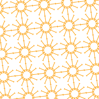
I just had to show off this pattern in orange - the design looks so bright and sunny! This is another great pattern that plays with positive and negative space. The first thing you probably notice is the repetition of the circles - how could you not, when they're so bold and obvious? But if you look closer, you also start to notice the white squares of white space created with four of the circles acting as each of the square's corners, and the almost four-pointed star/sunburst shape in the middle of each square. That's what I really like about this pattern - the feeling of rays extending out from the sunny circles is repeated in the four-pointed shape inside each square.

To me, Pattern Juanita is a very summery print, but I also think its shapes are applicable to the events of this coming weekend. Doesn't it almost look like a chain of fireworks exploding, or perhaps the radiant ball dropping in Times Square?

Here's hoping 2012 will bring as much optimism and happiness for you as this pattern exudes! See you next year! ;)

-

Click here to see all posts related to "Fancy/Funky Friday" 


Shameless plug time: Love my patterns? I incorporate them into a lot of the artwork I create, from stationery for Invites by Andrea to the watercolors I paint. Check out Invites by Andrea's website to see examples of these patterns in use or drop me a line at andrea@invitesbyandrea.com to let me know what you think!

Wednesday, December 28, 2011

"L'eau de Parfum" Watercolor

About a week ago I finished this watercolor, which I named "L'eau de Parfum" since the colors and technique seem so water-like.

"L'eau de Parfum" - Watercolor - Dec. 2011, ~22"w x 15"h

I initially approached it with a similar design as "Oian Sunset" - a large-scale pattern in the background, with some flowers in the foreground. (The photograph of the flowers I based the design on was taken in Paris's Jardin du Luxembourg in the summer of 2010.) But once I started painting it, I was inspired to try something different. In an effort to make the background look more spontaneous, I added splashes of paint splatter throughout the piece. I really like how the effect looks in the background - I was afraid it would look too "messy" and just like I didn't know how to paint, but it ended up looking very intentional and whimsical - but when I tried a similar treatment with the flowers, I was really unsatisfied. For someone who paints flowers a lot, I sure do struggle with them sometimes. :-/

"L'eau de Parfum" - a close-up of the background

I ended up adding colored pencil accents to the top of many of the flower petals, since I got to a point of overworking where the paper was way too saturated for me to successfully fix the issues with more watercolor paint - a technique I also used for my "Santorini" watercolor earlier this year. I suppose it doesn't look too bad, but I always end up disliking the final paintings when I had to resort to a last-minute colored-pencil fix. It feels like a total cop-out. Maybe sometime I should plan ahead to use colored pencil detailing. I'm sure if it was always part of the plan, I would be more happy with the end result, rather than when it's a mistake-fixing solution.

"L'eau de Parfum" - a close-up of the color-pencil accented flowers

Shameless plug time: Love my watercolors? Send me an email and let me know if you're interested in purchasing or commissioning a piece! :)

Tuesday, December 27, 2011

New Year's Eve Color Schemes

It's almost the end of 2011 and you know what that means - time to celebrate and welcome in the new year! And what better way to celebrate than hosting a party? ;)

I just love the idea of using clocks as decoration for a New Year's Party. If you're having a sit-down dinner, why not put a couple of mismatched tabletop clocks on every table? Look for a variety of different sizes and styles at antique stores. Old pocket-watches would also look sophisticated as part of a centerpiece, or scattered amongst some tabletop confetti. Make sure they're all synchronized, and set any alarm clocks for midnight. The bigger the cacophony of sounds, the better!

Another idea is to take a worldwide approach, and designate different ideas of your event venue as different time zones. Set up clocks in each zone for a specific city, and have a mini-celebration every time one of the zones hits that magical midnight hour! You can really carry this theme throughout the party, and have a table of appetizers or food samples at each station that corresponds to the area of the world it reflects.

New Year's Eve is also a great opportunity to use some classic, timeless color combinations.

Color Scheme #1 - Black and Gold


It seems that every piece of generic "Happy New Year" decoration you can purchase at a party store uses black and gold as their go-to colors. The problem with this color scheme is that it tends to be a little overused - but on the other hand, how can you get more classic than black and gold? If you pick this color scheme, finding matching decorations should be a breeze. Plus, there's just a certain symbolism to the colors that rings true for a new year's party. At midnight, the previous year will turn black, etched in our memories but no longer alive. Meanwhile, a new year is dawning, full of all the sparkle of hope and optimism for the next twelve months. Cheesy? Perhaps. But if done right, black and gold can also be very sophisticated and perfect for an end-of-the-year bash.

Color Scheme #2 - Blue and White


I love blue and white because it feels a little more fresh than the tired black and gold color scheme. Plus, it's very winery, which means it works just as well for any event this month - not just events that happen to fall on December 31st. If you can swing the cost, ice sculptures go perfect with this color combination, and they're another great New Year's symbol. There's something so beautiful about carved ice, and part of that beauty is because of how transient the sculpture is. You appreciate it more because you know that it won't last forever - just like every year that passes away to the next.

Color Scheme #3 - Purple and Silver


Purple and silver is another great color combination. They're both cool colors, so they instantly feel like winter, and they also have a regal enough history to bring that level of sophistication that New Year's Eve just seems to require. :)

Shameless plug time: Hosting an event? Need invitations? Check out invitesbyandrea.com to see some samples of my stationery!

Sunday, December 25, 2011

Sunday Sample Spotlight: "Holly Holiday"

Merry Christmas! Don't worry - I've written and scheduled this blog post ahead of time and am spending the holiday with my family. I hope that you are doing the same, and check this blog post only later, after you are stuffed full of delicious food and holiday happiness. ;)

Because Christmas fell on a Sunday this year, I almost had no choice but to pick this sample to showcase: "Holly Holiday." And no, this is not meant to be a reference to the character on Glee. She spells her last name with two L's. The name refers to the holly-patterned scrapbook paper that I used to line the left flap and right pocket of this crimson red metallic Cascade pocketfold envelope.

"Holly Holiday" - Invitation duo (invite & reply card)

This invitation duo is for a Christmas wedding, but the design could easily be adapted for any other non-nuptial holiday party. Like I usually try to do when I use scrapbook paper, I scanned the holly paper in to my computer to incorporate into the actual design of the stationery, to help tie the envelope and stationery together. The image printed on the invitation and reply card is a little less saturated than the bright reds and greens of the actual scrapbook paper, and this adds a little variation to the set.


The envelope is definitely the star of this design. Though it doesn't look very shiny in the above photographs, the image below captures the shine of the metallic red envelope better. For any kind of event that takes place on or near a holiday known for sparkle (like Christmas), metallic envelopes are practically a must. Plus, they look instantly formal, adding a bit of class to the invitation set. Pairing the metallic envelope with the saturated greens and reds of the holly-patterned paper makes the envelope stand out even more.


Happy Holidays everyone!

Next week's Sunday Sample Spotlight: An optimistically colorful polka-dot design perfect for welcoming in the new year!

Click here to view all Sunday Sample Spotlight posts.

"Like" Invites by Andrea on Facebook!

-

Shameless Plug Time: Love this invitation (or others featured on this blog)? Want something similar (or something completely custom) designed for your event? Visit Invites by Andrea to view more samples, download a catalogue pdf (coming soon!), or fill out a design request form. Or shoot me an email to ask me your questions or learn more information.


Friday, December 23, 2011

Fancy/Funky Friday: Patterns Lacey & Robin

Happy Holidays! This is my favorite season of the year - I love the warmth that comes from spending time with family and friends back in town, all the delicious food, the beautiful snow, the pretty decorations and glittering lights... And what better way to start of one of the biggest holiday weekends of the year than with a new Fancy/Funky Friday post? ;)

First, the "fancy": Pattern Lacey


This pattern is actually the first one I ever created. I designed it for a graphic design class project in 2009, where we had to design business cards that represented ourselves to potential employers. I tried a few different illustrations before I settled on a pattern. I wanted something that felt like typography while not being too obvious (like actual unmodified letters), and once I started repeating the shapes I created, I fell in love with the end result. It was feminine and unique and felt a little sophisticated and lacy, which felt perfect for my personality and how I wanted it portrayed on my own business card.

I ended up using the pattern on my resume, as well, which you can see below. A line of the pattern was used to underline and highlight my pre-marriage surname, and even each of the bullet points used to list the items on my resume is a little tiny unit of the pattern.


I don't even remember what character I used to create it anymore, and unlike many of the patterns I've made since then, I adapted the character a lot before I settled on this final pattern, so only part of the character remains, and nothing is really identifiable. But I do remember this - the little unit that's found between every figure-8 unit is actually a scaled down, rotated, and slightly rearranged version of the negative space found inside the figure-8. Do you see it? In the eight-like shape the two middle parts (known as "counters" to all you typography-lovers out there) point in toward each other, while the little unit has the pointed sides pointing away from each other.

Of course, I've had this pattern around so long, that I've also adapted it for other things, including - you guessed it! - stationery!


In the second example I even rotated the pattern to form a circle and incorporated it into the illustration of a clock I used for this anniversary party invitation design. What better way to tie two different parts of a design together than to reuse part of the pattern in the separate illustration?

In the end, it's one of my favorite patterns of all time. It's simple and elegant, so it works great as a large block of pattern or a single stripe, and it adds instant class to everything it touches. Plus, it was my first, so it will always hold a special place in my heart - just like this holiday season. :)

And now, the "funky": Pattern Robin


Pattern Robin is pretty straightforward, especially for a "funky" pattern. It feels funky to me only because it is so simple - big and bold and graphic are words that come to mind - and this is a stark contrast to many of the "funky" patterns I create, which are often crazier and busier.

This pattern seems very masculine to me, since the shapes are so big and attention-grabbing. Plus, from a distance you see tons of simple shapes - rectangles, circles, even diamonds. There's nothing frilly or really detailed about it - it's just there and proud, and you can either like it or not. It's not changing for anybody. ;)


Because it's such a bold, simple graphic, it's a great choice for a white pattern on a color background, like I used in the sample above. I also really love it with metallic colors, since the round shapes that repeat look almost like tiny metal washers for a machine, or perhaps the setting for a beautiful, sparking gem in a piece of jewelry. The simplicity of the pattern is what makes it so versatile, and it adapts easily to almost any design. What can I say, I love it because it makes things easy for me! :)


Enjoy your holiday weekend! Stay safe!

-

Click here to see all posts related to "Fancy/Funky Friday" 


Shameless plug time: Love my patterns? I incorporate them into a lot of the artwork I create, from stationery for Invites by Andrea to the watercolors I paint. Check out Invites by Andrea's website to see examples of these patterns in use or drop me a line at andrea@invitesbyandrea.com to let me know what you think!


Thursday, December 22, 2011

How to Use Illustrations on Stationery - Part Seven: Plants

And finally - the seventh and final part of the How to Use Illustrations on Stationery series - plants! :)


It's no secret that I love flowers and making illustrations of them - it's what I did for my own wedding, after all. And here are several more examples of illustrated plants that work great for stationery!


This first sample is an illustration of the quintessential red rose, paired with other imagery common of tattoos for a fun, casual, tattoo-themed invitation. I traced it from a photograph I'd taken of a rose.


The flowers and grass in the example below are much more free form, and weren't traced from a photograph, but rather drawn free hand with Illustrator's pen tool. They look more childlike since the shapes are simpler, and the bright colors and simple imagery gives the stationery a very optimistic feel.


The example below was traced from a photograph I took of a purple plant in Barcelona in 2010 that was bent over and hanging down with all of its purple petals facing the ground. I'm not knowledgeable enough about plants to know its name, but it was gorgeous, and that's all I needed to know to capture it with my camera and trace it for a stationery design. ;)


This image of lavender was also traced from a photograph of my 2010 travels - in this case, the Jardin du Luxembourg in Paris, France.


These flowers were obviously not traced from anything, but rather drawn free-hand with the Illustrator pen tool to exemplify pixelated old-school computer graphics.


The example below was traced from a photograph of another plant in Barcelona. My plant knowledge is pretty limited, but I think this was some type of magnolia.


This rose image was traced from a photograph of a rose bouquet I took. I've also painted a watercolor of that photograph, since I loved how the stems and leaves were more of the focus than the petals of the rose were. See the resemblance between the images?


And finally, this image of a silhouetted bare-branched tree was again drawn free-hand with the pen tool in Illustrator for this Halloween themed stationery set.


I hope you enjoyed seeing many of the illustrations I've created for my invitation samples! I certainly enjoyed making them! :)

-

Shameless plug time: Love my illustrations? Love these designs? Check out Invites by Andrea's website to see examples of these illustrations or download a catalogue pdf (coming soon!). Or drop me a line at andrea@invitesbyandrea.com to let me know what you think!

Wednesday, December 21, 2011

How to Use Illustrations on Stationery - Part Six: Animals

This is the sixth (and, sadly, second-to-last) installment of this illustration samples series, and I have a lot to show off today. These are all animal-themed illustrations, which are fantastic for stationery for events for and about children - birthday parties, baby showers, and baby announcements. Of course, they're also great for events hosted by anyone who's a little more grown up - but still a kid at heart!

These ducks and baby birds are perfect for young children or baby showers. Anything cute and feathery!


Have a favorite animal? Perhaps your son loves amphibians and reptiles - why not have a frog-themed birthday party for him?


Baby animals or illustrations of animals that look more like plush stuffed toys than the real deal are also great options for baby shower invitations and baby announcements. How cute are these guys?


Or maybe you're really into mythology, culture, symbols, or art from a certain part of the world. Do you collect brass elephant figurines from India? Do you love to scuba dive and wish you lived closer to a coral reef? Or do you just love Chinese food and want to invite your friends to join you on your birthday at your favorite Chinese buffet? Illustrations of Dragons are awesome for Asian-themed events!


Of course, there are also animals that are specific for certain holidays. How can you host Thanksgiving dinner without the obligatory picture of a turkey (perhaps even in a stereotypical Pilgrim hat)? Or have the neighborhood over for an Easter egg hunt without including illustrations of adorable bunnies on your invitations?


And then there are insects, some of which have become common themes for parties in their own right, such as butterflies, ladybugs, or bumble bees. I have a bit of a phobia about bees myself, so I would never want to host a bee-themed party (even if it was super cute, like a gender-reveal baby shower I saw on a party blog that asked 'what will it bee?'), but even I have to admit illustrations of butterflies and ladybugs can be downright adorable.


Tomorrow - my absolute favorite illustrations! Plants!

-

Shameless plug time: Love my illustrations? Love these designs? Check out Invites by Andrea's website to see examples of these illustrations or download a catalogue pdf (coming soon!). Or drop me a line at andrea@invitesbyandrea.com to let me know what you think!

Monday, December 19, 2011

New Website!

As an early birthday present to myself, I've finally got my new and improved website up! ;) It's a Flash website, so it may take a minute to fully load, but the pictures you can browse through when it's loaded is totally worth the short wait - I promise!

Check out some of the screenshots below, or go right to invitesbyandrea.com to see it for yourself!


Shameless plug time: Love the sample invitations you see on my website? Order something for your own event! :)

Sunday, December 18, 2011

Sunday Sample Spotlight: "Chocolate Covered Cherries"

Somehow it became a tradition on my dad's side of the family to have chocolate covered cherries every Christmas. Someone would always buy a box of Queen Anne chocolate covered cherries and wrap it up to place under the tree for my dad - and sometimes for my grandma, too, and we'd have two big boxes to share amongst only six people (two of whom don't even like cherries).

I'm one of the ones who doesn't like cherries. I absolutely adore chocolate, but I prefer my chocolate plain or with peanut butter - I don't like nuts or fruits fouling my chocolate with a hint of healthiness. ;) Still, I always loved seeing the box of Queen Anne chocolate covered cherries, with its rich red appearance and pretty gold font. And so, when I designed this fun dark brown and red design with its fancy, sugary font, my mind was immediately reminded of a candy shop - complete, of course, with chocolate covered cherries.

"Chocolate Covered Cherries" - Invitation duo (invite & reply card)

I chose the aptly named "chocolate brown" solid colored Himalaya pocketfold envelope for this stationery set, and lined the left flap and right pocket with an eye-catching, red polka-dotted scrapbook paper. The red dots tie into the printed design, but the vast scale difference between the size of the dots on the scrapbook paper and the design still make a clear distinction between envelope and actual invitation.


I usually draw attention to the names and/or date on my invitation by making that information larger or a different color, but for this design I tried a different approach. Trying to emulate candy wrappers, I created fanciful boxes to frame the names and date of this fictional couple's wedding. The result? It adds visual interest, ties the decorative elements into the fancy font (which otherwise looked a little odd juxtaposed against the simple polka-dot patterns), and fits perfectly with the candy theme of the invitation without being obvious or cheesy.

I think that is the most successful part of any design - where a viewer can sort of get a general feeling about something without it being over the top or too alienating to those who don't see the connection. If I hadn't called this design "Chocolate Covered Cherries," or talked about how I found the font reminiscent of ye olde candy shoppes, would you have seen this design as being inspired by chocolate? You might have made a connection to something else, or just had a generally whimsical feeling about the piece, and you would have enjoyed the design just as much. Now that I mentioned my personal inspiration, you can see hints of it throughout the design, but it still worked just as well before you knew that information.


This is one of my favorite fonts. It's elegant and fancy, but still a little unique. It doesn't look like every other italic or cursive-like font. I used characters from that font to make the curly elements I attached to the decorative boxes, as well as the little design seen flanked by two small circles on either side throughout the invitation and reply card designs. And, of course, since circles are such a significant part of the design, I incorporated modified circles into the reply card to act as the boxes that guests can check off with their reply. I don't mean to toot my own horn, but it all ties together so nicely, don't you think? ;)

Next week's Sunday Sample Spotlight: Christmas themed!

Click here to view all Sunday Sample Spotlight posts.

"Like" Invites by Andrea on Facebook!

-

Shameless Plug Time: Love this invitation (or others featured on this blog)? Want something similar (or something completely custom) designed for your event? Visit Invites by Andrea to view more samples, download a catalogue pdf (coming soon!), or fill out a design request form. Or shoot me an email to ask me your questions or learn more information.