Sunday, December 30, 2012

Sunday Sample Spotlight: "Black Gold"

Can you believe it's almost 2013?? A big THANK YOU to all who've been regularly visiting my blog - making 2012 an amazing year!

I loved the metallic "antique gold" color of this petal-fold envelope so much that I left it as is - without adding any embellishments like ribbons or scrapbook paper.


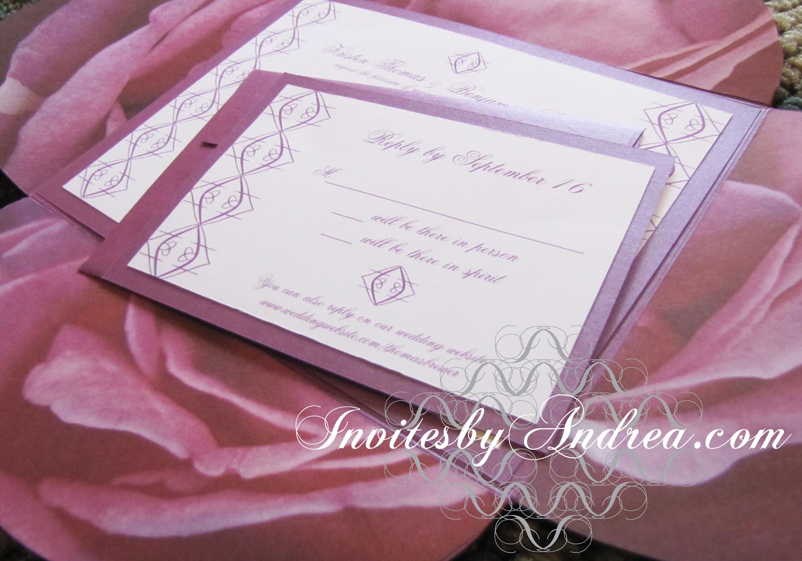
"Black Gold" Invitation Duo (invite & reply card)


The gold reply envelope matches the petal fold envelope, and both the invitation and reply card are mounted on metallic onyx black cardstock for extra sparkle.


 The amount of shine on the metallic envelopes and papers depends on the angle to the nearest light source. In the photo below, you can really see how sparkly the materials can look - making this stationery set perfect for winter weddings and holiday parties (especially New Year's Eve)!


The invitation and reply card are printed with simple black and gold lettering and one of my favorite patterns on a classic white cardstock background.


If the pattern looks familiar to you, it may be because you've seen it on one of my first Fancy/Funky Friday posts, which I posted more than a year ago! I used this pattern on the invitations I created for my own rehearsal dinner, way back in July 2011.


Next week's Sunday Sample Spotlight: "Through the Glass" - another one of my absolute favorites!


Click here to view all Sunday Sample Spotlight posts.

"Like" Invites by Andrea on Facebook!
Follow Invites by Andrea on Twitter!


-

Shameless Plug Time: Love this invitation (or others featured on this blog)? Want something similar (or something completely custom) designed for your event? Visit Invites by Andrea to view more samples, download a catalogue pdf, or fill out a design request form. Or shoot me an email to ask me your questions or learn more information.

Friday, December 28, 2012

Fancy/Funky Friday: Patterns Cinderella & Kelly

It's the last Friday of 2012 - celebrate by savoring this pair of childlike Fancy/Funky patterns! :)

First, the "fancy": Pattern Cinderella


Why it's "fancy": Curvy, elegant lines looped into a whimsical design.

Why it's great: Unlike many of my "fancy" patterns, pattern Cinderella has enough breathing room around each design "unit" that they're easily distinguished. Because of this, it looks less like real lace and more cartoonish - which is why I named it after a Disney princess.

Does this pattern look familiar? I used it in my "Waterlilies" watercolor, which I painted in October and posted about last month. :)


And now, the "funky": Pattern Kelly


Why it's "funky": Thick, bulbous arcs swoop together to form squiggle-infused circles - you can't get much more bold and graphic than this. :)

Why it's great: The foreground/background easily changes - you can consider either the green yin-yang shapes or the pinched white rectangles that connect to each other with a thin S as the "positive" shapes in this pattern.

-

Click here to see all posts related to "Fancy/Funky Friday" 


Shameless plug time: Love my patterns? I incorporate them into a lot of the artwork I create, from stationery for Invites by Andrea to the watercolors I paint. Check out Invites by Andrea's website to see examples of these patterns in use or drop me a line at andrea@invitesbyandrea.com to let me know what you think!

Wednesday, December 26, 2012

Event Idea: Day After Christmas Party

If you're like me, Christmas is your favorite holiday, and you're always a little sad on December 26th to see it go. This year, keep the spirit alive just a little longer by hosting a Day After Christmas Party for your friends and family!

I think the best main theme of a Day After Christmas Party is starting the countdown until the next year's Christmas. Display countdown timers (accurate to minutes and seconds) on computer monitors (you can easily find several free options online), or make a more low-tech version out of construction paper, which you adjust every hour to indicate one hour less to wait until the start of the next December 25th.

If 364 days is too long to wait, another option is to celebrate the ongoing current holiday season with a Twelve Days of Christmas theme. Assign every guest a day and have them bring food or presents to distribute that coincides with their assigned day. For example, your "Second Day of Christmas" guest might bring sugar cookies in the shapes of doves (harkening the song lyric "two turtle doves") and gifts of pairs of gloves (to represent the number two). A guest assigned the "Eighth Day of Christmas" could bring foods and drinks heavy in milk ingredients (such as egg nog or hot chocolate), and dress as a French maid. ;)

Another great idea is to have a Leftovers Party to avoid rotten or wasted food. Have your guests bring leftover dishes from previous Christmas parties or meals and have a big potluck. This is also a great way to get rid of edible gifts you may have received that you know you're never going to eat - maybe a well-meaning coworker gave you some peanut brittle (not knowing you have a nut allergy), or stockings full of candy (not knowing your New Year's Resolution for 2013 is to cut back on sweets), or maybe you just received way too many Christmas cookies to eat all by yourself. Whatever the reason, share these unwanted gifts with your guests to help clear out your kitchen and satisfy their hunger!

You can even take this one step further and have a white elephant gift exchange, where each guest brings a gift or two that they received over the holidays that (for whatever reason) they don't want. One person's trash can be another person's treasure! :)

-

Need party invitations? Check out my custom stationery at InvitesbyAndrea.com!

Sunday, December 23, 2012

Sunday Sample Spotlight: "The Purple Petal"

This is one of my favorite scrapbook-paper stationery designs!

"The Purple Petal" Invitation Duo (invite & reply card)

I just loved the photographic quality of the scrapbook paper, showing a very large-scale purple rose in such detail that you can see the veins in each petal, and knew I had to use it in a design. 


I used a petal-fold envelope to further exude the flowery feeling, and pasted the scrapbook paper to the insides of each of the four envelope flaps.


The actual invitation and reply card are each printed on white cardstock and flanked with one of my fancy patterns. I chose a calligraphic-inspired font to match the elegance of the pattern and floral scrapbook paper.

The petal fold envelope and matching reply card envelope are the same metallic purple color. I also used a matching metallic purple cardstock to frame each piece of printed stationery - the white cardstock is glued to the purple cardstock. Just this little bit of extra weight can go a long way in bringing the design together (in this case, matching the stationery to the envelopes), as well as adding significance (real and figurative "weight") to the invitation of an important event.


This stationery set is perfect for elegant and feminine affairs like weddings, anniversary parties, or Valentine's Day, and the color scheme works great for almost any time of the year (why not use this stationery for an Easter celebration?). I love different shades of lavender and purple paired with white for wintertime, but the large scale of the scrapbook's rose would also work well for the spring and summer, when roses and other colorful flowers are in full bloom.


Next week's Sunday Sample Spotlight: A beautiful black & gold stationery set perfect for New Year's!


Click here to view all Sunday Sample Spotlight posts.

"Like" Invites by Andrea on Facebook!
Follow Invites by Andrea on Twitter!


-

Shameless Plug Time: Love this invitation (or others featured on this blog)? Want something similar (or something completely custom) designed for your event? Visit Invites by Andrea to view more samples, download a catalogue pdf, or fill out a design request form. Or shoot me an email to ask me your questions or learn more information.

Friday, December 21, 2012

Fancy/Funky Friday: Patterns Cassandra & Decada

Happy Friday! Here are the patterns du jour:

First, the "fancy": Pattern Cassandra


Why it's "fancy": Thin lines that form curves and loops; from a distance, it looks like a collage full of strips of scallop-trimmed lace!

Why it's great: There are several different points of interest throughout the pattern - the negative white spaces with quotation-mark-like forms ascending and descending like stalagmites and stalactites and the diamond shapes formed when some of the criss-crossing lines intersect are my two favorites. :)


And now, the "funky": Pattern Decada


Why it's "funky": Simple, graphic shapes with a whimsical childlike feel.

Why it's great: Every other column of pattern units are staggered so the cloud-like forms fit together like puzzle pieces - and the direction of overlap also alternates with each column, so that some pattern units are overlapped on the bottom, while others are overlapped at the top.


-

Click here to see all posts related to "Fancy/Funky Friday" 


Shameless plug time: Love my patterns? I incorporate them into a lot of the artwork I create, from stationery for Invites by Andrea to the watercolors I paint. Check out Invites by Andrea's website to see examples of these patterns in use or drop me a line at andrea@invitesbyandrea.com to let me know what you think!

Wednesday, December 19, 2012

Winter Color Combo: Dark Green & "Christmas Glow"

You know what "glow" I'm talking about - the color of your normally beige walls when warm electric Christmas lights reflect around the room and the color of flickering candle flames - the artificial glows we create to compensate for the lack of brilliant sunshine this time of year. Pair that warm golden orange glow with the dark green of a Christmas tree, and you have a unique but beautiful holiday-themed color scheme.


This color scheme is perfect for a holiday party, but also works great for winter weddings. Adorn mantles with evergreen boughs and orange flowers. Cover tables with dark green tablecloths and make a centerpiece entirely out of glowing candlesticks staggered at different heights. Hang golden orange paper lanterns from the ceiling and wrap silky green ribbons around chairs, napkins, and party favors.

The end result is breathtaking. The warmth of the orange and the depth of the forest green instantly make your guests feel at home, since they mimic the quiet colors of lit fireplaces, family gatherings, and Christmas trees.

-

Follow Invites by Andrea on Twitter!
"Like" Invites by Andrea on Facebook!

Shameless Plug Time: Love this color combination? Looking for custom stationery made to match these colors (or whatever other color combinations you're using for your event)? Visit Invites by Andrea to view more samples, download a catalogue pdf, or fill out a design request form. Or shoot me an email to ask me your questions or learn more information.

Tuesday, December 18, 2012

Winter Color Combo: Sky Blue & Light Olive

Blue and green are both on the "cool" side of the color wheel - making this color combo great for winter events!


The light sky blue instantly reminds you of the color of frost, while the olive adds a hint of warmth (since it's green mixed with a bit of yellow or brown) and alludes to the eventually-returning spring. There are a lot of great olive and blue fabrics out there that would make for great tablecloths, and several light green flowers to choose from for decoration (such as cymbidium orchids, mums, lisianthus, gladiolus, hydrangea, and carnations).

Winter is also a great time to use bare tree branches or tree silhouettes (like the neckties pictured in the first row of the above inspiration board). You can carry that theme throughout your wall decor with tree stencils or peel-away wall stickers, and also incorporate tree branches into your reception centerpieces.

This color scheme is also great for interior design, and works best in a calming location, such as a breezy living room, nursery, or relaxing bedroom. :)

-

Follow Invites by Andrea on Twitter!
"Like" Invites by Andrea on Facebook!

Shameless Plug Time: Love this color combination? Looking for custom stationery made to match these colors (or whatever other color combinations you're using for your event)? Visit Invites by Andrea to view more samples, download a catalogue pdf, or fill out a design request form. Or shoot me an email to ask me your questions or learn more information.

Sunday, December 16, 2012

Sunday Sample Spotlight: "Friends Forevergreen"

Nothing feels more like winter than forest green pine trees paired with the crisp color of pure white snow!

"Friends Forevergreen" Invitation Duo (invite & info insert)

In this stationery set, the text is decorated with photographic evergreen scrapbook paper, transparent green ribbons, and warm metallic copper brads. I used a recycled ivory "Himalaya" fold envelope, and pasted scrapbook paper to the left flap and right side pocket.


I also scanned in the scrapbook paper to incorporate the design at the tops and bottoms of each printed sheet, helping the invitation and information card relate both to each other and the evergreen-decorated envelope!


Next week's Sunday Sample Spotlight: "The Purple Petal"


Click here to view all Sunday Sample Spotlight posts.

"Like" Invites by Andrea on Facebook!
Follow Invites by Andrea on Twitter!


-

Shameless Plug Time: Love this invitation (or others featured on this blog)? Want something similar (or something completely custom) designed for your event? Visit Invites by Andrea to view more samples, download a catalogue pdf, or fill out a design request form. Or shoot me an email to ask me your questions or learn more information.

Friday, December 14, 2012

Fancy/Funky Friday: Patterns Eloise & Amelia

Can you believe we're already halfway through December? Don't waste another minute - check out this week's patterns!

First, the "fancy": Pattern Eloise


Why it's "fancy": Thin, elegant lines that form perfect ellipses and cute bow-like shapes.


Why it's great: The small tip-touching triangles really make this otherwise simple pattern by adding unexpected visual interest. Depending on how you look at them, they resemble bows or diamonds!


And now, the "funky": Pattern Amelia


Why it's "funky": Thick, bold lines, unusual shapes, and a bright orange color.

Why it's great: The pattern "units" aren't exactly repeated - every other one is rotated ninety degrees to give off a playful vibe. Plus, its fun color and bold bubble-like shapes just scream "1970s!" :)

-

Click here to see all posts related to "Fancy/Funky Friday" 


Shameless plug time: Love my patterns? I incorporate them into a lot of the artwork I create, from stationery for Invites by Andrea to the watercolors I paint. Check out Invites by Andrea's website to see examples of these patterns in use or drop me a line at andrea@invitesbyandrea.com to let me know what you think!

Wednesday, December 12, 2012

Winter Color Combo: Pale Pink & Charcoal Gray

Dark charcoal gray is a great winter neutral for those who want to steer away from the more common white or silver. Charcoal gray has a depth to it that adds a little mystery, and works great with fragile winter pastels like pale pink.


Use pale pink flowers to decorate charcoal gray tables, and add sparkle whenever you can (spray paint tree branches a sparkly gray and hang strands of pink pearls or small pink Christmas tree ornaments on each branch - and then add even more "bling" in the jewelry and shoes you wear).

For weddings, dress the guys and girls in charcoal gray, and mix white flowers into pale pink bouquets for a more dimensional look. Adorn white or silver chiavari chairs with pink ribbons. And don't forget to incorporate your colors into your makeup and nail polish, too! Create a smoky gray eye with lots of eyeshadow, then use a very pale pink lipstick and blush so that all emphasis remains on your eyes.

-

Follow Invites by Andrea on Twitter!
"Like" Invites by Andrea on Facebook!

Shameless Plug Time: Love this color combination? Looking for custom stationery made to match these colors (or whatever other color combinations you're using for your event)? Visit Invites by Andrea to view more samples, download a catalogue pdf, or fill out a design request form. Or shoot me an email to ask me your questions or learn more information.

Tuesday, December 11, 2012

Winter Color Combo: Oxblood Red & Navy Blue

One of the hottest colors this season is oxblood red (also known as burgundy, to those who prefer a less disgusting-sounding name). Pair it with another dark-color-turned-neutral - the classic navy blue - for a sophisticated color scheme so dark that it instantly feels rich.


Dress the ladies of your wedding party in oxblood red gowns with navy blue pumps, and adorn the men with crisp navy blue suits and ties, with oxblood loafers. Have your florist find flowers with very deep red hues and create dark, mysterious bouquets and centerpieces. Cover the tables in navy tablecloths.

In general, you can take this color scheme one of two ways. First, you can look to menswear and England for inspiration (think of the richly colored libraries and billiards rooms of old mansions, men's-only clubhouses, and the masculine decor of the first-built universities). Second, if you're planning more of an "off-beat" affair, take inspiration from Gothic literature and architecture, as well as modern goth culture (think lacy boots and gloves, blood-red roses, dark lipstick, and a navy blue accent color that's so dark it's almost black).

Finally, this color scheme isn't limited to winter weddings. It would also make a unique color scheme for an adult Halloween party or Gothic Valentine's Day affair, and works great for anniversary dinners and other elegant events where you're looking for a male-friendly but sophisticated color scheme.

-

Follow Invites by Andrea on Twitter!
"Like" Invites by Andrea on Facebook!

Shameless Plug Time: Love this color combination? Looking for custom stationery made to match these colors (or whatever other color combinations you're using for your event)? Visit Invites by Andrea to view more samples, download a catalogue pdf, or fill out a design request form. Or shoot me an email to ask me your questions or learn more information.

Sunday, December 9, 2012

Sunday Sample Spotlight: "Ole Black & Blue Eyes"

What's more modern than an epic black envelope? Answer: Not much.

"Ole Black and Blue Eyes" Invitation Duo (invite & reply card)

If you're looking to create a balance between the traditional and modern, look no further than this stationery set, which features an elegant lace-like pattern that feels fresh and new thanks to its large scale, the timeless Helvetica, and a black petal-fold envelope.


More sophistication is added with the tactile characteristics of this design - the petal-fold envelope is a black linen, which gives it a hint of texture, and the obviously-textured light blue cardstock and powder blue brads give even more three-dimensionality to the set.


The cool blue hues paired with the classic and crisp black & white neutrals create a great color scheme that's perfect for winter!


Next week's Sunday Sample Spotlight: An evergreen-themed holiday design!


Click here to view all Sunday Sample Spotlight posts.

"Like" Invites by Andrea on Facebook!
Follow Invites by Andrea on Twitter!


-

Shameless Plug Time: Love this invitation (or others featured on this blog)? Want something similar (or something completely custom) designed for your event? Visit Invites by Andrea to view more samples, download a catalogue pdf, or fill out a design request form. Or shoot me an email to ask me your questions or learn more information.

Friday, December 7, 2012

Fancy/Funky Friday: Patterns Henrietta & Delilah

Happy Friday! Here are today's patterns!

First, the "fancy": Pattern Henrietta


Why it's "fancy": Loops galore definitely give the pattern a lace-like appearance.

Why it's great: Up close, you can see that not all loops are created equal: some are rounder, others are thin and almond-shaped, and others still are comprised of thick, bold lines.


And now, the "funky": Pattern Delilah


Why it's "funky": Perfect squares (tilted almost ninety degrees), obvious lowercase d's and e's, and a general "crowded" feel.

Why it's great: I love the squares that were created when the d's serifs met! The white squares give moments of calm to an otherwise hectic pattern.


-

Click here to see all posts related to "Fancy/Funky Friday" 


Shameless plug time: Love my patterns? I incorporate them into a lot of the artwork I create, from stationery for Invites by Andrea to the watercolors I paint. Check out Invites by Andrea's website to see examples of these patterns in use or drop me a line at andrea@invitesbyandrea.com to let me know what you think!

Wednesday, December 5, 2012

Winter Color Combo: Neon!

You might not think of neon colors when you're considering winter hues, but neon is a great color combo choice to add some spark to the coldest months of the year. :)


Don't be afraid to use several different shades, from neon yellow, pink, and orange to the more unusual electric blues and greens. There are almost limitless opportunities to incorporate neon throughout your event. Decorate tables by spray painting old vases or vintage metal lanterns with shades of neon, and then keep the flowers to a more delicate white. Tie neon bows to the backs of chairs, and hang old neon signs on the wall to give off a funky vibe. Serve colorful cocktails and brightly frosted cupcakes.

For a wedding, have each bridesmaid pick a different neon color to wear, and adorn the walls of the venue with re-purposed picture frames and mirrors that you've spray painted with a coat of bright color. Then, give out neon-themed wedding favors like fun sunglasses (even in the middle of winter!), or rock sugar candy.

Then, bring everything together (and give all the neon accents the perfect backdrop) with a season-appropriate neutral like crisp clean white. Your guests will forget all about the raging snowstorm outside and feel like they've entered a tropical paradise!

-

Follow Invites by Andrea on Twitter!
"Like" Invites by Andrea on Facebook!

Shameless Plug Time: Love this color combination? Looking for custom stationery made to match these colors (or whatever other color combinations you're using for your event)? Visit Invites by Andrea to view more samples, download a catalogue pdf, or fill out a design request form. Or shoot me an email to ask me your questions or learn more information.

Tuesday, December 4, 2012

Winter Color Combo: Periwinkle & Silver

Mix shades of periwinkle blue and silver for a distinctly winter feel perfect for an elegant wedding or holiday party!


I just love the wedding party in the middle of the last row of the inspiration board above. The long periwinkle gowns and warm white shoulder wraps epitomize this color scheme and the season. Bring those colors inside with long periwinkle tablecloths, crisp white napkins, and silver chiavari chairs. If you want to play up the Christmas season, hang tiny silver bells on silver spray-painted tree branches. You can even put a crystal bowl of silver and periwinkle ornaments out on each reception table as a beautifully festive centerpiece.

-


Follow Invites by Andrea on Twitter!
"Like" Invites by Andrea on Facebook!

Shameless Plug Time: Love this color combination? Looking for custom stationery made to match these colors (or whatever other color combinations you're using for your event)? Visit Invites by Andrea to view more samples, download a catalogue pdf, or fill out a design request form. Or shoot me an email to ask me your questions or learn more information.

Sunday, December 2, 2012

Sunday Sample Spotlight: "Le Moulin Rouge"

Today's stationery sample is all about the embellishments: two thick ribbons visually cut the printed invitation into thirds, while the large gold brads dot the ribbons like buttons on a fashionable jacket.


"Le Moulin Rouge" Invitation

This invitation uses a red petal-fold envelope, gold brads, and a unique sparkly ribbon that features stripes of pink and red. The text is printed in pink and red to match the ribbon and envelope, with the most important information written in a fun vintage font reminiscent of the 1920s.


Since this invitation doesn't have a lot of information (as it's an invitation to a couple's thirtieth anniversary party), there was plenty of room to play around with presentation. The petal-fold envelope folds down and covers the entire invitation - so when the recipient opens it, the colorful ribbon, large brads, and fun font are all unexpected surprises!


This red and pink color scheme would also work great for Valentine's Day!


Next week's Sunday Sample Spotlight: A modern black & blue color scheme!


Click here to view all Sunday Sample Spotlight posts.

"Like" Invites by Andrea on Facebook!
Follow Invites by Andrea on Twitter!


-

Shameless Plug Time: Love this invitation (or others featured on this blog)? Want something similar (or something completely custom) designed for your event? Visit Invites by Andrea to view more samples, download a catalogue pdf, or fill out a design request form. Or shoot me an email to ask me your questions or learn more information.