Showing posts with label anniversary. Show all posts

Sunday, March 17, 2013

Sunday Sample Spotlight: "Timeless Treasure"

Previously, I've shown a pink and gray stationery set that featured Lacey - the first pattern I ever designed in Illustrator. Today's stationery sample uses the same pattern - but in some new, interesting ways!


"Timeless Treasure" Invitation Design

Printed on cream linen paper and mounted on a textured gray cardstock, this stationery set boasts a lavender and gray color scheme that's subtly beautiful and perfect for almost any occasion, from weddings to anniversary celebrations.

This particular invitation is for an anniversary dinner, and the theme is - fittingly - the passage of time.


I used a strip of Pattern Lacey along the top and bottom of the design, and then repeated a smaller scale version of the pattern right next to it in a lighter shade to add the illusion of depth. The pattern is also found in the actual illustration of the clock, where I wrapped the pattern around into a circle and put patterned spacers between each of the Roman numerals on the clock face.


Next week's Sunday Sample Spotlight: An all-white color scheme that is sophisticated and ethereal...


Click here to view all Sunday Sample Spotlight posts.

"Like" Invites by Andrea on Facebook!
Follow Invites by Andrea on Twitter!


-

Shameless Plug Time: Love this invitation (or others featured on this blog)? Want something similar (or something completely custom) designed for your event? Visit Invites by Andrea to view more samples, download a catalogue pdf, or fill out a design request form. Or shoot me an email to ask me your questions or learn more information.

Sunday, January 6, 2013

Sunday Sample Spotlight: "Through the Glass"

For the first Sunday Sample Spotlight of 2013, I present you with this elegant stationery set with a color scheme perfect for winter events - "Through the Glass."


"Through the Glass" Invitation Duo (invite & info card)

I used a metallic silver "Himalaya" pocketfold envelope with matching metallic silver cardstock as the main color of this sparkly stationery set. The invitation and information sheet are both printed on classic white cardstock, and then mounted to the silver backing with light blue brads and a beautiful two-toned blue ribbon.


The ribbon is a unique blend of satin and sheer - the shiny blue satin mimics the sparkle of the silver cardstock and envelope, while the sheer blue stripe lets the underlying pale blue pattern show through.


I love that when the envelope is folded closed, the silver speaks for itself. When you start to open it, the elegant pattern and ribbons are the first things you see!

As you can see in the photos below, the shiny silver envelope and paper can have quite a bit of sparkle to them, depending on the light. Just because paper is static and flat doesn't mean it has to be boring! Metallic papers are a great way to add interest and depth to your stationery.


The main invitation is only attached to the silver envelope on the left side (the three brads pierce through the ribbon, white cardstock, silver cardstock, and silver envelope), so you can lift up on the right side of the invitation for a peak of more of the beautiful silver envelope underneath!


This stationery set would be great for any elegant winter event, including December holidays, weddings, and anniversary dinners.


Next week's Sunday Sample Spotlight: "Art Nouveau"


Click here to view all Sunday Sample Spotlight posts.

"Like" Invites by Andrea on Facebook!
Follow Invites by Andrea on Twitter!


-

Shameless Plug Time: Love this invitation (or others featured on this blog)? Want something similar (or something completely custom) designed for your event? Visit Invites by Andrea to view more samples, download a catalogue pdf, or fill out a design request form. Or shoot me an email to ask me your questions or learn more information.

Tuesday, December 11, 2012

Winter Color Combo: Oxblood Red & Navy Blue

One of the hottest colors this season is oxblood red (also known as burgundy, to those who prefer a less disgusting-sounding name). Pair it with another dark-color-turned-neutral - the classic navy blue - for a sophisticated color scheme so dark that it instantly feels rich.


Dress the ladies of your wedding party in oxblood red gowns with navy blue pumps, and adorn the men with crisp navy blue suits and ties, with oxblood loafers. Have your florist find flowers with very deep red hues and create dark, mysterious bouquets and centerpieces. Cover the tables in navy tablecloths.

In general, you can take this color scheme one of two ways. First, you can look to menswear and England for inspiration (think of the richly colored libraries and billiards rooms of old mansions, men's-only clubhouses, and the masculine decor of the first-built universities). Second, if you're planning more of an "off-beat" affair, take inspiration from Gothic literature and architecture, as well as modern goth culture (think lacy boots and gloves, blood-red roses, dark lipstick, and a navy blue accent color that's so dark it's almost black).

Finally, this color scheme isn't limited to winter weddings. It would also make a unique color scheme for an adult Halloween party or Gothic Valentine's Day affair, and works great for anniversary dinners and other elegant events where you're looking for a male-friendly but sophisticated color scheme.

-

Follow Invites by Andrea on Twitter!
"Like" Invites by Andrea on Facebook!

Shameless Plug Time: Love this color combination? Looking for custom stationery made to match these colors (or whatever other color combinations you're using for your event)? Visit Invites by Andrea to view more samples, download a catalogue pdf, or fill out a design request form. Or shoot me an email to ask me your questions or learn more information.

Sunday, December 2, 2012

Sunday Sample Spotlight: "Le Moulin Rouge"

Today's stationery sample is all about the embellishments: two thick ribbons visually cut the printed invitation into thirds, while the large gold brads dot the ribbons like buttons on a fashionable jacket.


"Le Moulin Rouge" Invitation

This invitation uses a red petal-fold envelope, gold brads, and a unique sparkly ribbon that features stripes of pink and red. The text is printed in pink and red to match the ribbon and envelope, with the most important information written in a fun vintage font reminiscent of the 1920s.


Since this invitation doesn't have a lot of information (as it's an invitation to a couple's thirtieth anniversary party), there was plenty of room to play around with presentation. The petal-fold envelope folds down and covers the entire invitation - so when the recipient opens it, the colorful ribbon, large brads, and fun font are all unexpected surprises!


This red and pink color scheme would also work great for Valentine's Day!


Next week's Sunday Sample Spotlight: A modern black & blue color scheme!


Click here to view all Sunday Sample Spotlight posts.

"Like" Invites by Andrea on Facebook!
Follow Invites by Andrea on Twitter!


-

Shameless Plug Time: Love this invitation (or others featured on this blog)? Want something similar (or something completely custom) designed for your event? Visit Invites by Andrea to view more samples, download a catalogue pdf, or fill out a design request form. Or shoot me an email to ask me your questions or learn more information.

Sunday, November 18, 2012

Sunday Sample Spotlight: "Froth au Lait"

Today's Sunday Sample Spotlight features an invitation for an elegant anniversary celebration - but could be adapted just as easily for a wedding or other fancy event!

"Froth Au Lait" Invitation

This invitation is all about subtlety - the ivory "petal-fold" envelope has a hint of metallic shine (as do the tiny gold brads), and the thin layer of vellum laid over the invitation text gives it a sophisticated, extravagant feel without being too over-the-top.


Subtle elegant patterns cover the entire printed invitation, each one (whether in silver or gold) fading into the white background of the paper. Finally, small silver "50"s adorn each side of the invitation as a nod to the couple's fiftieth wedding anniversary.


Next week's Sunday Sample Spotlight: A unique copper-toned stationery set!


Click here to view all Sunday Sample Spotlight posts.

"Like" Invites by Andrea on Facebook!
Follow Invites by Andrea on Twitter!


-

Shameless Plug Time: Love this invitation (or others featured on this blog)? Want something similar (or something completely custom) designed for your event? Visit Invites by Andrea to view more samples, download a catalogue pdf, or fill out a design request form. Or shoot me an email to ask me your questions or learn more information.

Sunday, November 11, 2012

Sunday Sample Spotlight: "Purple Rain"

Sometimes elegant occasions call for sleek, simple stationery - and today's Sunday Sample Spotlight delivers just that.


"Purple Rain" - Invitation Duo (invite & reply card)

This stationery set features an invitation and reply card, both of which are printed on white paper and adhered to purple cardstock with pale lavender brads. The texture of the purple cardstock and the metallic shine of the silver "petal-fold" envelope give the design a touch of extravagance (without being too in-your-face or expensive), and the brads give three-dimensionality to each piece.


The calligraphic cursive font is simple and timeless - but the oversized elegant pattern that adorns the top of the invitation and reply card is large enough in scale that it gives the otherwise traditional design a more modern feel. Finally, I incorporated the brads into the pattern by punching them through the paper in the middle of a loopy form so that they would give the appearance of flowers. The end result is a beautiful, understated design with a crisp purple, silver and white color scheme that would work just as well for an anniversary celebration, New Year's party, or elegant dinner party as it would for a sophisticated wedding.


Next week's Sunday Sample Spotlight: "Froth au Lait"


Click here to view all Sunday Sample Spotlight posts.

"Like" Invites by Andrea on Facebook!
Follow Invites by Andrea on Twitter!


-

Shameless Plug Time: Love this invitation (or others featured on this blog)? Want something similar (or something completely custom) designed for your event? Visit Invites by Andrea to view more samples, download a catalogue pdf, or fill out a design request form. Or shoot me an email to ask me your questions or learn more information.

Sunday, October 7, 2012

Sunday Sample Spotlight: "Paper Lanterns"

Today's Sunday Sample Spotlight has a very sophisticated neutral color scheme of ivory, dark gray, and pale gold.


"Paper Lanterns" - Invitation Duo (invite & reply card)

The "Himalaya" pocketfold envelope is a shimmering metallic ivory with an elegant linen texture that really makes a statement about the formality of the event. Because the envelope was so romantic, I decided to use a dark gray instead of traditional black, to further soften the mood. Finally, I printed the stationery on white cardstock and added pattern accents in a pretty pale gold color to complete the look.


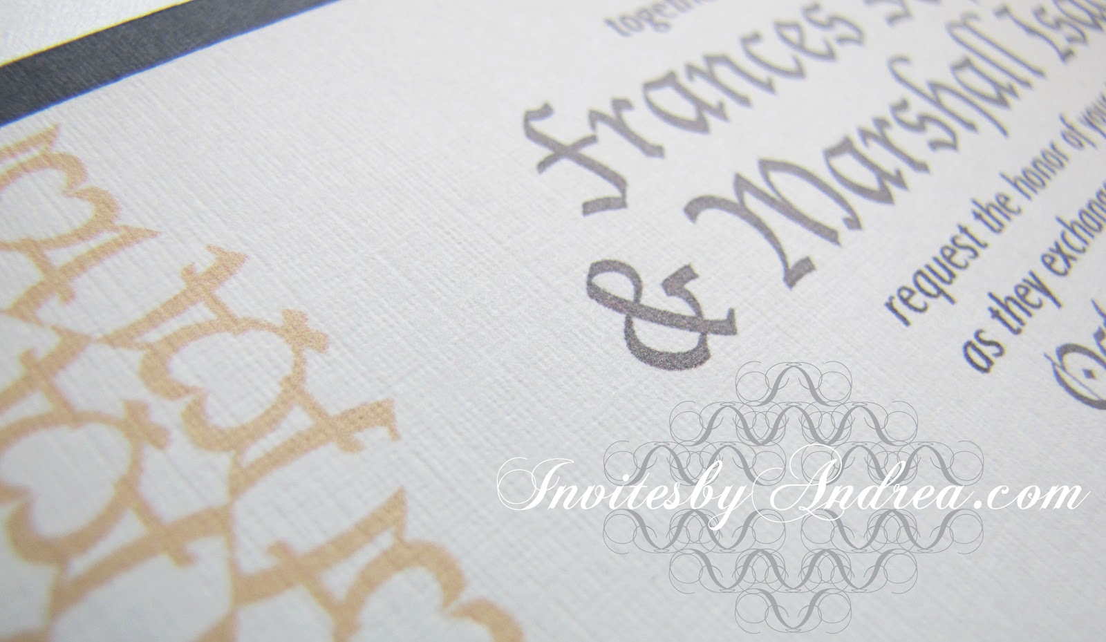
If this pattern looks familiar to you, don't worry - it should. :) I featured Pattern Vivian in a previous Fancy/Funky Friday blog post, and I've used the same pattern (in a radically different color scheme) in another stationery sample ("At First Blush").

I love this pattern because it's both simple and complex. To create it, I took the capital "A" of an Olde English font and reflected the character to create an elaborate heart shape. It can be very bold and funky when it's shown in a bright color (like hot pink), but in this design it starts to blend into the background, thanks to its pale color. It looks more elegant and refined in this color scheme, and adds the perfect amount of visual interest to a clean, sophisticated invitation.


In the photograph above, you can finally start to get a sense of the shimmery quality of the metallic linen envelope. In certain light, it really comes alive. I just love how pretty it looks!


Next week's Sunday Sample Spotlight: A bold blue and rich chocolate brown color combo!


Click here to view all Sunday Sample Spotlight posts.

"Like" Invites by Andrea on Facebook!
Follow Invites by Andrea on Twitter!


-

Shameless Plug Time: Love this invitation (or others featured on this blog)? Want something similar (or something completely custom) designed for your event? Visit Invites by Andrea to view more samples, download a catalogue pdf, or fill out a design request form. Or shoot me an email to ask me your questions or learn more information.

Sunday, August 26, 2012

Sunday Sample Spotlight: "The Perfect Pair"

This stationery set is based on a theme I saw on TheKnot.com - "The Perfect Pair" which features, as its illustration, a pair of pairs. :)

"The Perfect Pair" Invitation Duo (invite & information insert)


"The Perfect Pair" showcases a fun, modern color scheme: lime green and chocolate brown - a great color scheme for almost any season with its interesting mix of warmth (in the deep, rich brown) and cool yellow-green.


This stationery set uses a chocolate brown "Himalaya" pocketfold envelope, which I lined (on the left flap and right side pocket) with solid-colored green scrapbook paper. I then used these same colors on the printed stationery items, which feature graphic stripes and a simple two-color representation of pears leaning on each other. I created both the stripes and pears with the pen tool in Illustrator, and chose to have the pears touching each other without any hints of shadow so that it was a little hard to tell where one pear ended and another began.


The pear image is both adorable and sweet, and gets across the sentiment of a wedding in a fun but creatively simple way. And think of how easy it would be to continue the pear theme into your decor and wedding favors! This would also make a great theme for a wedding shower or anniversary party.


Next week's Sunday Sample Spotlight: "Kiss the Girl"


Click here to view all Sunday Sample Spotlight posts.

"Like" Invites by Andrea on Facebook!

-

Shameless Plug Time: Love this invitation (or others featured on this blog)? Want something similar (or something completely custom) designed for your event? Visit Invites by Andrea to view more samples, download a catalogue pdf, or fill out a design request form. Or shoot me an email to ask me your questions or learn more information.

Monday, July 16, 2012

My Paper Anniversary

Today is my one-year wedding anniversary! Back in 2010, I started designing all of my wedding stationery - and enjoyed it so much that I decided I wanted to design invitations for others' weddings as well! Now, Invites by Andrea has been in business for more than a year. It's amazing how quickly time flies. :)

In April 2011, I started posting about my upcoming nuptials and the projects I was working on for the event. Besides my stationery, I also painted watercolors for the reception tables and constructed a card box to match our wedding colors of coral and jade. As you can see from all the links in this paragraph - I've already posted a lot of blog entries about that event. Now, there is nothing else to say but remind you of this:

Though the name "Invites by Andrea" suggests that I design stationery, my skills are not limited to invitations only. I also design and print announcements, reply cards, thank you notes, save-the-dates, maps/directions, programs, menus, escort/place cards, and table markers. As a watercolorist, I can also paint decor for your wedding, whether that's patterned centerpieces for your reception, custom card boxes, or wall-hung paintings. I also have experience making books - which can act as photo albums, keepsakes, gifts, or guest books.

"Invites by Andrea" is more than just invitations. If you have another idea about how to make your event fantastic (even if I haven't listed it here!), don't hesitate to contact me. I might be able to create just what you have in mind! :)


Email: andrea@invitesbyandrea.com
Website: http://invitesbyandrea.com

Like "Invites by Andrea" on Facebook!
Wedding Wire Reviews

Friday, July 13, 2012

Fancy/Funky Friday: Patterns Andrea & Gigi

Because my one-year wedding anniversary is in three days, this week's theme is reflecting on the projects I finished for my own wedding. Today's "fancy" pattern is (though not the first pattern I ever designed) certainly the one that planted the seed in my mind to create more patterns and use my designs to decorate the borders of wedding stationery.


First, the "fancy": Pattern Andrea


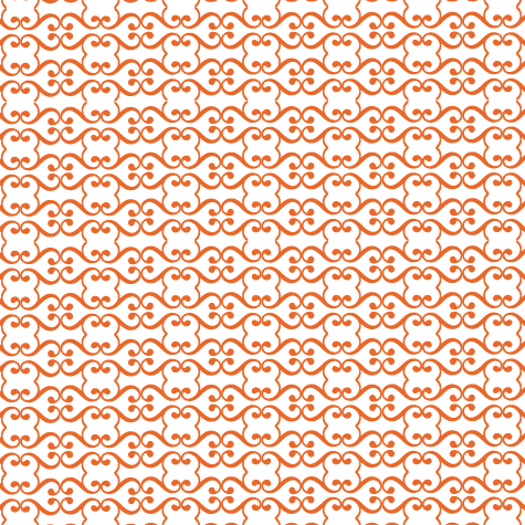
Pattern Andrea (named after myself not for narcissistic purposes but simply because it was the one I designed for my own wedding) was created from the curled line of the Baskerville italic ampersand character. Ampersands are some of my favorite characters to make patterns from, and I love how fitting they are to wedding themes. What could be more symbolic than an ampersand for an event celebrating the union of two people?

This pattern worked great for my wedding stationery because I used Baskerville italic in several places throughout the invitation; the text and pattern instantly connected to create a coheisive design. I also loved the slightly abstract heart-shaped forms that the pattern hinted at. I had our cake baker decorate each tier of our four-layer cake with a single strip of this pattern, and hand painted several watercolor placemats to incorporate the pattern into our reception table centerpieces. And of course, I used the pattern on all of our wedding stationery, from the thank you cards (I ordered so many that I'm still using them for non-wedding gifts!) and invitations to the table markers, escort cards, programs, and menus the guests picked up on the day of the event.


And now, the "funky": Pattern Gigi


Pattern Gigi (so named because of the prominent lowercase "g"s I used to create it) is a much bolder pattern. Because the lines are so thick, it works best as a large, graphic pattern. When it's small, the thick lines tend to bleed together, making it almost a solid color field instead of a fun, modern pattern.

Gigi has a fair bit of white negative space and the horizontal stripes of pattern create obvious divisions where the underlying structure is clear. These characteristics help calm it a little; Pattern Gigi is only projecting with the strong, clear voice of a public speaker - not screaming like a toddler. :)


-

Click here to see all posts related to "Fancy/Funky Friday" 


Shameless plug time: Love my patterns? I incorporate them into a lot of the artwork I create, from stationery for Invites by Andrea to the watercolors I paint. Check out Invites by Andrea's website to see examples of these patterns in use or drop me a line at andrea@invitesbyandrea.com to let me know what you think!

Sunday, May 6, 2012

Sunday Sample Spotlight: "By Any Other Name"

This year, it seems that practically every client I talk to about their wedding uses one (or more!) of the following three words to describe the aesthetic of their event: soft, romantic, and vintage. Pale pinks, deep reds, and creams are popular this year for just that reason, and it's no surprise that this particular design is a favorite among my clients. They love the feminine, romantic look of the flowers lining the petal envelope and want something similar for their own wedding.


"By Any Other Name" - Invitation Duo (invite & reply card)


"By Any Other Name" is an invitation duo situated on a deep red petal envelope with a soft linen texture. In case you're not sure how the petal envelope works, it folds up with each flap partly under the flap next to it, so that it creates a little spiral when closed, and opens up like a blooming flower bud. It's the perfect envelope for romantic weddings.


The red roses that line each flap of the inside of the petal envelope are cut from a piece of scrapbook paper I had. I haven't found this exact scrapbook paper again, but there are several other scrapbook paper designs I've found that are similar and would work just as well. I also have a lot of photographs of roses and other flowers, and could make a collage in Photoshop out of those to make my own version of the scrapbook paper.

Here are some of my favorite paper substitutes I've found for clients who were looking to duplicate this design:


All of those scrapbook choices fit the soft, romantic, and vintage feeling that this envelope and invitation design have, and, depending on the color scheme of the event, could be great choices to add a touch of elegance and femininity to your stationery.

For the actual invitation design, I used a simple design that was mainly text. I also scanned in the rose scrapbook paper and incorporated a few stripes of it on each printed piece just to help tie the invitation and reply card back to the envelope, but the text-heavy design would really work just as well without it. Because the scrapbook paper pops so much, it's best to keep everything else simple.


The invitation and reply card were each printed on a cream-colored linen cardstock so that the texture would match the texture of the envelope. The reply card has a matching cream-colored linen envelope, completing this romantic stationery set. Though this particular sample is for a wedding, this design could easily be adapted to an elegant anniversary party, and would be perfect for Valentine's Day. :)


Next week's Sunday Sample Spotlight: "At First Blush"


Click here to view all Sunday Sample Spotlight posts.

"Like" Invites by Andrea on Facebook!

-

Shameless Plug Time: Love this invitation (or others featured on this blog)? Want something similar (or something completely custom) designed for your event? Visit Invites by Andrea to view more samples, download a catalogue pdf, or fill out a design request form. Or shoot me an email to ask me your questions or learn more information.

Friday, December 23, 2011

Fancy/Funky Friday: Patterns Lacey & Robin

Happy Holidays! This is my favorite season of the year - I love the warmth that comes from spending time with family and friends back in town, all the delicious food, the beautiful snow, the pretty decorations and glittering lights... And what better way to start of one of the biggest holiday weekends of the year than with a new Fancy/Funky Friday post? ;)

First, the "fancy": Pattern Lacey


This pattern is actually the first one I ever created. I designed it for a graphic design class project in 2009, where we had to design business cards that represented ourselves to potential employers. I tried a few different illustrations before I settled on a pattern. I wanted something that felt like typography while not being too obvious (like actual unmodified letters), and once I started repeating the shapes I created, I fell in love with the end result. It was feminine and unique and felt a little sophisticated and lacy, which felt perfect for my personality and how I wanted it portrayed on my own business card.

I ended up using the pattern on my resume, as well, which you can see below. A line of the pattern was used to underline and highlight my pre-marriage surname, and even each of the bullet points used to list the items on my resume is a little tiny unit of the pattern.


I don't even remember what character I used to create it anymore, and unlike many of the patterns I've made since then, I adapted the character a lot before I settled on this final pattern, so only part of the character remains, and nothing is really identifiable. But I do remember this - the little unit that's found between every figure-8 unit is actually a scaled down, rotated, and slightly rearranged version of the negative space found inside the figure-8. Do you see it? In the eight-like shape the two middle parts (known as "counters" to all you typography-lovers out there) point in toward each other, while the little unit has the pointed sides pointing away from each other.

Of course, I've had this pattern around so long, that I've also adapted it for other things, including - you guessed it! - stationery!


In the second example I even rotated the pattern to form a circle and incorporated it into the illustration of a clock I used for this anniversary party invitation design. What better way to tie two different parts of a design together than to reuse part of the pattern in the separate illustration?

In the end, it's one of my favorite patterns of all time. It's simple and elegant, so it works great as a large block of pattern or a single stripe, and it adds instant class to everything it touches. Plus, it was my first, so it will always hold a special place in my heart - just like this holiday season. :)

And now, the "funky": Pattern Robin


Pattern Robin is pretty straightforward, especially for a "funky" pattern. It feels funky to me only because it is so simple - big and bold and graphic are words that come to mind - and this is a stark contrast to many of the "funky" patterns I create, which are often crazier and busier.

This pattern seems very masculine to me, since the shapes are so big and attention-grabbing. Plus, from a distance you see tons of simple shapes - rectangles, circles, even diamonds. There's nothing frilly or really detailed about it - it's just there and proud, and you can either like it or not. It's not changing for anybody. ;)


Because it's such a bold, simple graphic, it's a great choice for a white pattern on a color background, like I used in the sample above. I also really love it with metallic colors, since the round shapes that repeat look almost like tiny metal washers for a machine, or perhaps the setting for a beautiful, sparking gem in a piece of jewelry. The simplicity of the pattern is what makes it so versatile, and it adapts easily to almost any design. What can I say, I love it because it makes things easy for me! :)


Enjoy your holiday weekend! Stay safe!

-

Click here to see all posts related to "Fancy/Funky Friday" 


Shameless plug time: Love my patterns? I incorporate them into a lot of the artwork I create, from stationery for Invites by Andrea to the watercolors I paint. Check out Invites by Andrea's website to see examples of these patterns in use or drop me a line at andrea@invitesbyandrea.com to let me know what you think!