Friday, August 31, 2012

Fancy/Funky Friday: Patterns Connie & Louise

Today's patterns are both unique and feature (among other details) "x"-like designs.

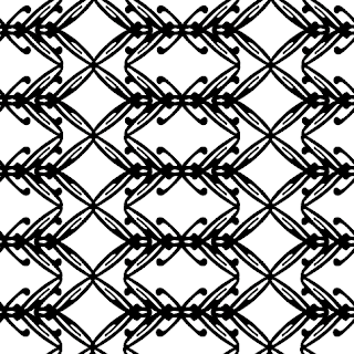
First, the "fancy": Pattern Connie


More unusual than many of my "fancy" patterns, Pattern Connie stays elegant with its thin lines and "x"-like details. The "x"-like forms both create structure and interest, while hinting at the regal diamond-like shapes I love to include in my "fancy" collection. The small loop-like details also hint at elegant crafts like embroidery or crochet, and from a distance, the design looks almost like lace.


And now, the "funky": Pattern Louise


This pattern feels distinctly Western, and brings to mind the designs of nineteenth-century American pioneer quilts. Furthermore, the curved bracket-like forms look like the sorts of designs a shoemaker might stamp on leather cowboy boots. From a distance, Pattern Louise appears to be a modified plaid design, but up close the curves of the almost-rectangular pattern units become more pronounced, giving it a more modern, playful vibe. Finally, the thinnest lines create an underlying "x" structure to each pattern unit, giving it an almost elegant feel.


-

Click here to see all posts related to "Fancy/Funky Friday" 


Shameless plug time: Love my patterns? I incorporate them into a lot of the artwork I create, from stationery for Invites by Andrea to the watercolors I paint. Check out Invites by Andrea's website to see examples of these patterns in use or drop me a line at andrea@invitesbyandrea.com to let me know what you think!

Wednesday, August 29, 2012

How to Line an Envelope

Lining envelopes is a great way to add a pop of color to your stationery, and its an easy process to do yourself!

Step 1: Insert the envelope liner into the envelope, making sure that the liner is tucked in as far as it will go and that it rests just under the sticky envelope seal.


Step 2: Fold the envelope closed as you normally would, making sure that the liner stays in place while it folds. This is much easier than measuring and trying to fold the liner separately and then inserting it into the envelope, and it makes a perfectly lined-up crease every time.


Step 3: Add glue to the back flap of the envelope liner.

I recommend using glue dots. They're easier to deal with and much less messier than liquid glue, and they stick superbly well. With liquid glue, you always run into the problem of not using enough or using too much. You don't want the glue to seep through the liner and ruin your stationery, and you don't want the glue to ooze out the other side and ruin the sticky part of the envelope making it either impossible to seal or impossible for your guests to open later on.


If you use a brand of glue dots that come on a long roll (like the "Zots" I used), you should either rip the paper around each dot or at least rip off a small section of the roll. It's easy to accidentally press a glue dot down on a part of the liner or envelope you didn't intend while you're applying a different dot on the same roll. Another easy way to solve that problem? Purchase glue dots that already come on individual backings, such as Michael's "Recollections" brand.


Press the glue dot firmly on to the back of the liner. For small or medium-sized glue dots, I placed five - one in the top corner, one on each side, and two on the center of each edge, just to help close the gaps that were created. For large-sized glue dots, I found three to be sufficient - one in each corner of the triangle.

Then, just peel off the paper backing. On the third picture in the above sequence, you can see what the envelope liner will look like once all the glue dots are in place.

Finally -

Step 4: Fold the envelope closed over the liner again, pressing down firmly to make sure the glue dots adhere to the envelope.


And voila! When you open the envelope, the liner should be attached to the top flap. In less than a minute, your envelope is beautifully lined! :)


-

Shameless plug time: Do you love the look of lined envelopes? Need invitations and stationery? Have an event coming up? Visit my website at InvitesbyAndrea.com or email me at andrea@invitesbyandrea.com for more information! I do weddings, bar/bat mitzvahs, birthdays, anniversary parties, holidays - anything you might need custom stationery for!

Sunday, August 26, 2012

Sunday Sample Spotlight: "The Perfect Pair"

This stationery set is based on a theme I saw on TheKnot.com - "The Perfect Pair" which features, as its illustration, a pair of pairs. :)

"The Perfect Pair" Invitation Duo (invite & information insert)


"The Perfect Pair" showcases a fun, modern color scheme: lime green and chocolate brown - a great color scheme for almost any season with its interesting mix of warmth (in the deep, rich brown) and cool yellow-green.


This stationery set uses a chocolate brown "Himalaya" pocketfold envelope, which I lined (on the left flap and right side pocket) with solid-colored green scrapbook paper. I then used these same colors on the printed stationery items, which feature graphic stripes and a simple two-color representation of pears leaning on each other. I created both the stripes and pears with the pen tool in Illustrator, and chose to have the pears touching each other without any hints of shadow so that it was a little hard to tell where one pear ended and another began.


The pear image is both adorable and sweet, and gets across the sentiment of a wedding in a fun but creatively simple way. And think of how easy it would be to continue the pear theme into your decor and wedding favors! This would also make a great theme for a wedding shower or anniversary party.


Next week's Sunday Sample Spotlight: "Kiss the Girl"


Click here to view all Sunday Sample Spotlight posts.

"Like" Invites by Andrea on Facebook!

-

Shameless Plug Time: Love this invitation (or others featured on this blog)? Want something similar (or something completely custom) designed for your event? Visit Invites by Andrea to view more samples, download a catalogue pdf, or fill out a design request form. Or shoot me an email to ask me your questions or learn more information.

Friday, August 24, 2012

Fancy/Funky Friday: Patterns Bunny & Keiko

Happy Friday! Scroll down for today's Fancy and Funky pattern choices! :)

First, the "fancy": Pattern Bunny


Pattern Bunny is definitely one of my more unique "fancy" patterns. Though the lines are thin, there are moments where lines overlap and create thick, bold areas - and several of the lines have little decorative "balls" on the ends of their curves, giving off a bug-like antenna vibe. :)

Still, the most obvious aspect of the pattern are elegant diamond shapes, which gives it a fancy feeling. This design works great as single stripes of pattern, as I used in the stationery sample below. Plus, the smaller diamond shapes make for great "reply boxes" on RSVP cards!


And now, the "funky": Pattern Keiko


Pattern Keiko has a very contemporary Asian feel. The line thickness and cartoonish curves remind me of the Japanese Anime style. I can totally see this fun pattern adorning the walls of a tourist-y Japanese store, or as a decorative element on children's clothes. The mix of straight lines and curves, as well as smaller and larger arcs make this a very fun, whimsical pattern that could be adapted for a variety of uses.


-

Click here to see all posts related to "Fancy/Funky Friday" 


Shameless plug time: Love my patterns? I incorporate them into a lot of the artwork I create, from stationery for Invites by Andrea to the watercolors I paint. Check out Invites by Andrea's website to see examples of these patterns in use or drop me a line at andrea@invitesbyandrea.com to let me know what you think!

Tuesday, August 21, 2012

Lakeshore Wedding Stationery

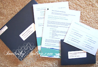
Back in February, I posted a collection of lakeshore-themed wedding save-the-dates that I designed for a client. A couple months ago, I finished the rest of their wedding stationery collection by designing and printing everything else including:

- An invitation (a two-page "packet" attached with a dark green brad that included a schedule of events at their casual park wedding celebration as well as several recommendations for hotel and camping accommodations)
- Two sets of reply cards (one intended for guests who were only invited to Saturday's big event, and another intended for out-of-town family and friends who were also invited to a dinner and temple service the night before and a brunch the Sunday morning after) 
- The extra invitation for the Friday and Sunday events (which was slipped into the envelopes of only some guests)
- Matching Thank You notes

and even:

- Adhesive name tags for all guests to wear at the Saturday and Sunday events (which I'll be including in another blog post at some future date). :)


All stationery items were printed in light blue (the background color of each piece), dark blue, and green. For the invitation and reply card envelopes, I used the same dark blue that I used on the save-the-dates, but chose a "Euro-flap" design (a more formal triangular seal instead of a rectangular seal).


Each invitation envelope and reply card envelope were addressed by adhering white rectangular labels, which I printed on my computer.


The informal wording of the invitation (which reads like a letter), the fun blue and green color scheme, and the easily readable sans-serif font all helped to give this stationery set a casual, outdoorsy feel that perfectly fit the vibe of this couple's wedding celebration. :)


-

Shameless Plug Time: Love this invitation (or others featured on this blog)? Want something similar (or something completely custom) designed for your event? Visit Invites by Andrea to view more samples, download a catalogue pdf, or fill out a design request form. Or shoot me an email to ask me your questions or learn more information.

Sunday, August 19, 2012

Sunday Sample Spotlight: "Elaborate Lives"

This classic white and navy blue invitation set features one of my "fancy" patterns. Paired with an elegant cursive font, "Elaborate Lives" is the epitome of formal - and the perfect design for a traditional wedding.

"Elaborate Lives" Invitation Duo (invite & reply card) with matching Save-the-Date

Each stationery item is printed on white cardstock and mounted on metallic dark blue cardstock. For the envelopes, I used a metallic pearl white "Himalaya" pocketfold envelope, with matching reply card and #10 size policy envelope for a uniquely-shaped save-the-date.


I used the elegant, loopy pattern in a big, bold way - the scale of the pattern is large, giving each stationery item an over-the-top splash of pattern along its borders. From a distance, the dark blue "zig-zag" down the middle of the pattern adds another hint of modern design to an otherwise traditional, formal invitation.


Metallic envelopes are a great way to add sparkle to elegant stationery! Here, both the white envelopes and blue cardstock have a metallic shimmer. The shine is subtle enough to be classy while sparkly enough in the light to be noticeable and appreciated - the perfect combination. :)


Next week's Sunday Sample Spotlight: A cute pear-themed stationery set!


Click here to view all Sunday Sample Spotlight posts.

"Like" Invites by Andrea on Facebook!

-

Shameless Plug Time: Love this invitation (or others featured on this blog)? Want something similar (or something completely custom) designed for your event? Visit Invites by Andrea to view more samples, download a catalogue pdf, or fill out a design request form. Or shoot me an email to ask me your questions or learn more information.

Friday, August 17, 2012

Fancy/Funky Friday: Patterns Villette & Erin

It's Friday again, and you know what that means - time for another Fancy/Funky Friday pattern post! :)

First, the "fancy": Pattern Villette


Villette is undeniably "fancy." Looking at it, I instantly think of lace, and for several reasons: the small loopy details, the elegant curves, the thin lines, the repetition of form, and the white negative spaces that really pop from the more heavily detailed areas. You could play up the lacy qualities of Pattern Villette by printing it on fabric, in a soft pastel or neutral color. On a colored background, Villette looks best as a subtle overlay that is slightly darker or lighter than the background, which gives it a shimmery lace-like appearance.

Alternatively, you can give Villette a modern twist (as I have here, by using a bright, bold cyan against the crisp white background) by creating a stark contrast between the pattern and background. The bold handling of this fancy pattern makes it even more interesting, and really catches the eye. This would be a great design for any kind of fabric - clothing, curtains, or upholstered furniture.


And now, the "funky": Pattern Erin


Pattern Erin is almost elegant in its simplicity, but the thick bold lines dominate the space so thoroughly that the white negative space is hardly noticeable at all (especially from far away), giving it a very bold, modern, funky attitude. The floral-like units were easily created by reflecting an italic lowercase "e" across both a horizontal and vertical axis.

My favorite part is the small white diamond formed where the counters (the loops on the top of the lowercase "e") all touch. That one tiny detail almost disappears when you view the pattern from a distance, but up close it adds a layer of interest to an otherwise rather plain design.


-

Click here to see all posts related to "Fancy/Funky Friday" 


Shameless plug time: Love my patterns? I incorporate them into a lot of the artwork I create, from stationery for Invites by Andrea to the watercolors I paint. Check out Invites by Andrea's website to see examples of these patterns in use or drop me a line at andrea@invitesbyandrea.com to let me know what you think!

Sunday, August 12, 2012

Sunday Sample Spotlight: "Peacock Alley"

Peacock feathers have been in style the last year or two, and it's no surprise why - the colors are gorgeous, and their design is so exotic and their nature so fragile that they give off an aura of luxury that's perfect for formal events like weddings.


"Peacock Alley" Invitation Trio (invite, info insert & reply card)

This stationery set was designed to fit inside a "Cascade" pocketfold envelope. The invitation takes up the flat part of the envelope in the middle, while the information insert (which features text about accommodations and rehearsal dinner info) and reply card and envelope slide into the pocket on the right. The "Cascade" envelope and reply envelopes are the perfect soft metallic blue to tone down the bright greens and cyan found in the feather illustrations printed on the stationery.


I designed the peacock feather image using Adobe Illustrator's pen tool. The multi-colored feathers are made of dark green, lime green, cyan, and hints of peach, with the characteristic "eye" of the feather done in the same cyan and peach, with a dark navy blue center. I chose a simple calligraphic font to add to the elegance of the design, and printed the text in cyan and green.


I added a sheet of thin semi-sheer pastel blue vellum over the main invitation and information insert to tie the stationery back to the light blue of the envelopes and give it an even more formal appearance. To attach the vellum overlay, I punched four holes at the top of the invitation and threaded a ribbed salmon-colored ribbon through the holes, to reflect the peach tones in the feather illustration.


The ribbon is not tied, glued, or secured in any way, and can easily be pulled out to allow the guests to view the design without the vellum attachment. This also helps the ribbon stay flat inside the envelope, and keep it from looking too messy or getting bunched up. In this example, I threaded the ribbon so that most of the ribbon was on the back of the invitation, leaving only two hints of color at the top (as seen from the front). I did this because I only wanted a hint of salmon pink, leaving the majority colors to be the stereotypical blues and greens associated with peacock feathers, but it could just as easily be threaded the other way to expose more of the elegant ribbon.


Next week's Sunday Sample Spotlight: "Elaborate Lives"


Click here to view all Sunday Sample Spotlight posts.

"Like" Invites by Andrea on Facebook!

-

Shameless Plug Time: Love this invitation (or others featured on this blog)? Want something similar (or something completely custom) designed for your event? Visit Invites by Andrea to view more samples, download a catalogue pdf, or fill out a design request form. Or shoot me an email to ask me your questions or learn more information.

Friday, August 10, 2012

Fancy/Funky Friday: Patterns Laila & Hannah

You don't have to come up with a complex pattern to make great designs! Sometimes simple is best, as today's fancy and funky patterns show. :)

First, the "fancy": Pattern Laila


This pattern (which was made from very tall, skinny capital "S" forms), made beautiful diamond-like heart shapes almost all by itself! I reflected the "S" both horizontally and vertically to make each pattern "unit" and then repeated them with a slight overlap to make the small loops. Each horizontal "stripe" of the design acts alone as a great accent for the borders of stationery, and when the stripes are repeated to create a field of pattern (as we see here), the forms flow almost seamlessly into each other. Pattern Laila is simple and elegant. The hearts sprinkled throughout aren't glaring (since they overlap to form loops), but act as a nice surprise to those who notice them. This pattern is perfect for almost any relatively formal event - but it's simple enough to be adapted to casual affairs, too.


And now, the "funky": Pattern Hannah


Pattern Hannah was also an easy pattern to make. I took an italic lowercase "w" and reflected it against a horizontal axis once to make each pattern unit. Because the resulting shape was so interesting, I didn't want to make the pattern too crowded by having each pattern unit touch, so I made sure to allow a bit of white negative space throughout the design. This pattern feels very kid-like to me - couldn't you just see this pattern wallpapered on a young child's bedroom? The shapes remind me both of sideways butterflies, and - for some reason - playful bananas or hot dogs. It's whimsical and fun without being too complicated, which makes it a classic "funky" pattern.


-

Click here to see all posts related to "Fancy/Funky Friday" 


Shameless plug time: Love my patterns? I incorporate them into a lot of the artwork I create, from stationery for Invites by Andrea to the watercolors I paint. Check out Invites by Andrea's website to see examples of these patterns in use or drop me a line at andrea@invitesbyandrea.com to let me know what you think!

Wednesday, August 8, 2012

Interior Design Color Schemes #4

Last week, I posted some photographs and showed how I picked out four colors from each image to use as inspiration for creating interior design inspiration color boards. Today, I have two new photographs to show you. :)


Inspirational Photo #7: Positano Flowers


This photograph was taken on the Italian Amalfi coast, in a town called Positano in 2010. These flowers were decorating the al fresco dining area of a beach-side restaurant. Though the magenta flowers and green leaves are the more saturated colors in this photograph, to me it is the two-toned white flowers that are most interesting. I loved the hints of purples and lavenders displayed on their petals.


To keep the emphasis on the pretty shades of purple and magenta, keep the green accents to a minimum, and choose an olive or khaki tint that will act more like a neutral than another jarring color. If your purples and magentas are very dark and saturated, using a lighter green than the one I had in the photograph is probably the best bet. In these examples, the olive green in the top left and right pictures and bottom middle image are used as light-colored accents. They're so light that they're almost the yellow color of early spring grass! To emphasize a darker green, tone down the dark shades of the purple and magenta, or better yet, just pick one of those saturated colors instead of using both.


Inspirational Photo #8: Fruit in Boston


I took this photograph at an outdoor street market in Boston in 2009. I love the dual colors of the fruit. When paired with the bright blue crate they were stacked in, the fruit are the very definition of saturated color.


To translate the saturated colors of the Boston photograph into home decor, remember to utilize accents and include a lot of neutrals. A dark chocolate brown or a fresh white are my favorite neutrals for this orange and yellow color scheme; because the citrus colors are so bold, the blue can even act as a neutral if it's dark enough. Select a navy, and use it either as subdued accents to a bright room, or make it more prominent and tone down the amount of orange and yellow instead. Either way, this color scheme is both modern and fun, and goes great in any contemporary space.


-


Don't forget - though these inspiration boards feature home decorating ideas, these color schemes could work just as well for any event! I hope you enjoyed my interior design advice. I'm a complete amateur when it comes to home decorating, but I've always loved finding new ideas to use color, and I can't wait to make over our new house with some of my own decorating ideas. :)


"Like" Invites by Andrea on Facebook!


Shameless Plug Time: Love these color combinations? Looking for custom stationery made to match these colors (or whatever other color combinations you're using for your event)? Visit Invites by Andrea to view more samples, download a catalogue pdf, or fill out a design request form. Or shoot me an email to ask me your questions or learn more information.

Tuesday, August 7, 2012

Interior Design Color Schemes #3

Last week, I posted some photographs and showed how I picked out four colors from each image to use as inspiration for creating interior design inspiration color boards. Today, I have two new photographs to show you. :)


Inspirational Photo #5: Barcelona's Port


This photograph is taken of the ship masts reflected in the water on a sunny Barcelona morning in 2010. I love the abstract feel of the image, as well as the classic color scheme. The blue and yellow combination is the perfect color scheme for a "beachy" feel, and creams, tans, white, and black all make great neutrals with the subdued blue and yellow shades.


For a light, airy, beach-themed room, keep the walls light colored and build up any blue or sandy yellow accents in little touches such as curtains and throw pillows. Painting a wall a dark denim blue or tan gives a more sophisticated, elegant feel to the room. I love the pairing of the black table and dark blue walls on the middle photograph on the bottom row.


Inspirational Photo #6: Brightly-colored roses


I absolutely love roses, especially ones with petals that show off multiple shades of color. Here, the deep magenta and bright sunshine yellow of the main rose really pops against the dark green stems and leaves, as well as the lighter pink of the rose in back. The light pink and dark green almost become the neutrals in this color palette, since the other two are so attention-grabbing and bold.


Coincidentally, this color scheme almost perfectly matches Andy Warhol's flower screenprints (shown in the middle of the inspiration board). Since the magenta and yellow are the stars of the show, you don't have to be shy in letting them shine. Feel free to go crazy with the saturated color, and then rein it in with neutrals (think a light shade of white or cream) on the floor, furniture, or walls. Finally, add dark green accents to the room with throw pillows and other small items, and you've developed a modern, sophisticated color scheme for your new favorite room in the house! ;)


-


Don't forget - though these inspiration boards feature home decorating ideas, these color schemes could work just as well for any event! I'll post more photos next week, so be sure to check back! :)


"Like" Invites by Andrea on Facebook!


Shameless Plug Time: Love these color combinations? Looking for custom stationery made to match these colors (or whatever other color combinations you're using for your event)? Visit Invites by Andrea to view more samples, download a catalogue pdf, or fill out a design request form. Or shoot me an email to ask me your questions or learn more information.