Showing posts with label metallic. Show all posts

Monday, September 16, 2013

Color of the Week - Antique Gold

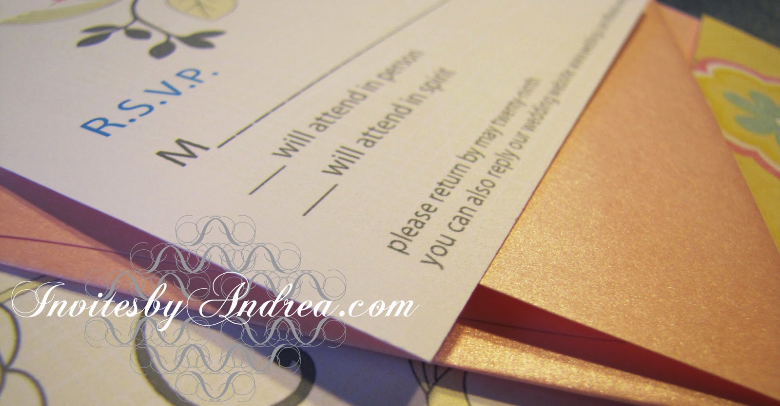
This week's color is Antique Gold - a sophisticated and worldly brownish-yellow hue!
 
Unlike pure gold, antique gold is slightly darker and browner, and often less metallic. It's a great neutral and pairs well with almost any color!


Fun facts about Antique Gold:

1.  The first recorded use of "old gold" as a color name in English was in the early 19th century, as a way to distinguish the darker qualities of the shade.
 
2. Many American universities and professional sports teams use antique gold as one of their primary colors, including Texas State University and Purdue University, as well as the New Orleans Saints football team and Pittsburgh Penguins hockey team.

3. Antique Gold is also known as Vegas Gold, since it is associated with the glamorous casinos and hotels of the Las Vegas Strip.

 -

Follow Invites by Andrea on Twitter!

"Like" Invites by Andrea on Facebook!


Shameless Plug Time: Love this color? Looking for custom stationery made to match this color (or whatever other color combinations you're using for your event)? Visit Invites by Andrea to view more samples, download a catalogue pdf, or fill out a design request form. Or shoot me an email to ask me your questions or learn more information.

Sunday, September 15, 2013

Sunday Sample Spotlight: "Steel Magnolias"

This simple stationery design features a neutral silver and white color scheme (perfect for winter!), a thick, modern serif font and a cute (but subtle) graphic flower-inspired pattern.

"Steel Magnolias" Invitation Duo (invite & info insert)

The invitation was printed on white paper and mounted to the folding silver metallic envelope with small silver brads in each corner.


You can really see how the dark silver envelope catches the light depending on the angle! Metallic envelopes are a great way to add elegance to your stationery.


Click here to view all Sunday Sample Spotlight posts.

"Like" Invites by Andrea on Facebook!
Follow Invites by Andrea on Twitter!


-

Shameless Plug Time: Love this invitation (or others featured on this blog)? Want something similar (or something completely custom) designed for your event? Visit Invites by Andrea to view more samples, download a catalogue pdf, or fill out a design request form. Or shoot me an email to ask me your questions or learn more information.

Sunday, September 8, 2013

Sunday Sample Spotlight: "Dressed to Impress"

Purple has long been one of my favorite colors. This simple purple and white color scheme combines a rich metallic purple with elegant lavender!

"Dressed to Impress" Invitation Duo (invite & reply card)

Both the main folding envelope and the reply card envelope are metallic purple. I used the same deep color for the smaller text and chose a subtler lavender tint for the larger text and elegant pattern.


Naturally, the font is calligraphic, thin, and sophisticated to match the fancy pattern flanking the top and bottom of the invitation!


Next week's Sunday Sample Spotlight: "Steel Magnolias"


Click here to view all Sunday Sample Spotlight posts.

"Like" Invites by Andrea on Facebook!
Follow Invites by Andrea on Twitter!


-

Shameless Plug Time: Love this invitation (or others featured on this blog)? Want something similar (or something completely custom) designed for your event? Visit Invites by Andrea to view more samples, download a catalogue pdf, or fill out a design request form. Or shoot me an email to ask me your questions or learn more information.

Wednesday, July 31, 2013

Summer Color Combo - Gold & Coral

Coral is perhaps *the* color of this summer - and gold gives it a perfect level of sophistication for elegant affairs! This gorgeous color scheme is a great blend of modern and timeless, and would also be beautiful for spring (especially with a lighter coral color) or autumn (thanks to the richness of the gold)!


Tie coral bouquets with gold ribbons or place coral blooms in gold vases. Deck your tables in coral tablecloths accented with gold chivari chairs and gold place settings. And there's no shortage of coral and gold jewelry at your disposal - use coral and gold beads to fill clear vases and adorn your centerpieces and favors with gold and coral ribbons!


I also think this color scheme would be beautiful for a family room or other living space. The coral and gold are so warm and inviting!

-

Follow Invites by Andrea on Twitter!
"Like" Invites by Andrea on Facebook!

Sunday, July 21, 2013

Sunday Sample Spotlight: "Where the Story Ends"

Metallic copper is a great neutral for almost any event - pair it with snow white and cream to let the copper really shine as the star!

"Where the Story Ends" Invitation Duo (invite & reply card)

This stationery set uses a horizontal pocketfold envelope in metallic copper. The invitation is attached to the main part of the envelope with a series of small metallic copper brads and cream striped ribbon for added texture; the reply card and reply envelope are easily tucked into the side pocket for mailing.


The invitation and reply card are both printed on smooth white cardstock. The smooth texture of the paper really helps the metallic shine of the envelope and the subtle texture of the ribbon stand out and take center stage!


Next week's Sunday Sample Spotlight: "Under Formal Circumstances"


Click here to view all Sunday Sample Spotlight posts.

"Like" Invites by Andrea on Facebook!
Follow Invites by Andrea on Twitter!


-

Shameless Plug Time: Love this invitation (or others featured on this blog)? Want something similar (or something completely custom) designed for your event? Visit Invites by Andrea to view more samples, download a catalogue pdf, or fill out a design request form. Or shoot me an email to ask me your questions or learn more information.

Sunday, May 26, 2013

Sunday Sample Spotlight: "Time to Pretend"

I absolutely adore this stationery set! It's perfect for spring!


"Time to Pretend" - Invitation Duo (invite & reply card)

I started with a metallic pale pink folding envelope, which I decorated with beautiful pale yellow scrapbook paper featuring a yellow/white/pale pink/sky blue floral design.


Up close (and tilted into the light), the pale rose-pink metallic envelopes really shine - and the scrapbook paper boasts an implied linen texture (though the paper is actually totally smooth). I very subtly mimicked this texture with pale yellow lines in the background of the printed invitation and reply card (it's so subtle, you can't even see it in these pictures!), and I incorporated the same blue, pink, and slate gray colors from the scrapbook paper for the images and text.


I recreated the linear floral design with Adobe Illustrator's pen tool so I could print it on the invitation. and seamlessly connect the digital printouts to the scrapbook-lined envelopes.


On the reply card, I only printed half of that flower form, poking down from the top edge of the paper. Because I didn't scale the image down (just cropped it), if you lay the RSVP on top of the invitation, the flowers line up exactly!

Because of its pastel colors, this design would work great for any spring event, as well as baby showers, birth announcements, and cutesy/feminine holidays like Easter and Valentine's Day!


Next week's Sunday Sample Spotlight: "Manors & Etiquette"


Click here to view all Sunday Sample Spotlight posts.

"Like" Invites by Andrea on Facebook!
Follow Invites by Andrea on Twitter!


-

Shameless Plug Time: Love this invitation (or others featured on this blog)? Want something similar (or something completely custom) designed for your event? Visit Invites by Andrea to view more samples, download a catalogue pdf, or fill out a design request form. Or shoot me an email to ask me your questions or learn more information.

Monday, May 20, 2013

Color of the Week - Champagne

This week's color is Champagne - a neutral that complements almost any color!

Champagne works with almost anything, from pastels to darker shades, and from highly saturated hues to fellow neutrals!


Fun facts about Champagne:

1. The first recorded use of the word champagne as a color term in English was in 1915; it was named for the sparkling wine produced from grapes grown in the Champagne region of France.

2. This color is often used to describe gemstones or paint finishes (such as in marketing automobiles) in order to imply that one is purchasing a luxury product.

3. Horses may inherit a "champagne gene" from either or both parents; this simple dominant allele creates rare horse coat colors, hazel eyes, and pinkish, freckled skin. In champagne colored horses, any hairs that would have been red are gold, and any hairs that would have been black are chocolate brown.


-

Follow Invites by Andrea on Twitter!
"Like" Invites by Andrea on Facebook!

Shameless Plug Time: Love this color? Looking for custom stationery made to match this color (or whatever other color combinations you're using for your event)? Visit Invites by Andrea to view more samples, download a catalogue pdf, or fill out a design request form. Or shoot me an email to ask me your questions or learn more information.

Sunday, May 19, 2013

Sunday Sample Spotlight: "If the Blue Fits"

Though simple at first glance, this stationery design has a lot going on - including a metallic envelope, scrapbook paper, colored brads, and a playful linear design.


"If the Blue Fits" - Invitation Duo (invite & info insert)

I started with a metallic sky blue folding envelope, then lined the left-side flap and right-side pocket with printed denim-blue scrapbook paper. I mimicked that same linear design on the actual invitation and information insert, using the nonparallel stripes as divisions for the paragraphs of text as well as design elements at the top and bottom of each page.


I love the "hollowness" of the font I used for the paragraph headlines - the thin blue outlines around each letter harken back to the nearly-horizontal stripes that cover the printed pages and scrapbook additions.


Finally, the blue brads give the stationery set added depth by incorporating three dimensions. From a distance, the lines and different shades of blue remind me of the way the surface of a calm lake might look as the water is rippled in the breeze. This design would be perfect for a spring or summer wedding - especially one outdoors near a pond or lake!


Next week's Sunday Sample Spotlight: a beautiful yellow and pink spring stationery set!


Click here to view all Sunday Sample Spotlight posts.

"Like" Invites by Andrea on Facebook!
Follow Invites by Andrea on Twitter!


-

Shameless Plug Time: Love this invitation (or others featured on this blog)? Want something similar (or something completely custom) designed for your event? Visit Invites by Andrea to view more samples, download a catalogue pdf, or fill out a design request form. Or shoot me an email to ask me your questions or learn more information.

Sunday, May 12, 2013

Sunday Sample Spotlight: "Creatively Cultivated"

Today's sample stationery set features a classic spring color scheme - green and pink!

"Creatively Cultivated" Invitation Duo (invite & reply card)

The invitation (printed on white cardstock and bordered with pale ballet pink cardstock) is mounted onto a metallic spring green folding envelope, while the matching pink-bordered RSVP card and metallic spring green reply card envelope are tucked into the side pocket.


Simple and direct, the straightforward text takes center stage - literally. In the background, two large faded triangles of floral-inspired pattern bleed into the white of the background to add subtle depth and the hint of the color scheme's springtime theme.


Next week's Sunday Sample Spotlight: "If the Blue Fits"


Click here to view all Sunday Sample Spotlight posts.

"Like" Invites by Andrea on Facebook!
Follow Invites by Andrea on Twitter!


-

Shameless Plug Time: Love this invitation (or others featured on this blog)? Want something similar (or something completely custom) designed for your event? Visit Invites by Andrea to view more samples, download a catalogue pdf, or fill out a design request form. Or shoot me an email to ask me your questions or learn more information.

Sunday, April 28, 2013

Sunday Sample Spotlight: "In the Land of Gray & Pink"

Gunmetal gray and hot pink make a great color combination for almost any time of year - the gray is cool and fresh, while the pink is bold and bright!


"In the Land of Gray & Pink" Invitation Duo (invite & reply card)

The above design features a long metallic gray folding envelope, with a pocket on the right to hold the RSVP card and metallic pink reply card envelope. To mail, the entire package is folded up and slipped inside a matching metallic pink A7 sized envelope.


 In the above picture, you can really see the metallic shine on both colors of envelope.


The pattern is fun and unexpected, featuring swirling starburst and spiral images, which are then repeated in a highly-structured plaid. By running the pattern along two adjacent sides of the design (the left and top edges), the whole invitation takes on an asymmetrical balance that is funky and playful.


Next week's Sunday Sample Spotlight: Birds!


Click here to view all Sunday Sample Spotlight posts.

"Like" Invites by Andrea on Facebook!
Follow Invites by Andrea on Twitter!


-

Shameless Plug Time: Love this invitation (or others featured on this blog)? Want something similar (or something completely custom) designed for your event? Visit Invites by Andrea to view more samples, download a catalogue pdf, or fill out a design request form. Or shoot me an email to ask me your questions or learn more information.

Sunday, April 14, 2013

Sunday Sample Spotlight: "The Music in Me"

This beautiful music-themed stationery design is all about the background image.

"The Music in Me" Invitation Duo (invite & info insert)

The envelope pictured is a metallic bronze-brown pocket envelope - perfect for giving off a rich, antique vibe and storing informational inserts right inside the envelope.


Semi-transparent layers of sheet music are stacked in the background of the design to give it both depth and a playful aged quality. I further played up this "classical" feel by choosing a font that feels like an old-school handwritten love letter.


This design also features a few different textures, which adds to its decadence. The invitation and info sheet were both printed on linen paper, and the folding envelope has a beautiful metallic sheen that shimmers in different lighting. In fact, depending on the warmth of the light, the linen paper can also take on a very different orange-brown tone, as you can see in the picture below.


Next week's Sunday Sample Spotlight: "Rainy Day"


Click here to view all Sunday Sample Spotlight posts.

"Like" Invites by Andrea on Facebook!
Follow Invites by Andrea on Twitter!


-

Shameless Plug Time: Love this invitation (or others featured on this blog)? Want something similar (or something completely custom) designed for your event? Visit Invites by Andrea to view more samples, download a catalogue pdf, or fill out a design request form. Or shoot me an email to ask me your questions or learn more information.

Sunday, March 31, 2013

Sunday Sample Spotlight: "What Lips My Lips Have Kissed"

This baby girl birth announcement is the perfect mixture of classic elegance and modern fun. 

"What Lips My Lips Have Kissed" Birth Announcement


The fun: The hot pink metallic petal-fold envelope is lined with semi-circles of scrapbook paper featuring large-scale pink polka dots.


The elegance: The printed announcement features a calligraphic font and hints of curly patterns in each corner.


But my favorite detail is the baby's head. Traced from an old photograph of myself as a baby, I turned a picture into a graphic illustration that's fun and modern, while still being realistic and photographic. Given photographs of your child (or engagement photos for wedding announcements), I can similarly turn one of your personal images into a fun illustration for use in whatever type of stationery you desire!


Next week's Sunday Sample Spotlight: "Ever the Same"


Click here to view all Sunday Sample Spotlight posts.

"Like" Invites by Andrea on Facebook!
Follow Invites by Andrea on Twitter!


-

Shameless Plug Time: Love this invitation (or others featured on this blog)? Want something similar (or something completely custom) designed for your event? Visit Invites by Andrea to view more samples, download a catalogue pdf, or fill out a design request form. Or shoot me an email to ask me your questions or learn more information.

Sunday, February 17, 2013

Sunday Sample Spotlight: "Florentine Brown"

I love the color of this metallic copper. Coupled with a rich chocolate brown, the light-reflecting copper really stands out! :)

"Florentine Brown" Invitation Duo (invite & reply card)

I used a bold, graphic pattern along one edge of both the invitation and reply card to give it a funky, modern feel. Unlike most of my patterns, I actually printed this pattern in white and placed it on top of a rectangle of copper color.


I used the same pattern unit (two capital-Cs turned sideways and facing each other) to break up paragraphs of text on the invitation and to serve as check-boxes for guests to indicate their availability on the RSVP card.


Both the copper envelopes and the dark brown cardstock that borders both the invitation and reply card are metallic, and the picture below is a great example of how different colors show off their shine in different ways. The lighter copper reflects light much easier (and looks a lot shinier) than its darker brown counterpart, where the metallic shimmer is more subtle and sophisticated.


The ultra-shine of two metallic colors makes this design perfect for holidays like New Year's Eve, where glitter and shimmer are everything.


Next week's Sunday Sample Spotlight: "My Life in Green & Pink"


Click here to view all Sunday Sample Spotlight posts.

"Like" Invites by Andrea on Facebook!
Follow Invites by Andrea on Twitter!


-

Shameless Plug Time: Love this invitation (or others featured on this blog)? Want something similar (or something completely custom) designed for your event? Visit Invites by Andrea to view more samples, download a catalogue pdf, or fill out a design request form. Or shoot me an email to ask me your questions or learn more information.

Sunday, January 13, 2013

Sunday Sample Spotlight: "Art Nouveau"

Give your event stationery the gold standard with this antique gold "Cascade" fold envelope!

"Art Nouveau" Invitation Duo (invite & reply card)

The long format of this folded envelope allow for a landscape-oriented invitation and leave plenty of room for a reply card and envelope to be tucked into the right pocket.


For this design, I used one of my "fancy" patterns to adorn the white backgrounds of the invitation and reply card. The font is an italic serif font with a calligraphic look, and the pattern's color mimics the gold of the metallic envelopes.


I attached a thin sheet of colored vellum to the invitation with two small gold brads to give the stationery added elegance. You can still read all of the invite's information through the vellum, or lift the paper to see the white background underneath.


Next week's Sunday Sample Spotlight: Getting pretty in pastels...


Click here to view all Sunday Sample Spotlight posts.

"Like" Invites by Andrea on Facebook!
Follow Invites by Andrea on Twitter!


-

Shameless Plug Time: Love this invitation (or others featured on this blog)? Want something similar (or something completely custom) designed for your event? Visit Invites by Andrea to view more samples, download a catalogue pdf, or fill out a design request form. Or shoot me an email to ask me your questions or learn more information.

Sunday, January 6, 2013

Sunday Sample Spotlight: "Through the Glass"

For the first Sunday Sample Spotlight of 2013, I present you with this elegant stationery set with a color scheme perfect for winter events - "Through the Glass."


"Through the Glass" Invitation Duo (invite & info card)

I used a metallic silver "Himalaya" pocketfold envelope with matching metallic silver cardstock as the main color of this sparkly stationery set. The invitation and information sheet are both printed on classic white cardstock, and then mounted to the silver backing with light blue brads and a beautiful two-toned blue ribbon.


The ribbon is a unique blend of satin and sheer - the shiny blue satin mimics the sparkle of the silver cardstock and envelope, while the sheer blue stripe lets the underlying pale blue pattern show through.


I love that when the envelope is folded closed, the silver speaks for itself. When you start to open it, the elegant pattern and ribbons are the first things you see!

As you can see in the photos below, the shiny silver envelope and paper can have quite a bit of sparkle to them, depending on the light. Just because paper is static and flat doesn't mean it has to be boring! Metallic papers are a great way to add interest and depth to your stationery.


The main invitation is only attached to the silver envelope on the left side (the three brads pierce through the ribbon, white cardstock, silver cardstock, and silver envelope), so you can lift up on the right side of the invitation for a peak of more of the beautiful silver envelope underneath!


This stationery set would be great for any elegant winter event, including December holidays, weddings, and anniversary dinners.


Next week's Sunday Sample Spotlight: "Art Nouveau"


Click here to view all Sunday Sample Spotlight posts.

"Like" Invites by Andrea on Facebook!
Follow Invites by Andrea on Twitter!


-

Shameless Plug Time: Love this invitation (or others featured on this blog)? Want something similar (or something completely custom) designed for your event? Visit Invites by Andrea to view more samples, download a catalogue pdf, or fill out a design request form. Or shoot me an email to ask me your questions or learn more information.