Showing posts with label architecture. Show all posts

Tuesday, December 11, 2012

Winter Color Combo: Oxblood Red & Navy Blue

One of the hottest colors this season is oxblood red (also known as burgundy, to those who prefer a less disgusting-sounding name). Pair it with another dark-color-turned-neutral - the classic navy blue - for a sophisticated color scheme so dark that it instantly feels rich.


Dress the ladies of your wedding party in oxblood red gowns with navy blue pumps, and adorn the men with crisp navy blue suits and ties, with oxblood loafers. Have your florist find flowers with very deep red hues and create dark, mysterious bouquets and centerpieces. Cover the tables in navy tablecloths.

In general, you can take this color scheme one of two ways. First, you can look to menswear and England for inspiration (think of the richly colored libraries and billiards rooms of old mansions, men's-only clubhouses, and the masculine decor of the first-built universities). Second, if you're planning more of an "off-beat" affair, take inspiration from Gothic literature and architecture, as well as modern goth culture (think lacy boots and gloves, blood-red roses, dark lipstick, and a navy blue accent color that's so dark it's almost black).

Finally, this color scheme isn't limited to winter weddings. It would also make a unique color scheme for an adult Halloween party or Gothic Valentine's Day affair, and works great for anniversary dinners and other elegant events where you're looking for a male-friendly but sophisticated color scheme.

-

Follow Invites by Andrea on Twitter!
"Like" Invites by Andrea on Facebook!

Shameless Plug Time: Love this color combination? Looking for custom stationery made to match these colors (or whatever other color combinations you're using for your event)? Visit Invites by Andrea to view more samples, download a catalogue pdf, or fill out a design request form. Or shoot me an email to ask me your questions or learn more information.

Thursday, September 6, 2012

Interior Design: Blue, Gray & Black Woodsy Bedroom

First, if you haven't watched any episodes of ABC's "Once Upon a Time" television series, you're really missing out. I watch quite a bit of (probably too much) television, and Once Upon a Time was easily my favorite show last year. In fact, I would even say that the first season was the absolutely best season of TV I have ever seen.

Besides the intriguing rewrites of familiar fairy tales, there was superb acting, beautiful costumes, and absolutely breathtaking scenery (CGI, of course). But one of my favorite backgrounds of the show was the interior design of the mayor's office. Mayor Regina Mills (trying desperately to hide her true identity as the evil queen and stepmother of Snow White) has an absolutely gorgeous black-and-white office that features, among other things, a really interesting tree-lined wallpaper.

I wanted to incorporate that wallpaper (or something similar) in the master bedroom of my new house, on a single accent wall behind the bed. First, I looked at wallpaper, and was amazed that I was able to find the exact same wallpaper used for the Once Upon a Time set on Anthropologie. Of course I wanted the exact wallpaper, but it would end up being much more expensive than I'd ever planned to spend decorating my bedroom (even for just one wall), and on top of the expense, the instructions for installing the wallpaper seemed way too complicated to do myself (and the reviews of the product agreed with my assessment, encouraging the hiring of a professional to install it).

I decided it would be easier to paint a mural of similar looking trees on the accent wall, and I'm so glad I did. I paid about $10 for the black paint, $10 for a handy paint bucket to pour it in, used an old brush from my art studio, and maybe $5 worth of painter's tape - significantly less than if I'd purchased the wallpaper, which would have been more than $400 for supplies, not including the cost of hiring a professional. Yes, it took a lot of time (I spent several hours on it over the course of five days), but it turned out even better than I expected, and I would spend all that time to do it all over again in a heartbeat.

Okay, enough talk. Here are the pictures I know you're dying to see. :)


First, we painted the other three walls a slightly blue-tinted medium gray, and the accent wall, ceiling, and trim around the whole room a very light gray that looks almost white. Then I measured where I wanted the main tree trunks on the wall and marked them off with painter's tape.


I drew freehand where I wanted all of the branches to go but didn't bother taping off the smaller branches because I knew it would 1) take forever if I did, and 2) waste a lot of tape. I knew I'd be careful painting the smaller branches anyway, and I wanted it to look a little gestural. Plus, I had plenty of extra light gray paint to go over any mistakes at the end (even after we used the same color to paint the staircase to our basement).

And then I painted! I got a (free!) sample of the actual Once Upon a Time wallpaper from Anthropologie and looked to it for guidance on how to add the details to the trees so that they'd look surprisingly realistic from a distance but obviously painted and really interesting up close.

Here's the final result!


I painted the shading on the tree trunks and branches on the right because the window (which faces east) was to their left, and I wanted it to seem like the sunlight streaming in the window was hitting the left sides of the trees. :)


Finally, when all the paint was dry, we moved our furniture back into place. Then we picked out a dark blue curtain to match our bedspread (and help block some of that early morning sunshine!) and replaced the old ceiling light/fan (though I took this picture before that last change was made). Voila! A super unique room with an awesome wintery tree mural I'm really proud of that pays homage to a television show my husband and I absolutely adore. What could be better?? :)


-


Shameless Plug Time: Love this mural, color combination and my decor ideas? I also paint watercolors (and occasionally acrylics)! Interested in purchasing one? Email me for more information!


Looking for custom stationery made to match these colors (or whatever other color combinations you're using for your event)? Visit Invites by Andrea to view stationery samples, download a catalogue pdf, or fill out a design request form. Or shoot me an email to ask me your questions or learn more information.

Wednesday, September 5, 2012

Interior Design: Green & Pink Guest Bedroom

As you may remember from previous blog entries, my husband I recently purchased a house. It's such a big house compared to the apartment we had before (and we still have so little furniture!) that it's definitely going to take awhile to get around to decorating all of the rooms. Two rooms that were high on our list of priorities were our master bedroom - which was painted a glaring salmon-peach color that didn't go with our black bedroom furniture or dark blue bedspread at all - and the guest bedroom. I'll show you pictures of how I decorated our master bedroom in a post tomorrow, but first --

Guest Bedroom:

Before:


Most of our house had been poorly painted by the previous owners - and I'm not just talking about a matter of taste. Even rooms that were painted only one (and not super offensive) color had obvious mistakes at closer inspection. The previous owners clearly didn't know about painter's tape - or were just too lazy to be bothered with it. Globs of green paint were all over the edges of the otherwise white ceiling, half of the white-painted trim had similar green splotches along edges, and there was even evidence of the previous bright blue paint color that was hiding under the newer green. When we went to change light switch and outlet covers, or remove their old curtain rods to put up new ones, there was suddenly bright blue paint visible everywhere that they never repainted.

And then there's the matter of the color green they chose. It wasn't horrible, but it wasn't quite right, either. The shade of green was somewhere between a pale mint/pistachio color and light lime green, which felt a little too pastel for the sophisticated feeling we wanted our grown-up guest room to have.

My husband loves green and pink color schemes, and I agreed that it would be great for our guest room, but the current green paint still had to go. We repainted the entire room (green-splotched white ceiling included) in a slightly darker and infinitely more sophisticated light olive green and found a great pink and green quilt to match. We installed window blinds and put up a white curtain, got a wrought iron bed at wayfair.com, and flanked the new bed with two nightstands from Ikea.

After:


The walls are still pretty bare (and we're still waiting for a wooden dresser and mirror that my in-laws are sending us), but we started to put some finishing touches in already. We hung up some wedding photos on the wall that I'd had matted in almost the same shade of green in amazing foresight last year, I found some nice inexpensive faux olive green flowers at Michael's to decorate one nightstand, and I put my grandma's old wooden hope chest at the foot of the bed.

The idea I had for this room was kind of a sweet homely garden cottage feel. The wooden dresser and chest will be different shades of wood, and I plan to drape at least one crocheted blanket over part of the wooden chest to add more texture to the room. We hung a leafy green wall hook from Pier 1 on the wall opposite the pictures, and I plan to make more art for the room over time that continues the green/pink color scheme and a warm, comfortable garden feeling. It's definitely on it's way!


-


I hope you enjoy my interior design advice. I'm a complete amateur when it comes to home decorating, but I've always loved finding new ideas to use color, and I can't wait to make over our new house with some of my own decorating ideas. :)


Shameless Plug Time: Love this color combination and my decor ideas? Looking for custom stationery made to match these colors (or whatever other color combinations you're using for your event)? Visit Invites by Andrea to view stationery samples, download a catalogue pdf, or fill out a design request form. Or shoot me an email to ask me your questions or learn more information.

Wednesday, August 8, 2012

Interior Design Color Schemes #4

Last week, I posted some photographs and showed how I picked out four colors from each image to use as inspiration for creating interior design inspiration color boards. Today, I have two new photographs to show you. :)


Inspirational Photo #7: Positano Flowers


This photograph was taken on the Italian Amalfi coast, in a town called Positano in 2010. These flowers were decorating the al fresco dining area of a beach-side restaurant. Though the magenta flowers and green leaves are the more saturated colors in this photograph, to me it is the two-toned white flowers that are most interesting. I loved the hints of purples and lavenders displayed on their petals.


To keep the emphasis on the pretty shades of purple and magenta, keep the green accents to a minimum, and choose an olive or khaki tint that will act more like a neutral than another jarring color. If your purples and magentas are very dark and saturated, using a lighter green than the one I had in the photograph is probably the best bet. In these examples, the olive green in the top left and right pictures and bottom middle image are used as light-colored accents. They're so light that they're almost the yellow color of early spring grass! To emphasize a darker green, tone down the dark shades of the purple and magenta, or better yet, just pick one of those saturated colors instead of using both.


Inspirational Photo #8: Fruit in Boston


I took this photograph at an outdoor street market in Boston in 2009. I love the dual colors of the fruit. When paired with the bright blue crate they were stacked in, the fruit are the very definition of saturated color.


To translate the saturated colors of the Boston photograph into home decor, remember to utilize accents and include a lot of neutrals. A dark chocolate brown or a fresh white are my favorite neutrals for this orange and yellow color scheme; because the citrus colors are so bold, the blue can even act as a neutral if it's dark enough. Select a navy, and use it either as subdued accents to a bright room, or make it more prominent and tone down the amount of orange and yellow instead. Either way, this color scheme is both modern and fun, and goes great in any contemporary space.


-


Don't forget - though these inspiration boards feature home decorating ideas, these color schemes could work just as well for any event! I hope you enjoyed my interior design advice. I'm a complete amateur when it comes to home decorating, but I've always loved finding new ideas to use color, and I can't wait to make over our new house with some of my own decorating ideas. :)


"Like" Invites by Andrea on Facebook!


Shameless Plug Time: Love these color combinations? Looking for custom stationery made to match these colors (or whatever other color combinations you're using for your event)? Visit Invites by Andrea to view more samples, download a catalogue pdf, or fill out a design request form. Or shoot me an email to ask me your questions or learn more information.

Tuesday, August 7, 2012

Interior Design Color Schemes #3

Last week, I posted some photographs and showed how I picked out four colors from each image to use as inspiration for creating interior design inspiration color boards. Today, I have two new photographs to show you. :)


Inspirational Photo #5: Barcelona's Port


This photograph is taken of the ship masts reflected in the water on a sunny Barcelona morning in 2010. I love the abstract feel of the image, as well as the classic color scheme. The blue and yellow combination is the perfect color scheme for a "beachy" feel, and creams, tans, white, and black all make great neutrals with the subdued blue and yellow shades.


For a light, airy, beach-themed room, keep the walls light colored and build up any blue or sandy yellow accents in little touches such as curtains and throw pillows. Painting a wall a dark denim blue or tan gives a more sophisticated, elegant feel to the room. I love the pairing of the black table and dark blue walls on the middle photograph on the bottom row.


Inspirational Photo #6: Brightly-colored roses


I absolutely love roses, especially ones with petals that show off multiple shades of color. Here, the deep magenta and bright sunshine yellow of the main rose really pops against the dark green stems and leaves, as well as the lighter pink of the rose in back. The light pink and dark green almost become the neutrals in this color palette, since the other two are so attention-grabbing and bold.


Coincidentally, this color scheme almost perfectly matches Andy Warhol's flower screenprints (shown in the middle of the inspiration board). Since the magenta and yellow are the stars of the show, you don't have to be shy in letting them shine. Feel free to go crazy with the saturated color, and then rein it in with neutrals (think a light shade of white or cream) on the floor, furniture, or walls. Finally, add dark green accents to the room with throw pillows and other small items, and you've developed a modern, sophisticated color scheme for your new favorite room in the house! ;)


-


Don't forget - though these inspiration boards feature home decorating ideas, these color schemes could work just as well for any event! I'll post more photos next week, so be sure to check back! :)


"Like" Invites by Andrea on Facebook!


Shameless Plug Time: Love these color combinations? Looking for custom stationery made to match these colors (or whatever other color combinations you're using for your event)? Visit Invites by Andrea to view more samples, download a catalogue pdf, or fill out a design request form. Or shoot me an email to ask me your questions or learn more information.

Wednesday, August 1, 2012

Interior Design Color Schemes #2


Yesterday, I posted two photographs and showed how I picked out four colors from each image to use as inspiration for creating interior design inspiration color boards. Today, I have two new photographs to show you. :)

Inspirational Photo #3: Barcelona's Parc Guell


Like yesterday's first picture, I took this photograph while on a Mediterranean cruise in 2010. Parc Guell was designed by renowned architect Antoni Gaudi, and many of the bridges and buildings were erected to complement the neighboring nature. Here, this man-made bridge is constructed to look like tree trunks and almost seamlessly blends in to its surroundings.


The dark dusty rose color goes well with the light and dark shades of green because red and green are opposites on the color wheel. A room that emphasizes light green and uses the dark forest green, chocolate brown, and pink as accents will feel very fresh and relaxing, making it the perfect choice for a sitting room or bedroom.


Inspirational Photo #4: Snow-covered cherries


This photograph was taken back in November, 2007 in my home-state of Michigan. Because of the recent snowfall, neutrals cover most of this photograph, whether its the white snow, the gray shadows, or the dark grays and blacks of the tree branches. However, despite the amount of neutrals (or perhaps because of them), the red of the cherries and the yellow of the fence really push through and pop.


Similarly, most of these rooms rely on gray, black, or white to lay a strong foundation of neutral color. Then, the highly saturated reds and yellows are added as accent colors. Though the inspiration photo is a winter scene, the fiery reds and and yellows feel anything but cold in these interior design photographs. The coolness of the gray balances out the heat of the bright colors, making this a great color scheme for any room.


-


Don't forget - though these inspiration boards feature home decorating ideas, these color schemes could work just as well for any event! I'll post more photos next week, so be sure to check back! :)


"Like" Invites by Andrea on Facebook!


Shameless Plug Time: Love these color combinations? Looking for custom stationery made to match these colors (or whatever other color combinations you're using for your event)? Visit Invites by Andrea to view more samples, download a catalogue pdf, or fill out a design request form. Or shoot me an email to ask me your questions or learn more information.

Tuesday, July 31, 2012

Interior Design Color Schemes #1

As I mentioned a few weeks ago, my husband and I recently bought our first house. Since then, I've been looking more and more into interior design to come up with some ideas of how to decorate our new home. Some blogs I came across had the interesting idea of taking a photograph and selecting certain colors from the image to come up with a color palette. It seemed like fun, and I wanted to give it a shot! :)

I dug around some of my old photographs - favorite images of past vacations and some of my favorite flowers - and found some to use as inspiration. Below are the first two photographs I used, along with an inspiration board of interior furniture and decor that matches the color scheme. Check back tomorrow and next week for further installments in this four-part series!


Inspirational Photo #1: A colorful plant in Barcelona


I took this photograph while on a Mediterranean cruise in 2010. I've always loved this picture and its use of the secondary triad of the color wheel: purple, orange, and green. None of the colors are quite the saturated version of their color wheel relative, so the color scheme feels both unique and fresh and modern. This purple is rather blue in places, and its lighter shades are almost more periwinkle than lavender. The orange and green, meanwhile, both lean toward the yellow end of their respective spectra. The lime green and yellow-orange act as a great contrast to the cool bluish-purple.


Because it's such a modern color scheme, it really lends itself to unique furniture and bold, graphic patterns. The easiest way to incorporate all three colors in a single room would be to use a light orangey wood as the basis of the furniture (like we see in the middle picture on the top row). This simple solution encourages the orange to be read as a neutral backdrop, and once that core is established it's easy to add lime green, dark purple, and lavender accents into table centerpieces, curtains, wall paint, area rugs, accent chairs, and throw pillows.


Inspirational Photo #2: The volcanic hot springs on the Greek island of Santorini


Though it perhaps looks a little unfriendly, the brown water near Santorini's volcano is both completely natural and safe. The water is several degrees warmer than the surrounding blue water, and has been thought since ancient times to have magical healing properties. The muted color scheme that I pulled from this photograph (taken on my honeymoon in 2011) features a lot of classic interior design shades. The gray-blue and light minty green are calming and relaxing, while the two shades of brown (one lighter and pinker and the other rich and chocolatey) act as great neutrals.


Many of these photos feature either the blue or green as the most prominent color, and use tan and brown as accent colors, but you could just as easily use both the blue and green if you wanted. Blues and greens look great together - both because they're found together in nature and because they're so close to each other on the color wheel.

-

Don't forget - though these inspiration boards feature home decorating ideas, these color schemes could work just as well for any event! I'll post more photos tomorrow. :)


"Like" Invites by Andrea on Facebook!


Shameless Plug Time: Love these color combinations? Looking for custom stationery made to match these colors (or whatever other color combinations you're using for your event)? Visit Invites by Andrea to view more samples, download a catalogue pdf, or fill out a design request form. Or shoot me an email to ask me your questions or learn more information.

Tuesday, June 19, 2012

Greece Collection Scrapbook Paper

Summer is finally upon us! Last summer, I visited Athens, Greece, along with the island of Mykonos and Santorini, while on my honeymoon. In 2008, I also visited Athens, as well as Thessaloniki, Delphi, Meteora, Napflion, Olympia, and the island of Crete, as part of a Mediterranean study abroad trip.

Since I won't be traveling overseas this year, I have contented myself with creating 12" x 12" designs for photographic scrapbook paper. All of these photographs were taken on one of my two Greek vacations, and would make great backgrounds for travelers looking to make a scrapbook of their adventures. :)


Clockwise from top left: 1) olive branches outside Olympia; 2) the sun setting over Athens; 3) the Greek countryside; 4) a floral building on the island of Santorini [Thira]; 5) the clifftop caves and beach of Matala, on the island of Crete; and 6) the whitewashed buildings of Santorini


Clockwise from top left: 1) a coastal view of the island of Mykonos; 2) an Athenian temple near the agora; 3) dusk at Mykonos' Ornos beach; 4) the clifftop city of Oia on the island of Santorini (as seen from across the caldera in Fira); 5) a street olive market in Thessaloniki; and 6) the sun setting in Mykonos' Little Venice


Clockwise from top left: 1) Santorini flowers at sunset; 2) the ancient temple of the oracle at Delphi; 3) part of the Athenian acropolis at night; 4) a baby Mykonos goat basking in the sunshine; 5) the Little Venice strip of Mykonos island; and 6) a view of Athens from a nearby hill


If you see a scrapbook design you like, or want to see some more examples of the scrapbook paper I've been creating, shoot me an email and I can send you some more pictures. I'm also planning to post more designs on this blog as I make them, so be sure to keep checking back!


Shameless plug time: Want to purchase some scrapbook paper? Drop me a line at andrea@invitesbyandrea.com to let me know! And don't forget to check out my watercolor paintings or browse my Invites by Andrea website to see sample stationery.

Sunday, June 3, 2012

Sunday Sample Spotlight: "Everybody Knows Your Name"

In 2009, my family took a short weekend trip to Boston. Since my brother and I had never been before, we were sure to take one of their famous Duck tours, which drove around the streets showing us some of Boston's best-known landmarks, before dipping into the waters of the Charles River as a boat. The illustration featured in this stationery set - of Boston's skyline as seen from the river - was traced from a photograph I took on that trip and turned into a graphic representation of Boston.


"Everybody Knows Your Name" - Invitation duo (invite & reply card)

The picture, which includes part of Boston's skyline as well as a passing sailboat, is used on both the invitation and matching reply card. The images are the same scale on both designs - if you lined the buildings on the reply card up to the invitation, it would perfectly match.


I used six colors in the illustration (light blue, dark blue, green, black, brown, and white). By limiting the colors and tracing only the most distinctive features of the buildings, I simplified the skyline to look more modern and graphic. The background of both the invitation and reply card features a gradient, from deep light blue at the bottom to the pale white of a sunlit sky on the top, but the overlying illustration is made up of all solid-colored shapes. I chose a metallic light blue for the petal envelope and reply card envelope, to play up the blues in the image and background.


This particular sample was made for a casual Bostonian rehearsal dinner, but the design could easily be adapted to any other event taking place in or celebrating the historic charm of downtown Boston.


Next week's Sunday Sample Spotlight: A funky color combination featuring graphic floral illustrations!


Click here to view all Sunday Sample Spotlight posts.

"Like" Invites by Andrea on Facebook!

-

Shameless Plug Time: Love this invitation (or others featured on this blog)? Want something similar (or something completely custom) designed for your event? Visit Invites by Andrea to view more samples, download a catalogue pdf, or fill out a design request form. Or shoot me an email to ask me your questions or learn more information.

Friday, May 11, 2012

Fancy/Funky Friday: Patterns Victoria & Anna


Both of today's patterns are on the detailed and fancy end of the spectrum, but as you'll see at the end of this blog post, the "funky" pattern also has very thick, bold lines which keep from letting it feel too elegant.

First, the "fancy": Pattern Victoria


I love the detail in this pattern. It has a lot of vertical emphasis with the long ovals throughout the pattern, but in between the ovals that let in a little negative space, there are a lot of interesting details and shapes created by the thin, decorative lines. There are a couple different heart-like shapes, and there are some discernible (though certainly fancy) letters, as well - can you spot the capital E and capital H letters? I really love the amount of detail. Every time you look at the pattern up close, you notice something else new. :)


This pattern is great for a thick strip of pattern across the top or sides of a stationery design, as shown above, and it works in almost any color. It looks even more royal in a deep blue, purple, or gold, and it would take on a more organic, garden ivy feel in shades of green.


And now, the "funky": Pattern Anna


Pattern Anna makes me instantly think of tudor architecture design with its thick, bold lines that create such a huge contrast to the light negative space, and its emphasis on diagonals. While it could be argued that tudors have a certain "fanciness" to them, I've always found such designs to feel too bold to be the elegant version of fancy I often think about (and use to define the "fancy" category of these blog posts). Plus, the design, though some parts are more detailed than others, is still relatively simple. There are a lot of thick diagonal lines, some thinner diagonal lines, and some slight curves that never quite make a full elegant loop. For all of those reasons, I feel that Pattern Anna and other similar patterns would have to be closer to the "funky" end of the spectrum - they're too unique, simple, and bold to be truly fancy. :)


-

Click here to see all posts related to "Fancy/Funky Friday" 


Shameless plug time: Love my patterns? I incorporate them into a lot of the artwork I create, from stationery for Invites by Andrea to the watercolors I paint. Check out Invites by Andrea's website to see examples of these patterns in use or drop me a line at andrea@invitesbyandrea.com to let me know what you think!

Tuesday, April 10, 2012

Sky Scrapbook Paper

Last week I showed you some scrapbook papers I created from photographs I'd taken of European churches. Today's scrapbook paper collection is similar, but focuses on images I've captured of the sky. As with before, each design is fitted for the typical 12" x 12" size, but could theoretically be adapted to a smaller size as well.

In case you're interested, I've included a list of locations where each photo was taken after each set of four scrapbook paper designs. 


Clockwise from top left: 1) a sunrise in Barcelona, Spain; 2) clouds over the Greek countryside; 3) the sun setting over the Arno river in Florence, Italy; and 4) a late afternoon sun over the Mediterranean (just off the coast of southern France).


Clockwise from top left: 1) somewhere in Greece; 2) sunset on the Greek island of Santorini; 3) clouds I saw en route from Florence to Siena, Italy; and 4) a sunset in the small Greek village outside Delphi.

I tried to find a variety of images in my catalogue of photographs to show the diversity of the sky, which is why this collection includes sunrises, sunsets, clouds, and clear skies.

If you see a scrapbook design you like, or want to see some more examples of the scrapbook paper I've been creating, shoot me an email and I can send you some more pictures. I'm also planning to post more designs on this blog as I make them, so be sure to keep checking back!


Shameless plug time: Want to purchase some scrapbook paper? Drop me a line at andrea@invitesbyandrea.com to let me know! And don't forget to check out my watercolor paintings or browse my Invites by Andrea website to see sample stationery.

Tuesday, April 3, 2012

European Churches Scrapbook Paper

Remember when about a month ago I showed you some snowy scrapbook papers I created from photographs I'd taken of winter weather? Well, today I'm going to continue with that photographic scrapbook paper trend with this collection. These photographs are all of European churches, cathedrals, monasteries, cloisters, or gardens, and feature the great combination of historic architecture and nature that our European ancestors mastered. Each design is fitted for the typical 12" x 12" size, but could theoretically be adapted to a smaller size as well.

In case you're interested, I've included a list of locations where each photo was taken after each set of six scrapbook paper designs.


Clockwise from top left: 1) Dubrovnik, Croatia; 2) a small chapel next to the hot springs/volcano on the Greek island of Santorini [Thira]; 3) inside a clifftop monastery in Meteora, Greece; 4) the flying buttresses of the Notre Dame in Paris, France; 5) Eze, France; and 6) the Duomo in Florence, Italy.


Clockwise from top left: 1) Along an ancient road in Rome, Italy; 2) the stained glass windows inside the St. Chappelle in Paris, France; 3) Along an ancient road in Rome, Italy; 4) a church in the town of Oia on the Greek island of Santorini [Thira]; 5) a close-up of the architecture of a church facade in Siena, Italy; and 6) outside view of a clifftop monastery in Meteora, Greece.

If you see a scrapbook design you like, or want to see some more examples of the scrapbook paper I've been creating, shoot me an email and I can send you some more pictures. I'm also planning to post more designs on this blog as I make them, so be sure to keep checking back!


Shameless plug time: Want to purchase some scrapbook paper? Drop me a line at andrea@invitesbyandrea.com to let me know! And don't forget to check out my watercolor paintings or browse my Invites by Andrea website to see sample stationery.


Sunday, January 29, 2012

Sunday Sample Spotlight: "Castle of Ladies"

In the summer of 2005, I left North America for the first time in my life to go to France for a few weeks with a small group of classmates and my high school French teacher. We each stayed with a different family in southern France (just outside of Montpellier) for three weeks, and then I met up again with the other eleven students and two chaperones for a few days in Paris before returning to the States. It was an experience I'll never forget, and only fueled my love of everything European. I've since returned to France to see the family I stayed with (and Paris) again.

And so I couldn't resist creating an illustration of one of my favorite sites of my first overseas trip - the castle of Chenonceau, which is a relatively small 16th century castle that was built as a bridge over the River Cher in the Loire Valley - and adapting it for a stationery set.

"Castle of Ladies" Invitation Duo (invite & reply card)

The most unique feature of the castle is it's bridge-like main hallway, which stretches across the river with large windows on either side, providing perfect views of the water. One of the colors I used for this stationery set, then, was practically chosen for me. I just had to use a deep, royal blue to help pronounce Chenonceau's beautiful river. The second color - metallic gold - also came out naturally, in an effort to maintain the regal European feel of the stationery.


I created the illustration of the castle in Adobe Illustrator by tracing a photograph I'd taken on my trip using Illustrator's pen tool. Since the illustration looked very stencil-like (and therefore more casual than a 16th century castle design should), I chose a very elegant script for the font, and spelled out the typical RSVP abbreviation to incorporate a little commonly understood French in the design.


The invitation and reply card were printed on my standard 67# smooth white cardstock, but they were mounted on a dark navy textured cardstock and paired with metallic gold envelopes to give it the rich texture and metallic shine it needed. The end result is a very elegant French design that would work great for any event that requires an excursion to Europe... or any stateside event that's merely European inspired. :)


Next week's Sunday Sample Spotlight: An artistic take on cupcakes!

Click here to view all Sunday Sample Spotlight posts.

"Like" Invites by Andrea on Facebook!

-

Shameless Plug Time: Love this invitation (or others featured on this blog)? Want something similar (or something completely custom) designed for your event? Visit Invites by Andrea to view more samples, download a catalogue pdf, or fill out a design request form. Or shoot me an email to ask me your questions or learn more information.

Sunday, October 9, 2011

"Santorini" Watercolor

I don't usually post things outside of the realm of projects I do for Invites by Andrea, but today I thought I'd post about a recent watercolor painting I finished. Since I graduated from Eastern with a double major in Graphic Design and Watercolor, I haven't done nearly as many watercolors as I used to - apparently there was something about having a deadline and being graded on my paintings that motivated me to actually do them - but I've still made sure I painted at least a few.

One of my goals for 2011 was to paint eight watercolors (which, considering I cranked out one every two weeks my senior year at EMU when I was getting ready for my senior thesis, shouldn't have been too difficult to accomplish). So far I've painted only four, and with everything else I have going on getting ready for the Brides-to-Be show in January 2012, I just don't know if I'll be able to get four more paintings done. Especially considering I'm not even that happy with the one I just completed.

"Santorini" by Andrea Arbit - 22" x 30" Watercolor and Colored Pencil, 9-10/2011

 It was a massive undertaking. I absolutely love taking photographs of landscapes and scenery on vacation (or just every day), and I always want to turn those photographs into watercolors. But it's so hard! I never get the water to look like water or the trees to look like trees... This particularly painting I've been working on now and then for the last couple of months was based on a collage of five different photographs I took while on my honeymoon on the Greek island of Santorini. I figured if I tried to do five photographs at once I wouldn't overwork any one photograph (like I usually do), and it would be one of the best "landscapes" I've ever done. (And maybe it is - though I guess that says something about my earlier landscapes...)

Of course, instead I just ended up overworking *every* photograph and it came out looking like a muddled mess. It actually doesn't look half-bad from a distance, but up-close I think it really falls apart.

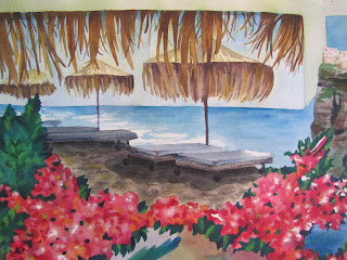
Close-up of the upper right corner of the painting (Santorini Cliffs)
Close-up of the upper left corner of the painting (Black Sand Beach)

I tried to bring some lights back into it with colored pencil and help define (fix) some of the edges that needed help, and that made it a little better. I'm just so out of practice since I don't paint as often as I did two years ago anymore.

Close-up of the colored pencil additions to the upper right corner of the painting (the town of Oia in the distance)
Close-up of the bottom right corner of the painting (a church and sunset in Oia)

I guess the individual "quadrants" of the painting aren't too bad with the added colored pencil. It's mainly the flowers that I'm most disappointed in - especially considering I have more experience painting flowers than anything else I painted in this piece! They just look like a solid blob of pink and it's just not working for me. It's really too bad, because I think if this painting had turned out terrific it would have inspired me to paint more and meet my eight-paintings-in-2011 goal. And now, I just don't feel like it's worth it to push myself to put in that extra time if I'm not going to be satisfied with the end product anyway.

It's okay - I really do have enough on my plate right now without trying to finish an arbitrary painting goal I put on myself. I still want to try to get two or three more paintings done this year (probably smaller ones), but my focus is definitely going to be on Invites by Andrea instead.

I still have a lot to do to get ready for the Brides-to-Be show! Expect an update soon with some pictures of some of the samples I've been working on, once I finish some more and photograph my whole new collection. :)


Shameless plug time: I know, I just spent this whole post acting self-deprecating about my watercolors, but if you love this painting, let me know! Email me at andrea@invitesbyandrea.com if you're interested in learning more about my watercolors, would like to see some more examples, or would like to purchase one. I can also do commissions! Love a photograph you've taken on vacation? I can copy it for you in watercolor, colored pencil, or a mixed of both!

Please do not steal my images. I am not watermarking them because I want to trust the people who visit my blog, and I can only continue to not watermark them if you don't commandeer the pictures I post for your own uses. I spent a lot of time and energy on this painting (and all the other paintings and projects I display on this blog), and I want credit for my work. Thanks!