Tuesday, October 30, 2012

Halloween Party Ideas

Hosting a Halloween party this year?

Here is a short collection of links to peruse for ideas to transform your Halloween get-together from so-so to spook-tacular:

Martha Stewart Halloween Decor Ideas: A varied collection of sophisticated, creepy, grown-up decorations (such as bouquets and centerpieces, cheesecloth spiderwebs, and candlestick displays) and cute kid-friendly options (such as jack-o-lantern themed balloons).

Indoor & Outdoor Decor: A wide collection of real photographs submitted by bloggers of indoor and outdoor Halloween decor, including DIY crafty ideas (like pumpkin topiaries, banners, and paper wreaths).

Halloween-Inspired Cocktails: Adult-only drinks where spooky presentation is everything.

Best Pumpkin Recipes: Spice up your party with a new recipe - because classic pumpkin pie has already been done. ;)

Kid-Friendly Snack Recipes: Mummified Hot-Dogs, Eyeball Punch, and Graveyard Cupcakes (among others).

Halloween Activities: How to entertain children and adults at your Halloween party.


Need Halloween invitations? Check out my custom stationery at InvitesbyAndrea.com!

Sunday, October 28, 2012

Sunday Sample Spotlight: "Fire & Ice"

Bright orange and navy blue is a great color scheme for autumn (as I showed in this fall inspiration board). I just love the contrast between the complementary colors!


"Fire & Ice" - Invitation Duo (invite & reply card)

I chose a solid orange petal-fold envelope with matching reply card envelope, and then mounted the stationery (printed on white cardstock) to a textured navy blue cardstock so that it would pop against the bright orange.


The great thing about this stationery design is the unexpected tilt of the text. Everything is on a diagonal, but since the diagonal is consistent (every line of text is still parallel to the others, and even the bold, graphic pattern lines up with the text), it still feels structured enough to be unoffensive.


I switched things up again in making the reply card, and changed the angle so that everything was tilting the other way. Because the pattern is so eye-catching and large in scale, I kept the font simple, going with a standard sans serif font family, and changing only between bold and light italic.


There are so many angles going on in the design - from the angle of the text and pattern stripes, to the actual units within the pattern itself - that the curvy petal-fold envelope works well to calm everything down.


This design would be perfect for a unique wedding venue, funky rehearsal dinner, or even sophisticated children's birthday party. The bold colors and tilted text give it a casual feel, but the thickness of the cardstock, special fold of the envelope, and the rich texture on the dark blue border give this stationery a substantial feel again, making it appropriate for even formal, important events.


Next week's Sunday Sample Spotlight: "The Little Red Hen"


Click here to view all Sunday Sample Spotlight posts.

"Like" Invites by Andrea on Facebook!
Follow Invites by Andrea on Twitter!


-

Shameless Plug Time: Love this invitation (or others featured on this blog)? Want something similar (or something completely custom) designed for your event? Visit Invites by Andrea to view more samples, download a catalogue pdf, or fill out a design request form. Or shoot me an email to ask me your questions or learn more information.

Friday, October 26, 2012

Fancy/Funky Friday: Patterns Darcy & Kyra

TGIF! Celebrate the weekend with today's Fancy/Funky Friday post!

First, the "fancy": Pattern Darcy


I love this pattern because it has a great mix of simpler shapes (diamonds) and elegant curved designs. From close-up, you can tell that the diamonds are made up of slightly curved lines, but from a distance they look straighter and add structure to the fancier parts of the pattern.


Last November, a featured a stationery set that uses Pattern Darcy. I love how the diamonds in the pattern work great for adding stick-on jewels, brads, or other embellishments to invitations. The negative space within the diamonds also works great for a check box on reply cards, and the pattern works with almost any elegant font, whether italic, calligraphic, cursive, or handwritten!


And now, the "funky": Pattern Kyra


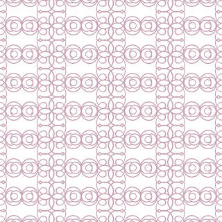
This pattern is definitely "funky"! It varies between open white negative spaces (which are slightly reminiscent of Batman's Bat Signal) and very dense areas of circles and loops. Though the lines are thin, the shapes are unpredictable and sit oddly in the negative space, conforming strictly to an obvious grid.

Still, from a distance, the columns of pattern start to look like lace - though the pairs of circles that are repeated in the columns of white always look more like spirals, or eyes staring back out at me. What do you see when you look at this pattern? :)


-

Click here to see all posts related to "Fancy/Funky Friday" 


Shameless plug time: Love my patterns? I incorporate them into a lot of the artwork I create, from stationery for Invites by Andrea to the watercolors I paint. Check out Invites by Andrea's website to see examples of these patterns in use or drop me a line at andrea@invitesbyandrea.com to let me know what you think!

Thursday, October 25, 2012

Halloween Color Combo: Poison Apple Green & Black

Finally, I have one more Halloween color scheme to show off this year -

Poison Apple Green & Black:


This sophisticated color scheme would work well for just about any modern event, but I think it lends itself particularly well to Halloween. The acidity of the green hints at sinister secrets, while the black accents layer on the mystery. Serve neon green cocktails under a sign that encourages guests to "pick their poison." Display green apples as edible decor, and don't be afraid to use bold black-and-white (or black-and-green) patterns, like damask (for more elegant affairs) and striking spiderwebs (for more obvious Halloween references).

And how great is the bouquet in the lower left corner of this inspiration board? I just love how elegant the lime green flowers and black leaves look, and if you look closely there are subtle hints of Halloween without being too kitschy or obvious. See the solid black miniature pumpkins hiding in the flowers? What a unique centerpiece for a Halloween event!

-


Follow Invites by Andrea on Twitter!
"Like" Invites by Andrea on Facebook!

Shameless Plug Time: Love these color combinations? Looking for custom stationery made to match these colors (or whatever other color combinations you're using for your event)? Visit Invites by Andrea to view more samples, download a catalogue pdf, or fill out a design request form. Or shoot me an email to ask me your questions or learn more information.

Wednesday, October 24, 2012

Halloween Color Combo: Electric Blue & Pumpkin Spice

Mix pale near-death blues with bright neon cerulean (think spooky simmering potions and Katy Perry wigs) for an overall "electric blue" tone, and then add splashes of rusty oranges and scarecrow and pumpkin themed decor for a unique but totally awesome Halloween color scheme.


Electric Blue & Pumpkin Spice:


Use real pumpkins and blue flowers for truly authentic decor. Keep plates and glassware simple, using wheat or cream colors and playing up blue and orange accents in border patterns, plate chargers, tablecloths, or napkins. Display blue mason jars or "scarecrow wheat" colored candlesticks as extra accents, and serve foggy blue cocktails or blue raspberry fruit drinks to quench your guests' thirst.

Of course, what autumn or Halloween party would be complete without pumpkin pie? If you don't have time to bake a fresh pie (or several) yourself, purchase a delicious-smelling jar candle to pump your party venue full of tantalizing pumpkin pie scent.


-


Follow Invites by Andrea on Twitter!
"Like" Invites by Andrea on Facebook!

Shameless Plug Time: Love these color combinations? Looking for custom stationery made to match these colors (or whatever other color combinations you're using for your event)? Visit Invites by Andrea to view more samples, download a catalogue pdf, or fill out a design request form. Or shoot me an email to ask me your questions or learn more information.

Tuesday, October 23, 2012

Halloween Color Combo: Blood Red, Bone White & Black

Halloween events don't have to follow the same boring orange and black color scheme. This week I'll be showing inspiration boards of three other Halloween-inspired color combo options to help make your Halloween get-together fresh and memorable. :)

Blood Red, Bone White & Black:


For this color scheme, turn to vampires, skeletons, and mummies for inspiration. I just love those fang-bitten cupcakes in the top row, and I've always loved the almost-sinister look of delicious red velvet cake. Ideas for red beverages are also plentiful to come by - wine, berry cocktails, fruit punch, and red-tinted hot chocolate all make for great party drinks, and double as great decor on Halloween tables.

For non-edible decor, consider these options: hang black spiderwebs on walls, wrap clear flower vases in black fishnet stockings, or paint black and red pupils on white marbles or stones for instant "creepy eyeball" decor.

-


Follow Invites by Andrea on Twitter!
"Like" Invites by Andrea on Facebook!

Shameless Plug Time: Love these color combinations? Looking for custom stationery made to match these colors (or whatever other color combinations you're using for your event)? Visit Invites by Andrea to view more samples, download a catalogue pdf, or fill out a design request form. Or shoot me an email to ask me your questions or learn more information.

Sunday, October 21, 2012

Sunday Sample Spotlight: "Lavenderly Beloved"

Today's Sunday Sample Spotlight is almost an entire stationery set, and includes an invitation, reply card, save-the-date, and thank you note, all in a beautiful green, lavender, and purple color scheme!


"Lavenderly Beloved" - Invitation Duo (invite & reply card), Save-the-Date, and Thank You Note

I traced a photograph I'd taken of a lavender garden to achieve the illustration featured heavily in this design. Using the Adobe Illustrator pen tool, I left thin white spaces between all of shapes of individual lavender stems and leaves to give a graphic, stenciled look.


Then, I used a bold, sans-serif font in the same vibrant green of the leaves for the most important text (such as the date and names of the happy couple), using a thinner version of the same sans-serif font for the longer paragraphs of text, which I made the same pretty purple as the lavender in the illustration.


This design and color scheme would work for almost any time of year - since the blueish-purple is cool in tone, it works great for colder months, but the rich green and the floral theme fit great for the spring and summer seasons, too!


Next week's Sunday Sample Spotlight: "Fire & Ice"


Click here to view all Sunday Sample Spotlight posts.

"Like" Invites by Andrea on Facebook!
Follow Invites by Andrea on Twitter!


-

Shameless Plug Time: Love this invitation (or others featured on this blog)? Want something similar (or something completely custom) designed for your event? Visit Invites by Andrea to view more samples, download a catalogue pdf, or fill out a design request form. Or shoot me an email to ask me your questions or learn more information.

Friday, October 19, 2012

Fancy/Funky Friday: Patterns Julia & Eleanor

Today's pattern choices are Pattern Julia & Eleanor. Scroll down to take a look!

First, the "fancy": Pattern Julia


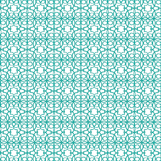
This is a great pattern. From a distance it almost looks lace-like, which immediately brings to mind fancy occasions and formal wear - but up close the six-pointed stars that are formed in the white space jump forward and demand attention. These stars are so graphic (and they're repeated in such an obvious horizontal/vertical grid) that they turn an otherwise elegant pattern into something much more modern.

The strokes are thin and form infinite loops at a high density, but if anything, the crowded-ness of the loops only adds to the modern feeling of the pattern, since it creates a huge contrast to the simpler six-pointed stars. Obvious contrast is a great way to pull emphasis to the parts of the pattern that you want the viewer to be attracted to, and here the contrast between the dense loops and white stars only makes the stars more visible.


And now, the "funky": Pattern Eleanor


The simplicity of the pattern is what makes this a great "funky" design. The emphasis is on straight lines (though almost all of the pattern is actually curved) - since the "units" almost make perfect squares, our brain is tricked into thinking they are squares from a distance. Only up close can you tell just how many lines are actually curved.

Our brains get the idea of straight lines from the little white squares in between each pattern unit. These small negative spaces are made from the edges of the thicker black strokes. Furthermore, the "units" are stacked in an obvious grid, which adds to the deception of straight lines.


A couple weeks ago, I highlighted this stationery sample (shown above) in a Sunday Sample Spotlight post. Titled "Pop Rocks" for the shimmery quality of the paper and bright hot pink and black color scheme, this stationery set uses Pattern Eleanor as a graphic burst of pink color on either side of the paragraphs of text.


-

Click here to see all posts related to "Fancy/Funky Friday" 


Shameless plug time: Love my patterns? I incorporate them into a lot of the artwork I create, from stationery for Invites by Andrea to the watercolors I paint. Check out Invites by Andrea's website to see examples of these patterns in use or drop me a line at andrea@invitesbyandrea.com to let me know what you think!

Wednesday, October 17, 2012

Other Romantic/Vintage Wedding Color Options

Last week, I showed you a couple of photographs that worked as great inspirations for a beautiful ivory/blush/rose pink color scheme. But if off-whites and light colors aren't your thing, there's good news - you can still achieve that romantic/vintage look with other color schemes, too!

The trick is to keep your colors soft. Don't pick highly saturated hues, but instead go for tints (color + white), tones (color + gray), or shades (color + black). (For a quick lesson on color theory and the definitions of these terms, go here.)

For example, take the photograph below, which I took at dusk on a beach in Malibu, California during a road trip out west this past summer:


There are several colors in this photograph, including pink, rust, blue, and gray - but none of them are vibrant hues, so they all seem softer. This would be a great color scheme for a romantic wedding. The colors are darker than the ivories and creams we found in the photograph of white roses last week, so they seem more sophisticated and mysterious. Here, the neutral is dark gray (not ivory), and the rust is even darker/grayer than the rusty pinks I showed last week - in fact, it's almost brown, and thus works as another dark neutral. The pink color of the sunset is a very subdued pink, and the blue is softened with copious additions of gray.


For those who want to avoid pink completely, here's another example. I took this photograph on a rainy day in Thessaloniki, Greece back in 2008:


The white tiled sidewalk was beautifully reflective in the rain, and showed a variety of cool neutral shades. The lightest color here is almost white, but still has enough hints of gray and blue to feel cool and refreshing. Other shades of gray and blue flow throughout the sidewalk and sky. Even the forest green of the trees and grass is still dark enough that it isn't too saturated (though it is the most colorful part of the photo).

The colors are soft enough (and the gray on the far left is warm enough) that it still feels romantic, even though it's a much cooler color scheme overall. It's a much more unique color combo for a vintage-inspired wedding, but works just as well. Use warm and cool grays as your base color (playing up different textures within the neutral shades), and add darker greens and blues for accent colors throughout your wedding.


-


Follow Invites by Andrea on Twitter!
"Like" Invites by Andrea on Facebook!

Shameless Plug Time: Love these color combinations? Looking for custom stationery made to match these colors (or whatever other color combinations you're using for your event)? Visit Invites by Andrea to view more samples, download a catalogue pdf, or fill out a design request form. Or shoot me an email to ask me your questions or learn more information.

Sunday, October 14, 2012

Sunday Sample Spotlight: "In the Bubbly Shadows"

Today's sample stationery set features a funky design and color scheme: Dark blue and rich chocolate brown!

"In the Bubbly Shadows" - Invitation Duo (invite & reply card) & Save-the-Date

The main invitation is mounted to a petal-fold chocolate brown envelope that I lined with a fun patterned blue scrapbook paper that I had, and the reply card and save-the-date have matching chocolate brown envelopes.


I carried the circular pattern over to the printed stationery to tie it back to the scrapbook paper and create a cohesive look, but I also added some differences to make the pattern interesting. In the scrapbook paper, the "stripes" of circles vary between smaller and larger forms, but the stripes only go horizontally, never vertically or at a diagonal. In the invitation and save-the-date I further adorned the corners by switching the orientation to vertical and diagonal to create a small "sunburst" that catches the eye.


This is one of my favorite fonts to use on stationery. The stroke is thin, so it looks elegant, but there are also unique, unexpected characters (like the long line that continues off of the capital T and ends up underline half of the name that follows). It has just the right amount of "funky" aspects to go well with this bright color scheme and fun pattern, while still being fancy enough for a formal event.


For the reply card, I carried the circular forms over by making the check boxes circles instead of squares. I also rounded the corners in the light blue rectangle for guests to write their names.


Of course, the emphasis on all things circular is most obvious in the design of the envelope itself, which has four curved flaps that fold in to close in the invitation. So many round forms add a softness to an otherwise funky (and possibly jarring) design.


Next week's Sunday Sample Spotlight: "Lavenderly Beloved"


Click here to view all Sunday Sample Spotlight posts.

"Like" Invites by Andrea on Facebook!
Follow Invites by Andrea on Twitter!


-

Shameless Plug Time: Love this invitation (or others featured on this blog)? Want something similar (or something completely custom) designed for your event? Visit Invites by Andrea to view more samples, download a catalogue pdf, or fill out a design request form. Or shoot me an email to ask me your questions or learn more information.

Friday, October 12, 2012

Fancy/Funky Friday: Patterns Quella & Stacey

Happy Friday! Here are today's patterns:

First, the "fancy": Pattern Quella


Pattern Quella is a lot less predictable than most of my "fancy" patterns. Instead of looking like a design from the Renaissance or Baroque, Pattern Quella is a more modern take on elegance. This lace-like pattern works well as a large-scale pattern, where the white negative space becomes more pronounced and lets the design breathe. The lines are generally thin (though some are slightly thicker than others), and form lots of curves and loops, adding to the elegance of the piece.


And now, the "funky": Pattern Stacey


Pattern Stacey, meanwhile, is the epitome of "funky" with its thick lines, bold, graphic style, tilted repetition, and the simplicity of each individual pattern "unit". The blue lines are so thick that the white pops forward to become the positive space, relegating the blue to the background.

The oval forms aren't quite perfect ellipses (the lines are thicker on one half of the oval than the other), and though every set of four connects predictably in the center to form a flower-like shape, the flower does not have radial symmetry. Each side of the flower is symmetrical, but it taller than it is wide, which becomes apparent when I rotate every other flower unit 90 degrees. To make the pattern even more unpredictable, I then rotated the entire block of pattern on a tilt - and voila! A funky print great for modern design with a distinctly retro 70s feel. :)


-

Click here to see all posts related to "Fancy/Funky Friday" 


Shameless plug time: Love my patterns? I incorporate them into a lot of the artwork I create, from stationery for Invites by Andrea to the watercolors I paint. Check out Invites by Andrea's website to see examples of these patterns in use or drop me a line at andrea@invitesbyandrea.com to let me know what you think!

Wednesday, October 10, 2012

Romantic/Vintage Wedding Colors

One of the biggest trends in wedding colors right now is mixing several different shades of light neutrals (such as ivory, cream, tan, light brown, or dusty gray) with pinks (like peach, blush, or even hints of dark rust).

Turn to white roses for your inspiration to achieve the perfect mix of neutrals. If you look at a photograph of roses, you'll see that each rose is not one single color. Use the eyedropper tool in Photoshop to pull out shades in different parts of the flower - the large petals that catch the light, the middle shades that are partly in shadow, and the inner-most parts of the flower that will provide a dark base for your color scheme.


You'll probably discover (just like Monet and the other Impressionists did back in the 1860s!) that shadows aren't perfect blacks and browns, but have hints of color in them, as well. The rusty pink color I pulled out of the photograph above (the circle on the far right of the palette) was actually from the shadows in the center of the rose on the left!

Then, if you want to add more hints of romance to your color scheme, turn to increasing the varieties of pink. Since you want to get a variety of colors, look for something with a light base and dark colors in the shadows. You can turn to a photograph of a light pink rose, but if you start with a rose that's already too dark, you'll miss out on some great blush-colored shades!


Here, I went with a photograph of flamingos instead. I took this photo at the Detroit Zoo, and I love the different shades you can find in the feathers of these beautiful birds. Most of their feathers are pale pink (a shade that would be identical to the shades of ivory in the first photograph if we just added a bit of yellow). Their tail feathers look like they're a much more vibrant pink, but because they're in shadow under the pale pink, they're actually much more rust colored (as you can see in the circles of color I pulled out of the image with Photoshop's eyedropper tool).

Mix together all of these shades of dusty pink, blush, and rust together with the light-colored neutrals from the rose photograph (or pick out a few of your favorites instead of trying to incorporate them all) for a beautiful, nuanced, romantic color scheme!

This color scheme works great for almost any type of venue, from a rustic, casual setting to an elegant ballroom with crystal chandeliers. It's also perfect for brides working within a budget, because these colors look best when everything has sort of a found, vintage look to it. Don't worry about making sure your bridesmaids' dresses match, or that every centerpiece is identical at the reception. Fill bouquets with more inexpensive blooms and add one or two eye-catching flowers to add that touch of extravagance without completing blowing your budget.

Play around with different textures in your wedding party's attire depending on the time of year (lace, cotton, silk, worn leather, khaki, light-colored velvet), and add other textured elements to your centerpieces depending on the theme of your wedding (twigs, moss, buttons, ceramic vases, mason jars, cut glass, berries, peaches, feathers, rose petals).


-


Follow Invites by Andrea on Twitter!
"Like" Invites by Andrea on Facebook!

Shameless Plug Time: Love these color combinations? Looking for custom stationery made to match these colors (or whatever other color combinations you're using for your event)? Visit Invites by Andrea to view more samples, download a catalogue pdf, or fill out a design request form. Or shoot me an email to ask me your questions or learn more information.

Sunday, October 7, 2012

Sunday Sample Spotlight: "Paper Lanterns"

Today's Sunday Sample Spotlight has a very sophisticated neutral color scheme of ivory, dark gray, and pale gold.


"Paper Lanterns" - Invitation Duo (invite & reply card)

The "Himalaya" pocketfold envelope is a shimmering metallic ivory with an elegant linen texture that really makes a statement about the formality of the event. Because the envelope was so romantic, I decided to use a dark gray instead of traditional black, to further soften the mood. Finally, I printed the stationery on white cardstock and added pattern accents in a pretty pale gold color to complete the look.


If this pattern looks familiar to you, don't worry - it should. :) I featured Pattern Vivian in a previous Fancy/Funky Friday blog post, and I've used the same pattern (in a radically different color scheme) in another stationery sample ("At First Blush").

I love this pattern because it's both simple and complex. To create it, I took the capital "A" of an Olde English font and reflected the character to create an elaborate heart shape. It can be very bold and funky when it's shown in a bright color (like hot pink), but in this design it starts to blend into the background, thanks to its pale color. It looks more elegant and refined in this color scheme, and adds the perfect amount of visual interest to a clean, sophisticated invitation.


In the photograph above, you can finally start to get a sense of the shimmery quality of the metallic linen envelope. In certain light, it really comes alive. I just love how pretty it looks!


Next week's Sunday Sample Spotlight: A bold blue and rich chocolate brown color combo!


Click here to view all Sunday Sample Spotlight posts.

"Like" Invites by Andrea on Facebook!
Follow Invites by Andrea on Twitter!


-

Shameless Plug Time: Love this invitation (or others featured on this blog)? Want something similar (or something completely custom) designed for your event? Visit Invites by Andrea to view more samples, download a catalogue pdf, or fill out a design request form. Or shoot me an email to ask me your questions or learn more information.

Friday, October 5, 2012

Fancy/Funky Friday: Patterns Lulu & Grace

Both of today's designs are fairly simple and work best as bold, graphic, large-scale patterns.

First, the "fancy": Pattern Lulu


In many ways, Pattern Lulu is similar to a different pattern that I featured in my "Blue Lagoon" stationery set - both feature ninja-star shapes, created from an italic lowercase "y" character. The main difference, however, is the additional character (an italic lowercase "f") added to Pattern Lulu. With the "f"s radiating out of the star-shaped centers, the stars require more breathing room around them. The result is rectangular negative spaces that jump out and become the main pattern from a distance.


In this stationery sample, the tilted rectangular "negative" spaces becomes clear, because those rectangles are so large in scale to the rest of the pattern. Pattern Lulu is graphic and bold and works best at a large scale - but it stays elegant and "fancy" with its calligraphic lines that vary between medium thickness and thin accents.


And now, the "funky": Pattern Grace


Pattern Grace is even simpler than Pattern Lulu. It's made of lowercase "s" forms that flow seamlessly into each other to create columns of design. Instead of lining the columns up so that they touched, I let them breathe a little by leaving some white space between them. Then, I rotated the column 180 degrees so that some of the columns seem to point upwards, while the others point down. This creates a sense of movement throughout the pattern, and forms zig-zags within the white negative space between the columns.


-

Click here to see all posts related to "Fancy/Funky Friday" 


Shameless plug time: Love my patterns? I incorporate them into a lot of the artwork I create, from stationery for Invites by Andrea to the watercolors I paint. Check out Invites by Andrea's website to see examples of these patterns in use or drop me a line at andrea@invitesbyandrea.com to let me know what you think!

Wednesday, October 3, 2012

Fall Color Combo: Shades of Rust & Pink

There's no better color for autumn than a rich rusty red. Use it as a strong base color and it almost becomes a neutral - then add accents of lighter pinks, blush, and tan to soften the mood.

Shades of Rust & Pink:


I've said this a lot already in my other recent posts about fall color schemes, but it's so important that it bears repeating: autumn is all about layer different textures to achieve the perfect cozy, warm, romantic mood.

There are a lot of easy ways to incorporate different shades of color and different textures into your wedding. Mix several blooms in your bouquets and centerpieces, or even create a bouquet out of vintage pins, paper, or fabrics like lace, feathers, leather, sheer organza, and silk. Let each bridesmaid pick out a dress in the fabric, fit, and shade of her choice. Go antiquing and thrift store shopping to amass a collection of patterned plates in rusty red and blush pink shades so that each table place setting is a little different. Create an organic color scheme that flows back and forth between members of the same color family without getting too matchy-matchy, and all of your guests will feel right at home.


-


Follow Invites by Andrea on Twitter!
"Like" Invites by Andrea on Facebook!

Shameless Plug Time: Love these color combinations? Looking for custom stationery made to match these colors (or whatever other color combinations you're using for your event)? Visit Invites by Andrea to view more samples, download a catalogue pdf, or fill out a design request form. Or shoot me an email to ask me your questions or learn more information.

Tuesday, October 2, 2012

Fall Color Combo: Bronze & Aqua

Aqua is not your typical autumn color - but pair it with a warm metallic like bronze or copper and suddenly it acts like a chilly breeze on a sunny fall day, making it an unexpected but totally trendy color combo great for fall and winter events!

Bronze & Aqua:


To get the most out of this color scheme, think of the old "something blue" wedding tradition and just use hints of blue throughout your decor. Use aqua in moderation to draw attention to important details, but stick with your warm bronze base for everything else. By keeping your palette mostly warm, you'll really get across the cozy feeling of the fall season.

Dress your bridesmaids in a rich metallic brown and create a soft bouquet of light blues and creams with pops of brighter aqua shades. Similarly, dress the groomsmen in brown or khaki suits and add accents of aqua in their ties and boutonnieres. Use cream or metallic bronze as your tablecloth color for your reception, and add blue in your napkins, escort cards, or centerpieces, where they'll stand out perfectly against their neutral background.

-


Follow Invites by Andrea on Twitter!
"Like" Invites by Andrea on Facebook!

Shameless Plug Time: Love these color combinations? Looking for custom stationery made to match these colors (or whatever other color combinations you're using for your event)? Visit Invites by Andrea to view more samples, download a catalogue pdf, or fill out a design request form. Or shoot me an email to ask me your questions or learn more information.