Showing posts with label easter. Show all posts

Sunday, June 2, 2013

Sunday Sample Spotlight: "Manors & Etiquette"

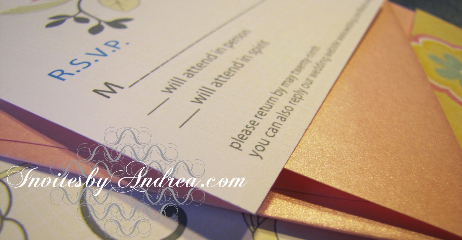
This romantic invitation has a beautiful yellow and purple color scheme.


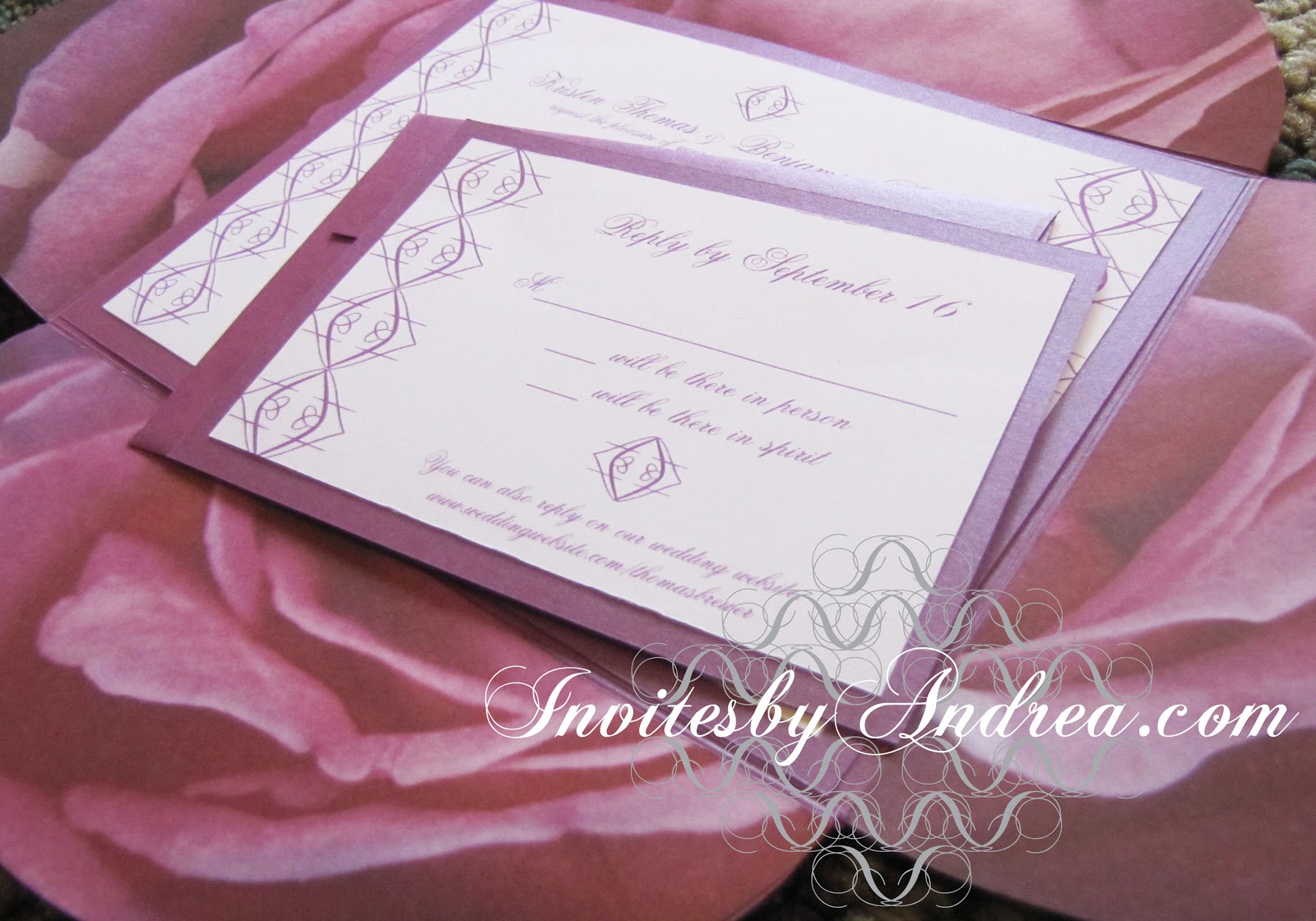
An elegant yellow pattern lines the top of this baby shower invitation; an identical stripe cuts the remaining white background into two, acting as both a design element and a way to feature the most important text of the invitation - the day, time, and location of the event. I love how the second pattern stripe acts like a fancy yellow highlighter!


Though this example is for a baby shower, this design could work for almost any traditional or elegant event, including weddings and spring holidays.


Next week's Sunday Sample Spotlight: A bold red & turquoise color scheme!


Click here to view all Sunday Sample Spotlight posts.

"Like" Invites by Andrea on Facebook!
Follow Invites by Andrea on Twitter!


-

Shameless Plug Time: Love this invitation (or others featured on this blog)? Want something similar (or something completely custom) designed for your event? Visit Invites by Andrea to view more samples, download a catalogue pdf, or fill out a design request form. Or shoot me an email to ask me your questions or learn more information.

Sunday, May 26, 2013

Sunday Sample Spotlight: "Time to Pretend"

I absolutely adore this stationery set! It's perfect for spring!


"Time to Pretend" - Invitation Duo (invite & reply card)

I started with a metallic pale pink folding envelope, which I decorated with beautiful pale yellow scrapbook paper featuring a yellow/white/pale pink/sky blue floral design.


Up close (and tilted into the light), the pale rose-pink metallic envelopes really shine - and the scrapbook paper boasts an implied linen texture (though the paper is actually totally smooth). I very subtly mimicked this texture with pale yellow lines in the background of the printed invitation and reply card (it's so subtle, you can't even see it in these pictures!), and I incorporated the same blue, pink, and slate gray colors from the scrapbook paper for the images and text.


I recreated the linear floral design with Adobe Illustrator's pen tool so I could print it on the invitation. and seamlessly connect the digital printouts to the scrapbook-lined envelopes.


On the reply card, I only printed half of that flower form, poking down from the top edge of the paper. Because I didn't scale the image down (just cropped it), if you lay the RSVP on top of the invitation, the flowers line up exactly!

Because of its pastel colors, this design would work great for any spring event, as well as baby showers, birth announcements, and cutesy/feminine holidays like Easter and Valentine's Day!


Next week's Sunday Sample Spotlight: "Manors & Etiquette"


Click here to view all Sunday Sample Spotlight posts.

"Like" Invites by Andrea on Facebook!
Follow Invites by Andrea on Twitter!


-

Shameless Plug Time: Love this invitation (or others featured on this blog)? Want something similar (or something completely custom) designed for your event? Visit Invites by Andrea to view more samples, download a catalogue pdf, or fill out a design request form. Or shoot me an email to ask me your questions or learn more information.

Sunday, May 5, 2013

Sunday Sample Spotlight: "The First Twitter"

What's cuter for a baby shower invitation or birth announcement than illustrations of chirping baby birds?


"The First Twitter" Invitation

Fluffy and fun, these little birds stand on a tree branch not far from the nest where their future younger siblings lay sleeping in their eggs. I designed this image in Adobe Illustrator; it would be easy to create a custom illustration to reflect an actual family - perhaps a mommy and daddy bird, an older brother or sister baby bird, and a nested egg to represent the new addition to the family. :)


This design could also work for any spring event - especially Easter celebrations!


Next week's Sunday Sample Spotlight: "Creatively Cultivated"


Click here to view all Sunday Sample Spotlight posts.

"Like" Invites by Andrea on Facebook!
Follow Invites by Andrea on Twitter!


-

Shameless Plug Time: Love this invitation (or others featured on this blog)? Want something similar (or something completely custom) designed for your event? Visit Invites by Andrea to view more samples, download a catalogue pdf, or fill out a design request form. Or shoot me an email to ask me your questions or learn more information.

Wednesday, March 27, 2013

Supersize Pastel Inspiration Board

As March draws to an end, I leave you with this - an oversized inspiration board featuring this season's beautiful pastel color palette!

Within this inspiration board are ideas for everything:

- Easter decor (ornate eggs, pastel balloons!)
- Spring fashion (pastel lips, jewelry, clothes, hair!)
- Interior design (a pretty mint green sunroom, and floral wallpaper!)
- Party refreshments (gelato-colored candies and cupcakes!)

- And, of course, spring wedding decor (painted mason jars, bouquets, centerpieces, dresses!)

If you're planning a baby shower, child's birthday party, Easter gathering, or spring wedding, this board is for you. :)

Enjoy!


-

Follow Invites by Andrea on Twitter!
"Like" Invites by Andrea on Facebook!

Shameless Plug Time: Love this color combination? Looking for custom stationery made to match these colors (or whatever other color combinations you're using for your event)? Visit Invites by Andrea to view more samples, download a catalogue pdf, or fill out a design request form. Or shoot me an email to ask me your questions or learn more information.

Tuesday, March 12, 2013

Spring Color Combo: Lavender & Salmon Pink

Pastels are always beautiful for spring events, and today's color scheme of lavender and pale salmon is another great example!


Give out fabric satchels of lavender as guest favors at a fancy event like a wedding or dinner party. I just love the small salmon pink pocket tied with twine in the middle of the second row. 

Versatile and calming, this color scheme is also great for everyday fashion, and easily lends itself to makeup (lavender purple eyes and pale pink lips are always classic). These colors would also be gorgeous for a baby shower, baby announcements, or to decorate a child's bedroom or nursery. And don't forget spring holidays. The soft colors and pink accents work great for Valentine's Day and Easter!


-

Follow Invites by Andrea on Twitter!
"Like" Invites by Andrea on Facebook!

Shameless Plug Time: Love this color combination? Looking for custom stationery made to match these colors (or whatever other color combinations you're using for your event)? Visit Invites by Andrea to view more samples, download a catalogue pdf, or fill out a design request form. Or shoot me an email to ask me your questions or learn more information.

Wednesday, February 27, 2013

Spring Color Combo: Poppy Red & Linen

Pantone has included both "poppy red" and "linen" in its list of spring colors for 2013 - and its certainly true that it's easy to find both of these colors on the fashion runways! Incorporate this classic color scheme into almost any spring event (weddings, Valentine's Day - even Easter, if you're open to changing out traditional white lily decor for some brilliant red poppies)!


Poppies are easy flowers to fake with crepe paper or fabric, making it a breeze to decorate (under budget!) for any occasion. Play up texture within the neutral beige color to add dimension - string a paper or fabric banner of triangle flags, and use a linen tablecloth with visible threads.

This color scheme would also be beautiful in the fall, or even for winter holidays like Thanksgiving or Christmas!

-

Follow Invites by Andrea on Twitter!
"Like" Invites by Andrea on Facebook!

Shameless Plug Time: Love this color combination? Looking for custom stationery made to match these colors (or whatever other color combinations you're using for your event)? Visit Invites by Andrea to view more samples, download a catalogue pdf, or fill out a design request form. Or shoot me an email to ask me your questions or learn more information.

Tuesday, January 15, 2013

Photo Inspiration: A Hint of Neon

Today we continue the look at photograph-inspired color schemes that we started last week. This picture was taken in Barcelona's Parc de la Ciutadella in 2010.


Why these colors go together: These tints of blue-violet obviously go together, since they all have the same base color. I particularly love the blueish icy feel of the lightest tint! Then, for a touch of excitement, I pulled out the neon acid-yellow that was created from the sun shining through the background foliage. This acid-yellow goes with the blue-violet shades because yellow is purple's complement on the color wheel - and because it has the same icy feeling as the lighter purple shades.

How to use this color scheme: This funky modern color scheme would be great in a living space decorated with contemporary Ikea-esque furniture, a nursery/child's bedroom (who needs stereotypical pink and blue when you can have blue-violet and acid-yellow??), or a fun, unique event. The icy undertones lend itself obviously to winter weddings, but I think this color scheme could work just as well in any season - the neon yellow is perfect for spring or summer, and the richness of the darkest blue-violet pairs perfectly with the yellow for an autumn wedding, as well.

-

Follow Invites by Andrea on Twitter!
"Like" Invites by Andrea on Facebook!

Shameless Plug Time: Love this color combination? Looking for custom stationery made to match these colors (or whatever other color combinations you're using for your event)? Visit Invites by Andrea to view more samples, download a catalogue pdf, or fill out a design request form. Or shoot me an email to ask me your questions or learn more information.

Wednesday, January 9, 2013

Photo Inspiration: Candy Shop

Today's photo was taken inside a large candy store just outside Montpellier in the south of France, which I visited as a high schooler in 2005.


Why these colors go together: The pink and blue colors of the candy wrappers go together because they're both tints (lighter shades) of primary colors - created by adding white to either red or blue. Adding the green (found in the darker candy wrappers on the next shelf up on the left side of the photo) is a great way to relate back to the pink and blue, since green is pink's complement and sits next to blue on the color wheel. For the last color to pull out of this photo, I chose a neutral tan. Neutrals go with everything, and are a great way to add some depth without introducing a fourth eye-popping color.

How to use this color scheme: This color scheme would be great for a winter or spring wedding, since the pink and blue tints have a bit of an icy feel. It would also be ideal for a baby shower or for decorating a nursery, since it features the quintessential "baby" colors of pink and light blue. Perhaps less obvious are other fun choices like valentine's day parties, the interior of bakeries or ice cream shops, or a unique, modern living space.

-

Follow Invites by Andrea on Twitter!
"Like" Invites by Andrea on Facebook!

Shameless Plug Time: Love this color combination? Looking for custom stationery made to match these colors (or whatever other color combinations you're using for your event)? Visit Invites by Andrea to view more samples, download a catalogue pdf, or fill out a design request form. Or shoot me an email to ask me your questions or learn more information.

Tuesday, January 8, 2013

Photo Inspiration: Four Bright Colors

For the month of January, I have planned a series of blog posts featuring color schemes pulled from different photographs I've taken. These color schemes could be incorporated into a room of your house, an art project, or event decorations (for birthdays, weddings, you name it!).

Today's photo is one of the many floral pictures of taken of gardens. I just loved the bright, highly saturated colors!


Why these colors go together: The most dominant color in the photograph is that gorgeous kelly green color, and each of the other three picks relate specifically to that green. Yellow is next to green on the color wheel, pink (as a shade of red) is green's complement, and orange is a secondary color (a color created by combining two of the three primary colors of red, yellow and blue) - just like green. Since each of those colors work nicely with green, they also work well with each other!
How to use this color scheme: These bright colors would be great for spring or summer weddings, outdoor events, kid's birthday parties, sunny kitchens or living rooms, and children's bedrooms or playrooms.

-

Follow Invites by Andrea on Twitter!
"Like" Invites by Andrea on Facebook!

Shameless Plug Time: Love this color combination? Looking for custom stationery made to match these colors (or whatever other color combinations you're using for your event)? Visit Invites by Andrea to view more samples, download a catalogue pdf, or fill out a design request form. Or shoot me an email to ask me your questions or learn more information.

Sunday, December 23, 2012

Sunday Sample Spotlight: "The Purple Petal"

This is one of my favorite scrapbook-paper stationery designs!

"The Purple Petal" Invitation Duo (invite & reply card)

I just loved the photographic quality of the scrapbook paper, showing a very large-scale purple rose in such detail that you can see the veins in each petal, and knew I had to use it in a design. 


I used a petal-fold envelope to further exude the flowery feeling, and pasted the scrapbook paper to the insides of each of the four envelope flaps.


The actual invitation and reply card are each printed on white cardstock and flanked with one of my fancy patterns. I chose a calligraphic-inspired font to match the elegance of the pattern and floral scrapbook paper.

The petal fold envelope and matching reply card envelope are the same metallic purple color. I also used a matching metallic purple cardstock to frame each piece of printed stationery - the white cardstock is glued to the purple cardstock. Just this little bit of extra weight can go a long way in bringing the design together (in this case, matching the stationery to the envelopes), as well as adding significance (real and figurative "weight") to the invitation of an important event.


This stationery set is perfect for elegant and feminine affairs like weddings, anniversary parties, or Valentine's Day, and the color scheme works great for almost any time of the year (why not use this stationery for an Easter celebration?). I love different shades of lavender and purple paired with white for wintertime, but the large scale of the scrapbook's rose would also work well for the spring and summer, when roses and other colorful flowers are in full bloom.


Next week's Sunday Sample Spotlight: A beautiful black & gold stationery set perfect for New Year's!


Click here to view all Sunday Sample Spotlight posts.

"Like" Invites by Andrea on Facebook!
Follow Invites by Andrea on Twitter!


-

Shameless Plug Time: Love this invitation (or others featured on this blog)? Want something similar (or something completely custom) designed for your event? Visit Invites by Andrea to view more samples, download a catalogue pdf, or fill out a design request form. Or shoot me an email to ask me your questions or learn more information.

Sunday, September 9, 2012

Sunday Sample Spotlight: "Ladybug Girl"

This week's Sunday Sample Spotlight pays homage to the adorable ladybug with a fun black red and white color scheme.

"Ladybug Girl' - Invitation Duo (invite & reply card)

This stationery set features a red linen "Himalaya" pocketfold envelope, which I lined with patterned scrapbook paper in matching colors. The invitation and reply card was printed on white linen paper to match the texture of the envelope, and the reply card was given a white linen envelope to contrast against the red of the pocketfold envelope.


This invitation design would be great for a child's birthday party or any springtime event. Though red, black, and white is a classic color combination, the fun cartoonish illustrations give it a more modern, childlike look - a feeling that the uneven stripes on the scrapbook paper only further plays up. :)


I put the small ladybugs in a line to refer back to the stripes on the scrapbook paper, but made sure to rotate and reflect the image so that the line wouldn't be too straight and predictable and keep that whimsical, childlike look.


Next week's Sunday Sample Spotlight: "Recycled Pink"


Click here to view all Sunday Sample Spotlight posts.

"Like" Invites by Andrea on Facebook!
Follow Invites by Andrea on Twitter!


-

Shameless Plug Time: Love this invitation (or others featured on this blog)? Want something similar (or something completely custom) designed for your event? Visit Invites by Andrea to view more samples, download a catalogue pdf, or fill out a design request form. Or shoot me an email to ask me your questions or learn more information.

Sunday, April 29, 2012

Sunday Sample Spotlight: "The Blue Period"

Since this stationery set has such an interesting blue color scheme, I instantly thought of my art history classes and learning about Pablo Picasso's "Blue Period." Of course, the bold, graphic flower design of this invitation is much less depressing from Picasso's early paintings - and even though the colors are all from the cool side of the color wheel, their high saturation makes them energized and exciting despite their cool tendencies. ;)

"The Blue Period" Invitation Duo (invite & reply card)


The main envelope is a dark blue metallic Himalaya pocketfold envelope. I think the darker metallic envelopes are some of the prettiest - they have the most variation in color, from very dark (as they are in the photograph above) to light and shiny when tilted toward a light source. The light blue cardstock I used as a background border for the invitation and reply card (which is also the same color as the light blue envelope used for the reply card envelope) is actually metallic, too. But the light metallics just don't seem to shine as much as the dark ones, simply because they're already so light to begin with that a little shine doesn't make as much difference.


I loved the way this flower graphic "popped" when its colors were lighter against a dark background, so I made the background of both the invitation and reply card a dark blue similar to the envelope. Of course, this would make it practically impossible for guests to write their response on the RSVP card, so I used the light lime green from the graphic flower as a background where the guests should write their name and reply.

Another thing that makes this reply card unique from most of my other designs is that it has the same vertical orientation as the invitation does. Usually I turn reply cards to "landscape" rather than "portrait" to allow more room for guests to write their name on the line, but because of the largeness (and roundness) of this flower graphic, the design simply worked best vertically. With stationery (like most areas of graphic design), it's always a delicate balance between functionality and beauty.


I created the eye-catching modern flower illustration by using the pen tool in Adobe Illustrator. I traced an image of an interesting plant I photographed in a Barcelona park in 2010, and changed the colors to a very contemporary lime green and pale blue color combination so that they'd really pop against the dark blue background and command attention.


All in all, this is one of my favorite stationery designs. It's so unique in almost every area, from the bold symbolic graphic to the interesting color scheme and orientation of the reply card. Plus, it uses some of those gorgeous metallic cardstock and envelopes that I love! :)


Next week's Sunday Sample Spotlight: A romantic rose-themed invitation set!


Click here to view all Sunday Sample Spotlight posts.

"Like" Invites by Andrea on Facebook!

-

Shameless Plug Time: Love this invitation (or others featured on this blog)? Want something similar (or something completely custom) designed for your event? Visit Invites by Andrea to view more samples, download a catalogue pdf, or fill out a design request form. Or shoot me an email to ask me your questions or learn more information.

Sunday, April 22, 2012

Sunday Sample Spotlight: "The Other Side"

Happy Earth Day! In celebration, today's Sunday Sample Spotlight features recycled envelopes and a spring grass motif. :)


"The Other Side" Invitation Trio (invite, reply card & information insert)

The envelopes for this wedding invitation set are all recycled "Kraft Brown" envelopes. The main envelope is a Himalaya style pocketfold, and the matching 4Bar reply card envelope is also shown. Because the envelopes are recycled, they are a little thinner than most of the envelopes I use, but they have a really cool texture to them that would be great for an eco-friendly or rustic-themed event.

I had a great piece of scrapbook paper made from a photograph of grass that I used for this design. I used the actual paper to line the left flap and right pocket of the Himalaya pocketfold envelope, and then scanned the paper into my computer to incorporate into the printed designs as well. The invitations and directions insert both feature a band of the grass at the top and bottom, and the reply card has a strip just along the top.


The typewriter-like font I used fit the theme of the vintage, recycled paper and grass motif very well, so I used it everywhere. I pulled the light green and black colors for the text right from the grassy scrapbook paper, and included a note at the bottom of the reply card and direction insert that encouraged the recycling of the invitation pieces after use.


Next week's Sunday Sample Spotlight: A bold flower illustration with a modern blue color scheme!

Click here to view all Sunday Sample Spotlight posts.

"Like" Invites by Andrea on Facebook!

-

Shameless Plug Time: Love this invitation (or others featured on this blog)? Want something similar (or something completely custom) designed for your event? Visit Invites by Andrea to view more samples, download a catalogue pdf, or fill out a design request form. Or shoot me an email to ask me your questions or learn more information.

Sunday, April 15, 2012

Sunday Sample Spotlight: "Orange is the New Pink"

Orange and pink is a great color combination for spring and summer events. You can keep both shades pale for a softer, pastel look, or pump up either the pink or the orange to a more saturated hue for a little punch. If you want to be really daring, you can even make both colors bright and bold by using an exciting bright orange and hot pink combo.

For this design, I was inspired by a piece of scrapbook paper I had, and built the design around that. The paper (which I cut out and attached to two of the four flaps of the metallic rose pink "petal" envelope I used) features a collage of bright orange and medium/light pink flowers, with hints of saturated greens and blues in the flowers' centers. I picked the same shades of orange and pink for the textured orange cardstock and pink envelopes to carry the color scheme through the whole package.


"Orange is the New Pink" Invitation


What I really liked about the scrapbook paper (other than the fun, springtime colors) was the implied texture. The paper was smooth to the touch, but the shading and coloring of the flowers gave it a woven or canvas-like appearance that was really interesting. Because of this, I used a textured orange cardstock to back the invitation instead of a smooth paper to play up that textured feeling.


I scanned in another section of the scrapbook paper to my computer and incorporated a muted version of the same design in the background of the actual printed invitation. Because it was lighter, it didn't distract too much from the fun font the text was written in, but it still instantly connected with the scrapbook-lined petal envelope.


The whimsical nature of this bubble-font made it the perfect fit with the sunny colors and fun scrapbook paper, so I just had to use it. I love that the font is an outline, too - it helps keep the design airy and light, and allows the colors and textures of the scanned scrapbook background to shine through the words. Can you imagine how different the design would feel if the letters were solid black? They'd be so bold and thick they wouldn't go with the color scheme or design at all!


Next week's Sunday Sample Spotlight: An Earth Day Celebration!


Click here to view all Sunday Sample Spotlight posts.

"Like" Invites by Andrea on Facebook!

-

Shameless Plug Time: Love this invitation (or others featured on this blog)? Want something similar (or something completely custom) designed for your event? Visit Invites by Andrea to view more samples, download a catalogue pdf, or fill out a design request form. Or shoot me an email to ask me your questions or learn more information.

Sunday, April 8, 2012

Sunday Sample Spotlight: "The Not-So-Ugly Duckling"

To those who celebrate them, Happy Easter and Passover! For today's Sunday Sample Spotlight, I thought it would be fitting to showcase one of the designs I've created to celebrate the miracle of nature and new life. "The Not-So-Ugly Duckling" is an invitation design intended for a baby shower or baby announcement, but it could be adapted to other events, as well.


"The Not-So-Ugly Duckling"

Initially I designed this invitation to have a light peach background, but when I started to play around with the colors I found that the dark backgrounds really made the blues and whites pop forward, giving the image an almost neon glow that was really interesting and fun. I still like the original design as well (and perhaps it would be more fitting for a baby shower invitation, since this rich chocolate brown is almost too dark for such an exciting, happy event), but there's just something about the dark background that I can't get over. It makes the design seem more modern and really adds a lot of sophistication to the piece.


I traced the image from a photograph of two ducks I took when on vacation in Barcelona, Spain in 2010. The ducks were in a pond in the Parc de la Ciutadella, which is a beautiful park with lots of ponds, flowers, plants, and cool architecture that my then-fiance and I walked around for a few hours as we waited for the Picasso Museum to open. It was very peaceful, sitting there in the early morning hours, watching the ducks swim around. I loved the reflections of the pure white feathers in the water, and wanted to capture that in a flat, two-dimensional image. As usual, I used Adobe Illustrator's pen tool to trace the photograph, simplifying it a bit and only tracing the parts that were meaningful to the image.

After I printed out the design, I selected a dark chocolate brown envelope to match the background I'd selected, though I think a bright blue envelope (like the color of the background of the photographs above) would be just as amazing with this design. And how perfect would a deep, saturated blue be for a baby boy? I've never understood our society's desire to make all the colors so pastel when welcoming new life. It's an exciting event - why wouldn't you want a bright, bold blue instead of a pale, subdued shade? ;)


Next week's Sunday Sample Spotlight: Includes graphic, flowery scrapbook paper and a metallic rose pink envelope... :)

Click here to view all Sunday Sample Spotlight posts.

"Like" Invites by Andrea on Facebook!

-

Shameless Plug Time: Love this invitation (or others featured on this blog)? Want something similar (or something completely custom) designed for your event? Visit Invites by Andrea to view more samples, download a catalogue pdf, or fill out a design request form. Or shoot me an email to ask me your questions or learn more information.

Friday, April 6, 2012

Fancy/Funky Friday: Patterns Adrienne & Chloe

It's time for another Fancy/Funky Friday post!

First, the "fancy": Pattern Adrienne


There's no doubt that Pattern Adrienne falls into the "fancy" category. With its thin lines, open white spaces, delicate loops, and a general lace-like quality, it epitomizes everything I look for in a "fancy" pattern. From a distance, the pattern becomes very grid-like with its emphasis on vertical and horizontal lines, but up close you can really see all of the intricate details that make it interesting.


And now, the "funky": Pattern Chloe


What's great about this pattern is how the parts seem to be connected, especially from a distance, while not actually touching. You still get a very clear sense of each part of the pattern, even with the little white gaps in between the pieces. Another cool thing about Pattern Chloe is how the lowercase o's create a wavy effect that keeps the horizontal rows from seeming too structured. It makes the whole pattern more fun!


I love this pattern in a light green because I think the individual units seem vaguely plant like - from a distance, there's something almost flowery or leaf-like about the lines. It's a great springtime pattern, so it's only fitting that it gets a fun spring color. I paired it with a pure white neutral in the stationery example above, which calms down the bright green and craziness of the pattern to make it more formal.

-

Click here to see all posts related to "Fancy/Funky Friday" 


Shameless plug time: Love my patterns? I incorporate them into a lot of the artwork I create, from stationery for Invites by Andrea to the watercolors I paint. Check out Invites by Andrea's website to see examples of these patterns in use or drop me a line at andrea@invitesbyandrea.com to let me know what you think!

Wednesday, April 4, 2012

Easter Decor Ideas

It's almost Easter, so here are a couple of ideas for decorating your home or event venue for the holiday. The key is to think spring. Tulips and daffodils are great springtime flowers for centerpieces, but bare tree branches, twigs, and blades of grass also work as creative and beautiful decor.

Use egg cups everywhere. They make great miniature vases for spring flower table centerpieces. Stack them on tiered cake trays or display stands with an assortment of small blooms inside (even fabric ones from the store look nice, or make your own flowers out of paper). Fill them with colored jelly beans or speckled candy eggs. Or use them as intended, and place a beautifully dyed hard-boiled egg in each one, with a few pieces of grass sticking out for a springtime feel.

Hang eggs. Whether real egg shells, decorated elegantly for a sophisticated party, or the colorful plastic ones, you can't be more festive than eggs for Easter. The easiest solution - hang them from tree branches outside, or have a flower vase full of a few spindly branches and hang the eggs down inside to make great centerpieces. Not only is it trendy - it's a long standing tradition in Europe. Check out these adorable egg ornaments for inspiration.

Make your own baskets. Wrap an old bucket, paint can, or tupperware container with twigs or bendy tree branches. Don't worry about perfect weaving, and let the basket look more like a handmade nest. Pussy willow and long grass blades are other great options for nest creation. Or make delicate paper baskets out of oragami paper, scrapbook paper, or lace doilies. These are great for displaying candies or other small items. You can even use paper grocery bags to make miniature baskets. Place a small mason jar or shot glass inside for a miniature centerpiece at each table setting. Another easy idea is to purchase pastel-colored baking cups. You can set them out on tables as is with collections of jelly beans or Easter-colored M&Ms inside, or decorate the baking cups with paper flower petals to amp the "cute factor" up even higher. ;)

Finally, if you're looking for unique new ideas for dyeing and decorating Easter eggs, Martha Stewart has some really great ideas:
Make miniature egg sculptures by decorating them with felt and pipe cleaners to make little animals
Wrap eggs in elegant oragami paper
Spray paint eggs silver

Happy Easter!

Sunday, April 1, 2012

Sunday Sample Spotlight: "Out in the Yellow Meadows"

Unfortunately, Andrea was swallowed by a bear this weekend and is unable to post today's Sunday Sample Spotlight as scheduled. Andrea should make a full recovery by next weekend. Make sure to check back then, when all regular blog posts should resume.

Thanks for your understanding in this trying time. If you wish to send Andrea get well sentiments, you can send your thoughtful emails to the following email address: justkidding@aprilfools.com.

Happy Sunday! Here's hoping all of your jokes and pranks on this glorious April Fool's Day are more successful than the one I just halfheartedly attempted above. ;)

Today's Sunday Sample Spotlight is an invitation duo (invite and reply card) mounted on textured bright yellow cardstock. The envelopes are a solid springtime green color called "Green Meadow", and the main envelope folds out into a flowery "Petal" design.


"Out in the Yellow Meadows" - Invitation Duo (invite & reply card)

The pattern used for these stationery designs is one I've already featured in a Fancy/Funky Friday blog post: Pattern Emma. The pattern was designed by reflecting and rotating a comma into a bold, graphic flower-like shape. Since the pattern is so big and attention-grabbing, I kept the rest of the design simple. There is only a hint of sunshine yellow on each piece of the stationery (around the border), and the green of the pattern exactly matches the color of the envelopes. I also made sure to keep the background pure white and used a sans-serif plain black font for most of the text. That way, the main focus of the design is really just the pattern - with the bright yellow frame around the invitation and reply card acting as a secondary focus.


Since the pattern is so simple in its construction, I kept things interesting by letting the invitation and reply card use the pattern differently. The pattern is larger and bolder on the invitation, where it's featured as a horizontal line across the top of the design. On the reply card, the pattern is a little smaller and graces both sides of the design with a single vertical line of the pattern. In both, I also used a single flower-like "unit" of the pattern as a way to separate paragraphs of text. This is an easy and effective way to incorporate the rest of the invitation or reply card to the pattern design along the edges - and a method that I frequently use. :)


Next week's Sunday Sample Spotlight: A baby shower invitation with an adorable duck motif!

Click here to view all Sunday Sample Spotlight posts.

"Like" Invites by Andrea on Facebook!

-

Shameless Plug Time: Love this invitation (or others featured on this blog)? Want something similar (or something completely custom) designed for your event? Visit Invites by Andrea to view more samples, download a catalogue pdf, or fill out a design request form. Or shoot me an email to ask me your questions or learn more information.

Tuesday, March 27, 2012

Grass Collection Scrapbook Paper

In honor of spring, today I want to show you a new collection of scrapbook paper designs I've created. All of the papers are solid colors (either two or three colors), and feature one of the patterns I've designed. They're shown here as 12" x 12" scrapbook paper squares, but could be adapted down to a different size, as well. Though I only used springtime yellows and greens (plus a few neutrals) for this collection, the colors could also be changed to whatever other color combinations you may want!


If you see a design you like, or want to see some more examples of the scrapbook paper I've been creating, shoot me an email and I can send you some more pictures. I'm also planning to post more designs on this blog as I make them, so be sure to keep checking back!


Shameless plug time: Want to purchase some scrapbook paper, or have stationery designed from the patterns and color combinations featured here? I also incorporate pattern in some of my watercolor paintings. Check out Invites by Andrea to browse sample stationery
or drop me a line at andrea@invitesbyandrea.com to let me know what you think!

Sunday, March 25, 2012

Sunday Sample Spotlight: "Rainbow Bright"

Nothing is more symbolic of springtime than rainbows - the natural phenomena that show off beautiful colors in the sky during periods of rain and sunshine. Today's Sunday Sample Spotlight uses rainbows, as well as other common images like clouds, grass, and flowers, to really evoke the feeling of spring.


"Rainbow Bright" - Invitation Duo (invite & information insert)

The envelope is a solid dark purple Himalaya pocketfold envelope, which I lined with a pale yellow scrapbook paper on the left flap and right pocket. The scrapbook paper has a subtle design of large yellow flowers, which further adds to the theme of the invitation.


I drew all of the images, from the fun spirals and imperfect flowers and grass to the simplified three-color rainbow and light blue clouds, with the pen tool in Adobe Illustrator. Usually I find an image (such as a photograph I've taken) to use as a starting point, and trace that photograph with the pen tool to change it into a flat-color vector image - but for these drawings, I wanted them to seem more whimsical and free, so I didn't start with anything and just made the drawings from scratch.

You can really tell in the images of the flowers (scroll down for a close-up photograph of them), which are clearly drawn freely. They are meant to be symbolic of flowers and springtime in general rather than indicative of any actual type of flower. Even the rainbow is simplified. Instead of using all of the colors, I picked only three, including the two colors used in the envelope to help bring the envelope and invitation design together into a cohesive package.


To finish off the design, I picked a fun, curly font that matched the spirals and designs I drew with the pen tool. Though this particular example is for a fun, casual springtime wedding, this design could easily be adapted to any event. I think it would work particularly well for a child's birthday party, since the images and font are all so whimsical and childlike themselves. :)


Next week's Sunday Sample Spotlight: "Out in the Yellow Meadows"

Click here to view all Sunday Sample Spotlight posts.

"Like" Invites by Andrea on Facebook!

-

Shameless Plug Time: Love this invitation (or others featured on this blog)? Want something similar (or something completely custom) designed for your event? Visit Invites by Andrea to view more samples, download a catalogue pdf, or fill out a design request form. Or shoot me an email to ask me your questions or learn more information.