Showing posts with label save-the-date. Show all posts

Sunday, September 1, 2013

Sunday Sample Spotlight: "The Stone Age"

This stone-inspired stationery set is great for weddings along pebbled beaches, or any occasion to celebrate local geology!

"The Stone Age" Invitation Duo (invite & reply card) and Save-the-Date

The invitation is printed on white paper and mounted to a recycled brown envelope with small silver brads. I decorated the side right flap and left pocket with scrapbook paper featuring a fun photographic stone print. I scanned the scrapbook paper into my computer to incorporate into the printed invitation, reply card, and save-the-date (though I lightened the picture a little so it wouldn't completely blend into the darker scrapbook paper).


For the text, I used a fun font that looks like letters scratched onto stone or wood. Less important information was written in a smaller typewriter inspired font.


The save-the-date and reply card also both have matching brown recycled envelopes.


Next week's Sunday Sample Spotlight: "Dressed to Impress"


Click here to view all Sunday Sample Spotlight posts.

"Like" Invites by Andrea on Facebook!
Follow Invites by Andrea on Twitter!


-

Shameless Plug Time: Love this invitation (or others featured on this blog)? Want something similar (or something completely custom) designed for your event? Visit Invites by Andrea to view more samples, download a catalogue pdf, or fill out a design request form. Or shoot me an email to ask me your questions or learn more information.

Sunday, August 11, 2013

Sunday Sample Spotlight: "Down Memory Lane"

For a formal event, sometimes simple and elegant is the best way to go!


"Down Memory Lane" Save-the-Date

This save-the-date features one of my "fancy" pattern designs in a soft green in the background. The text is calligraphic and traditional, but instead of boring black the letters and the linen textured cardstock bordering the save-the-date are both in a rich chocolate brown. For a pop of color, the outside envelope is a cool grass green to match the light green pattern.


Next week's Sunday Sample Spotlight: A unique, retro twist on flower-inspired stationery!


Click here to view all Sunday Sample Spotlight posts.

"Like" Invites by Andrea on Facebook!
Follow Invites by Andrea on Twitter!


-

Shameless Plug Time: Love this invitation (or others featured on this blog)? Want something similar (or something completely custom) designed for your event? Visit Invites by Andrea to view more samples, download a catalogue pdf, or fill out a design request form. Or shoot me an email to ask me your questions or learn more information.

Sunday, April 7, 2013

Sunday Sample Spotlight: "Ever the Same"

I love this color scheme for summer - the two neutrals (white and tan) really offset the saturated blue hue, letting it take center stage. It feels crisp, clean, and fresh - and would make a perfect color combo for a beach wedding or casual outdoor affair!


"Ever the Same" Invitation Duo (invite & reply card) and Save-the-Date

The main envelope is a tan-colored folding envelope with a pocket on the right side to hold the reply card and matching reply card envelope.


The pattern reminds me of sand-dollars (or perhaps manta rays), alluding to a casual, beach/ocean theme. I love the way its stamped-on quality, which gives it a handmade feel.


Next week's Sunday Sample Spotlight: "The Music in Me"


Click here to view all Sunday Sample Spotlight posts.

"Like" Invites by Andrea on Facebook!
Follow Invites by Andrea on Twitter!


-

Shameless Plug Time: Love this invitation (or others featured on this blog)? Want something similar (or something completely custom) designed for your event? Visit Invites by Andrea to view more samples, download a catalogue pdf, or fill out a design request form. Or shoot me an email to ask me your questions or learn more information.

Sunday, March 24, 2013

Sunday Sample Spotlight: "King's Cross"

Today's stationery set is all about subtle beauty.

"King's Cross" Invitation Duo (invite & reply card) with matching Save-the-Date

When a guest receives this invitation, they first see a closed white petal envelope...


...And when they open it, they see the invitation and reply card, safely nestled inside.


The reply card stands alone - an elegant and timeless design printed on white cardstock. The text is calligraphic and all in traditional black, and a thinly-lined lace-like gold pattern fades in and out of the otherwise white background to add a hint of dimension.

But for the invitation and save-the-date, another layer was also added.


A thin sheet of sparkly white vellum was overlaid on top of the invitation and save-the-date, held in place just at the top with three small silver brads. The text is mostly readable through the vellum, and it's easy enough to lift that top layer to see the words even better - and all the details in the pattern.


The vellum's sparkles were a little difficult to capture with the camera, since they were so transient in the light, but you can get some idea of the iridescent specks sprinkled throughout the vellum with the above image, as well as the image below, showing the vellum laid on top of the save-the-date.


All white, with a hint of black and gold, is a classically elegant color scheme that will never go out of style. It's perfect for formal events like weddings because it harkens back to a fairy tale time gone by.


Next week's Sunday Sample Spotlight: The perfect birth announcement stationery for a baby girl


Click here to view all Sunday Sample Spotlight posts.

"Like" Invites by Andrea on Facebook!
Follow Invites by Andrea on Twitter!


-

Shameless Plug Time: Love this invitation (or others featured on this blog)? Want something similar (or something completely custom) designed for your event? Visit Invites by Andrea to view more samples, download a catalogue pdf, or fill out a design request form. Or shoot me an email to ask me your questions or learn more information.

Sunday, February 24, 2013

Sunday Sample Spotlight: "My Life in Green and Pink"

I call this design "ugly-pretty" (not to be confused with "pretty ugly") because it's a bit of an acquired taste. Funky and eclectic, there are several competing patterns and colors that seem like they shouldn't go together... but the childlike whimsy of it all brings it together into a design that works.

"My Life in Green and Pink" Invitation Duo (invite & reply card) with matching Save-the-Date

The invitation is mounted to a solid color smooth-textured grass green "cascade" style envelope. I adorned the left flap and right side pocket with fun pink and green striped/polka-dotted scrapbook paper, and then used all of those same colors (the lime green, light pink, rusty violet, and minty green-blue) in the text and pattern printed on the white cardstock of the invitation, reply card, and save-the-date.


There was a lot of white space to fill on either side of the invitation, and I didn't want the pattern from the scrapbook paper to start feeling stale by repeating it everywhere - so I designed and introduced a new pattern - a funky, two-tone linear design that stresses zig-zag cross-like forms and rounded rectangles. Because the colors still relate to the scrapbook paper, it still feels coherent, but also keeps everything fresh and interesting.


Finally, I picked a very angular font for all of the text to play off the structure of both stripe-emphasizing patterns. And - of course - I took a part of one of the patterns (in this case, the minty blue-green rounded rectangles) and used them as guest "check-boxes" for the RSVP card, to help tie everything together. :)


This green and pink color scheme is great for spring, and the festive feeling of the competing patterns makes this a great design for a let-your-hair-down celebration, such as a St. Patrick's Day party.


Next week's Sunday Sample Spotlight: "Beyond the Veil"


Click here to view all Sunday Sample Spotlight posts.

"Like" Invites by Andrea on Facebook!
Follow Invites by Andrea on Twitter!


-

Shameless Plug Time: Love this invitation (or others featured on this blog)? Want something similar (or something completely custom) designed for your event? Visit Invites by Andrea to view more samples, download a catalogue pdf, or fill out a design request form. Or shoot me an email to ask me your questions or learn more information.

Sunday, January 27, 2013

Sunday Sample Spotlight: "Breakfast at Tiffany's"

This stationery set fuses a fun diamond pattern with a pale striped design.

"Breakfast at Tiffany's" Invitation Duo (invite & reply card) with matching Save-the-Date

First, the solid Tiffany blue "Cascade" envelope is decorated with horizontally striped scrapbook paper on the left flap and right pocket, to make it seem even longer. Then, I used two vertical strips of one of my fancy patterns to adorn either side of the printed invitation to section off the long horizontal envelope.


I love when I can use part of the pattern for the "check boxes" on the reply card. Not only is it functional (here, the same diamond shapes from the pattern are available for the guests to select their RSVP option), but it ties the whole design together in a simple, cohesive way.


This pale aqua and crisp white color scheme is great for winter (think ice and snowflakes) or summer (think Caribbean beaches and the fresh whitecaps of waves); furthermore, the two patterns used (intricate arcs forming diamonds and simple, thick stripes) can easily be dressed up in elegance or dressed down for a casual affair, making this stationery set flexible for almost any event!


Next week's Sunday Sample Spotlight: "Heart of Steel"


Click here to view all Sunday Sample Spotlight posts.

"Like" Invites by Andrea on Facebook!
Follow Invites by Andrea on Twitter!


-

Shameless Plug Time: Love this invitation (or others featured on this blog)? Want something similar (or something completely custom) designed for your event? Visit Invites by Andrea to view more samples, download a catalogue pdf, or fill out a design request form. Or shoot me an email to ask me your questions or learn more information.

Sunday, November 4, 2012

Sunday Sample Spotlight: "The Little Red Hen"

Today's Sunday Sample Spotlight features a highly saturated red & golden yellow color scheme that's great for fall!


"Little Red Hen" Invitation Duo (invite & reply card) & Save-the-Date

For this stationery set, I chose a bright red "cascade" envelope and lined the left flap and right side pocket with yellow vine-patterned scrapbook paper. I also scanned in the scrapbook paper and included the design on the top and bottom borders of each printed piece, to visually connect the actual invitation, reply card, and save-the-date to the envelope.


The scrapbook paper reminds me both of fallen leaves and wheat harvest (don't the vines look a little like grain?), so I thought it was the perfect choice for this time of year. By pairing it with a crisp apple orchard red, I made the autumnal inspiration even more obvious. Then, I kept the palette simple by printing all text in the same yellow and red hues (instead of introducing black or another neutral).


This is one of my favorite fonts for invitation designs. I just love the calligraphic/vintage feel of the font, and how elongated the decorative lines are on each capital letter!


Next week's Sunday Sample Spotlight: "Purple Rain"


Click here to view all Sunday Sample Spotlight posts.

"Like" Invites by Andrea on Facebook!
Follow Invites by Andrea on Twitter!


-

Shameless Plug Time: Love this invitation (or others featured on this blog)? Want something similar (or something completely custom) designed for your event? Visit Invites by Andrea to view more samples, download a catalogue pdf, or fill out a design request form. Or shoot me an email to ask me your questions or learn more information.

Sunday, October 14, 2012

Sunday Sample Spotlight: "In the Bubbly Shadows"

Today's sample stationery set features a funky design and color scheme: Dark blue and rich chocolate brown!

"In the Bubbly Shadows" - Invitation Duo (invite & reply card) & Save-the-Date

The main invitation is mounted to a petal-fold chocolate brown envelope that I lined with a fun patterned blue scrapbook paper that I had, and the reply card and save-the-date have matching chocolate brown envelopes.


I carried the circular pattern over to the printed stationery to tie it back to the scrapbook paper and create a cohesive look, but I also added some differences to make the pattern interesting. In the scrapbook paper, the "stripes" of circles vary between smaller and larger forms, but the stripes only go horizontally, never vertically or at a diagonal. In the invitation and save-the-date I further adorned the corners by switching the orientation to vertical and diagonal to create a small "sunburst" that catches the eye.


This is one of my favorite fonts to use on stationery. The stroke is thin, so it looks elegant, but there are also unique, unexpected characters (like the long line that continues off of the capital T and ends up underline half of the name that follows). It has just the right amount of "funky" aspects to go well with this bright color scheme and fun pattern, while still being fancy enough for a formal event.


For the reply card, I carried the circular forms over by making the check boxes circles instead of squares. I also rounded the corners in the light blue rectangle for guests to write their names.


Of course, the emphasis on all things circular is most obvious in the design of the envelope itself, which has four curved flaps that fold in to close in the invitation. So many round forms add a softness to an otherwise funky (and possibly jarring) design.


Next week's Sunday Sample Spotlight: "Lavenderly Beloved"


Click here to view all Sunday Sample Spotlight posts.

"Like" Invites by Andrea on Facebook!
Follow Invites by Andrea on Twitter!


-

Shameless Plug Time: Love this invitation (or others featured on this blog)? Want something similar (or something completely custom) designed for your event? Visit Invites by Andrea to view more samples, download a catalogue pdf, or fill out a design request form. Or shoot me an email to ask me your questions or learn more information.

Tuesday, August 21, 2012

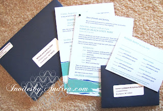
Lakeshore Wedding Stationery

Back in February, I posted a collection of lakeshore-themed wedding save-the-dates that I designed for a client. A couple months ago, I finished the rest of their wedding stationery collection by designing and printing everything else including:

- An invitation (a two-page "packet" attached with a dark green brad that included a schedule of events at their casual park wedding celebration as well as several recommendations for hotel and camping accommodations)
- Two sets of reply cards (one intended for guests who were only invited to Saturday's big event, and another intended for out-of-town family and friends who were also invited to a dinner and temple service the night before and a brunch the Sunday morning after) 
- The extra invitation for the Friday and Sunday events (which was slipped into the envelopes of only some guests)
- Matching Thank You notes

and even:

- Adhesive name tags for all guests to wear at the Saturday and Sunday events (which I'll be including in another blog post at some future date). :)


All stationery items were printed in light blue (the background color of each piece), dark blue, and green. For the invitation and reply card envelopes, I used the same dark blue that I used on the save-the-dates, but chose a "Euro-flap" design (a more formal triangular seal instead of a rectangular seal).


Each invitation envelope and reply card envelope were addressed by adhering white rectangular labels, which I printed on my computer.


The informal wording of the invitation (which reads like a letter), the fun blue and green color scheme, and the easily readable sans-serif font all helped to give this stationery set a casual, outdoorsy feel that perfectly fit the vibe of this couple's wedding celebration. :)


-

Shameless Plug Time: Love this invitation (or others featured on this blog)? Want something similar (or something completely custom) designed for your event? Visit Invites by Andrea to view more samples, download a catalogue pdf, or fill out a design request form. Or shoot me an email to ask me your questions or learn more information.

Sunday, August 19, 2012

Sunday Sample Spotlight: "Elaborate Lives"

This classic white and navy blue invitation set features one of my "fancy" patterns. Paired with an elegant cursive font, "Elaborate Lives" is the epitome of formal - and the perfect design for a traditional wedding.

"Elaborate Lives" Invitation Duo (invite & reply card) with matching Save-the-Date

Each stationery item is printed on white cardstock and mounted on metallic dark blue cardstock. For the envelopes, I used a metallic pearl white "Himalaya" pocketfold envelope, with matching reply card and #10 size policy envelope for a uniquely-shaped save-the-date.


I used the elegant, loopy pattern in a big, bold way - the scale of the pattern is large, giving each stationery item an over-the-top splash of pattern along its borders. From a distance, the dark blue "zig-zag" down the middle of the pattern adds another hint of modern design to an otherwise traditional, formal invitation.


Metallic envelopes are a great way to add sparkle to elegant stationery! Here, both the white envelopes and blue cardstock have a metallic shimmer. The shine is subtle enough to be classy while sparkly enough in the light to be noticeable and appreciated - the perfect combination. :)


Next week's Sunday Sample Spotlight: A cute pear-themed stationery set!


Click here to view all Sunday Sample Spotlight posts.

"Like" Invites by Andrea on Facebook!

-

Shameless Plug Time: Love this invitation (or others featured on this blog)? Want something similar (or something completely custom) designed for your event? Visit Invites by Andrea to view more samples, download a catalogue pdf, or fill out a design request form. Or shoot me an email to ask me your questions or learn more information.