Showing posts with label st. patrick's day. Show all posts

Monday, April 22, 2013

Color of the Week - Emerald

This week's color is Emerald - a beautiful medium green (and Pantone's named color of the year for 2013)!

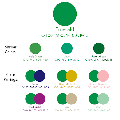
Because Emerald is already so saturated, it works well with neutrals and tints (lighter colors) - but if you're daring, go for another saturated color to create a rich, jewel-toned pair.


Fun facts about Emerald:
 
1. The first recorded use of emerald as a color name in English was in 1598; unsurprisingly, the name comes from the typical appearance of the gemstone (and May birthstone) of the same name.

2. Ireland is sometimes referred to as the Emerald Isle due to its lush greenery.

3. L. Frank Baum's famous children's story, The Wonderful Wizard of Oz, features a grand "Emerald City" where everything from the food eaten to the people are emerald green. In the end, it is revealed that the city is actually normal colored - but the glasses everyone wears are emerald-tinted.


-

Follow Invites by Andrea on Twitter!
"Like" Invites by Andrea on Facebook!

Shameless Plug Time: Love this color? Looking for custom stationery made to match this color (or whatever other color combinations you're using for your event)? Visit Invites by Andrea to view more samples, download a catalogue pdf, or fill out a design request form. Or shoot me an email to ask me your questions or learn more information.

Sunday, February 24, 2013

Sunday Sample Spotlight: "My Life in Green and Pink"

I call this design "ugly-pretty" (not to be confused with "pretty ugly") because it's a bit of an acquired taste. Funky and eclectic, there are several competing patterns and colors that seem like they shouldn't go together... but the childlike whimsy of it all brings it together into a design that works.

"My Life in Green and Pink" Invitation Duo (invite & reply card) with matching Save-the-Date

The invitation is mounted to a solid color smooth-textured grass green "cascade" style envelope. I adorned the left flap and right side pocket with fun pink and green striped/polka-dotted scrapbook paper, and then used all of those same colors (the lime green, light pink, rusty violet, and minty green-blue) in the text and pattern printed on the white cardstock of the invitation, reply card, and save-the-date.


There was a lot of white space to fill on either side of the invitation, and I didn't want the pattern from the scrapbook paper to start feeling stale by repeating it everywhere - so I designed and introduced a new pattern - a funky, two-tone linear design that stresses zig-zag cross-like forms and rounded rectangles. Because the colors still relate to the scrapbook paper, it still feels coherent, but also keeps everything fresh and interesting.


Finally, I picked a very angular font for all of the text to play off the structure of both stripe-emphasizing patterns. And - of course - I took a part of one of the patterns (in this case, the minty blue-green rounded rectangles) and used them as guest "check-boxes" for the RSVP card, to help tie everything together. :)


This green and pink color scheme is great for spring, and the festive feeling of the competing patterns makes this a great design for a let-your-hair-down celebration, such as a St. Patrick's Day party.


Next week's Sunday Sample Spotlight: "Beyond the Veil"


Click here to view all Sunday Sample Spotlight posts.

"Like" Invites by Andrea on Facebook!
Follow Invites by Andrea on Twitter!


-

Shameless Plug Time: Love this invitation (or others featured on this blog)? Want something similar (or something completely custom) designed for your event? Visit Invites by Andrea to view more samples, download a catalogue pdf, or fill out a design request form. Or shoot me an email to ask me your questions or learn more information.

Tuesday, March 27, 2012

Grass Collection Scrapbook Paper

In honor of spring, today I want to show you a new collection of scrapbook paper designs I've created. All of the papers are solid colors (either two or three colors), and feature one of the patterns I've designed. They're shown here as 12" x 12" scrapbook paper squares, but could be adapted down to a different size, as well. Though I only used springtime yellows and greens (plus a few neutrals) for this collection, the colors could also be changed to whatever other color combinations you may want!


If you see a design you like, or want to see some more examples of the scrapbook paper I've been creating, shoot me an email and I can send you some more pictures. I'm also planning to post more designs on this blog as I make them, so be sure to keep checking back!


Shameless plug time: Want to purchase some scrapbook paper, or have stationery designed from the patterns and color combinations featured here? I also incorporate pattern in some of my watercolor paintings. Check out Invites by Andrea to browse sample stationery
or drop me a line at andrea@invitesbyandrea.com to let me know what you think!

Sunday, March 18, 2012

Sunday Sample Spotlight: "The Orange and the Green"

Happy St. Patrick's Day Weekend! And here's something else to celebrate: you're currently reading my 100th blog post!! :)

I gave this design the name "The Orange and the Green" because of the colors it uses and because the petal folding envelope resembles a green four-leaf clover. Despite all that, this design is not for St. Patrick's party - though it could certainly be adapted for one, or for any other springtime party, with its bright, sunny colors.


"The Orange and the Green" - Invitation with Petal Envelope

Though it doesn't particularly look like it in the photograph above, the petal envelope is a metallic green (you can see the metallic shine better in the next photo, below). Instead of lining each of the four petal flaps with scrapbook paper, this time I only lined the top and bottom flaps. Since the colors were so bright and bold, I didn't want to overdo it.


Above, you can see what the petal envelope looks like when closed. The envelopes lie perfectly flat until the you open up the flaps like a blooming flower to reveal the shape seen in the first photograph.


The invitation, which is for a kid's birthday party, is printed on standard 67# bright white cardstock and mounted to a textured orange cardstock paper with yellow brads, which I punched through the printed blue stripe.


Because the scrapbook paper featured little dots in some of its striped pattern, it was a no-brainer to also include round brads to mount the invitations to the orange cardstock. The brads match the exciting, bold colors found elsewhere in both the scrapbook paper and the printed invitation, and the circular shapes are just larger scale versions of the dots seen on the paper's pattern.

Next week's Sunday Sample Spotlight: The epitome of springtime!

Click here to view all Sunday Sample Spotlight posts.

"Like" Invites by Andrea on Facebook!

-

Shameless Plug Time: Love this invitation (or others featured on this blog)? Want something similar (or something completely custom) designed for your event? Visit Invites by Andrea to view more samples, download a catalogue pdf, or fill out a design request form. Or shoot me an email to ask me your questions or learn more information.

Friday, March 16, 2012

Fancy/Funky Friday: Patterns Vera & Melissa

If you're like me, you're never more grateful for a Friday than the ones that precede a holiday weekend. And what better way to celebrate the start of St. Patrick's Day weekend than with today's Fancy/Funky Friday post? ;)

First, the "fancy": Pattern Vera


If you've been following this blog, you know that I love patterns that remind me of argyle. Anything that uses diamond-like shapes just feels instantly sophisticated to me. :) This pattern is no exception, even though the "diamonds" are more like ovals, since the lines are so curved. I think they resemble those fancy Christmas ornaments that were popular decades ago... And so this pattern feels kind of antique or vintage to me, which I love. It's simple and classic, and perfect to use in the background of so many different stationery designs or watercolor paintings.


The pattern is a light enough color in the background that it just adds some visual interest without being too distracting. The ample amount of white negative space also helps the pattern to stay simple and classic. Any pattern that has that much negative space can never be too busy. :)


And now, the "funky": Pattern Melissa


If Pattern Vera was simple and airy, Pattern Melissa is it's opposite. This pattern is quite busy and dense, made to seem even more so since the pen strokes are so thick. If you look carefully at the pattern, you can see that each individual square "unit" is either rotated 90 degrees from the one directly next to it, or reflected across the invisible axis between them. This makes the pattern flow so well that it's hard to tell where the "units" actually are, since they function so well as a whole. That's one of the marks of a good pattern. :)


It is a very busy pattern, but if you use just a column of it instead of an entire block, it's a little simpler. In the stationery design above, I used a single column in a copper color to add a fun pattern to both vertical borders to frame the invitation information without being too distracting.

-

Click here to see all posts related to "Fancy/Funky Friday" 


Shameless plug time: Love my patterns? I incorporate them into a lot of the artwork I create, from stationery for Invites by Andrea to the watercolors I paint. Check out Invites by Andrea's website to see examples of these patterns in use or drop me a line at andrea@invitesbyandrea.com to let me know what you think!