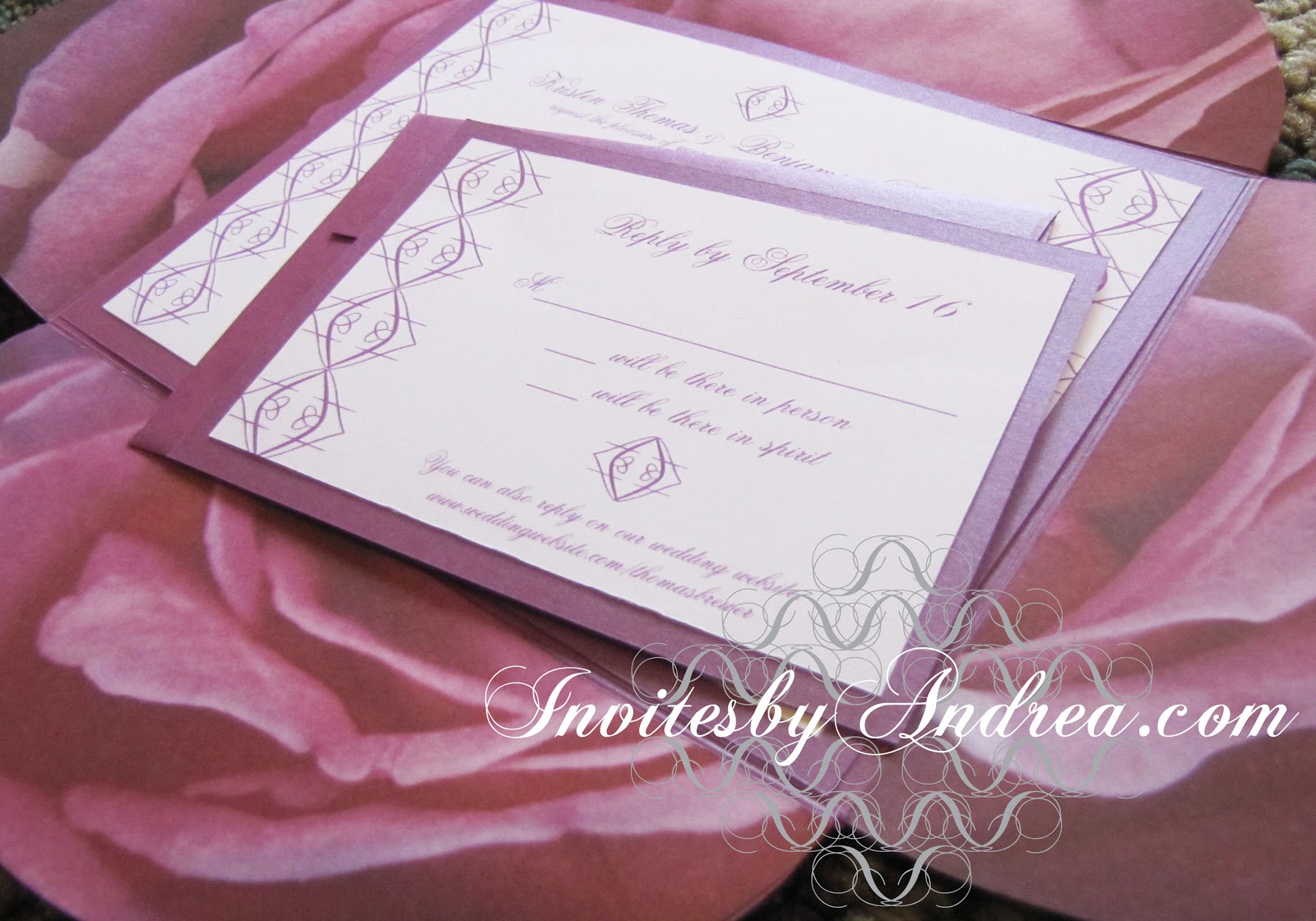
This week's color is Ballet Pink - a pastel pink perfect for adding a sweet, calming touch to any bright color!
For a typical Parisian or Ballet-inspired color scheme, pair ballet pink with white and black or a dark navy blue.

Fun facts about Ballet Pink:
1. The color's name comes from the typical pink shade of ballet tutus, leotards, and slippers worn by female ballet dancers. Traditionally, male dancers wear white or black ballet shoes, though many modern ballerinas of both genders wear nude-colored slippers to give the illusion of dancing barefoot.
2. The art of ballet originated in the Italian Renaissance courts of the 15th century, eventually becoming very popular in France and Russia.
3. Many flowers come in ballet pink
shades, including carnations, roses, tulips, orchids, daisies,
hydrangeas, and dahlias, as well as the blossoms of many flowering fruit trees.
-
Follow Invites by Andrea on Twitter!
"Like" Invites by Andrea on Facebook!
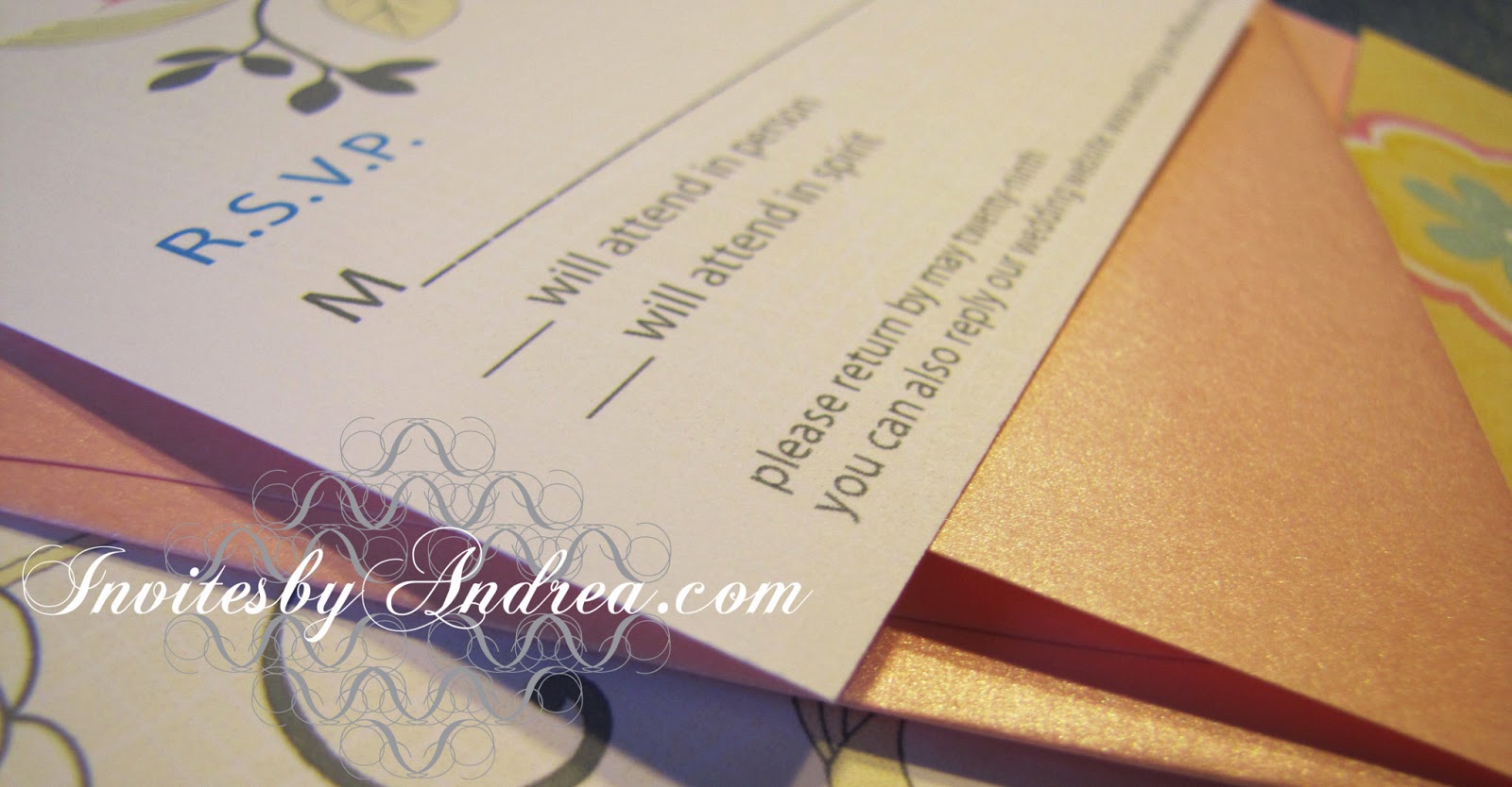
Shameless Plug Time: Love this color? Looking for custom stationery made to match this color (or whatever other color combinations you're using for your event)? Visit Invites by Andrea to view more samples, download a catalogue pdf, or fill out a design request form. Or shoot me an email to ask me your questions or learn more information.
Follow Invites by Andrea on Twitter!
"Like" Invites by Andrea on Facebook!
Shameless Plug Time: Love this color? Looking for custom stationery made to match this color (or whatever other color combinations you're using for your event)? Visit Invites by Andrea to view more samples, download a catalogue pdf, or fill out a design request form. Or shoot me an email to ask me your questions or learn more information.