Friday, May 31, 2013

Fancy/Funky Friday: Patterns Kenzie & Faye

As May draws to a close, I present you with two final May patterns - Kenzie & Faye!

First, the "fancy": Pattern Kenzie


Why it's "fancy": Thin, calligraphic lines, loops and curves, and a general lace-like appearance (especially from a distance) all characterize this fancy pattern (and many others)!

Why it's great: I love the little bow-tie like details!


And now, the "funky": Pattern Faye


Why it's "funky": With so many swirling loops, your eyes are constantly on the move, taking in the dynamic details of this fun pattern.

Why it's great: The evenly-spaced loops give it a funky mod 1960s feel.

-

Click here to see all posts related to "Fancy/Funky Friday" 


Shameless plug time: Love my patterns? I incorporate them into a lot of the artwork I create, from stationery for Invites by Andrea to the watercolors I paint. Check out Invites by Andrea's website to see examples of these patterns in use or drop me a line at andrea@invitesbyandrea.com to let me know what you think!

Wednesday, May 29, 2013

Fun Bandana Decor

I love bandanas - they're colorful and cute, and they're useful for so much more than just wearing. They're so carefree and summery, they're perfect decor for this time of year!

1. Use bandanas to jazz up your patriotic Memorial Day, Fourth of July, or Labor Day party or picnic!


2. Bandanas come in other colors, too! Use them for outdoor parties, office picnics, children's birthday parties, and decorating your house (especially kids' bedrooms or nurseries)!


Bandanas are perfect alternatives for cloth napkins, make great flags, banners, tablecloths, and table runners, and easily roll up for utensil holders or clever nut/popcorn carriers!

And bandanas aren't limited to just summer, either - orange and black bandanas are great for Halloween and other autumn events!

-

Need party invitations? Check out my custom stationery at InvitesbyAndrea.com!

Monday, May 27, 2013

Color of the Week - Turquoise

This week's color is Turquoise - a bright blue with just a hint of green undertone!

Turquoise is already fairly saturated - pair it with a slightly darker hue that's also high in saturation (like royal blue or red-violet) for a brilliant eye-catching color scheme. It's particularly striking with red (check out my inspiration boards here & here).


Fun facts about Turquoise:

1. The first recorded use of turquoise as a color name in English was in 1573, based on the gem of the same name. In turn, the gem's name comes from the French word for "Turkish," as it was originally imported from Turkey.

2. As a mineral, turquoise has been prized as a gem and ornamental stone for thousands of years, and is the traditional birthstone of December. In the ancient Persian Empire, turquoise gems were worn around the neck or wrist as protection against unnatural death; it was believed that if they changed color, the wearer had reason to fear the approach of doom. Today, science has proved that turquoise gems can indeed change color, though it is thought to be caused by light, or by a chemical reaction brought about by cosmetics, dust, or the acidity of skin.

3. The color turquoise is known to be calming, and can be used to treat patients prone to panic attacks or mania. Mainstream psychiatric hospitals often use turquoise and other light tones of blue and green to paint their interior walls, and many nurses often wear turquoise scrubs.


-

Follow Invites by Andrea on Twitter!
"Like" Invites by Andrea on Facebook!

Shameless Plug Time: Love this color? Looking for custom stationery made to match this color (or whatever other color combinations you're using for your event)? Visit Invites by Andrea to view more samples, download a catalogue pdf, or fill out a design request form. Or shoot me an email to ask me your questions or learn more information.

Sunday, May 26, 2013

Sunday Sample Spotlight: "Time to Pretend"

I absolutely adore this stationery set! It's perfect for spring!


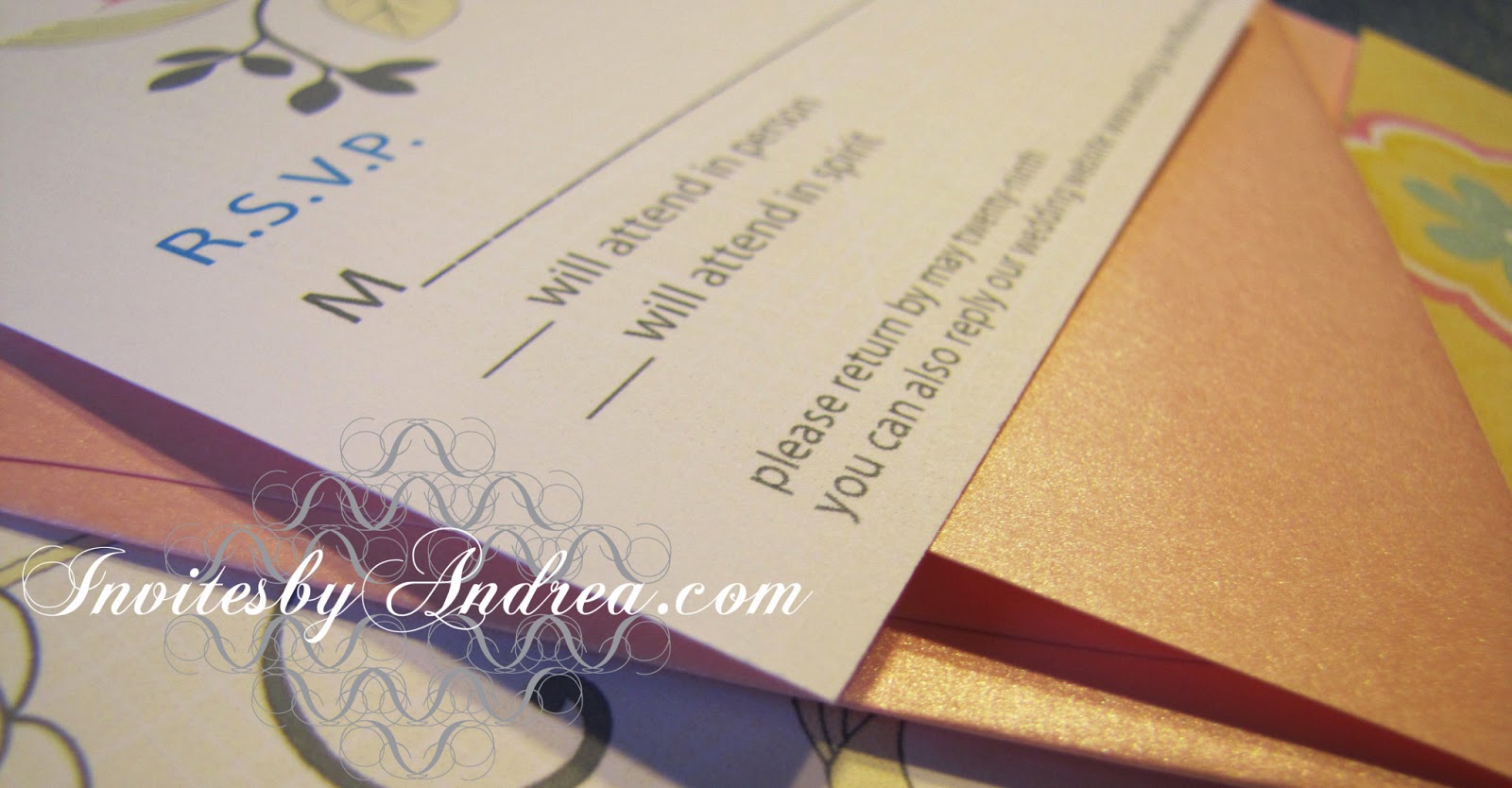
"Time to Pretend" - Invitation Duo (invite & reply card)

I started with a metallic pale pink folding envelope, which I decorated with beautiful pale yellow scrapbook paper featuring a yellow/white/pale pink/sky blue floral design.


Up close (and tilted into the light), the pale rose-pink metallic envelopes really shine - and the scrapbook paper boasts an implied linen texture (though the paper is actually totally smooth). I very subtly mimicked this texture with pale yellow lines in the background of the printed invitation and reply card (it's so subtle, you can't even see it in these pictures!), and I incorporated the same blue, pink, and slate gray colors from the scrapbook paper for the images and text.


I recreated the linear floral design with Adobe Illustrator's pen tool so I could print it on the invitation. and seamlessly connect the digital printouts to the scrapbook-lined envelopes.


On the reply card, I only printed half of that flower form, poking down from the top edge of the paper. Because I didn't scale the image down (just cropped it), if you lay the RSVP on top of the invitation, the flowers line up exactly!

Because of its pastel colors, this design would work great for any spring event, as well as baby showers, birth announcements, and cutesy/feminine holidays like Easter and Valentine's Day!


Next week's Sunday Sample Spotlight: "Manors & Etiquette"


Click here to view all Sunday Sample Spotlight posts.

"Like" Invites by Andrea on Facebook!
Follow Invites by Andrea on Twitter!


-

Shameless Plug Time: Love this invitation (or others featured on this blog)? Want something similar (or something completely custom) designed for your event? Visit Invites by Andrea to view more samples, download a catalogue pdf, or fill out a design request form. Or shoot me an email to ask me your questions or learn more information.

Friday, May 24, 2013

Fancy/Funky Friday: Patterns Corella & Scarlett

Happy Friday! Here are today's patterns (both shown in a bright, cheerful red color!) -

First, the "fancy": Pattern Corella


Why it's "fancy": In between the prominent white shapes is an elegant sea of curlicues and loop-di-loops, all drawn in thin lines.

Why it's great: The negative space really comes forward because the hexagon-like shapes are so large in comparison to all the other details.


And now, the "funky": Pattern Scarlett


Why it's "funky": From a distance, it has some lace-like qualities, but up close, there are just too many fun allusions to make this pattern anything but uniquely fun!

Why it's great: I don't know about you, but when I look at this pattern, I see cartoonish dog bones, spooky ghost eyes, and simplified Greek columns... ;)

-

Click here to see all posts related to "Fancy/Funky Friday" 


Shameless plug time: Love my patterns? I incorporate them into a lot of the artwork I create, from stationery for Invites by Andrea to the watercolors I paint. Check out Invites by Andrea's website to see examples of these patterns in use or drop me a line at andrea@invitesbyandrea.com to let me know what you think!

Wednesday, May 22, 2013

Red, White and Blue Recap

Memorial Day (and the unofficial start of summer) is quickly approaching! Rediscover my patriotic color and decor inspiration board from last year to find the perfect idea for your family's Memorial Day get-together! :)

Monday, May 20, 2013

Color of the Week - Champagne

This week's color is Champagne - a neutral that complements almost any color!

Champagne works with almost anything, from pastels to darker shades, and from highly saturated hues to fellow neutrals!


Fun facts about Champagne:

1. The first recorded use of the word champagne as a color term in English was in 1915; it was named for the sparkling wine produced from grapes grown in the Champagne region of France.

2. This color is often used to describe gemstones or paint finishes (such as in marketing automobiles) in order to imply that one is purchasing a luxury product.

3. Horses may inherit a "champagne gene" from either or both parents; this simple dominant allele creates rare horse coat colors, hazel eyes, and pinkish, freckled skin. In champagne colored horses, any hairs that would have been red are gold, and any hairs that would have been black are chocolate brown.


-

Follow Invites by Andrea on Twitter!
"Like" Invites by Andrea on Facebook!

Shameless Plug Time: Love this color? Looking for custom stationery made to match this color (or whatever other color combinations you're using for your event)? Visit Invites by Andrea to view more samples, download a catalogue pdf, or fill out a design request form. Or shoot me an email to ask me your questions or learn more information.