Friday, December 16, 2011

Fancy/Funky Friday: Patterns Ravenna & Lynne

TGIF! It's time for another Fancy/Funky Friday!

First, the "fancy": Pattern Ravenna


This is definitely one of my busiest, most dense "fancy" patterns - especially when seen from a distance. The lines are close together and there's hardly any white space to speak of. Even zoomed in, the pattern is a little crowded and busy, though with the white space also bigger, it at least feels a little more airy.
Unlike many of my patterns, there is a lot going on all at once, and there isn't just one pattern "unit" that is repeated, but a few different ones. Furthermore, characters right next to each other are repeated exactly as their next door neighbor, rather than being reflected or rotated first. This adds to the density of the pattern and starts to create little mini repetitions within the larger repetition of the entire pattern.

Maybe it's too busy for you, or maybe you love how interesting each little part of the pattern is and how it all works together - but no matter your stance, the fact remains that it's important for me to try all sorts of different ways of creating patterns in Illustrator. With over 150 patterns already made (and more being made any time I'm bored and looking for something fun to do!), they start to all look the same after awhile if you don't shake things up every now and then. ;)

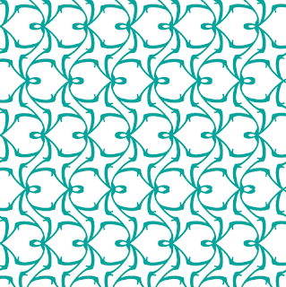
And now, the "funky": Pattern  Lynne


Depending on what you see as the positive shapes and negative shapes in this pattern, you might focus on a sideways heart-like shape (with a little loop at the top) or what I like to think of as a "ninja star" - the four-pointed star-like shape that curves at the ends. 
Another interesting thing to note is apparent when you view the horizontal stripes that the vaguely heart-shaped forms make when repeated in a row. From a distance, the stripes appear to not be quite straight. This is an optical illusion similar to this famous type of optical illusion below:


The stripes look like they get wider and skinnier, when in fact they're really straight the whole way down. The "v" like forms create that movement where it doesn't actual exist.
I used a slight variation of Pattern Lynne in the above set of stationery. If you look at where I actually repeat the pattern, you'll notice that the "stripes" of pattern are not reflected, and that adjacent "heart" forms face the same direction. I made this change to get rid of the optical illusion so that it wouldn't be too distracting on the invitation design.

I used this pattern as both a repeated block and a single "ninja star" stripe, as well as both obviously in the foreground of the design (dark teal against the white background) and blending into the background, where the pattern is seen in white on a teal background - until the teal fades into white and the pattern is indiscernible from the white space. I love how versatile the pattern is and how it looks interesting and works in almost any color. Plus, with the opportunity for optical illusion, this quirky pattern definitely fits the bill of the "funky" category! :)

-

Click here to see all posts related to "Fancy/Funky Friday" 


Shameless plug time: Love my patterns? I incorporate them into a lot of the artwork I create, from stationery for Invites by Andrea to the watercolors I paint. Check out Invites by Andrea's website to see examples of these patterns in use or drop me a line at andrea@invitesbyandrea.com to let me know what you think!

Thursday, December 15, 2011

How to Use Illustrations on Stationery - Part Five: Food

Hungry yet? You might be after viewing this post, filled with illustrations of food I created in Adobe Illustrator for my sample stationery. ;)


First, the obvious - if you're have a dinner party, or any kind of baking party with your culinary friends, or otherwise have plans to feature a type of food prominently at your event, why not include an illustration of said food on your stationery? Are you dying to try out recipes in a new cookbook you purchased, and have plans to invite friends over for dinner? Planning a cupcake reception for your wedding? Here's the answer to your invitation design dilemma.


Or maybe its the drinks of your event that will be the better draw (no pun intended). Hosting a cocktail party, or planning a wine and cheese tasting? Showcase the goods so people make sure to come thirsty!


You can even illustrate just the garnishes if you want to give your guests only a hint of what's to come. Dancing lime slices down the side of an invitation just screams margarita party - and you don't even have to show the margaritas!


For a fancier wine-and-cheese event, add a little elegance by including the history. Don't just show a glass of wine, but the vineyard it came from.


Finally, don't feel like you're restricted to illustrating just foods or drinks you'll be serving at your party. Fruits can make great event themes since they feel so summery and whimsical. Having a picnic? Include an illustration of a watermelon. Planning an all-girl party? I once had a slumber party in middle school for my birthday where I gave every guest a fruit-themed identity (like Princess Plum, Grape Goddess, and Strawberry Sweetie). It was cute and fun; I gave them each an individual goody bag at the beginning of the party that had appropriately colored nail polish and fruit-scented lotions and we all gave each other makeovers to embody the fruit we'd been assigned.


Or maybe the location of your venue is known for a certain type of food, like cereal from Battle Creek, or cherries from Traverse City, Michigan. Why not include an illustration of the famous food on your invitations as a tribute to your locale?


Next week - some of my favorite illustrations: animals and plants!

-

Shameless plug time: Love my illustrations? Love these designs? Check out Invites by Andrea's website to see examples of these illustrations or download a catalogue pdf (coming soon!). Or drop me a line at andrea@invitesbyandrea.com to let me know what you think!

Wednesday, December 14, 2011

How to Use Illustrations on Stationery - Part Four: Fashion

In the posts for today and tomorrow I'm going to look at two specific groups of illustrations that would normally fit under the "objects" category - fashion and food.


The four examples I have to show you of illustrations today are of shoes and feathers. The type of shoes drawn below give a very different feel than the illustration of a cowboy boot even further down - one is feminine and girl, while the other is masculine and indicative of a certain location.


These shoes (and the mascara brush writing the letters above it) are great illustrations for a fun and flirty bachelorette party or a girl's slumber party.


Meanwhile, these cowboy boots (resting oh so casually against a cactus) are the perfect illustration for a western-themed event, or an event with rustic, southern decor.


Another popular fashion accessory right now is feathers - especially peacock feathers. I just love the colors found in peacocks, and I've seen several great examples floating around the internet of wedding bouquets and centerpieces that use peacock feathers to add an elegant touch of texture. If you're planning on incorporating this trend in the decor of your event, why not start by displaying it proudly on your invitations?


A close up of the texture of a feather is another great illustration useful for a variety of events. Keep the colors bold and bright and cover a large area of the design with an illustration like this, or lighten the colors to match the background white and add just a subtle hint of texture to your design without overpowering the invitation with feathers.


Tomorrow we'll look at some examples of food illustrations I've designed for my sample stationery.

-

Shameless plug time: Love my illustrations? Love these designs? Check out Invites by Andrea's website to see examples of these illustrations or download a catalogue pdf (coming soon!). Or drop me a line at andrea@invitesbyandrea.com to let me know what you think!

Tuesday, December 13, 2011

Gift Wrapping

I love gift wrapping, and since the holiday gift-giving season is approaching I thought I'd mention a few ideas about how to spruce up the packages you hand out this year.

Maybe you have a really great gift already picked out for a special someone, and you want the outside packaging to look just as amazing as the gift inside. There are many gorgeous wrapping papers available in stores for the holidays, but those aren't your only options. Old newspapers or maps can be great ways to recycle and reuse paper while giving your presents a unique look, especially if the gift inside relates to the wrapping on the outside.

Road maps are perfect wrapping paper for a car GPS unit (they won't need those old road maps anymore anyway!). Trail maps of local parks or hiking spots are great for wrapping a new backpack or water bottle for an outdoorsy friend. A map of a foreign country would be a fabulous way to wrap a travel book for a friend planning a vacation to that country. Or maybe you've decided to splurge and buy plane tickets for you and a special someone to go on the vacation of your dreams. What better way to wrap up that special surprise than with a map of the city the two of you will be shortly exploring?

Maps are also great for presents that have come from a certain location. Package Belgian chocolates in - you guessed it - a map of Belgium, or a bottle of California wine in a map of the Napa Valley. And cheap reproductions of historical maps (or newspapers, or documents) are great if you're buying for a history buff.

For small gifts, consider using old postcards or photographs as wrapping paper - it's not hard now to scan an image into your computer, tile it out on a standard sheet of 8.5" x 11" paper and print it out on your printer. That way you can make personal wrapping paper that includes photographs of you and the person you're giving your gift to! You could even make the package into a complete work of art by covering a cardboard box with a collage of all sorts of photographs and other items like playbills and ticket stubs of the memories you've shared together.

If you're putting the gift inside a cardboard box anyway, why not try a really unique approach and paint the box instead of wrapping it? You could even paint a ribbon around the entire thing and a bow on the top so that at first glance it's a trompe l'oeil (trick of the eye) and looks like a real ribbon- and wrapping-paper decked present.

If that's not enough options for you, consider special craft paper, scrapbook paper, or fabric. They feel and act similarly to standard wrapping paper, so they're easy to work with. I just love Hollander's, a decorative paper store in Ann Arbor, MI. They have a ton of great papers to choose from that would make for absolutely gorgeous wrapping paper for special presents. The best part? You can also order paper online if you're not near Ann Arbor.

And if you have a bit of extra fabric lying around from an old sewing project, why not put it to good use? You can also go the extra mile and pick out some new fabric with your gift recipient in mind. You can even design your own fabric on Spoonflower.com and incorporate photographs onto fabric to print out and use as wrapping. Or for smaller packages, your standard home printer can print your design out on fabric - just make sure that an 8.5" x 11" swatch of fabric will be enough to cover the gift.

Of course, once you have your gift wrapped, you don't have to stop there. Why not use some creativity and create your own ribbons and bows? Use fake flowers or strands of beads to decorate your gift, or get some cheap fabric ribbon in the bargain bins at JoAnn Fabrics stores. Even the cheapest fabric ribbon looks nicer than the paper ribbon you can buy next to the wrapping paper.

And don't forget the gift tags! If you have good handwriting, why not hand-draw your own gift tags? You can also print digital tags from your computer. If it's a travel-themed gift, why not make the tag look like a luggage tag? If you're buying gardening supplies for someone, why not write the gift tag on a small packet of seeds and attach it to the package? There are tons of ways to be creative, depending on who you're buying for - and what you bought them. :)

Happy wrapping!

Monday, December 12, 2011

Holiday and Winter Parties

It's that time of year again - the season of holidays and all the holiday parties that go with it. Of course there are certain traditions and activities already planned for such events depending on the holiday (Christmas, Hanukkah, Kwanzaa, Winter Solstice, New Year's Eve), but what about ideas for other parties that aren't so holiday-specific? My friends and I have a "Birchristmakwanzukkahsolstice" party every year - so named because it's not really about the many holidays at all (or my/my husband's birthday around the same time), but about seeing each other again now that we're all back home for a winter break from work or school.

One of the most fun traditions we've done the past few years is a game called "tele-draw" (which has now been adapted into board game form and marketed as "Telestrations," though we've been playing it since 2007). You start by creating small packets of paper - enough for each person at the party to have one sheet of paper - and then staple them in one corner so it's fastened but still easy to flip through. The first person writes a word or phrase - anything they want - and then passes it to the next person, who then has to try to draw (on the second page) whatever the first person wrote (on the first page). After drawing, the second person folds down the original written phrase so that the next person will only be able to see their drawing and passes it on. The third person has to try to guess what the word or phrase was based on the drawing, and it goes back and forth between writing and drawing until the packet has made it all the way around the circle. It's like a mixture between Pictionary and Telephone and the end results are hilarious!

Another idea for a non-holiday-specific winter party is to enjoy the snowy weather! It doesn't matter if you're ten or thirty - sledding down a snow-covered hill is just plain fun! Dress warmly, go to an appropriately sized hill (it helps if you go after dark so it's not overrun with children), and have fun! All the adult stress in your life will melt away and you'll feel like a kid again!


Or, have a hot beverage party! (This could be a good idea for the aftermath of your sledding adventure, as well). Turn your kitchen into a hot beverage factory and try all different kinds of hot chocolate (try adding caramel, delicious flavors of extract, cinnamon sticks, or mints and other hard candies, and see what flavor combinations you can create). Get different flavors of marshmallows and whipped cream and stock up on festive sprinkles for toppings. Donuts and cookies are great companions to dip in your steaming mugs of hot chocolate. And if that doesn't sound fun and exciting enough for you, make sure to get some Irish cream, eggnog, or alcohol-infused whipped cream* to liven up the party. ;)

(*I am not kidding. This exists.)

Whatever you choose to celebrate, and however you decide to do it, make sure to enjoy the season. I love how beautiful winter can be, but it can also be frigid and bleak - and the best solution to beating the winter blues is to meet up with family and friends and create warm new memories.

Sunday, December 11, 2011

Sunday Sample Spotlight: "Peaches and Cream"

What is it about vellum overlays that seem so classy? :) I love colored vellum because it's still a fancy transparent layer, but with a little added flavor. For this stationery set (a wedding invitation, a reply card, a save-the-date, and an invitation for a wedding shower), I chose a light peach-colored vellum, which I paired with a flat peach cardstock.

"Peaches and Cream" - Invitation duo (invite & reply card), save-the-date, and shower invitation

Because the vellum already felt so fancy, I picked one of my "fancy" patterns as the main stationery design, and printed everything on bright white linen paper, which has a great sophisticated texture. Of course, then I also needed white linen envelopes - I chose a Cascade Pocketfold for the main A7-sized invitation, and matching white linen envelopes in size #10 (shower invitation), A2 (save-the-date), and 4Bar (reply card).

The stark white of the envelopes (and the paper, once the vellum is lifted) feels very wintry to me, and the pale peach and pinks I use in the design also have a little bit of a cooler temperature (especially for pink), making this a great color scheme for winter. But with a different neutral (maybe cream colored envelopes, or a rich brown instead of light white), the pastel peach and pink could easily be adapted for a springtime event.


One of the great things about vellum is how it both exposes and hides the details of your invitation simultaneously, giving your event a hint of mystery. It's a little hard to read all of the text through the peach vellum (as seen in the two photographs above), but that problem is easy enough to remedy by pressing the vellum closer to the paper, or by lifting the vellum up to expose the bright white paper and clear, easy-to-read design underneath.

And what better way to attach vellum to invitations than with decorative brads? They're obvious enough to show the stationery recipient how to lift the vellum and are great at keeping the vellum both in place and easily lift-able. I had some great pastel pink brads that I used, and this worked great at another important design task - tying what was on top of the peach vellum (the brads) back to what lies underneath the vellum (the design and text of the invitation).

I wanted to use two pastel colors along with the bright white, and peach and pink seemed the perfect pairing. It's a little unexpected, since they're pretty similar, but that's what I love about it. The pink isn't as obvious as the peach, especially since most of it is covered in peach vellum (until the vellum overlay is lifted up). It adds a hint of interest, but it's so subtle that if you're not really looking for the second color, you might not even notice it. But once you do notice it, the shades are different enough so that they still look intentional. If the colors were too similar, they'd just look like my cursor slipped and I chose the wrong color swatch in Illustrator! You never want a part of your design to look like an accident. :)


Honestly, I cannot say enough good things about brads. I just love the way they look, and they're such an easy way to fasten multiple layers of paper to each other on stationery. Plus, they add that extra pop of color, and they have such interesting and gorgeous brads now - why wouldn't you want to use them? ;) They have sparkly ones, metallic ones, solid ones, and brads of all different shapes and sizes, too, so it's easy to find one that works with almost any design.


Next week's Sunday Sample Spotlight: "Chocolate Covered Cherries"

Click here to view all Sunday Sample Spotlight posts.

"Like" Invites by Andrea on Facebook!

-

Shameless Plug Time: Love this invitation (or others featured on this blog)? Want something similar (or something completely custom) designed for your event? Visit Invites by Andrea to view more samples, download a catalogue pdf (coming soon!), or fill out a design request form. Or shoot me an email to ask me your questions or learn more information.

Friday, December 9, 2011

Fancy/Funky Friday: Patterns Michelle & Myrtle

It's hard to believe that we're already nine days into December - but the good part about time flying is that it feels like Fancy/Funky Friday comes around a lot sooner! ;)

First, the "fancy": Pattern Michelle


There are several things that I love about this pattern. First, I really like how masculine it seems, even for a "fancy" pattern. Notice how it looks less like delicate lace and doesn't feature a lot of loops and curves? The "x"s throughout the pattern are very strong and structured, and the dominating diamonds instantly bring to mind preppy argyle. And how many other patterns do you know that look so undeniably sophisticated and classy on either sex? Second, I love how the little hearts that become more apparent in the details of Pattern Michelle bring some femininity back into the pattern. And it is precisely this masculine-feminine duality that I wanted to incorporate in my own rehearsal dinner invitations, which is why I used this pattern when I created those last year.


I paired Pattern Michelle with a very similar but even more masculine pattern (with larger diamonds, less detail, and fewer hearts), and used blues and blacks in the design. I could have just used the same patterns I had already used in designing my wedding stationery, but I was afraid that the coral orange color, the femininity of the pattern, and the rose illustrations I created for that stationery set was starting to alienate the male guests who would be coming into town for our wedding weekend. Creating a couple of new patterns that had elements of both masculinity and femininity was the perfect compromise.

Another thing I love about Pattern Michelle is how well it works in parts. As you can see from the example above, it looks just as great in a single vertical stripe as it does when repeated several times. It works great as a sophisticated stripe and takes on a whole new feeling when fewer diamonds are created due to a lack of repetition. It feels even more masculine when the strong "x" forms become the dominant part of the pattern.

And now, the "funky": Pattern Myrtle


Unlike today's "fancy" pattern, this one has an overabundance of loops and curves - so many that it takes on a very playful personality. I instantly think of bubbles when I see Pattern Myrtle - which is why I named it after the young ghost in the Harry Potter series who haunts the Hogwarts bathrooms and visits Harry while he soaks in a very bubbly bath.

Pattern Myrtle is very busy, but it works because the individual units are so airy with white space. Whenever the smaller loopy forms start to feel a bit crowded, larger forms come in to let in even more free space. I don't often play with scale if I repeating the same shape in a pattern, but because there is only one basic shape I use in the entire pattern, having both larger and smaller versions meshes well together.

The pattern's features are so bubbly and fun that I had to pick a more somber, neutral color to display it in. The brown calms it down a little so it doesn't seem too over the top, and adds a little balance to Pattern Myrtle's exuberant personality. :)

-

Click here to see all posts related to "Fancy/Funky Friday" 


Shameless plug time: Love my patterns? I incorporate them into a lot of the artwork I create, from stationery for Invites by Andrea to the watercolors I paint. Check out Invites by Andrea's website to see examples of these patterns in use or drop me a line at andrea@invitesbyandrea.com to let me know what you think!