TGIF! It's time for another Fancy/Funky Friday!
First, the "fancy": Pattern Ravenna
This is definitely one of my busiest, most dense "fancy" patterns - especially when seen from a distance. The lines are close together and there's hardly any white space to speak of. Even zoomed in, the pattern is a little crowded and busy, though with the white space also bigger, it at least feels a little more airy.
Unlike many of my patterns, there is a lot going on all at once, and there isn't just one pattern "unit" that is repeated, but a few different ones. Furthermore, characters right next to each other are repeated exactly as their next door neighbor, rather than being reflected or rotated first. This adds to the density of the pattern and starts to create little mini repetitions within the larger repetition of the entire pattern.
Maybe it's too busy for you, or maybe you love how interesting each little part of the pattern is and how it all works together - but no matter your stance, the fact remains that it's important for me to try all sorts of different ways of creating patterns in Illustrator. With over 150 patterns already made (and more being made any time I'm bored and looking for something fun to do!), they start to all look the same after awhile if you don't shake things up every now and then. ;)
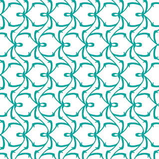
And now, the "funky": Pattern Lynne
Depending on what you see as the positive shapes and negative shapes in this pattern, you might focus on a sideways heart-like shape (with a little loop at the top) or what I like to think of as a "ninja star" - the four-pointed star-like shape that curves at the ends.
Another interesting thing to note is apparent when you view the horizontal stripes that the vaguely heart-shaped forms make when repeated in a row. From a distance, the stripes appear to not be quite straight. This is an optical illusion similar to this famous type of optical illusion below:
The stripes look like they get wider and skinnier, when in fact they're really straight the whole way down. The "v" like forms create that movement where it doesn't actual exist.
I used a slight variation of Pattern Lynne in the above set of stationery. If you look at where I actually repeat the pattern, you'll notice that the "stripes" of pattern are not reflected, and that adjacent "heart" forms face the same direction. I made this change to get rid of the optical illusion so that it wouldn't be too distracting on the invitation design.
I used this pattern as both a repeated block and a single "ninja star" stripe, as well as both obviously in the foreground of the design (dark teal against the white background) and blending into the background, where the pattern is seen in white on a teal background - until the teal fades into white and the pattern is indiscernible from the white space. I love how versatile the pattern is and how it looks interesting and works in almost any color. Plus, with the opportunity for optical illusion, this quirky pattern definitely fits the bill of the "funky" category! :)
-
Click here to see all posts related to "Fancy/Funky Friday"
Shameless plug time: Love my patterns? I incorporate them into a lot of the artwork I create, from stationery for Invites by Andrea to the watercolors I paint. Check out Invites by Andrea's website to see examples of these patterns in use or drop me a line at andrea@invitesbyandrea.com to let me know what you think!


No comments:
Post a Comment