Today's Fancy/Funky Friday post is going to look at Patterns Winifred and Ambrose. :)
First, the "fancy": Pattern Winifred


Pattern Winifred is very classic of my "fancy" patterns. It's one of those designs that is so similar to others I've made, and so indicative of how I think of the adjective "fancy" in my head, that I'm sure I've used it on several stationery designs and in the backgrounds of several watercolor paintings - and yet, I can't seem to find any examples! It's like thinking of an actor who is always in a certain genre of movie so much so that s/he has practically become synonymous with that genre, yet when you're asked to call to mind some specific movies that s/he has been in, you can't seem to think of any examples that pass a fact-checking test. The actor is so ubiquitous that you assume s/he is in movies that s/he isn't, just because it seems like s/he should be.
That is Pattern Winifred to me. :) I mean, it has the thin strokes, the wide open white space, and the mix of diamond-like shapes and gentle curves that make it seem both modern-professional (like argyle or a wrought-iron gate) and ancient-elegant (like the interior of the Napoleon III apartments in the Louvre). It has everything I look for when I'm designing a "fancy" pattern.
And now, the "funky": Pattern Ambrose


Ambrose is one of my favorite "funky" patterns because it is so unique. It looks great either horizontal or vertical, or as a few columns or an entire block of pattern. Because the pattern units are so long, it really emphases whichever direction you turn it, making the reply card below seem even longer than it is by mimicking the reply line and the horizontal orientation of the card.

It also works great with a unique long font, like the one used above, and the pattern can be easily deconstructed in other parts of the stationery, since the individual parts look almost as interesting as the entire pattern does. Above, I took part of the pattern to make the "check boxes" for guests to reply with. I've done this with several of my patterns, but using Ambrose is one of my favorites. The interesting diamond shapes I used for the "check boxes" are a little lost when looking at the pattern as a whole, since the longer rounded rectangles, circles, and perpendicular straight lines command so much attention. By pulling the diamonds out to use elsewhere in the stationery, I make sure they don't go completely unnoticed, and I tie the rest of the stationery design back in with the pattern.
-
Click here to see all posts related to "Fancy/Funky Friday"
Shameless plug time: Love my patterns? I incorporate them into a lot of the artwork I create, from stationery for Invites by Andrea to the watercolors I paint. Check out Invites by Andrea's website to see examples of these patterns in use or drop me a line at andrea@invitesbyandrea.com to let me know what you think!
First, the "fancy": Pattern Winifred
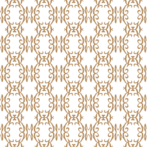

Pattern Winifred is very classic of my "fancy" patterns. It's one of those designs that is so similar to others I've made, and so indicative of how I think of the adjective "fancy" in my head, that I'm sure I've used it on several stationery designs and in the backgrounds of several watercolor paintings - and yet, I can't seem to find any examples! It's like thinking of an actor who is always in a certain genre of movie so much so that s/he has practically become synonymous with that genre, yet when you're asked to call to mind some specific movies that s/he has been in, you can't seem to think of any examples that pass a fact-checking test. The actor is so ubiquitous that you assume s/he is in movies that s/he isn't, just because it seems like s/he should be.
That is Pattern Winifred to me. :) I mean, it has the thin strokes, the wide open white space, and the mix of diamond-like shapes and gentle curves that make it seem both modern-professional (like argyle or a wrought-iron gate) and ancient-elegant (like the interior of the Napoleon III apartments in the Louvre). It has everything I look for when I'm designing a "fancy" pattern.


Ambrose is one of my favorite "funky" patterns because it is so unique. It looks great either horizontal or vertical, or as a few columns or an entire block of pattern. Because the pattern units are so long, it really emphases whichever direction you turn it, making the reply card below seem even longer than it is by mimicking the reply line and the horizontal orientation of the card.

It also works great with a unique long font, like the one used above, and the pattern can be easily deconstructed in other parts of the stationery, since the individual parts look almost as interesting as the entire pattern does. Above, I took part of the pattern to make the "check boxes" for guests to reply with. I've done this with several of my patterns, but using Ambrose is one of my favorites. The interesting diamond shapes I used for the "check boxes" are a little lost when looking at the pattern as a whole, since the longer rounded rectangles, circles, and perpendicular straight lines command so much attention. By pulling the diamonds out to use elsewhere in the stationery, I make sure they don't go completely unnoticed, and I tie the rest of the stationery design back in with the pattern.
-
Click here to see all posts related to "Fancy/Funky Friday"
Shameless plug time: Love my patterns? I incorporate them into a lot of the artwork I create, from stationery for Invites by Andrea to the watercolors I paint. Check out Invites by Andrea's website to see examples of these patterns in use or drop me a line at andrea@invitesbyandrea.com to let me know what you think!
No comments:
Post a Comment