Friday, March 30, 2012

Fancy/Funky Friday: Patterns Lola & Mimi

It's hard to believe March is almost over already! Here's today's Fancy/Funky Friday post.

First, the "fancy": Pattern Lola


This pattern obviously has a very horizontal structure. It's so strong that you really look at the pattern as a collection of stacked "striped" units, rather than the individual parts of the stripe repeated within the horizontal bands. The diagonal lines, which shift direction in each row, give the pattern a very dynamic movement, but the thin lines and elegant loops keep it from getting too "funky."

Can you spot the cursive capital letter I used to create this pattern? L has been my favorite letter for as long as I can remember. I love the way it sounds, the way it looks, and the way it lends itself so well to singing... Plus, I'm sure it didn't hurt that it was the first letter of my middle name. ;) When I learned cursive in grade school, I was very pleased to discover that a cursive L is one of the most beautiful characters.


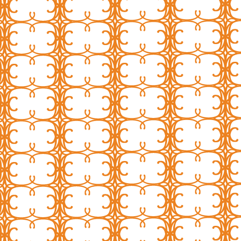
And now, the "funky": Pattern Mimi


Pattern Mimi is the exact opposite of Pattern Lola - instead of being a series of horizontal rows, it's a collection of vertical columns. The contrast between the dense lines and wide open white spaces is even more prominent in this pattern - so much so that from a distance, it almost looks as if the white circular pairs are sitting on top of a background of solid orange.

The main shape that pops out from the pattern - the side-by-side white circles that form sideways figure-eights - reminds me of Konstantin Brancusi's minimalist sculpture "The Kiss." Doesn't each one kind of look like the outlines of two profiles (with prominent ears) mushed together in an embrace? :)

-

Click here to see all posts related to "Fancy/Funky Friday" 


Shameless plug time: Love my patterns? I incorporate them into a lot of the artwork I create, from stationery for Invites by Andrea to the watercolors I paint. Check out Invites by Andrea's website to see examples of these patterns in use or drop me a line at andrea@invitesbyandrea.com to let me know what you think!

Wednesday, March 28, 2012

Flower Bat Mitzvah Placecard Poster and Table Markers

A couple months ago I posted a pink and green flower-themed Bat Mitzvah invitation set I designed for a client. A few weeks after I made that post, the client came back to me to ask for some table markers and a placecard poster in a similar theme for the dinner party after the ceremony.

I used the same template for the table markers as I did when I made some for my own wedding. The three-sided self-standing table marker template fits onto standard legal paper (8.5" x 14") - a size that's bigger than the usual 8.5" x 11" but still fits into my printer. :) I used the same rose design from the invitations on each side of the table marker, but changed the number to a different (serif) font since the sans-serif font I used for everything else didn't have the most recognizable number characters from a distance.

Before I sent them off to the Chicago area (where the event was to take place), I first took some photos of them in my apartment. I had a bit of fun setting them up on a chair by the window, letting the spring sunshine work as lighting. Since they're self-standing, they even easily stack on top of each other to make a tall tower!


And here is a photograph of the table markers at the actual event. I love how it works with the color of the tablecloth and centerpiece flowers! :)


I also painted and assembled a sign for the dining room to show guests where to sit. I painted a large version of the same rose design along the right side of the sign (a large tri-fold foam board I found in the science fair aisle of my local Michael's store), and painted the new Bat Mitzvah's name across the top in both English and Hebrew (just like I did on the invitations).

To make sure that I painted it as accurately as possible, I printed out a template from my computer and traced it onto the board before painting. I used acrylic paint, mixing my own pink and green to try to emulate the exact colors I used on the invitations. For the rest of the sign, I printed a list of names for each table on my computer and attached each to a piece of the same metallic "pink azalea" colored cardstock I used on the invitations.

Here are a few photographs I took in my apartment of the completed sign:


And here is the self-standing sign on a pink-clothed table at the entrance to the dining room at the Bat Mitzvah celebration:


The clients loved the table markers and sign, and a lot of the guests were talking about them too! I'm glad it was a successful event!


-

Shameless plug time: Love these design? Want some of your own? Download my convenient pdf catalogue to see all of my design options, or check out my Invites by Andrea website to view some samples and get more information. I can also do custom designs! Need a sign painted in acrylic or watercolor for your event? I do paintings, too! :)

Tuesday, March 27, 2012

Grass Collection Scrapbook Paper

In honor of spring, today I want to show you a new collection of scrapbook paper designs I've created. All of the papers are solid colors (either two or three colors), and feature one of the patterns I've designed. They're shown here as 12" x 12" scrapbook paper squares, but could be adapted down to a different size, as well. Though I only used springtime yellows and greens (plus a few neutrals) for this collection, the colors could also be changed to whatever other color combinations you may want!


If you see a design you like, or want to see some more examples of the scrapbook paper I've been creating, shoot me an email and I can send you some more pictures. I'm also planning to post more designs on this blog as I make them, so be sure to keep checking back!


Shameless plug time: Want to purchase some scrapbook paper, or have stationery designed from the patterns and color combinations featured here? I also incorporate pattern in some of my watercolor paintings. Check out Invites by Andrea to browse sample stationery
or drop me a line at andrea@invitesbyandrea.com to let me know what you think!

Sunday, March 25, 2012

Sunday Sample Spotlight: "Rainbow Bright"

Nothing is more symbolic of springtime than rainbows - the natural phenomena that show off beautiful colors in the sky during periods of rain and sunshine. Today's Sunday Sample Spotlight uses rainbows, as well as other common images like clouds, grass, and flowers, to really evoke the feeling of spring.


"Rainbow Bright" - Invitation Duo (invite & information insert)

The envelope is a solid dark purple Himalaya pocketfold envelope, which I lined with a pale yellow scrapbook paper on the left flap and right pocket. The scrapbook paper has a subtle design of large yellow flowers, which further adds to the theme of the invitation.


I drew all of the images, from the fun spirals and imperfect flowers and grass to the simplified three-color rainbow and light blue clouds, with the pen tool in Adobe Illustrator. Usually I find an image (such as a photograph I've taken) to use as a starting point, and trace that photograph with the pen tool to change it into a flat-color vector image - but for these drawings, I wanted them to seem more whimsical and free, so I didn't start with anything and just made the drawings from scratch.

You can really tell in the images of the flowers (scroll down for a close-up photograph of them), which are clearly drawn freely. They are meant to be symbolic of flowers and springtime in general rather than indicative of any actual type of flower. Even the rainbow is simplified. Instead of using all of the colors, I picked only three, including the two colors used in the envelope to help bring the envelope and invitation design together into a cohesive package.


To finish off the design, I picked a fun, curly font that matched the spirals and designs I drew with the pen tool. Though this particular example is for a fun, casual springtime wedding, this design could easily be adapted to any event. I think it would work particularly well for a child's birthday party, since the images and font are all so whimsical and childlike themselves. :)


Next week's Sunday Sample Spotlight: "Out in the Yellow Meadows"

Click here to view all Sunday Sample Spotlight posts.

"Like" Invites by Andrea on Facebook!

-

Shameless Plug Time: Love this invitation (or others featured on this blog)? Want something similar (or something completely custom) designed for your event? Visit Invites by Andrea to view more samples, download a catalogue pdf, or fill out a design request form. Or shoot me an email to ask me your questions or learn more information.

Friday, March 23, 2012

Fancy/Funky Friday: Patterns Genesis & Sydney

Happy Friday! Here are today's Fancy and Funky patterns! :)

First, the "fancy": Pattern Genesis


I love this pattern. It reminds me of decorative sand dollars, and because of this I find that it feels distinctly summery. I love how the pattern looks in beachy colors like tans, blues, and sunshine yellow. In the example below, I used the pattern to dress up an invitation, reply card, and save-the-date set with recycled tan envelopes.


The pattern also reminds me of stained glass windows. Having a wedding in a beautifully decorated cathedral or church? You could play up the stained glass decor by coloring in this pattern with vibrant reds, blues, and greens, and give your guests a tantalizing taste of what they'll see at your event. :)


And now, the "funky": Pattern Sydney


Patterns that don't follow a traditional horizontal/vertical grid are so much more exciting - and they're easy to do. I just made this pattern like I did so many others - by repeating a unit in horizontal and vertical lines - but when I had a large area of the pattern, I tilted everything so that it was at an angle. It's instantly more dynamic and energized, but since the grid is still there (just tilted), it still has an underlying structure.

I love how these lines connect with each other so seamlessly. Doesn't it look like the whole pattern was drawn without ever picking up your pencil? The pattern practically begs you to trace your finger along it, following all of its fun zig-zags and U-turns. :)

-

Click here to see all posts related to "Fancy/Funky Friday" 


Shameless plug time: Love my patterns? I incorporate them into a lot of the artwork I create, from stationery for Invites by Andrea to the watercolors I paint. Check out Invites by Andrea's website to see examples of these patterns in use or drop me a line at andrea@invitesbyandrea.com to let me know what you think!

Wednesday, March 21, 2012

Ice Collection Scrapbook Paper

Last month, I posted a collection of pink, red, and purple scrapbook paper designs I created for Valentine's Day. Today, I want to show you another set of patterned scrapbook paper designs in a different set of colors - pastels from the cool half of the color wheel. These color combinations would work great for a winter or spring wedding, or another spring event, like Easter. Because even the purples and yellows I used have a hint of cool temperament when paired with the icy blues and pale greens, I like to call this collection of scrapbook paper designs the "Ice Collection." :)

As before, all of these papers are solid colors (either two or three colors), and feature one of the patterns I've designed. They're shown here as 12" x 12" scrapbook paper squares, but could be adapted down to a different size, as well. Though I only used icy pastels for this collection, the colors could also be changed to whatever other color combinations you may want!


Some of these patterns have already been featured elsewhere on this blog (on stationery samples or Fancy/Funky Friday posts), so they might look familiar to you.


If you see a design you like, or want to see some more examples of the scrapbook paper I've been creating, shoot me an email and I can send you some more pictures. I'm also planning to post more designs on this blog as I make them, so be sure to keep checking back!


Shameless plug time: Want to purchase some scrapbook paper, or have stationery designed from the patterns and color combinations featured here? I also incorporate pattern in some of my watercolor paintings. Check out Invites by Andrea to browse sample stationery
or drop me a line at andrea@invitesbyandrea.com to let me know what you think! 

Tuesday, March 20, 2012

Photo Save-the-Dates

Anytime a client wants to use a photograph in their stationery designs, the design would have to count as a "custom" design rather than a "catalogue" one, which is why I don't have any examples of photographs in my catalogue. But I do have some samples of photographic stationery, and I wanted to take the opportunity now to show a few of them off.

All three of these designs are "fake" save-the-dates I made after my wedding, just for photographic stationery examples. The photographs were all taken by Amber Hunt Photography at our engagement photo shoot.


-

Shameless Plug Time: Love these save-the-dates (or other stationery featured on this blog)? Want something similar (or something completely custom) designed for your event? Visit Invites by Andrea to view more samples, download a catalogue pdf, or fill out a design request form. Or shoot me an email to ask me your questions or learn more information.