Happy Friday the 13th, everyone! :) To celebrate the upcoming weekend, I like to post two patterns - one each from my "fancy" and "funky" pattern collections. So, without further ado, here is today's Fancy/Funky Friday post!
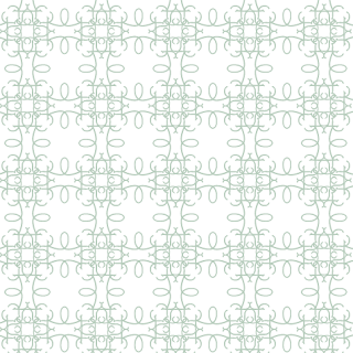
First, the "fancy": Pattern Taila
Like many of my "fancy" patterns, Pattern Taila alternates between airier white spaces and more dense parts of the design, giving it a bit of a lacy quality. The thin pen strokes and curly aspects further cement it into the "fancy" category, but at the same time, it feels a bit more modern than many in my "fancy" collection. I can't quite put my finger on why - but to me it feels like a modern take on a traditional design.
Perhaps it's the pairing of perfectly straight and slightly ornamented lines with the simple loops. Or perhaps it's the roundness of the loops, which feel fatter and more like lassos than the typical elegant arabesque. It could even be that each white area, with its generally circular form and sand-dollar-like design, seems like a casual beach house pattern, balancing out the rest of the more elaborate pattern to make the whole thing feel more modern. Whatever the reason, I feel like this pattern would be more likely to be turned into a stencil and painted on a single accent wall rather than printed as a wallpaper and filling an entire European interior, and that quality is something I really like about this design.
And now, the "funky": Pattern Stephanie
Pattern Stephanie is definitely "funky". I love how much simpler it looks from a distance. The square shapes, for instance, look like straight lines until you zoom in and see that they have a bit of curl and embellishment to them. And the triangles are the perfect contemporary, funky adaptation of the traditional heart shape. Repeated top-to-top (or side-to-side, when the triangular hearts are rotated), they form a diamond-like shape that takes on an almost plant-like or leafy quality. And yet, the unorthodox squares, triangles, and diamonds are all repeated in a very structured, grid-like pattern, again establishing them all as more traditional than they actually are at closer look. :)
It's also a great pattern to use in a single row on stationery, to add just a touch of interest, like I did in the invitation above. By keeping the funky pattern a light bluish-gray color, I don't overshadow the other textures and metallic shine of the rest of the stationery with the pattern's bold uniqueness.
-
Click here to see all posts related to "Fancy/Funky Friday"
Shameless plug time: Love my patterns? I incorporate them into a lot of the artwork I create, from stationery for Invites by Andrea to the watercolors I paint. Check out Invites by Andrea's website to see examples of these patterns in use or drop me a line at andrea@invitesbyandrea.com to let me know what you think!


No comments:
Post a Comment