Long ago when I first decided to post weekly Fancy/Funky Friday posts, I showed you the steps I take in creating a sample pattern. This week, you get a sneak peek into my process again - I have a collection of images that showcase the method I used to create today's "fancy" pattern. Scroll down to take a look! :)
First, the "fancy": Pattern Pandora


Pattern Pandora is definitely one of the more unique "fancy" patterns I've designed. In the final pattern, the fluffy pillow-like forms become the main "unit" that stands out, but when I first created it, the original "unit" was the diamond-like shape that was created in the negative space as I rotated the characters and connected them to each other.
Here's a look at the process:
With this pattern, the negative space that came out when I repeated the "unit" I created became much more prominent than the original unit. Now it's the white pillow-like forms that stand out most, even when only a couple rows of the pattern are shown.

In the sample above, you can really see how interesting the pattern is when it's used on stationery. The thin lines, elegant curves, and linear detail make it "fancy" but it still has a bit of a fun, modern feel to it, too, due to its uniqueness.
And now, the "funky": Pattern Electra


Not to be outdone, this week's "funky" pattern is also incredibly unique. Made out of the capital S and L of a Greek-themed font, Pattern Electra has an underlying grid structure that creates actual squares - and then turns them all on their sides for a dynamic twist. The concept and execution of the pattern is fairly straightforward, but there's still something dramatic and unexpected about the craziness of the dense miniature zig-zag starbursts paired with modified rectangles and larger squares of white negative space.
I've also used this pattern in stationery, as you can see in the photograph below. I added a few columns of this pattern to either side of a long rectangular invitation, and broke off a couple of the tilted rectangles to use as paragraph separation decorations down the center of the design.

I wanted to play up the uniqueness of this pattern by using funky colors. First, I used two colors on the actual pattern, making the zig-zags light lime green and the rectangles a pale mint to match the interesting colors in the striped and polka-dotted scrapbook paper I added to the green envelopes. For the stationery's lettering, I again turned to the scrapbook paper and used the same light lime green and pale mint, as well as the light and dark pink the scrapbook paper uses.
There's a lot going on in this stationery design, and I admit it certainly won't be for everyone. But if you're hosting a funky event, or are looking for a bit of intrigue with your color scheme and font choice, this is definitely the design for you! :)
-
Click here to see all posts related to "Fancy/Funky Friday"
Shameless plug time: Love my patterns? I incorporate them into a lot of the artwork I create, from stationery for Invites by Andrea to the watercolors I paint. Check out Invites by Andrea's website to see examples of these patterns in use or drop me a line at andrea@invitesbyandrea.com to let me know what you think!
First, the "fancy": Pattern Pandora
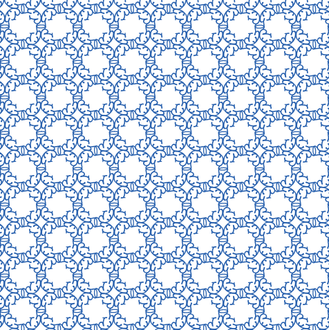

Pattern Pandora is definitely one of the more unique "fancy" patterns I've designed. In the final pattern, the fluffy pillow-like forms become the main "unit" that stands out, but when I first created it, the original "unit" was the diamond-like shape that was created in the negative space as I rotated the characters and connected them to each other.
Here's a look at the process:
 |
| I started with a capital "P" and "G" from a fun font |
 |
| I play around with the letters until I start to get a pattern I like by rotating and reflecting the characters. |
 |
| Once I have a "unit" I like, I repeat it several times to fill a large square full of the pattern! |
With this pattern, the negative space that came out when I repeated the "unit" I created became much more prominent than the original unit. Now it's the white pillow-like forms that stand out most, even when only a couple rows of the pattern are shown.

In the sample above, you can really see how interesting the pattern is when it's used on stationery. The thin lines, elegant curves, and linear detail make it "fancy" but it still has a bit of a fun, modern feel to it, too, due to its uniqueness.
And now, the "funky": Pattern Electra


Not to be outdone, this week's "funky" pattern is also incredibly unique. Made out of the capital S and L of a Greek-themed font, Pattern Electra has an underlying grid structure that creates actual squares - and then turns them all on their sides for a dynamic twist. The concept and execution of the pattern is fairly straightforward, but there's still something dramatic and unexpected about the craziness of the dense miniature zig-zag starbursts paired with modified rectangles and larger squares of white negative space.
I've also used this pattern in stationery, as you can see in the photograph below. I added a few columns of this pattern to either side of a long rectangular invitation, and broke off a couple of the tilted rectangles to use as paragraph separation decorations down the center of the design.

I wanted to play up the uniqueness of this pattern by using funky colors. First, I used two colors on the actual pattern, making the zig-zags light lime green and the rectangles a pale mint to match the interesting colors in the striped and polka-dotted scrapbook paper I added to the green envelopes. For the stationery's lettering, I again turned to the scrapbook paper and used the same light lime green and pale mint, as well as the light and dark pink the scrapbook paper uses.
There's a lot going on in this stationery design, and I admit it certainly won't be for everyone. But if you're hosting a funky event, or are looking for a bit of intrigue with your color scheme and font choice, this is definitely the design for you! :)
-
Click here to see all posts related to "Fancy/Funky Friday"
Shameless plug time: Love my patterns? I incorporate them into a lot of the artwork I create, from stationery for Invites by Andrea to the watercolors I paint. Check out Invites by Andrea's website to see examples of these patterns in use or drop me a line at andrea@invitesbyandrea.com to let me know what you think!
No comments:
Post a Comment