This is one of my favorites of the approximately 170 sample sets I designed and assembled in preparation for the upcoming Brides-to-Be show I'll be participating in (in just two short months!). I call it "Classic Vintage" because the colors and worn-out aesthetic of the zig-zag-patterned scrapbook paper I used are really unique and have a vintage quality about them. This invitation set would be perfect for a chic vintage-inspired wedding. They have a very "hand-made" feel because of all of the different layers and textures. I started with a Pearl White Metallic Cascade Pocketfold Envelope, and lined the left flap and right pocket with a piece of scrapbook paper I had. Then I scanned in the rest of the scrapbook paper so that I could use the same zig-zag pattern on the actual invitations.
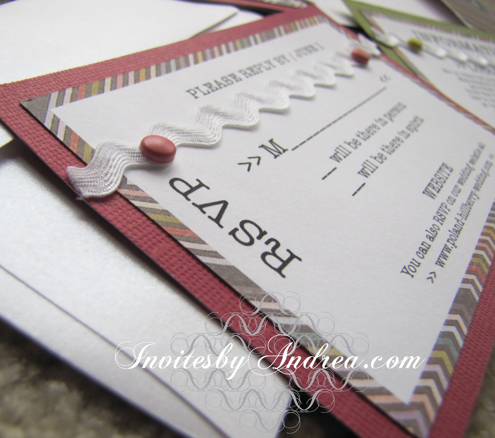
I found a couple of different colored textured cardstock pages that matched two of the colors in the scrapbook paper and used those for the backgrounds of each stationery item. The dark olive and cheery raspberry colors are unique and fun, but also sophisticated. The brightness of the other colors in the scrapbook paper would help this design work for spring or summer as well, but I think the olive and raspberry feel particularly autumnal, like late summer berries. I used the most similarly colored decorative brads I could find, and I love that they're not quite right. The different shades give it a more casual and vintage feel again. The green brads are so yellow that they pick up the thin yellow stripes in the scrapbook paper, as well.


And then, because the smooth textured of the flat 67# cardstock I printed the invitations on, the implied textured of the scrapbook paper, and the texture of the olive and raspberry cardstock weren't quite enough, I added a ric rac ribbon in pure white to match the background of the stationery. The best part? I found it in the $1 bargain bin at Michael's. :)


Every piece, from the information insert to the reply card have the decorative brads and ribbons. Though this would probably cause the price of mailing to increase, I think it's worth it. The ribbon adds texture to what would otherwise be a rather plain design and ties the stationery to the texture found in the background and on the Cascade envelope.

Since there is so much going on with the different textures, papers, and add-ons, I kept the actual printed stationery pretty simple, and used only black ink and one font for the text (though I did play with uppercase vs. lowercase letters to differentiate the more important information). I used a type-writer inspired font for each stationery item to again play up the vintage feel, but I incorporated >> brackets << as decorative elements to help the stationery feel more modern. They instantly remind you of the digital age, while still looking crisp and clean. Plus, they once again tie back to the other papers and textures used in the stationery, since the brackets look like the tiny v's of parts of the zig-zag pattern!

It took a lot of time and resources just to create this one sample, so making enough for all of the guests to a wedding (or other event) would undoubtedly be time-consuming and expensive. But it's such a unique look that for some people it may be worth the extra time and cost. The save-the-dates and invitations you send out to your guests is the first impression of your event your guests will get. It sets the mood and gets them excited for the upcoming nuptials, and this stationery set definitely delivers. If I received this package in the mail, I'd be expecting a beautiful (but unique) event, with a very tactile feel - maybe some highly textured tablecloths and cloth napkins, with some gorgeous raspberry and olive floral centerpieces.
Next week's Sunday Sample Spotlight: a simple patterned design with a cheerful color scheme!
Click here to view all Sunday Sample Spotlight posts.
"Like" Invites by Andrea on Facebook!
-
Shameless Plug Time: Love this invitation (or others featured on this blog)? Want something similar (or something completely custom) designed for your event? Visit Invites by Andrea to view more samples, download a catalogue pdf (coming soon!), or fill out a design request form. Or shoot me an email to ask me your questions or learn more information.
 |
| "Classic Vintage" - Invitation Trio (invite, reply card & information insert), plus save-the-date |
I found a couple of different colored textured cardstock pages that matched two of the colors in the scrapbook paper and used those for the backgrounds of each stationery item. The dark olive and cheery raspberry colors are unique and fun, but also sophisticated. The brightness of the other colors in the scrapbook paper would help this design work for spring or summer as well, but I think the olive and raspberry feel particularly autumnal, like late summer berries. I used the most similarly colored decorative brads I could find, and I love that they're not quite right. The different shades give it a more casual and vintage feel again. The green brads are so yellow that they pick up the thin yellow stripes in the scrapbook paper, as well.


And then, because the smooth textured of the flat 67# cardstock I printed the invitations on, the implied textured of the scrapbook paper, and the texture of the olive and raspberry cardstock weren't quite enough, I added a ric rac ribbon in pure white to match the background of the stationery. The best part? I found it in the $1 bargain bin at Michael's. :)

Every piece, from the information insert to the reply card have the decorative brads and ribbons. Though this would probably cause the price of mailing to increase, I think it's worth it. The ribbon adds texture to what would otherwise be a rather plain design and ties the stationery to the texture found in the background and on the Cascade envelope.

Since there is so much going on with the different textures, papers, and add-ons, I kept the actual printed stationery pretty simple, and used only black ink and one font for the text (though I did play with uppercase vs. lowercase letters to differentiate the more important information). I used a type-writer inspired font for each stationery item to again play up the vintage feel, but I incorporated >> brackets << as decorative elements to help the stationery feel more modern. They instantly remind you of the digital age, while still looking crisp and clean. Plus, they once again tie back to the other papers and textures used in the stationery, since the brackets look like the tiny v's of parts of the zig-zag pattern!

It took a lot of time and resources just to create this one sample, so making enough for all of the guests to a wedding (or other event) would undoubtedly be time-consuming and expensive. But it's such a unique look that for some people it may be worth the extra time and cost. The save-the-dates and invitations you send out to your guests is the first impression of your event your guests will get. It sets the mood and gets them excited for the upcoming nuptials, and this stationery set definitely delivers. If I received this package in the mail, I'd be expecting a beautiful (but unique) event, with a very tactile feel - maybe some highly textured tablecloths and cloth napkins, with some gorgeous raspberry and olive floral centerpieces.
Next week's Sunday Sample Spotlight: a simple patterned design with a cheerful color scheme!
Click here to view all Sunday Sample Spotlight posts.
"Like" Invites by Andrea on Facebook!
-
Shameless Plug Time: Love this invitation (or others featured on this blog)? Want something similar (or something completely custom) designed for your event? Visit Invites by Andrea to view more samples, download a catalogue pdf (coming soon!), or fill out a design request form. Or shoot me an email to ask me your questions or learn more information.
No comments:
Post a Comment